CLIENT: Edjewcation Station
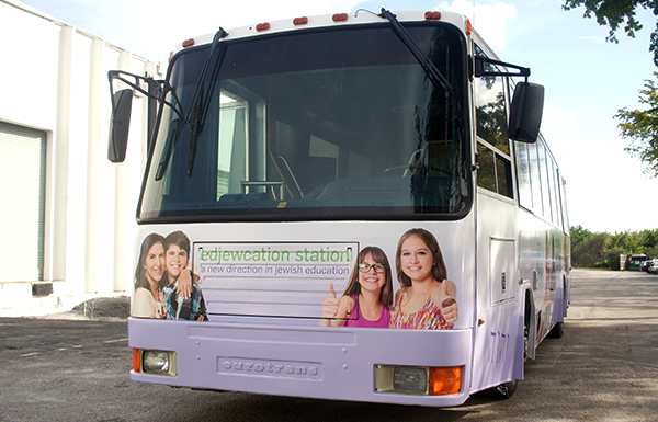
Cantor Debbi Ballard had a radical idea for bringing Jewish education to underserved and unaffiliated families in South Florida: a bus that could take the educational experience to them. But first she needed a logo for the program and a design for the most integral piece of the program, the bus itself.
Logo Design
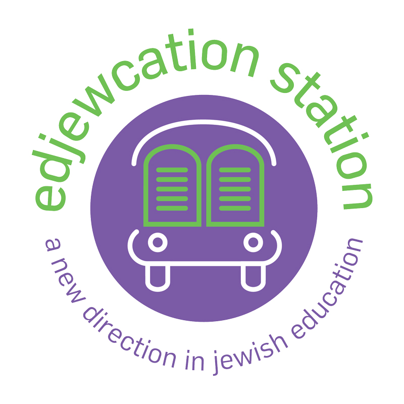
The logo we developed for the Edjewcation Station conveyed the concept of mobile Jewish Education by combining two symbols, a bus and two tablets representing the 10 Commandments — subtly incorporated into the bus icon by doubling as the windshield. The roundness of the logo, the logotype, and the style in which the icon is executed all combine to make a mark that feels inviting and kid-friendly, while still appealing to the older teens and adults the program also targets.
Bus Wrap
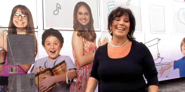
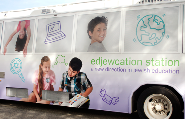
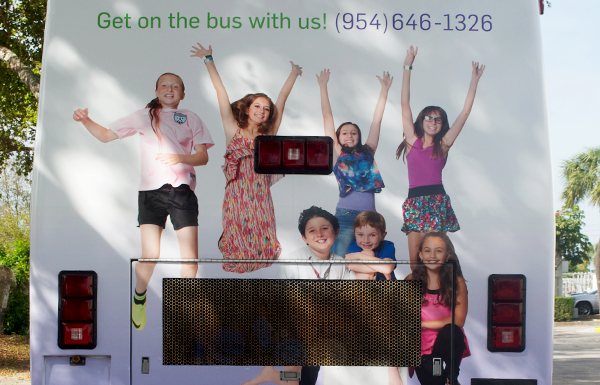
After creating the logo, the next step was creating a design, or “wrap” for the bus that quickly conveyed what the program was about. A combination of illustration and energetic photos (taken of children who are actually enrolled in the program) was a compelling way to tell a story about Jewish education for a range of ages.
Links
- See other work we’ve done for Cantor Debbi Ballard.
- See other case studies.
- Contact Red Rooster Group for help with branding.


