The Many Ways to Unify Your Nonprofit’s Brand
Is your program more well-known than your organization? Do you have several operating units with names and logos that don’t relate to your parent organization?
It’s important for nonprofits to have a cohesive brand so that donors and participants recognize all aspects of your organization. These examples of brand families show different ways of creating a brand architecture that unifies divisions or programs to create a comprehensive, easily recognized brand.
Unifying Multiple Locations of One Organization
Graphic Device Highlights Location While Keeping Prominence on Organization’s Name
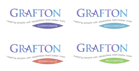
This autism organization was operating from 4 different locations but wasn’t maximizing that advantage (most other agencies in the region had only one location). To show the agency’s greater breadth, we updated their logo and created a brand family with logos that identity each of the agency’s venues.
Since we had redesigned the logotype without an icon, it made sense to use a graphic device to identity the respective location while providing additional visual interest to the logo. While colors distinguish each location, the curved tagline helps to unify the entire logo configuration.
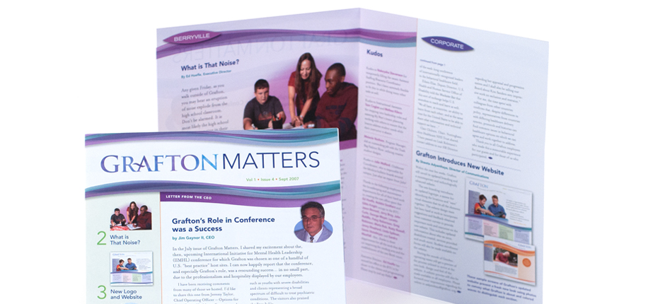
When adapted to the newsletter and other communications materials, the wave motif is used as a design element.
Establishing a Naming System for Chapters and Affiliates
Creating a Consistent Treatment of the Names and Tagline
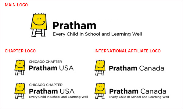
The largest educational organization in India was growing, with 15 chapters in the United States and international affiliates, but lacked standards for . how chapters were named. To address this, we developed a comprehensive brand architecture for the organization that defined the relationship of the logo and tagline, created consistency for their 15 chapter and international affiliate names, and determined how they should be styled. We then developed versions of all the logos (15 chapters plus international partners) with and without the tagline in formats for print and web use.
Giving More Prominence to Fundraising Divisions
Connecting the Giving Circles the Parent Organization
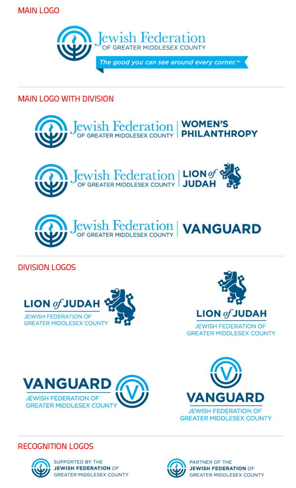
This local Federation (one of 157 nationwide) was grappling with brand standards for their different fundraising divisions. Some giving circles did not have a consistent treatment for their name — for example each fundraising invitation looked entirely different, and there was no connection to the agency — a lost opportunity to develop recognition and connection. Other giving groups, such as the Lion of Judah, had a long-standing icon that was used for an elegant pin worn by those giving at a certain level, and was recognized nationally throughout the Federation system. Compounding this confusion was the fact that when the division name was used, there was often no connection to the Federation.
Creating Division Logos to Stand on Their Own
We addressed these concerns with a thorough re-thinking of how the division names should be treated in relative to the organization’s name and developed the Main Logo with Divisions when it was important for the agency’s name to be more prominent, and Division Logos that identify the Federation when they are used on invitations. We also developed logos that work well at very small sizes to identify the organizations supported by the Federation as well as partner organizations.
Creating Consistency for Different Programs
Giving More Prominence to the Program Names with a Special Type Treatment
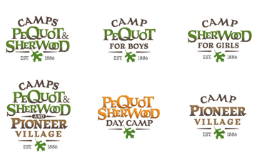
In order to counter the religious perception of its name, Incarnation Camp wanted to use the division names that it had been using for years, which were more like traditional camp names. Since the camps divisions were Pequot for Boys, Sherwood for Girls, and Pioneer Village for Teens, we created a series of logos using those names in a coordinated way. The consistent type treatment helps people identify the logos as being the same camp, while the changes in color — green for the boys and girls overnight camp, brown for teens, and orange for day camp — distinguish between the divisions.
Connecting Different Operating Units Under One Organization
A Single Logo with Different Color Bands Connect All the Units
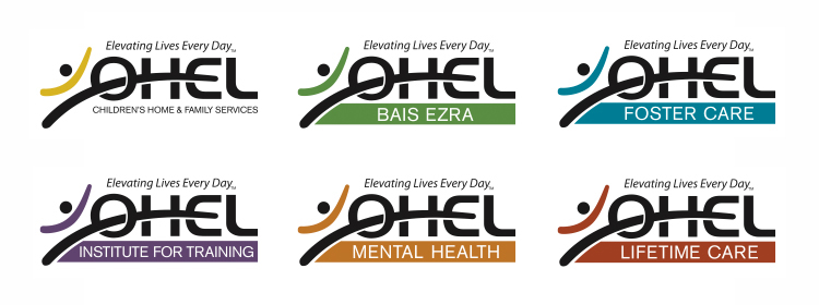
This social service agency was operating under 3 different names, each with a different logo, in addition to having other departments. They wanted to capitalize on their breadth of services to demonstrate their impact in the community in order to improve their ability to fundraise.
We created a brand family that unifies all the operating units in a consistent way. The icon of the leaping figure in black remains consistent while the color bands identify each operating unit.
The 40th Anniversary Logo Uses Elements from the Organization’s Logo
The 40 Year Anniversary logo uses the colored arc (leaping man’s arms) as part of the design, subtly mimicking the embrace of two hands, while the 4 extends into the zero, echoing the look of the O in Ohel.
Alternative Treatment for Operating Units
Unique Symbols Made from the Same 3 Elements Create Unity
We had proposed another way of addressing their operating units under the same organizational header — using a leaping figure symbol for the agency consisting of three elements: a purple circle, a yellow brush stroke, and a green brush stroke. These three elements were then recombined to create distinctive icons for each of the business units. The color and use of the logo elements helps create consistency, while the different icons create distinction for each division.
Creating a Brand Family to Connect Fundraising Event & Anniversary
Consistent Use of Color and Icons Creates Harmony
This example shows how elements from the organization’s logo (such as the leaping figure) are used in other logos like the agency’s 25th Anniversary logo and Overcoming the Odds Awards (OTO) logo. Notice how the open book is used as the top of the letter “T’ in the OTO logo.
Developing Unity Among Programs, Partners and Parent
Color Gradient and Typography Creates a Flexible System
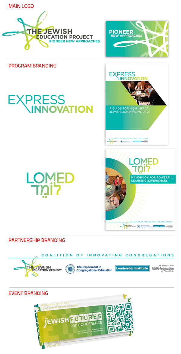
This educational nonprofit had a new logo for the agency (designed by BBMG), but the logo and design of their program marketing materials didn’t look like they came from the same organization. We helped tie them to the parent agency with a consistent typographic treatment and use of the color gradient. Now each program has a slightly different look, but is unmistakably recognizable as coming from The Jewish Education Project.
Unifying the Partnership with Other Organizations
In addition, the agency ran programs in partnership with other organizations under the moniker, Coalition of Innovating Congregations, but lacked a way of unifying the disparate logos. We unified the logos using the loop in The Jewish Education Project as the anchor.
Looking to revitalize your brand?
Look to Red Rooster Group’s 30 years of experience in creating effective and cohesive brands for nonprofits.


