1. Suggest Donation Amounts
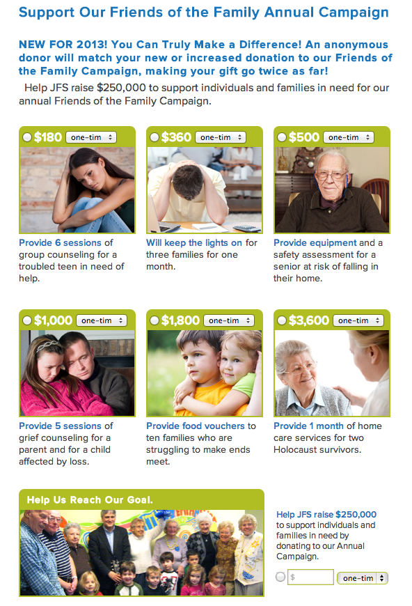
Provide a suggested donation amount to help increase giving levels. Use concrete examples of what each level of a donation may go towards.
> http://www.jfsmetrowest.org/get-invovled/donate
2. Feature Testimonials
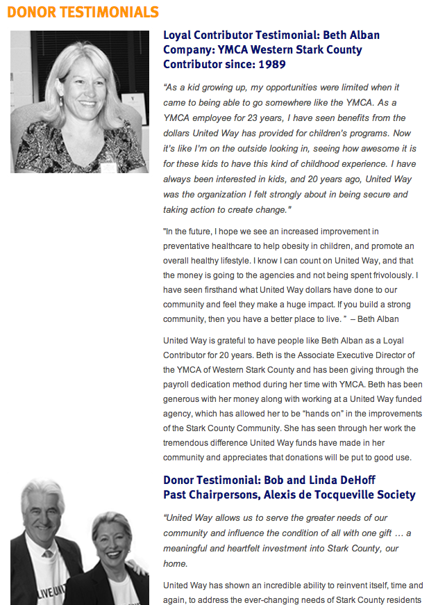
Provide donor profiles and testimonials, allowing potential donors to know that they fit in with others supporting the organization.
> http://www.uwstark.org/donor-testimonials
3. Show Sponsor and Foundation Logos
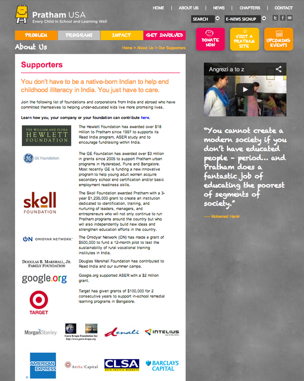
Show logos of corporate sponsors and foundation funders to create visual interest, quicker recognition and impact. If appropriate, you can categorize sponsors by giving level or display the number of years they have been supporting your organization,or describe their relationship with you to show a strong, stable base of support and commitment by funders.
Large sponsors are accompanied by a description of their relationship with Pratham (photo top). Other sponsors are represented by their logos (bottom).
> http://prathamusa.org/about-us/our-supporters
4. Ensure That Your Site is Mobile-Ready
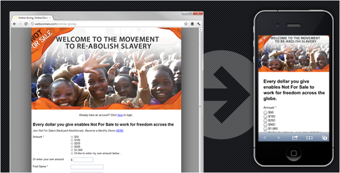
Make sure that information displays in a way that can be read easily on different devices and that the donation form works well on those devices.
> http://www.givingfuel.com/features/mobile-giving
5. Include Listings and Endorsements
Make sure your listings on Guidestar, Charity Navigator and Better Business Bureau are accurate and include third-party endorsements of financial stewardship and assurances of secure online donation transactions on your donation page, if appropriate.
6. Use Photos with a Headline and Caption
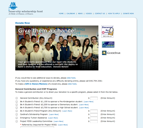
Add visual appeal to your donation by using photos and headlines that summarize your mission and convey the impact of the funds raised.
> http://www.icsf-nyc.org/donte.cfm
7. Demonstrate Impact Visually
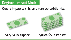
If possible, create a graphic showing how donated funds are leveraged to achieve greater impact. For example:
8. Thank You Page
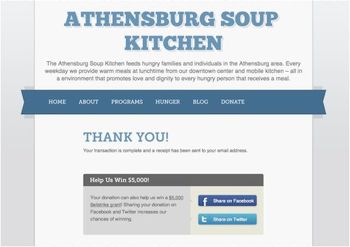
Have a robust “Thank You” page that is triggered after a donation is made and that encourages donors to get involved in your organization in other ways, such as volunteering or attending an upcoming event.
This donation page solicits social media engagement.
> http://blog.bellstrike.com/page/3
Best Practices
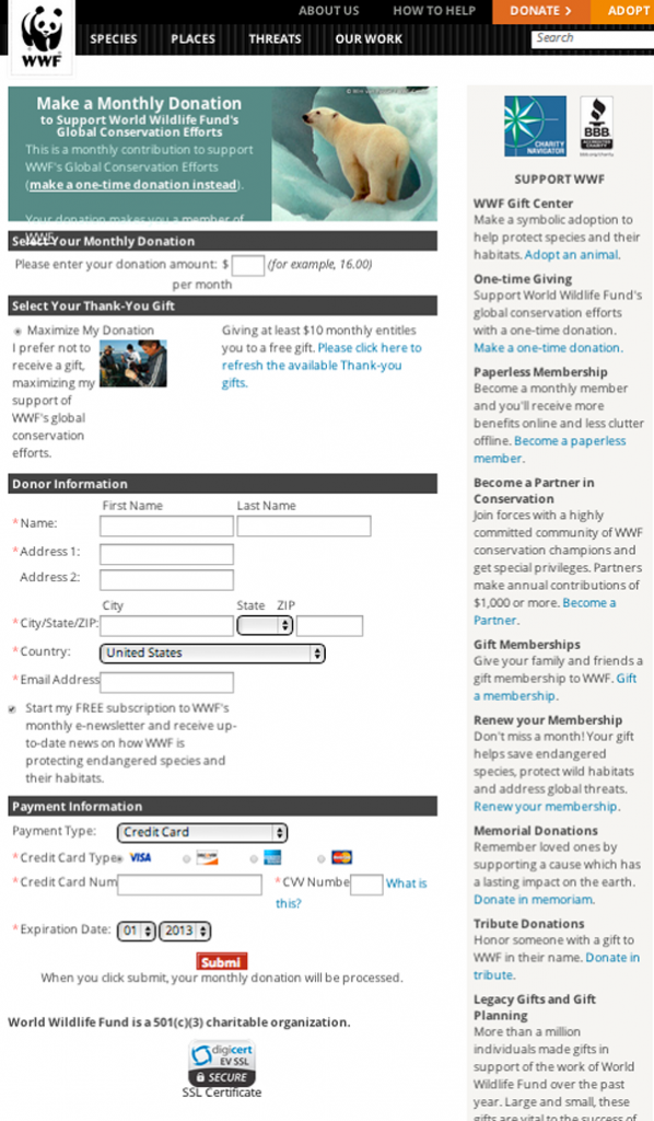
An example of a a donation landing page that received high remarks in one study is shown below. The main column features pictures, graphics and an aesthetically pleasing form. Additional ways to engage donors are featured in the right sidebar. Note the 3 different assurances to donors below the submit button.
> http://nonprofit.about.com/od/onlinefundraising/ss/The-Final-Test-Donor-Pages-That-Convert_2.htm
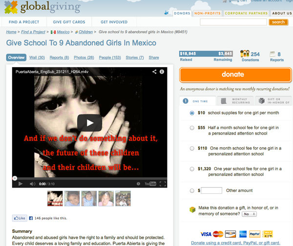
Here is another example of a clean, easy to navigate donation page. Note the large video and description of the organization in the main column, the campaign goal and graphics showing the number of donations on the top right, the descriptions of donations levels and tabs for “one time”, “monthly” and “gift honor of” options.


