Partnership With Native Americans

Renaming a National Nonprofit for Increased Fundraising Impact
The country’s largest charity supporting Native American communities came to Red Rooster Group to address its brand challenge — its fundraising sub-brands were generating diminishing returns. Our comprehensive assessment and new naming strategy returned the organization to fundraising profitability within 6 months.
Services
- Brand Analysis
- Competitive Analysis
- Stakeholder Interviews
- Brand Positioning & Messaging
- Naming
- Field Testing & Surveys
- Visual Identity System
- Brand Style Guide
Challenge
Key Issues
- The parent name did not reflect the mission of the organization and had little recognition outside the current donor base.
- Multiple program areas had separate brand identities which confused donors and cannibalized revenue from each other.
- Combining names might result in lost revenue.
Objectives
- Re-position the parent organization while reducing the confusion caused by the many operating brands.
- Better distinguish the organization from similar organizations so it becomes the charity of choice for donations to Native American causes.
- Implement the new brand without negatively affecting fundraising efforts.
BEFORE
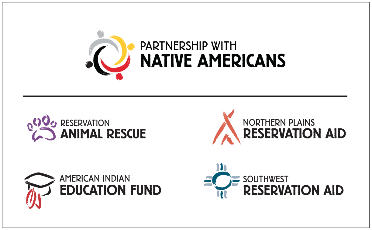
AFTER
Research
Our research phase included:
- Reviewing Existing Research: We started by assessing the fundraising base and demographics to gain an overview of how NRC raised funds through direct mail and telemarketing, and with an extensive breakdown by program type and donor analysis and trends.
- Competitive Review: We looked at more than 100 Native American relief and related organizations to understand the dynamics of the landscape.
- Brand Workshop: This session with the organization’s leadership provided the opportunity to share NRC’s history as it pertained to moving the brand forward, explore NRC’s brand uniqueness, and clarify the issues and expectations around the naming the organization.
Name Development
Creative Brief for the Name
Before generating names, we wrote a Creative Brief to get everyone on the same page about what the name should accomplish and to list the criteria and considerations for the name. The Creative Brief included Image Criteria, Functional Criteria, Directional Naming Considerations, and the Decision-Making Process for choosing the name. We also wrote a Brand Statement that summarized what NRC is all about in order to provide direction for generating names.
Generating Names
We explored broadly generating names for the parent brand, developing Descriptive and Evocative Names, names that were literal, benefit-oriented, metaphorical, and action-oriented. We discussed the initial list of names with the client to assess the types of names that would be suitable. It was determined that Descriptive names would best work for the organization and that the word ”partnership” resonated as a leading term.
We discussed the initial list of names with the client. The goal at this stage was to assess the types of names that would be suitable. It was determined that Descriptive names would best work for the organization, and so the Evocative names were discarded. The word ”partnership” resonated as a leading term.
Testing
We tested the names in the following ways:
Interviews
We conducted 18 in-depth interviews with a range of constituents to generate qualitative feedback on three primary themes and name options, in order to determine which resonated best with key stakeholder groups.
Surveys
We conducted a randomized survey of NRC’s internal donor base to field-test the appeal of various parent names and get insight into program loyalties. Variations of the survey were created for donors to each of the eight sub-brands. More than 700 donors completed the surveys.
Sub-Brand Naming
Assessing the Sub-Brands
A goal of the re-branding effort was to consolidate its eight program sub-brands in a way that both supported the new parent name while preserving the funding appeal of the organization’s three primary focus areas:
- Geographic Focus (Plains, Southwest)
- Type of Service (health, medical, economic, education)
- Long vs. Short-term Impacts (capacity-building vs. short-term relief)
In considering directions for the sub-brand renaming strategy, we evaluated the strengths and weaknesses of each program name and focus of service and made recommendations for the sub-brands based on the findings that:
- Donors had stronger allegiances to the general mission of supporting Native American communities than to any particular program.
- Certain programs (e.g., animal care) had significant name recognition and loyalty.
Visual Identity
Developing a Brand Architecture
After the names had been established, we started designing a brand architecture that unified the parent brand and its sub-brands into a cohesive brand family that could be easily recognized by supporters of all the programs. This would allow the organization to take credit for all of its programs and expand its fundraising appeal.
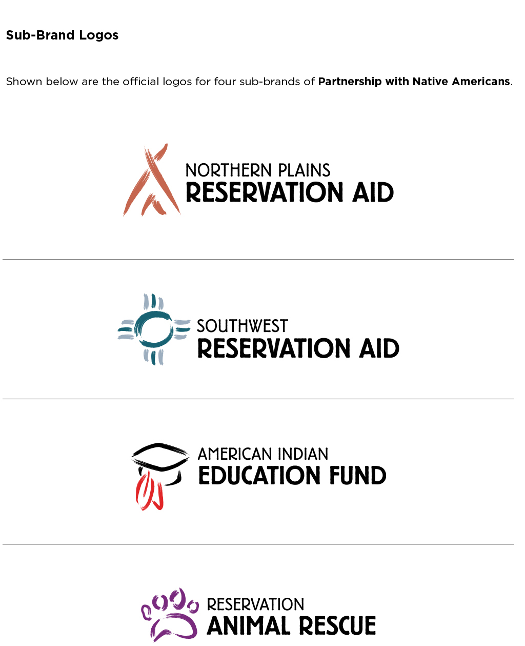
Given the task of building out the sub-brand logos in a way that connected them with the parent logo, we rendered the medicine wheel concept with brush strokes, allowing us to use that style for the sub-brands to create a consistent look across the organization. We then explored colors that would best represent each of the sub-brands.

Brand Manual
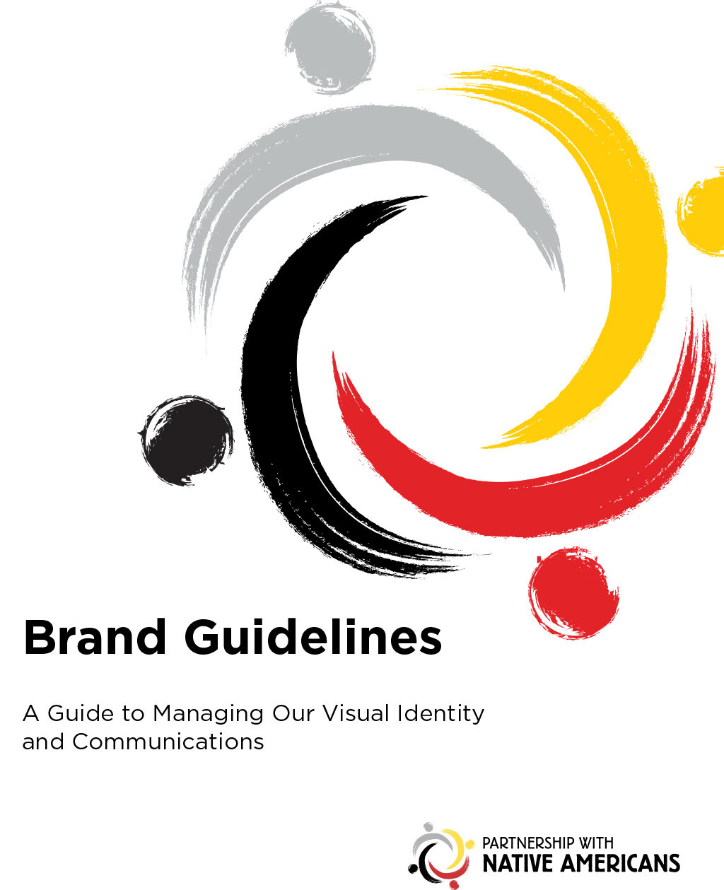
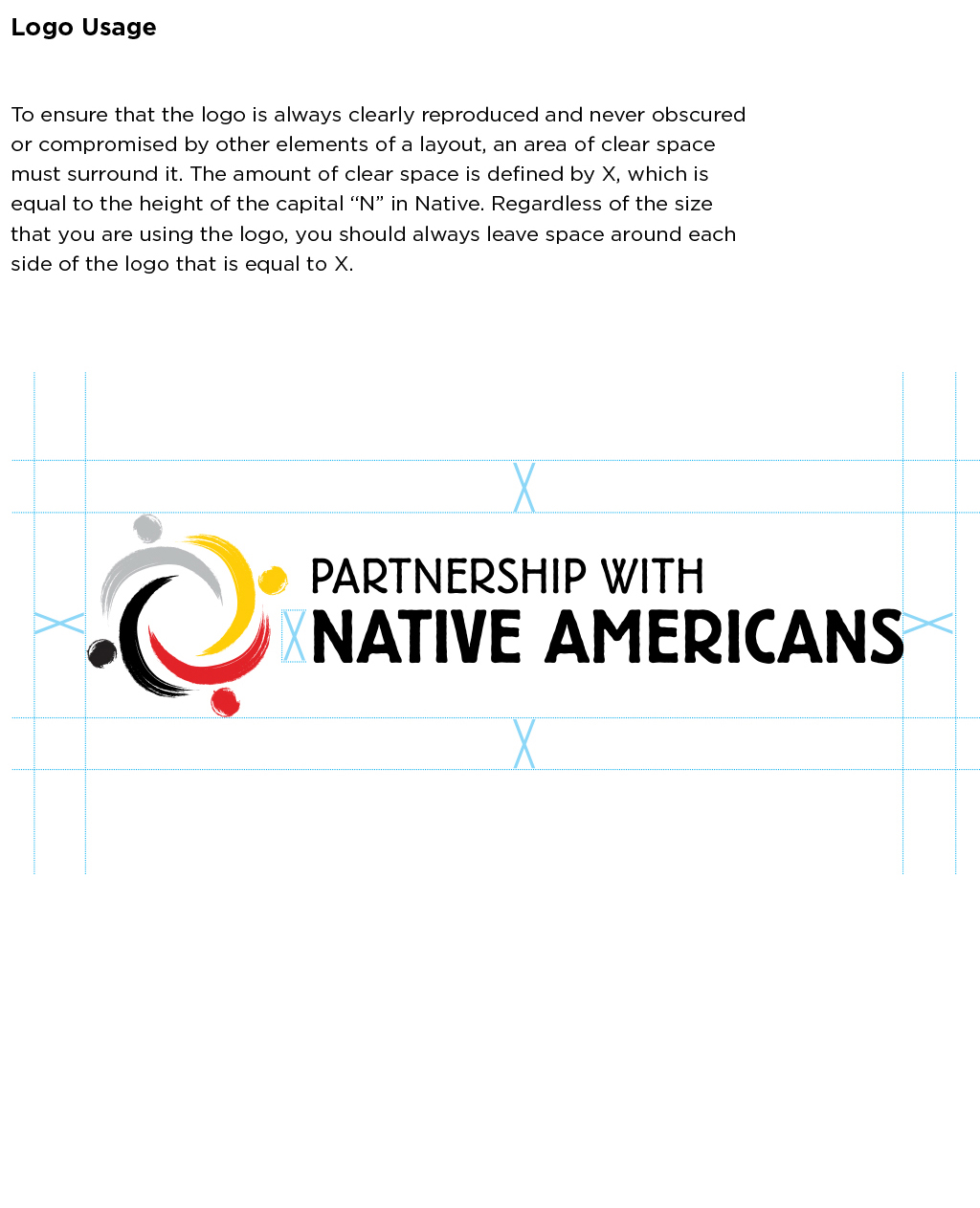
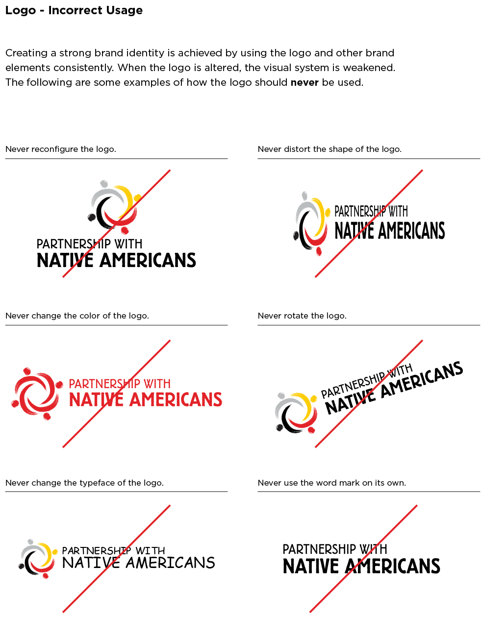
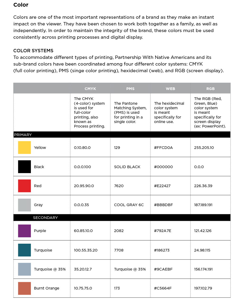
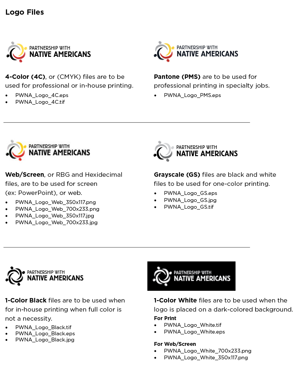
Once the logos were finalized, we developed a Brand Manual that included the brand elements and usage guidelines.
Outcomes
By reducing the number of sub-brands that it uses for fundraising, the organization was able to consolidate its fundraising efforts, cut the amount of direct mail it sends in half, and reduce costs significantly.


