How does a $100 million social service agency remain relevant in a competitive environment?
We created a new name, message, and visual identity that positions it as a leader in the sector.
Founded in New York City in 1831, Leake & Watts had evolved from an orphanage to a multi-faceted agency with more than 40 different programs. But their name and brand were hampering their ability to get referrals and attract donors. Red Rooster Group led the agency through a process of revitalizing its brand, including a name change to Rising Ground, a new visual identity, Mission, Vision, and organizational language, as well as a new website, and marketing materials.
These changes helped elevate Rising Grounds’ leadership position in the sector and foster its growth. Rising Ground acquired another agency, boosting its revenue to $140 million. As one of the largest social service agencies in the New York City area, Rising Ground is now well-positioned to support the next generation of New Yorkers.
THE CHALLENGE: Updating a Brand with History
Leake & Watts had been struggling with its name for a long time. Since its founding in 1831, its mission had evolved from an orphanage to a full-service agency providing more than 4o programs to a range of populations. But that wasn’t clear from the name. It sounded like a law firm, or plumbing or electrical company, and was difficult to spell.
As social service agencies in New York City consolidated and updates in order to remain relevant, a strong brand presence was critical in order to appeal to appeal to government funders and private donors. Yet, organizational inertia and fear of losing touch with its 186-year heritage had prevented a name change. Red Rooster Group was brought in to assess and address the situation.
DISCOVERY: Uncovering Brand Insight
We conducted a thorough Discovery process that was designed to help us uncover
brand perceptions and communication issues, assess brand equity, determine whether
a name change was warranted, and gain insight for revitalizing their brand.
Discovery included:
- A Brand Audit that assessed all touchpoints with the public.
- A Competitive Review of other human services agencies to identify key differentiators.
- 25 Interviews with leadership, Board members, and donors.
- An Interactive Workshop with two dozen senior leaders to explore brand strengths.
- Five Focus Groups with different departments to understand their brand challenges.
INSIGHT: The Need for Improving the Brand
BRAND: The organization has a family-like culture, respected leadership, and competent staff committed to helping people overcome their challenges. This insight would serve as the cornerstone of the brand — using the idea of ”Rise” as the organization’s primary theme.
COMMUNICATIONS: There was a disconnect between the parent brand and program brands — each department has discrete audiences making marketing efforts difficult to coordinate.
WEBSITE: We also assessed the needs of their various audiences, and used that insight to develop a new website to inform potential clients and referral sources, and inspire donors to support the organization.
NAMING: Developing a Case to Change the Name
Poor name recognition outside the current referral base was hampering their ability to attract new donors. We developed a position paper describing the arguments for and against a name change with a recommendation that a change would help:
- tell a more emotional story
- be a more effective tool for fundraising
- resonate better with younger audiences
- connote a forward-thinking organization
- improve SEO and PR opportunities
We supported the Brand Committee in making the case to the Board. Skeptics were won over, and the Board voted to approve exploring a new name.
NAMING PROCESS: Creating an Effective Name
The leadership, Brand Committee, and Board were engaged in a thorough process to develop and test a new name that would meet their needs around the theme of “Rise.”
CREATIVE BRIEF: We started with a Creative Brief that articulated the goals and criteria for the new name.
GENERATING NAMES: We presented names in a series of rounds that allowed the Brand Committee and board members to become familiar with the naming process, learn about different kinds of names, and explore words that would best represent their organization. We generated more than 1,400 naming ideas, tested the perceptions of different names through surveys, and had legal vetting conducted to review for conflicts.
FIELD TESTING: We surveyed consumers who were unfamiliar with Leake & Watts to test how certain names were perceived. This provided the Committee with feedback about how well the names communicated different brand attributes so they could make an informed decision.
GAINING CONSENSUS: Through this process, the Committee recognized the need to move beyond names that were amended versions of Leake & Watts and make a break from their past. They also came to see how they could move past a merely descriptive name to one that was more evocative and inspiring, and would serve them well into the future.
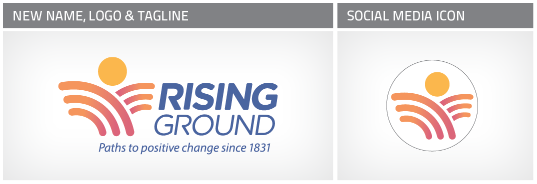
SELECTING A NAME: The Brand Committee selected the name Rising Ground, an original and available name that conveys how the organization helps people rise above adversity regardless of what they are facing. The tagline, ”Paths to positive change since 1831” amplifies the message and connects to their history.
MESSAGING: Crafting Compelling Messages
The name was not changed in insolation. We led the Committee and Board through a
process of updating the Mission and Vision Statements, Values, and other brand messaging so they better conveyed the agency’s commitment and made it easier for staff, clients, and donors to understand what Rising Ground does, and be articulate brand ambassadors.
Mission
Driven by the belief that each of us can thrive when life has hope and opportunity, Rising Ground provides caring support and proven paths to positive change, helping the most vulnerable children, adults and families rise above adversity.
Vision
Rising Ground envisions a future for New York where every child has an equal opportunity to succeed; where vulnerable individuals and families have the resources and support they need; where people with disabilities can access opportunity and fully participate in their communities; and where all are supported as they navigate life’s challenges and positively direct their lives.
Boilerplate
Rising Ground is a leading nonprofit social service organization, providing the most vulnerable children, adults and families in the Greater New York City area, with the resources and skills needed to rise above adversity and positively direct their lives.
VISUAL IDENTITY: Designing a Unified System
We created a new visual identity that is expressive, contemporary, and evokes the agency’s personality. The visual identity system consists of:
- A Logo with icon depicting earth and sun that can be read as a rising figure. The ”trapped” circle figure in the original logo, was ”released” with positive energy and motion.
The icon was designed to work well in social media while the custom typography for
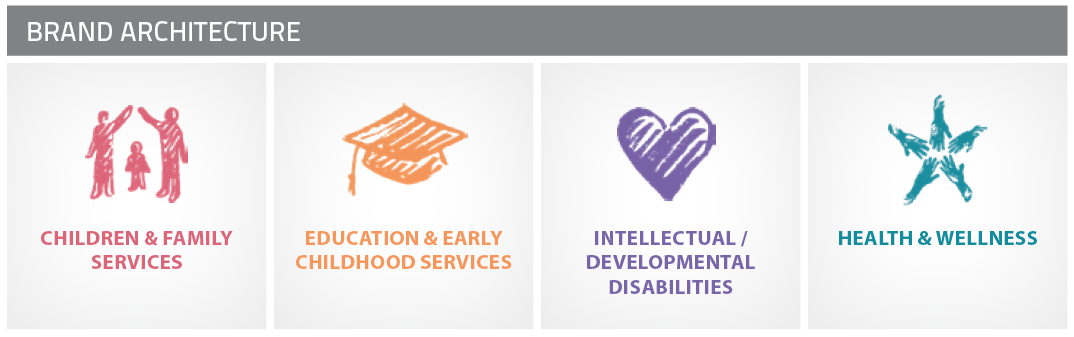
the word mark gives a contemporary and distinctive voice to the organization. - Brand Architecture that organizes more than 40 programs into four categories with icons and colors associated with each category.
- Color System with colors assigned to specific programs, website sections, and actions.
- Typographic System with guidelines for usage.
- Icons for use in print and online media.
- Brochure System for developing program brochures in-house.
- Brand Style Guide describing usage guidelines for all brand elements.
- Brand Messaging including Mission, Vision, Values, Boilerplate, and Elevator Pitch.
- Editorial Guidelines with grammar, language, and spelling preferences.
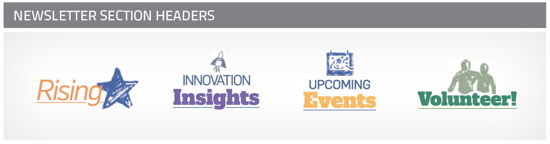
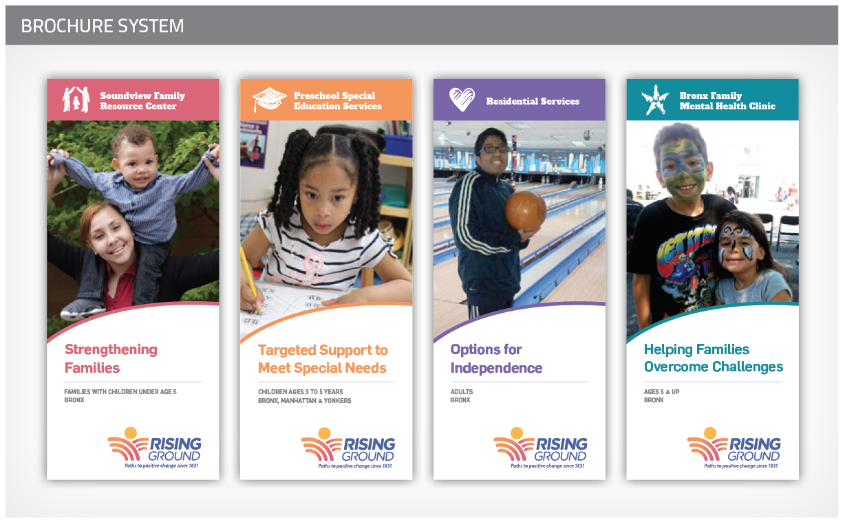
We developed a flexible template the allows their staff to easily create consistent-looking program brochures.
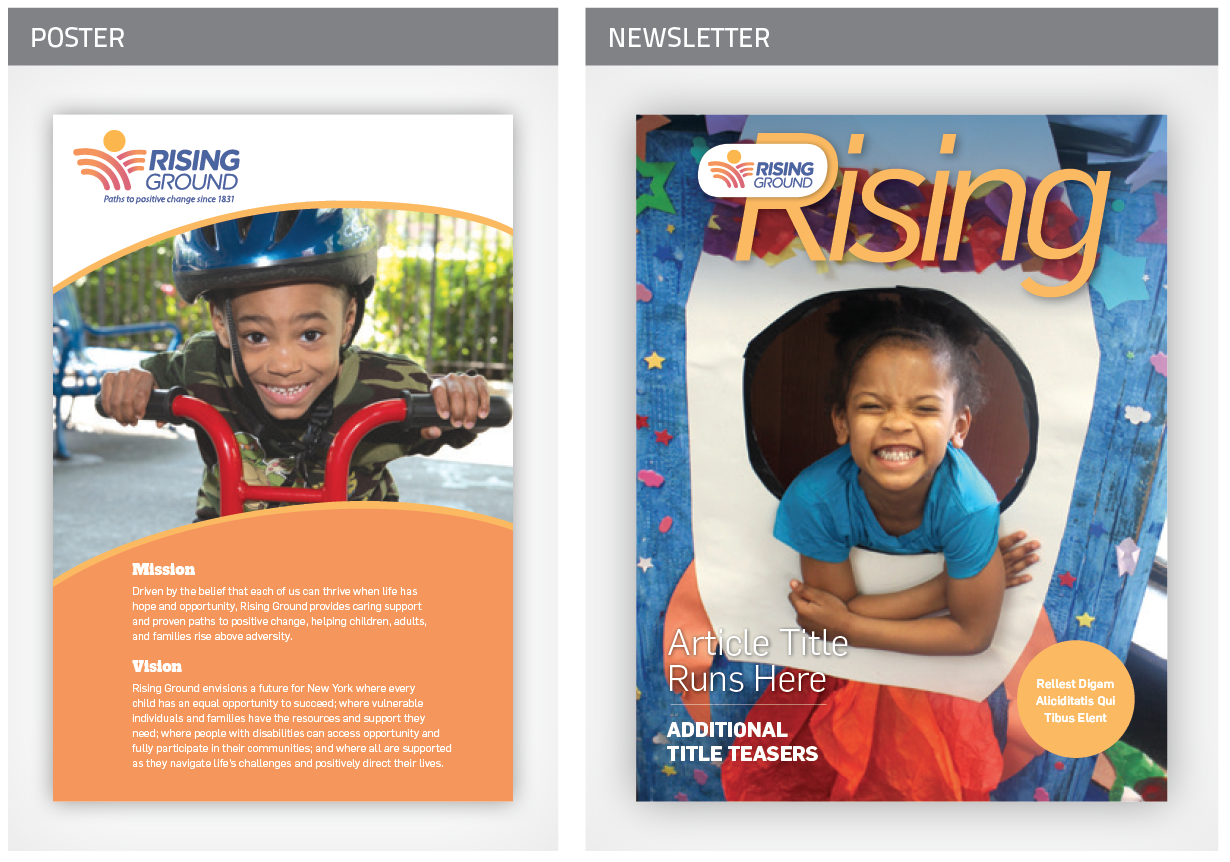
This poster for their various facilities keeps the new Mission and Vision top of mind for staff.
We redesigned their newsletter to have more of a magazine feel to better represent the organization’s leadership role in the sector.
WEBSITE: Creating an Engaging Online Experience
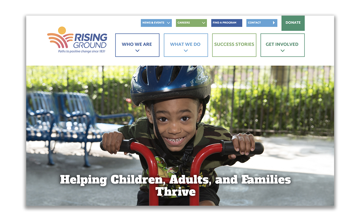
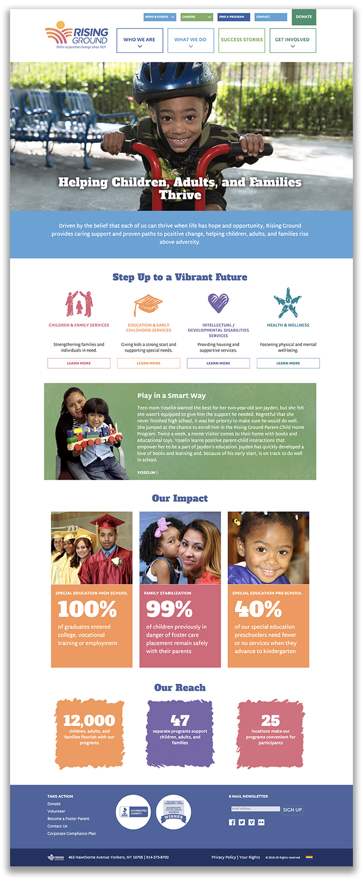
We planned, wrote, designed, and developed a completely new website for the organization. We created a positive experience that showcases the agency’s mission of helping people rise above adversity. The four program categories are color coded throughout the site for easy navigation. There is also a drop down menu of all services for easy access. The site features testimonials, success stories, impact statistics, a career section, and other features to engage audiences and motivate them to donate, volunteer, apply for a job, refer a client, or get help. The website was developed in WordPress. The client can edit all sections of the site.
BRAND LAUNCH: Gaining Acceptance for the New Brand
Announcing the new name was an opportunity to renew enthusiasm for the organization. To facilitate the transition and rollout, we drafted a Why We Changed Our Name document, letters to each stakeholder group, FAQs, posters with the new Mission and Vision, and other supporting materials. We produced a video that was used to announce the name to staff at launch events at their different locations. The events generated lots of excitement and the name was well received by staff and donors, and garnered some media coverage (handled by a PR firm).
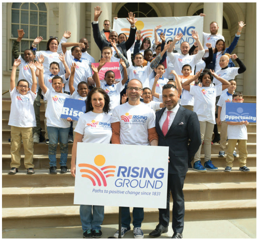
The new name was publicly announced on the steps of New York City Hall.
OUTCOMES: A Leader in the Social Services Sector
Rising Ground’s new brand eliminates the confusion with their old name, inspires donors with an uplifting message, and gives staff a clear purpose to rally around. The organization now has a responsive website that engages clients, donors, and volunteers, and has the tools to manage its brand and communicate its message.
Most importantly, the Rising Ground is positioned as a leader in the social services sector — one not known for bold changes. With several organizations in their field having rebranded by truncating their names in recent years, (such as Jewish Board of Family & Children’s Services to Jewish Board, and Children’s Aid Society to Children’s Aid), Leake & Watts’ transformation to Rising Ground has sent a signal to the sector that it is leading the way with bold decisions. They are seen as an attractive potential partner for acquiring other agencies, and their new brand is serving them well as in vying for attention and funding in these uncertain political times.
“Howard and the entire team at Red Rooster Group truly went above and beyond with our project – the rebranding and renaming of a venerable 185+ year organization. It wasn’t easy! Red Rooster Group took the time to really listen to what we believe in and what we wanted to achieve. Their process was strategic, creative, and inventive from start to finish. All throughout, Red Rooster Group made sure we stayed true to the core themes of our work that we collectively identified. No detail was too small and no request unsatisfied. You couldn’t ask for a team more dedicated. Today, we have a new name, visual identity, website, messaging, and mission and vision statements that are truly reflective of our impact in the community. Our new brand positions us with confidence as we look to the future and ways to further increase our impact. Red Rooster Group was a tremendous partner. We are delighted with the results of our work together!”