CLIENT: Grafton
With 700 employees, Grafton, a nonprofit organization that serves people with autism and other developmental disorders, realized that is had a great opportunity to develop a deeper relationship with its employees and help get its story out.
When Grafton engaged Red Rooster Group to upgrade its overall brand image and improve its communications, giving their internal newsletter an upgrade was a part of the process.
The newsletter, addressed to Grafton’s 300 employees, describes the news at the organization’s three locations. Each of the locations were allocated a spread in the publication, establishing a format for each venue to collect news to share with all the employees. The newsletter helps all employees to feel connected to the organization, fosters a better understanding of Grafton’s services, and boost morale.
Brand Architecture
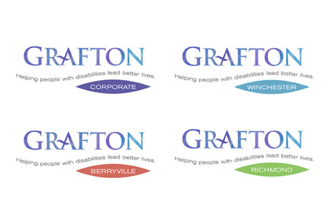
Our research uncovered that one of Grafton’s strengths, the specialized expertise and dedication of its staff, was not being conveyed. We shortened the official name of Grafton School to Grafton and established a brand hierarchy to unify the organization’s four locations under one brand name.
Brand Manual
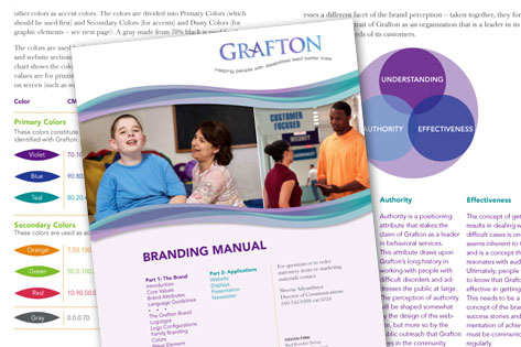
We created a brand manual to explain the brand – what the organization stands for — and specifies colors, typefaces, graphics and guidelines for the brand. This has allowed the client manage their own brand effectively.
Website
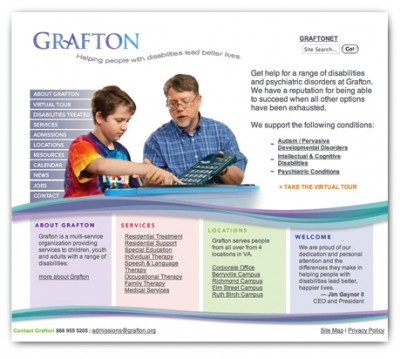
After a strategic assessment of competitors and the users, we redesigned the website around the needs of the users. The redesign has been receiving rave reviews. grafton.org
Display
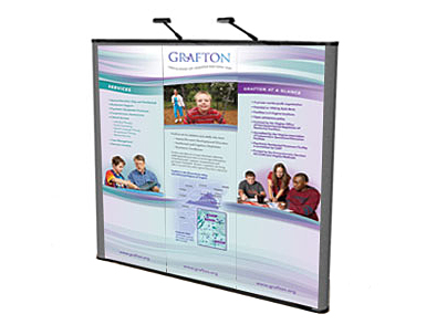
A flexible system of interchangeable panels helps make their display adaptable for fairs, attracting potential students and employees.
Links
- See more examples of nonprofit branding.
- Contact Red Rooster Group for help branding and design for your nonprofit organization.


