Updated Messaging & Materials Breathe New Life Into Social Service Agency
Founded as an orphanage 112 years ago, UMFS has grown into a multi-dimensional social service agency with 10 offices throughout Virginia. The agency needed help raising its profile across the state. Red Rooster Group was engaged develop a clear, purposeful message, unified voice and visual look with consistency across all marketing. We also helped employees become enthusiastic brand ambassadors for UMFS in order to raise the organization’s profile in the state, increase use of services, and drive donations.
Challenge
A review of UMFS’ marketing materials revealed a fractured image with inconsistent messaging, generic stock photos, and overall lack of cohesiveness.
OLD MATERIALS

As with all of our engagements, we viewed our branding and marketing efforts in the context of the organization’s strategic goals:
- Create a clear set of messages and an organizational culture that every employee believes in and lives.
- Increase the number of donors and obtain $1.5 million in donations from donors, foundations, and grants.
- Increase market share for statewide referrals.
- Increase media visibility for UMFS around the state.
We began the process by conducting the following market research:
- 15 in-depth, hour-long interviews with staff, donors, and other constituents.
- Competitive Landscape Review of social service agencies in Virginia.
- Marketing Materials Review assessing the organization’s brochures, ads, newsletters, and other communications.
Messaging
Mission Statement & Tagline
After conducting research about the needs of the organization and how it was perceived, we recommended revisiting the mission, vision, tagline, and core messaging. Working with a committee of 10 people including key staff, board, and lay people, we prescribed a series of sessions to get to the heart of what UMFS is all about, and to craft a Mission Statement that would serve the organization well. We led the committee through several lively discussions that ultimately led to the theme “Unwavering champions for children and families,” which is now the organization’s tagline.
In addition to being very generic, the organization’s old Mission Statement was a catch phrase and was not useful in helping people understand the agency or in galvanizing people around its mission. Its Vision Statement was clinical and uninspiring. Our goal was to revitalize these fundamental messages to help the organization capture people’s attention and imagination, and motivate staff.
Old Mission
Touching lives. Creating futures.
Old Vision
Be the agency of choice for services that empower children, adults, and families to reach their full potential by developing innovative community resources and partnerships.
New Mission
UMFS is an unwavering champion for high-risk children and families, collaborating with communities to help them reach their full potential.
New Vision
Creating a world where caring, opportunity and generosity are passed on from generation to generation — empowering all children to contribute to society as engaged citizens.
Mission Statement Process
The committee agreed on some broad terms that the Mission Statement needed to convey. The following questions guided discussions about the Mission Statement:
- What do we do that’s different than other organizations?
- What’s most valued about our work?
- What have we been successful at?
- Where do we want to be as an agency in 10 years?
We then explained the differences between the Mission Statement and the Vision Statement, and what they each could and could not accomplish. To get a baseline for evaluating UMFS’ Mission Statement, and to get the group’s creative juices flowing, we provided examples of Mission Statements from 50 top nonprofits and asked committee members to explain which ones they thought were effective.
To understand what UMFS wanted to communicate about itself, we developed Key Message Points, based on the interviews and research we had conducted:
- Proactively identifying community needs.
- Shift from ”saving” toward ”empowering.”
- Shift from ”what” we do to ”why” we do it.
- Encompass children, families, and community.
- Commitment to children to ”never say never.”
- Collaboration as an organizational value.
- Innovative, experimenting, learning organization.
We wrote Mission Statements that explored a wide range of concepts for the committee’s consideration. Committee members were asked to select the Mission Statement they thought worked best and to describe why. A lively, and fruitful discussion ensued, with consensus around the concept of “unwavering champion.” The concept of “eradicating gaps” also gained traction.
In the next meeting, the committee reviewed Mission Statements using the ”unwavering champion” concept, and discussed the nuances of the ways to refer to children (disadvantaged, vulnerable, impoverished, etc.), settling on ”high-risk,” and ultimately reaching the conclusion that it was both children and families that were the beneficiaries of the services. After finalizing the Mission Statement, we wrote a Vision Statement that expressed the ultimate impact that UMFS hoped to achieve.
Other Messaging
Our next step was writing a range of messaging documents to help UMFS communicate to audiences in different ways.
- Internal and External Message Points
- What We Do
- Description of Services
- Elevator Pitch
- Short, Medium, and Long Boilerplate Language
- Fundraising Language
Faith-based Messages
Because of UMFS’ has strong ties to the Methodist community, we also developed messaging points addressing the need to move beyond the faith-based community without disenfranchising supporters from that community.

Visual Identity
Tagline and Brand Architecture
Several years before, UMFS had introduced a new logo, along with logos for each division. While the UMFS logo cleanly displayed a heart to represent the agency, the division logos resorted to more literal and clichéd renderings. We took on the task of developing icons that communicated each division’s message. For Project Life, whose mission is to empower young adults who have aged out of the foster care system, we used two stars to represent the youth and those who support them. For Child & Family Healing Center, we used a compass to symbolize that the program helps point people in the right direction in their lives — a fitting symbol since program participants are handed a compass at the completion of the program.

Brochures
The brochures we wrote and designed present a fresh, new look for the organization and introduced the elements of play and creativity UMFS uses when working with children. The brochures help UMFS stand out from other social service agencies.


Newsletter
In line with UMFS’ new messaging, we renamed their Guardian Newsletter. Now named The Champion, it showcases people who are living the organization’s mission.
Before

After


Impact Report
As a metrics-driven organization, UMFS wanted to communicate its successes in a compelling way. Departing from their previous year’s design format, we created their Impact Report with infographics showing the organization’s impact in five areas corresponding to their values. The infographics use large numbers as a focal point and icon-style graphics to illustrate the statistics. The graphics were used in both printed brochures and on their responsive website, which we also designed.


Website
We developed a responsive website that appealed to clinicians, parents, and donors. We wrote and designed the website to make it easy for users to understand UMFS’ services and take action. The website was developed in WordPress around a flexible, modular, block system that allows the creation of interesting pages throughout the site. Interactive features include the Donate Today section, with rollovers displaying gift descriptions. We included a rollover exploration of services and features to help engage potential employees. The site is fully responsive for mobile, tablet, and desktop, and was developed using WordPress Content Management System so the staff of UMFS can easily update pages.
www.umfs.org

A benefit-oriented headline, short copy, and unique graphics greet site visitors.
A rollover invites site visitors to explore donation levels.
Information is presented in small increments and reflows when viewed on tablets and phones.
Engaging Website Interface
Throughout the site, stylized illustrations are combined with donor forms and videos to create a layout that’s both inviting and informative. Pages for each division of the agency thoughtfully address the concerns and challenges faced by each demographic.
A rollover invites site visitors to explore services.
Modular block system makes pages interesting, and can be easily updated by the client.

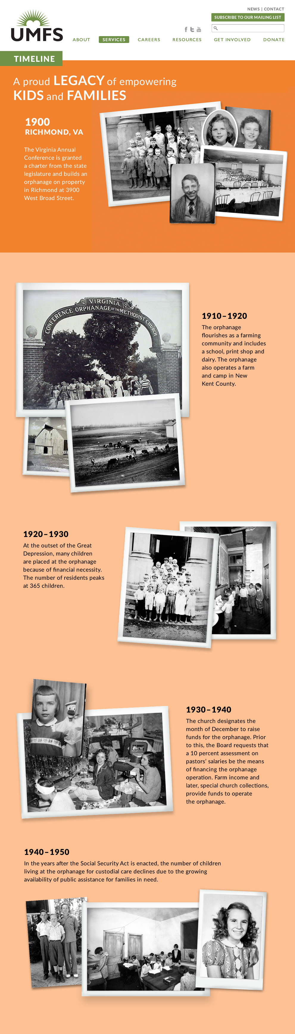
History
We created a vertical timeline that adapts to responsive design for mobile devices.
Careers
UMFS wants to attract high-quality staff. We created a Careers page that emphasized how much fun it is to work there.

Brand Launch
Brand Book
To help UMFS communicate its message to its 300 employees statewide, we created a brand book that illustrates key points in an easy-to-understand way. Copies of the brand book were distributed at brand launch sessions to build enthusiasm and ensure consistent messaging throughout the organization.


Brand Launch Sessions
To help staff understand and embrace the brand messages, we held brand workshops for key staff and the board. The sessions included hands-on activities to create enthusiasm for the messages. One participant said, ”Five years ago, we had another agency do our branding and conduct a workshop, but this was much better. First, you guys really nailed what we are all about. And second, I really feel I understand and embrace our messages.”

Howard and Jonathan from Red Rooster Group introduce UMFS’ new messaging.

About 80 key staff attended the workshop. We held a separate session for the board.

To emphasize the message of ”Unwavering Champions,” we created cutouts so people could photograph themselves as champions.

For one activity, we asked participants to write and perform a song using UMFS’ new messages. Everyone really engaged and amazed us with their performances.

A balloon drop helped generate excitement and underscore the importance of the brand initiative.

We asked participants to decorate and post a sheet depicting the wall surrounding their campus to demonstrate what’s behind the wall.
Results
-
“Red Rooster Group led a messaging process with our Board and staff that transformed our mission and vision. Due to our new mission, we proudly refer to ourselves as unwavering champions for high-risk children and families. Howard and Jonathan captured the social impact and organizational DNA that was a part of our culture and they brought it to the surface with dynamic text, graphics, and focus. Our board and staff have rallied around this bold new message and our donors, customers, and competitors have taken notice. We now have a much more visible platform in our state!”
UMFS, President & Chief Executive Officer