
This logo for a financial advisor deftly combines the image of two rivers coming together to form a memorable symbol for the firm.
Continue readingThis logo for a financial advisor deftly combines the image of two rivers coming together to form a memorable symbol for the firm.
Continue reading
This logo for a tour guide of New York City landmarks perfectly captures his personality with this witty and distinctive treatment.
Continue reading
When the Utah Association of Public Schools and the American School Foundation Alliance decided to produce the first major conference for educational foundations in the region, they needed name for the conference that would help it establish immediate credibility. We generated a list of names that were short enough to be catchy and memorable, and unique enough to have an available domain name. The recommended name, SummX is only 5 letters, and we were able to claim the domain name summx.org.
Continue reading
This example of effective nonprofit publication design showcases various Jewish learning programs for teens from a diverse array of organizations on behalf of many area congregations. Designed to appeal to the teens as well as their parents, the catalog was successful in balancing the needs of all of these constituents and creating a compelling offering in a very quick timeframe. We also created banner ads to promote the initiative on local websites.
Continue reading
To thank its donors and supporters, with a last minute appeal for donations, we created this email that explained the impact that this multi-service agency had during the year using best practices for nonprofit fundraising appeals.
Continue reading
To provide an update to funders on the effectiveness of this program in creating innovative models of Jewish education, we created an info sheet and PowerPoint presentation.
Continue reading
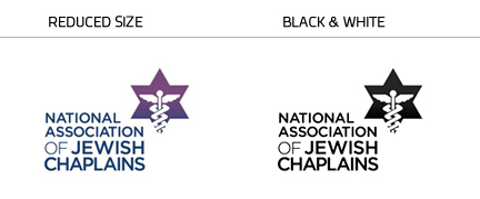
The National Association of Jewish Chaplains is the certifying entity for Jewish chaplains in the United States, overseeing education and providing support for these front line professionals working at the intersection of social work and religion. When this nonprofit membership organization approached us for help with their fundraising, we realized that the first step in communicating their brand effectively was to improve the legibility and impact of their logo.

The old logo was outdated and confusing. It was very difficult to read the type, and to discern what the graphic was. And the the logo did not reproduce well on a photocopier, a method used frequently by the organization.
The new logo strengthens the brand equity (recognition) of the medical symbol over Magen David star, while addressing a number of issues:

The redesigned logo creates a professional image for Hebrew College and blends together both religious and secular symbols to appeal to their audiences. It is inspired by the breastplate worn by the high priests in biblical times and made to represent twelve tribes, as well as the tablets from the Ten Commandments, an open doorway to learning, and a sunburst indicating enlightenment. The letters H and C are also subtly embedded in the design.
Click here to read the full case study.

Center for Non-Profits Annual Conference Postcards
Continue reading
Homage to Milton Glaser’s famous I Love New York logo, showing support for proving help to victims of Hurricane Sandy.
Continue reading
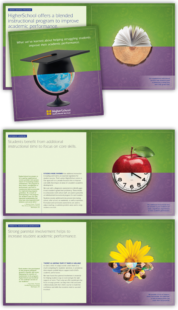
We developed a suite of new marketing materials including a brochure and matching presentation format that positions the firm in a strong way against formidable competitors in the New York City school market.
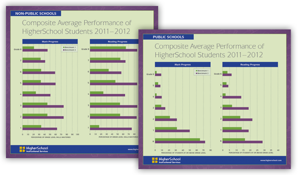
To present HigherSchool as better able to address the needs of that market, we created a brochure that shows an understanding of schools’ concerns and how HigherSchool can help. The headline creates an enticing offer to the schools to learn about how HigherSchool uses their expertise to achieve results for each school. The unique design helps reinforce the message in a memorable way. The client thought this approach was so effective that they asked us to adapt it for a national audience. The package also included inserts that show improvements in student achievement as a result of HigherSchool’s services.
 Red Rooster Group is a New York based graphic design firm that creates effective brands, websites, and marketing campaigns to increase your visibility, fundraising, and communications effectiveness. Contact us about your project.

This promotional campaign promotes The Jewish Education Project’s Young Pioneers Awards event recognizing individuals with innovative ideas in Jewish education.
Continue reading