Illustrations can set designs apart. When used appropriately, hand-renderings speak a distinct stylistic and emotional language that grabs attention and communicates at a gut level.
Digital photography and stock websites make it easier than ever to access to commercial graphics. Broad access to a wealth of visual resources is valuable, but in a saturated creative environment, using custom illustrations is a great way to make marketing materials stand out from the crowd. Potential clients, customers, and donors are inundated with the soft glow of screens and pixels. A hand-drawn image is authentic and personal. It catches interest and motivates your audiences to learn more about your organization.
Whatever the tone of a piece—understated and elegant, vibrant and lively, classic, or modern—well-executed drawings can help you communicate with impact and style. Illustrations with treatments and subject matter tailored specifically to match an organization’s messaging will result in marketing materials that maintain a clear and consistent theme. At Red Rooster Group, we’ve used a variety of illustrated approaches to tell our clients’ stories.
A picture is worth 1,000 words
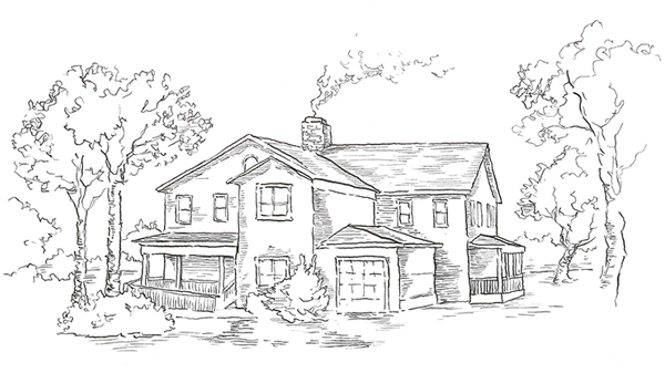
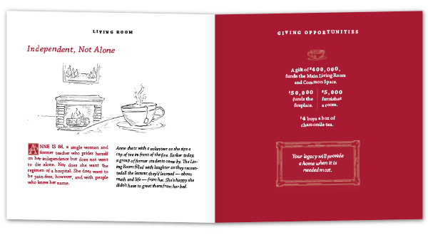
For Fairfield County Hospice House, a residential hospice now in development, we were tasked with designing a capital campaign brochure to raise funds. We created a human connection by telling hypothetical stories of people who might use the house. The still-life scenes we depict in illustrations augment each anecdote and create an inviting, personal atmosphere. Pen-and-ink drawings and custom drop-cap lettering provide a warmth and artistry usually reserved for books, imbuing the piece with a narrative, literary sensibility.
A suite of brochures for UMFS, a multi-dimensional social services agency devoted to empowering at-risk kids facing a broad variety of challenges, combines playful illustrations with bright photos. We created a vibrant visual language that’s playful—capturing the imagination and creativity that are crucial tools for young people to learn, grow, and heal. This treatment complements the brand’s messaging wonderfully, painting a clear picture of the agency as a collective of champions dedicated to helping kids thrive in any given environment.
The time, effort, and care required for illustrations are evident in a finished piece, and convey your organization’s dedication to quality. While custom illustration may not be right for every project, exploring every creative avenue is always the correct approach when developing marketing materials that are distinctive, grab attention, and speak loudly.
By David Sankey, Graphic Designer at Red Rooster Group.


