CLIENT: Sephardic Bikur Holim
Like many social service organizations, Sephardic Bikur Holim wanted to engage a younger audience, encourage volunteerism, and help people connect events and services to their organization. To accomplish this, we launched a magazine that was two-in-one. One half of the publication featured a youth event, and the other half featured articles and charts about volunteering. We proposed the engaging format of a double-sided magazine with two different covers, so that whether someone picked up the magazine from the front or the back, they would see a cover and get the message.
Engaging a Younger Audience
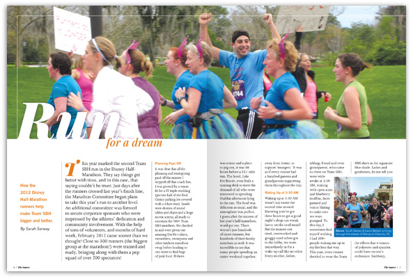
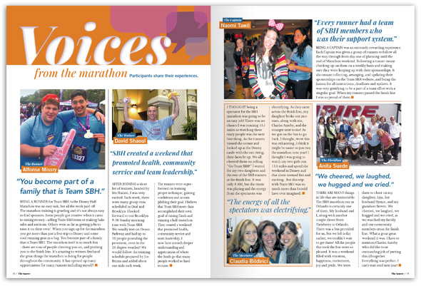
Draws for younger people included a lead article written by one of their peer participants describing her experience in the half-marathon.  Another spread called “Voices from the Marathon” highlighted various participants with large, colorful photos and quotes to share why people participated in the organization’s event.
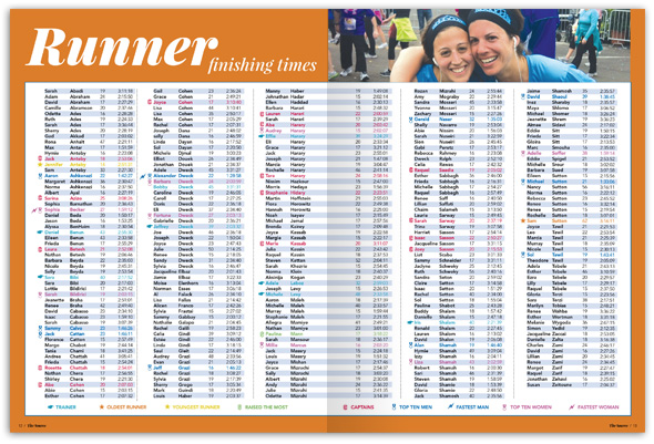
  A third spread listed each participant’s finish time complete with a colorful key that highlighted such people as the “Top 10 Women” “Youngest Runner” and “Fastest Man.”
Promoting Volunteerism
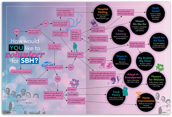
The other half of the magazine, complete with an entirely different cover, was guided by the theme of “volunteerism.” These articles emphasized the many ways that people have been involved in volunteering for SBH.  We also designed a flowchart showing young people how their interests could be channeled into volunteer work: “What do you think is a better gift, flowers or chocolate?”
- Flowers > Volunteer for Flowers for Widows.
- Chocolate > Volunteer for SBH’s Food Pantry.
- The only good gift is a power tool. > Volunteer for Home Improvement.
 Visually Unifying SBH Events & Programs
The design of the magazine also addressed another one of the agency’s problems: that many people participated in their programs and events without being aware that they were supporting SBH. This was partly a result of each program being promoted independently with their own ads and marketing materials. To remedy this and showcase SBH’s involvement, we created “house ads” showcasing each service and event in a consistent way. Now, instead of an array of ads with completely different designs, the ads reinforce SBH’s brand. All the ads feature the line, “Another great way to support the work of SBH,” as a way of connecting the programs and events directly to the agency so that people know who they are supporting. 
Results
SBH had the opportunity to reach a large audience by having the new magazine shrink-wrapped and distributed with a widely circulated and well-known publication within their community. However, that gave us an extremely rush deadline of only 3 days to design the entire publication. The Red Rooster Group team pulled together to develop a unique format for the publication, map out the content, design all the spreads, retouch all the images, and go through rounds of proofing and revisions — all within the given time. The effort was well worth it, as the magazine has landed in people’s homes in time for the summer, and has been receiving a very enthusiastic response.
 “Red Rooster Group turned our marketing dreams into reality! We wanted to create a magazine that represented our vast and varied charity organization, and our goals quickly became one and the same. In true “marathon” fashion, the finished product exceeded all expectations – no one can stop talking about it! We look forward to working with Red Rooster for many more issues and years to come. Thank you!”
— Rachel Hazan, Editor, The Source
Links
![]() Red Rooster Group is a New York based graphic design firm that creates effective brands, websites, and marketing campaigns to increase your visibility, fundraising, and communications effectiveness. Contact us.
Red Rooster Group is a New York based graphic design firm that creates effective brands, websites, and marketing campaigns to increase your visibility, fundraising, and communications effectiveness. Contact us.


