Communicating Your Message in Your Nonprofit Organization’s Annual Report
Help your audience of clients, donors, and others to understand your message and the impact your organization has by using infographics, maps, and other techniques. These examples are drawn from the annual reports and publications that Red Rooster Group has created for our clients.
1. Showcasing Impact
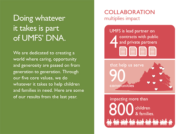
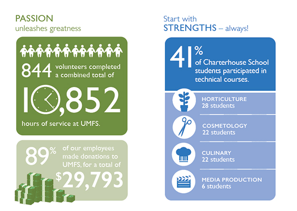
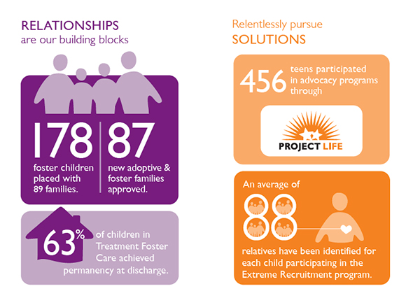
In this example, our client, UMFS, a social service agency in Virginia, wanted to communicate the impact they had across a range of areas. To reinforce the organization’s brand message, the infographics are introduced as examples of the organization’s five core values. The infographics use large numbers as a focal point, and icon-style graphics to illustrate the points. The graphics were used both in a printed brochure, as well as on their website, which we also created, and are designed to be seen on a mobile device.
2. Unifying Diverse Information
When you have a diverse set of information to present, as we did in this annual report for Student Advocacy, you need to bring focus and consistency. In this case, we used a silhouetted color photograph of students as the focal point illustrating the demographics of the population they served, and used a color palette of gray, yellow, and white to create unity among all the elements. The graphics are not that complex, but they create enough variety to maintain interest throughout the pages. The map does double duty, showing both the locations served, and the number of students at each location.

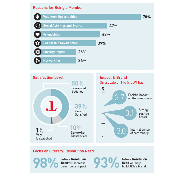
3. Sharing Results
In this publication for the Junior League Washington, DC, a nonprofit organization that relies on volunteer members to perform public service, the results of a member survey are shared through a bar chart, pie chart and impact scale. Color is restrained to unify the elements.
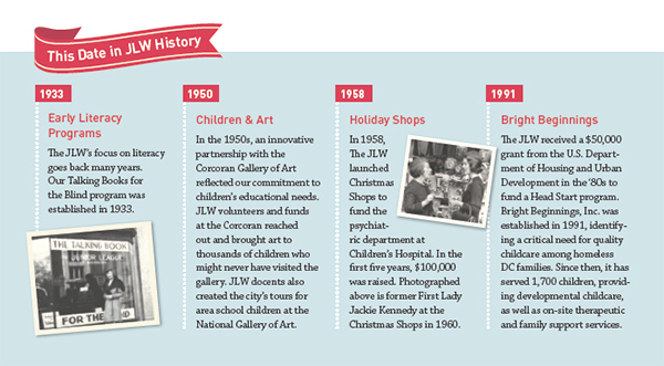
A simple timeline shows dates in the organization’s history. Tight editing is required to fit the text in each section.
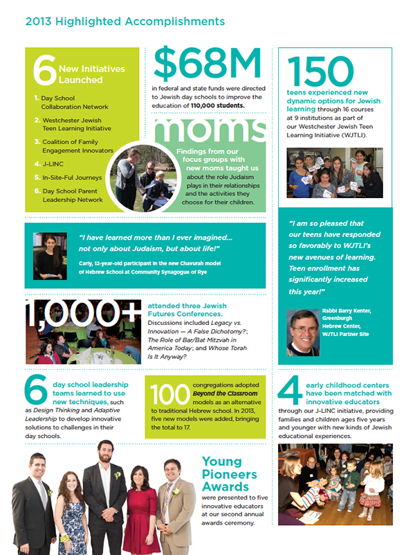
4. Creating Graphic Interest
In the annual report for this educational organization, 9 stats and 2 quotes are designed into a grid. Numbers are enlarged as focal points for each section, while photos are kept small.
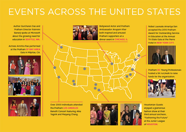
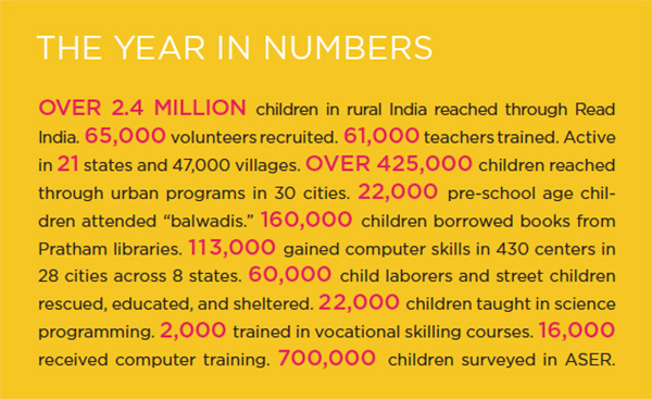
5. Impact & Events
For the annual report for Pratham USA, a nonprofit organization that raises funds for the largest literacy organization in India, impact numbers were run together to form a block, with the numbers larger and red to stand out.
To showcase the organization’s events around the country, we used a map as the central focus, framing it with photos and captions, with lines to their respective cities.