CLIENT: The Jewish Education Project
We created an info sheet and PowerPoint presentation to provide an update to funders on the effectiveness of this program in creating innovative models of Jewish education.
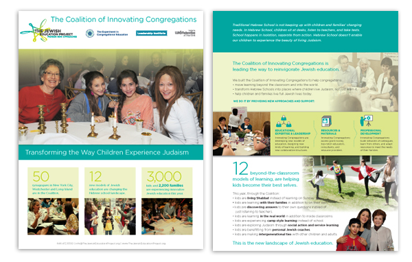
Summary Sheet
We designed a summary sheet that was used as a handout during the presentation. The sheet makes it easy to funders to learn about the program using best practices for nonprofit design.
Images: A large photo provides a focal point, draws people in,and shows the main outcomes of the program — families learning together. Photos on the back of the sheet show educators coming together to learn in the organization’s program, and kids and families.
Headline: A main headline is used to deliver the news, the outcome of the programs: Transforming the Way Children Experience Judaism. Too often, nonprofits just use their organizational or program name, which don’t tell what the organization is actually achieving.
Statistics: We highlighted 3 statistics on the front of the brochure to show the full impact of the program.
Copy: The copy is compelling in describing not only the program, but in depicting the various outcomes and painting a picture of how the scenario will be different with the organization’s continued involvement.
Infographics: To show the organization’s three main services to educators, we depicted them as icons for visual representation and appeal.
It’s one litte sheet that does a lot.
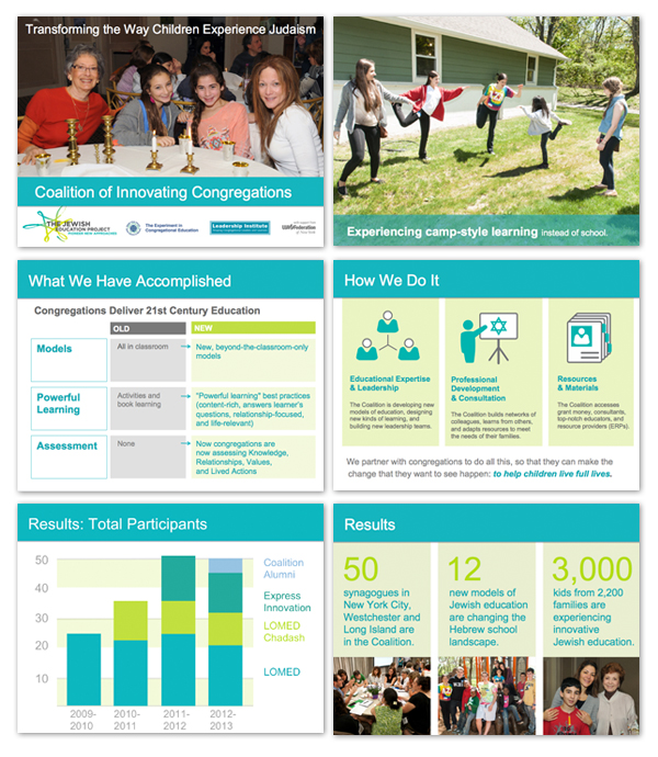
Presentation
The presentation was designed to visually-engage the audience with photos, charts, and infographics. None of the pages contain traditional bullet point style — each slide was designed to communicate a specific point, from the visual depiction of the programs through a series of full screen images, to the charts and graphics that depict the programs and results. A uniform color palette and typography unify the presentation.

Results
Overall, the presentation helped to strengthen the relationship with the funder by showing where the program was succeeding, and what work still needed to be done — a recommended practice for any nonprofit that is looking for renewed funding from a particular source. This is an example of how nonprofits can use best practices in graphic design to help tell their story effectively.


