CLIENT: Jewish Federation of Greater Middlesex County, NJ
CHALLENGE
How do you expand the audience for an event which has traditionally attracted women only, to include more men? This Federation’s Main Event is the signature event for their Women’s Philanthropy division, and a key source of connection and revenue. However, faced with a shrinking donor base, the goal was to appeal to a wider audience.
SOLUTION
 With the change in the nature of the event to a less formal structure, we decided to emphasize the topic of the event — Inside the First Marriage. As an example of effective nonprofit design, we created a gatefold design that invites the recipients to open the invitation, and step inside the White House. We put more emphasis on the speaker’s topic, rather than as just a social mingling opportunity, and feature the recognizable Main Event logo on the front, but in a more subordinate role.
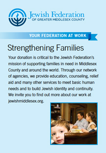
Seeing the mailing as an opportunity to inform people about the Federation’s work, we also connected the event to an aspect of the Federation’s mission, by creating a panel that describes their programs that strengthen families. We also created an email version of the invitation.
RESULT
The event was a huge success — attracting 160 people — more than double the 60 attendees from the previous year.
Further Findings
A post-event online survey was conducted to learn want people thought of the event. The attendees indicated that the printed email was the primary way that they found out about the event. This was interesting since 4 times the amount of people received an email invite as did the printed invite (in fact, the emails went out twice). So the invite did its job in getting people’s attention.
We also discovered that most people attended because they were interested to hear the keynote speaker, but after the event reported that they were most moved by the personal stories of local women who supported the Federation’s work.
The survey also asked what should be improved for next year’s event, so we gained some valuable feedback about that as well. The survey was short – just 5 questions so that people would be motivated to respond. We used Survey Monkey since it’s free and easy to use. It’s a great tool to use to gain feedback on your event, and it helped us learn what marketing worked, what people wanted to hear, and how to create an even more successful event next year.
OTHER DESIGN EXAMPLES
- See another invitation we created for the Jewish Federation.
- See the ad we created for the Jewish Federation.
- See other direct mail.
ARTICLES
CONTACT US
Red Rooster Group is a New York based graphic design firm that creates effective brands, websites and marketing campaigns for nonprofits to increase their visibility, fundraising and communications effectiveness. Contact us at info@redroostergroup.com.


