Launching a New Financial Certification

National Association of Registered Social Security Analysts

Launching a New Financial Certification Company

A new financial service needed to assess its market, establish itself as a trusted brand, and attract both financial analysts and consumers. We analyzed their business challenges and developed their strategy, brand, marketing materials, and website for a national launch.

Services

  • Market Viability
  • Marketing Strategy
  • Brand Strategy
  • Messaging
  • Visual Identity & Brand Guidelines
  • Printed Materials for Analysts
  • Consumer Brochures
  • Customizable Print-On-Demand Materials
  • Sales Presentations
  • Consumer Video Series
  • “Did You Know“ Video Series
  • Integrated Website Strategy
  • Website Copy, Design & Development for Consumer & Analyst Sites

A New Service for Seniors

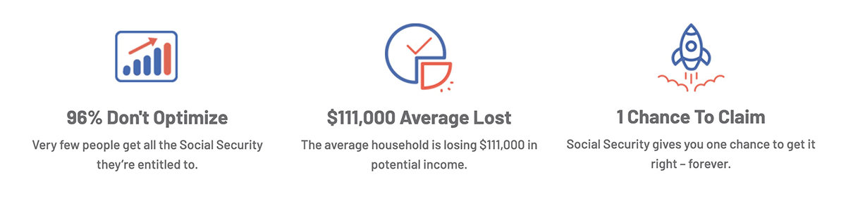
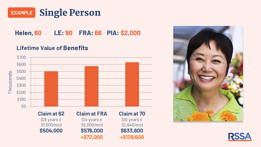
Many people do not realize that they have options when collecting social security. Factors such as age, marital status, disability, and self-employment, among others, can affect the amount of money received. Registered Social Security Analyst (RSSA) created a certification program to train professionals to guide people in optimizing their benefits.

An Untapped Market for Financial Professionals

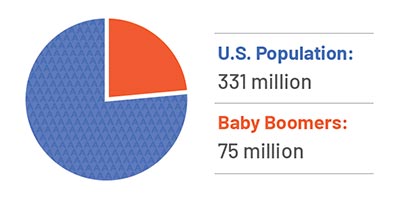
With 10,000 Baby Boomers retiring every day, the market for advice about social security benefits is huge. RSSA provides a new professional certification to tap into that market. Financial professionals can enhance their practice, and someone seeking an encore career could start a business. 
From Concept to a Thriving Business

Who would become an RSSA? How much would people pay for this service? Would people welcome entering this new profession? We conducted focus groups and research to ascertain the viability of this new financial service and how to attract professionals and clients. We helped RSSA define and launch the business model.
Developing the Value Propositions

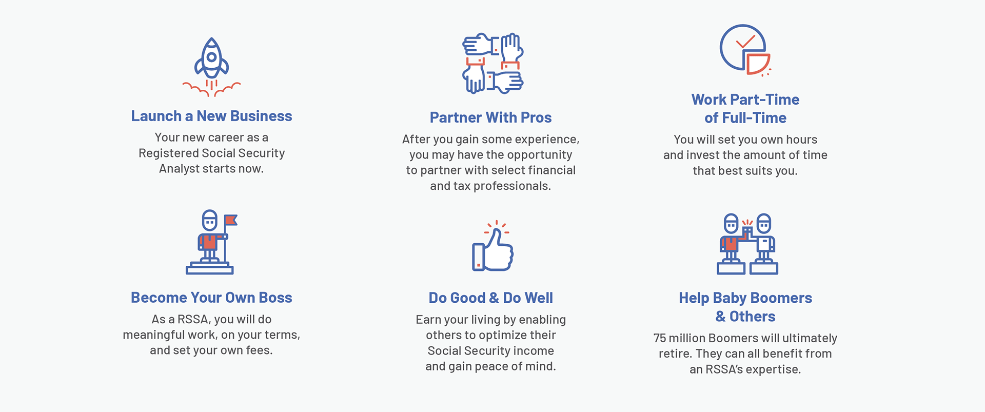
Potential analysts need to know about the training and the value of adding this certification to their services. We developed the value proposition that guided the marketing to recruit analysts and attract soon-to-be-retirees to the service.
Crafting the Brand

RSSA needed a recognizable logo that would have the same respect as “CPA” or other financial certifications. Branded as a personalized service to optimize your Social Security benefits, we designed a logomark that could be used on everything, from business cards to marketing materials to stationery by professionals across the country.
Developing a Unified Web Strategy for Analysts & Consumers

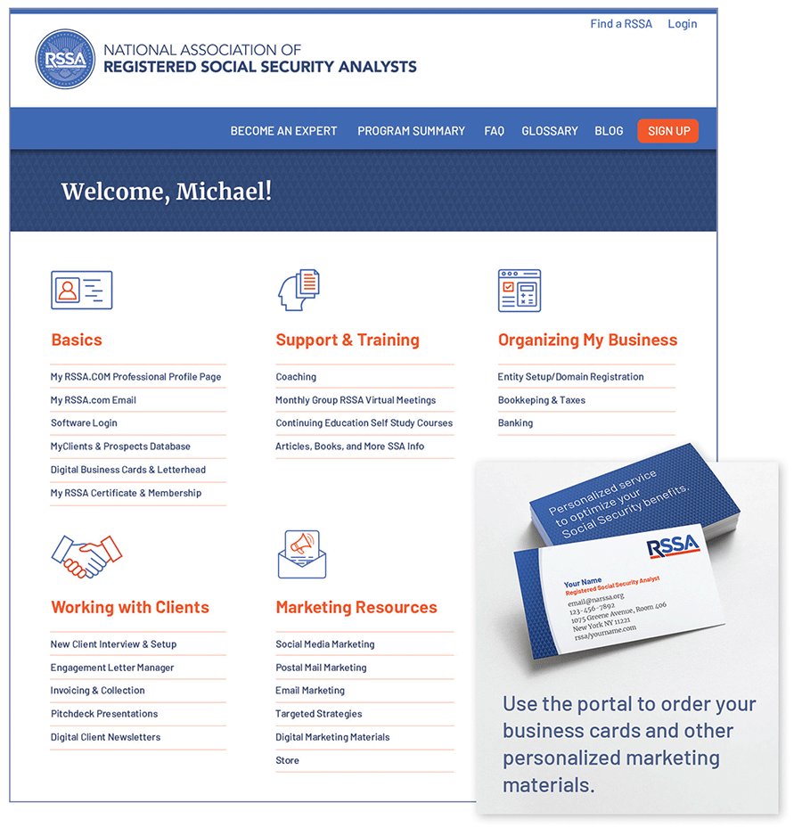
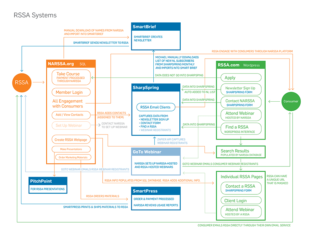
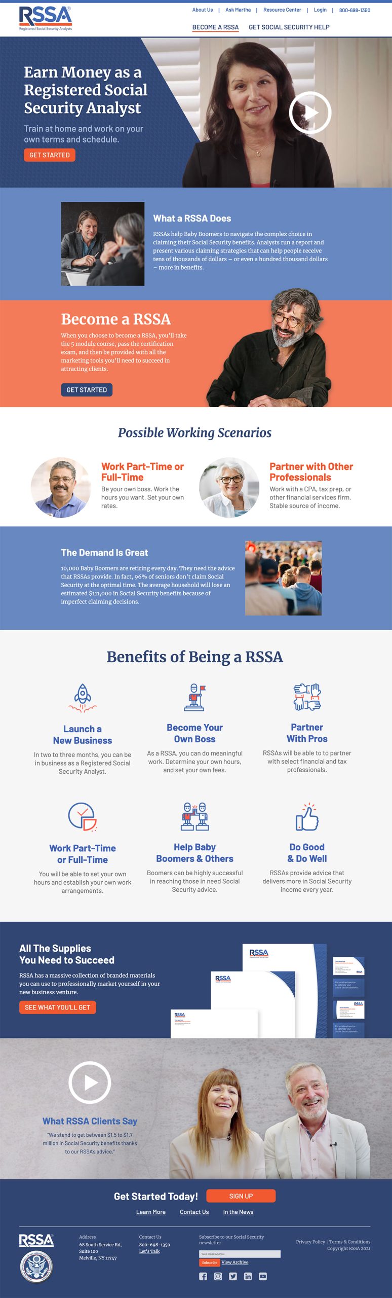
Professionals need a website for training, customizing and printing their marketing materials, finding leads, and keeping up to date on changes. Their website is a one-stop shop, with links to training modules and the certification exam. 

When they become analysts, they have access to marketing materials, from business cards to social media posts as well as continuing education. They can add their name to the list of qualified analysts so potential customers will find them easily.

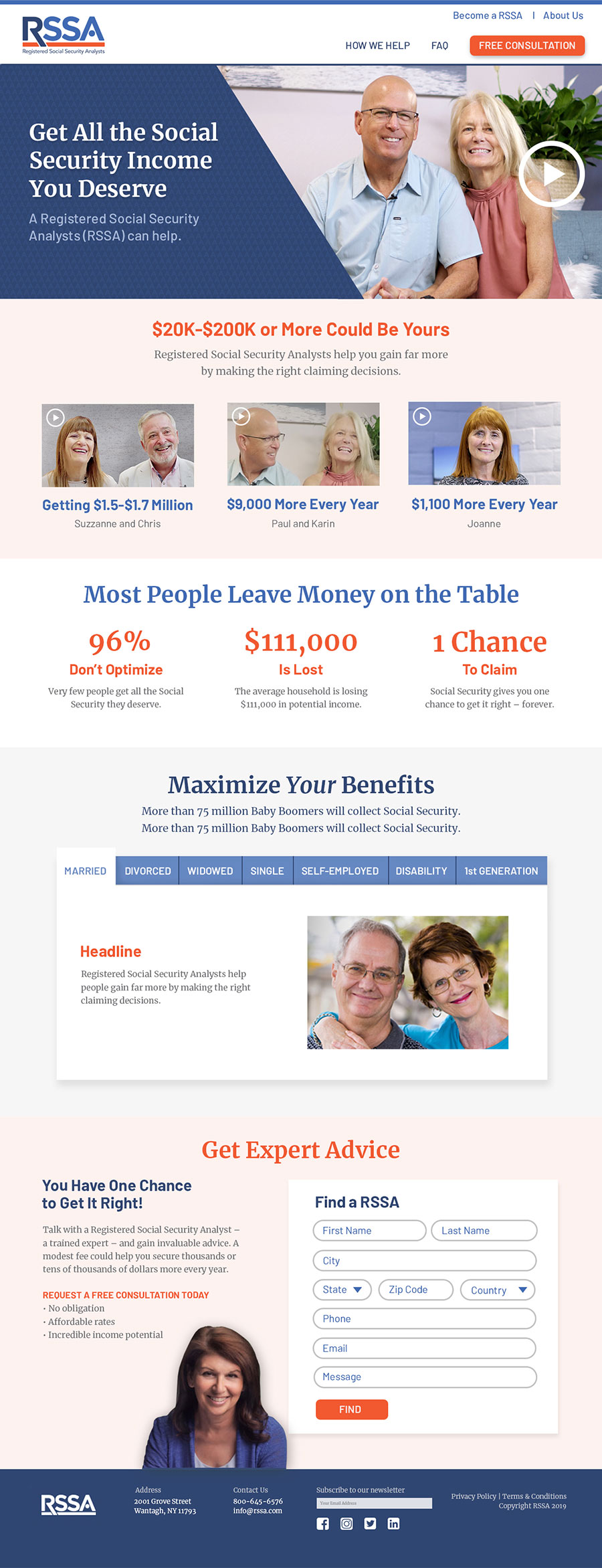
Consumers need a website that explains the value of RSSA and helps them find an analyst near them.  Although the material presented here is different from that on the analysts’ site, the two are seamlessly integrated at the back end so clients and analysts can find each other and communicate seamlessly.
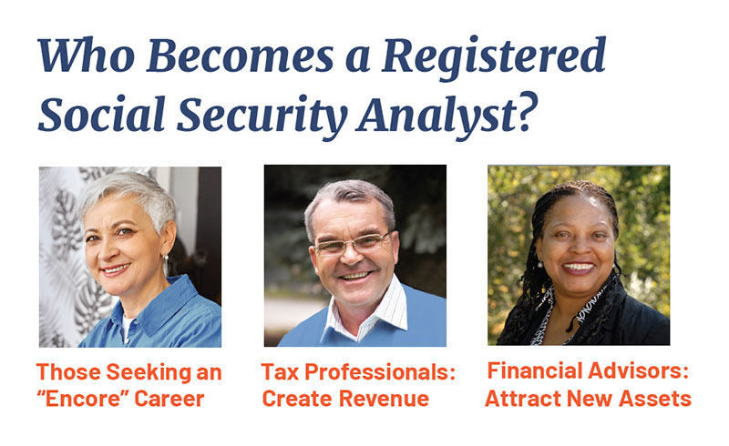
Recruiting RSSAs

We identified the types of people who make good RSSAs and developed marketing outreach materials, including a sales kit, to attract them.
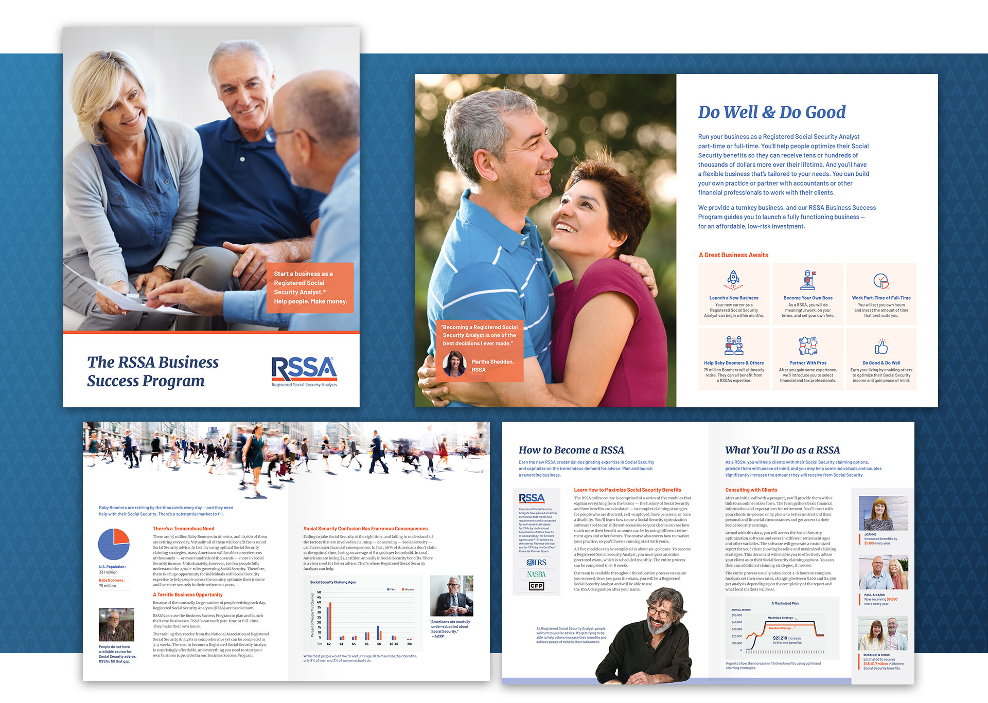
Creating a Turnkey Business Operation

Reaching the market of soon-to-be-retired people required both print and online materials as well as a marketing strategy that includes emails, postcards, social media, and a consumer-facing website. With just one login, an analyst can set up a profile, create marketing materials, invoice clients, do bookkeeping, and get support.
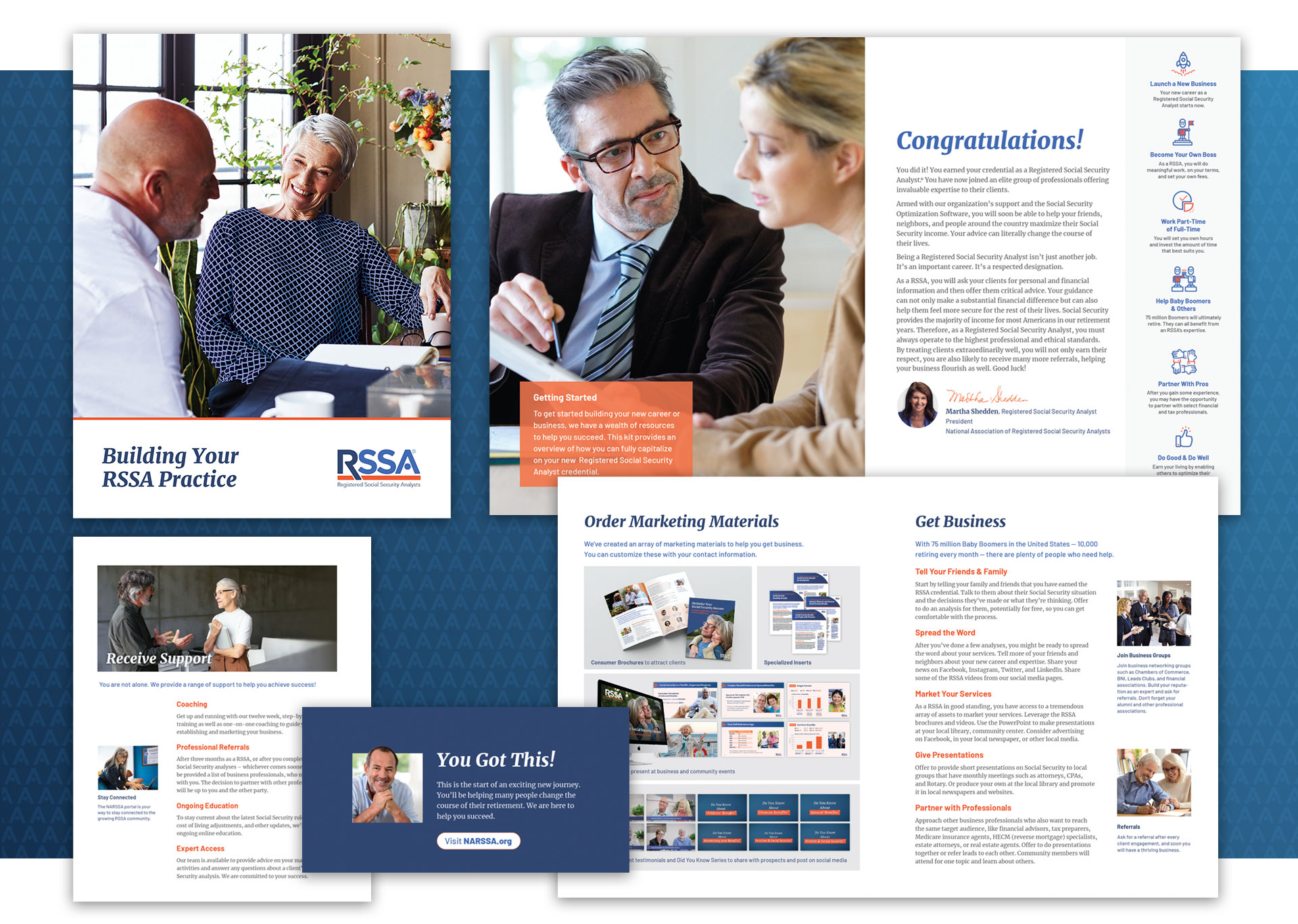
Attracting Consumers

To attract consumers, we crafted the value proposition, marketing materials, including print, digital, and videos, and the lead-generation system to drive leads to RSSAs.
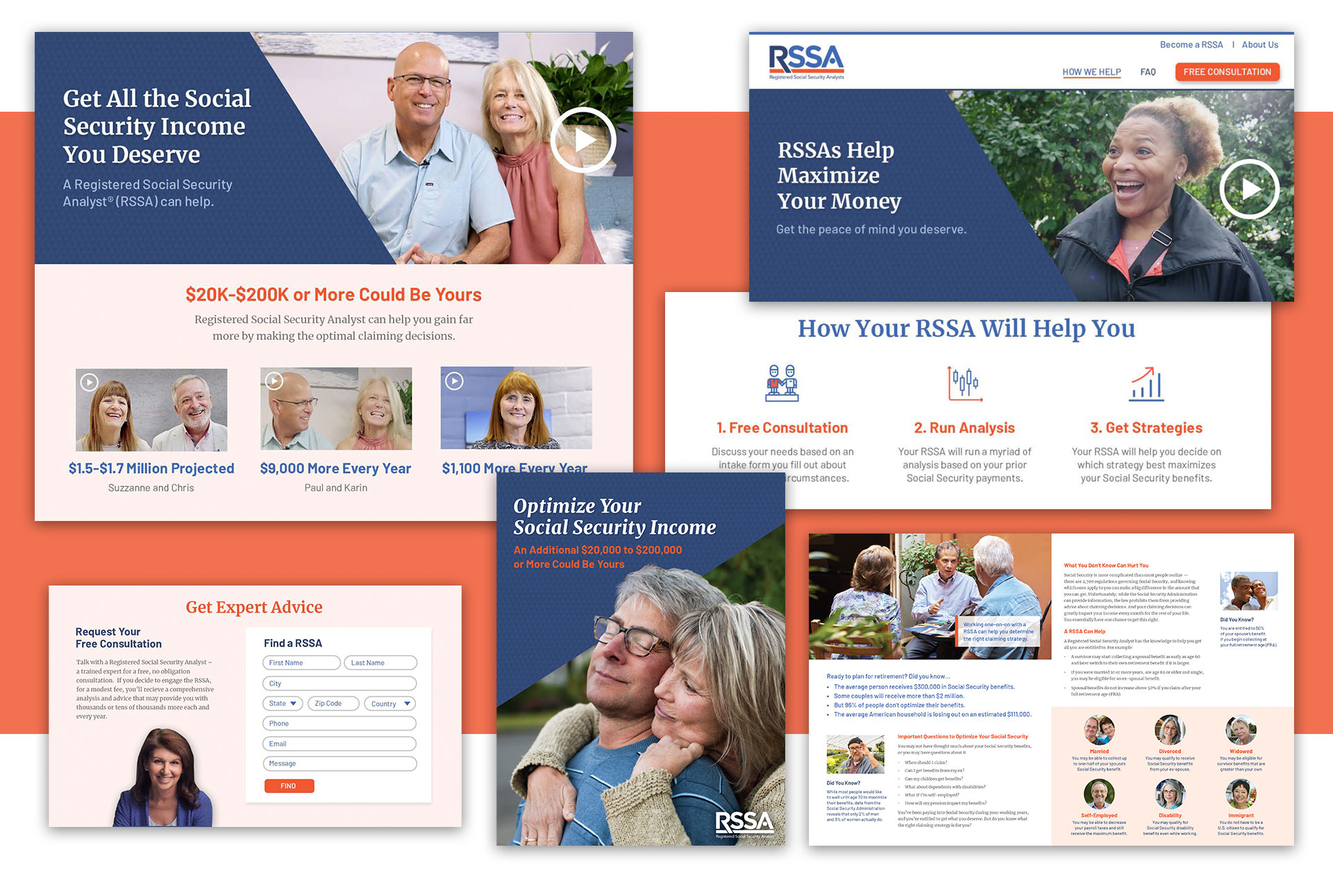
Creating Customizable Marketing Materials

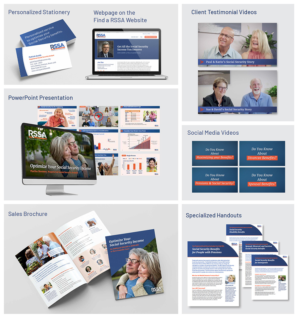
The new analyst can open a business immediately because the NRSSA website has everything that they need to promote their practice:

  • A customizable web page that helps consumers find them
  • Marketing brochures
  • Pring-on-demand, customizable stationery, and business cards
  • PowerPoint presentations
  • Videos that can be posted on social media
  • Monthly newsletter
  • Coaching and continuing education

Success

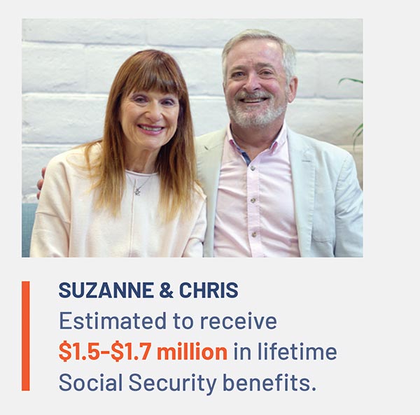
The National Association of Registered Social Security Analysts is now a respected source of financial information, frequently quoted in publications such as Financial Advisor Magazine, MarketWatch, Accounting Today, and TheStreet. It has a partnership with the National Association of Enrolled Agents so tax planning can include social security benefits. The organization has attracted RSSAs who are providing valuable expertise to help people maximize their Social Security benefits.
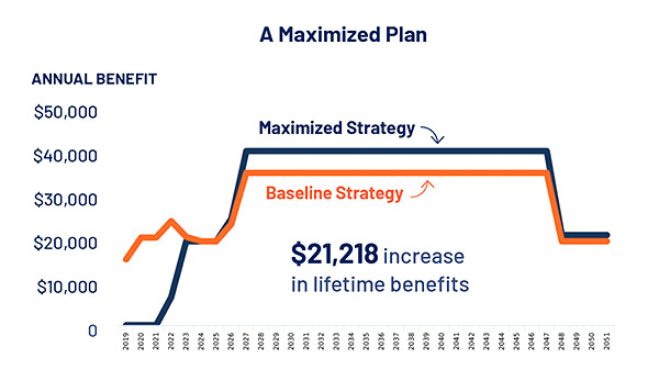
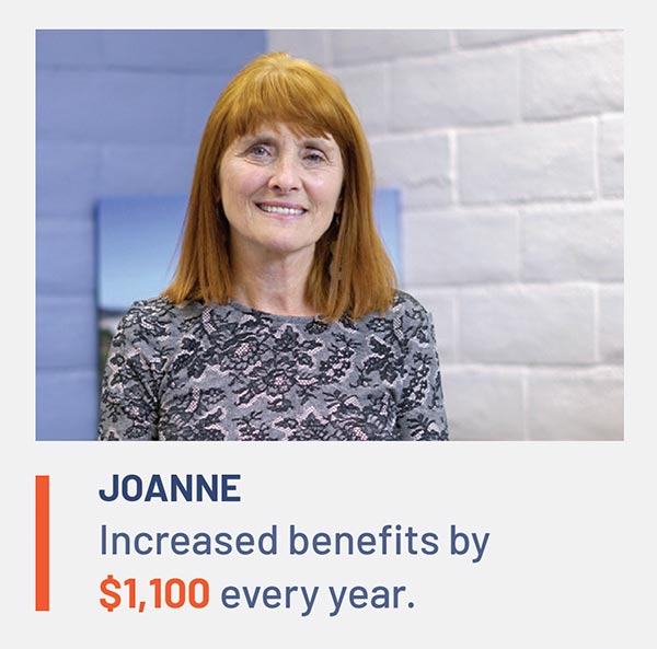
Rebranding Positions Human Services Agency as a Leader in the Sector

How does a $100 million social service agency remain relevant in a competitive environment?

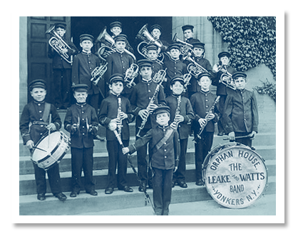
Founded in New York City in 1831, Leake & Watts had evolved from an orphanage to a multi-faceted agency with more than 40 different programs. But their name and brand were hampering their ability to get referrals and attract donors.

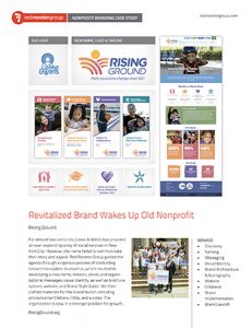
We created a new name, message, and visual identity that positions it as a leader in the sector. Here’s how we did it.

Challenges

The organization needed to address the problems with its name and retain a sense of history while moving forward to appeal to donors and funders.

Discovery

We conducted a thorough Discovery process that was designed to help us uncover brand perceptions and communication issues:

  • A Brand Audit that assessed all touchpoints with the public.
  • A Competitive Review of other human services agencies to identify key differentiators.
  • 25 Interviews with leadership, Board members, and donors.
  • An Interactive Workshop with two dozen senior leaders to explore brand strengths.
  • Five Focus Groups with different departments to understand their brand challenges.

Naming

The leadership, Brand Committee, and Board were engaged in a thorough process to develop and test a new name that would meet their needs around the theme of “Rise.”

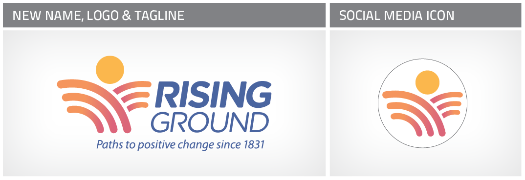
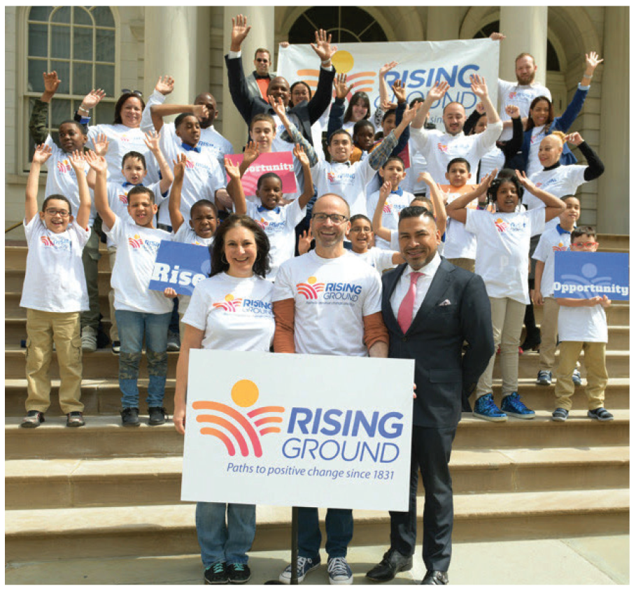
After exploring more than 1,400 naming ideas, field testing for perceptions, and conducting legal vetting, the Brand Committee selected the name Rising Ground. This conveys how the organization helps people rise above adversity regardless of what they are facing. The tagline, ”Paths to positive change since 1831” amplifies the message and connects to their history.

Rising Ground Logo

Messaging

As part of the branding process, we updated the Mission and Vision Statements, Values, and other brand messaging.

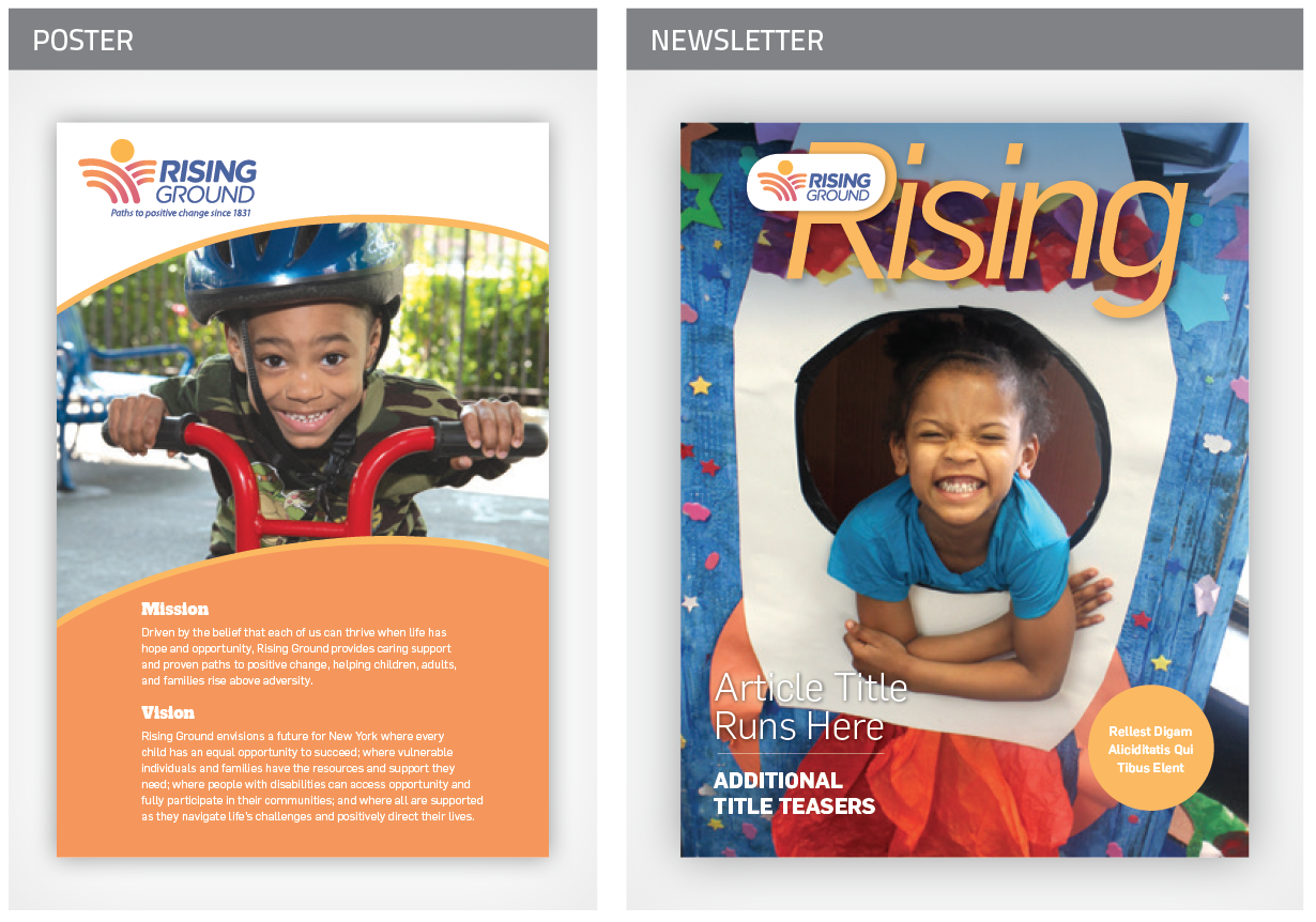
Mission

Driven by the belief that each of us can thrive when life has hope and opportunity, Rising Ground provides caring support and proven paths to positive change, helping the most vulnerable children, adults and families rise above adversity.

Vision

Rising Ground envisions a future for New York where every child has an equal opportunity to succeed; where vulnerable individuals and families have the resources and support they need; where people with disabilities can access opportunity and fully participate in their communities; and where all are supported as they navigate life’s challenges and positively direct their lives.

Boilerplate

Rising Ground is a leading nonprofit social service organization, providing the most vulnerable children, adults and families in the Greater New York City area, with the resources and skills needed to rise above adversity and positively direct their lives.

Visual Identity

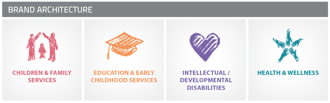
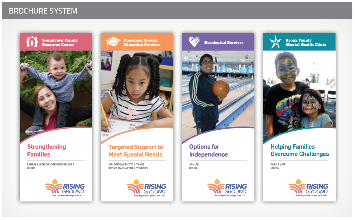
We created a new visual identity that is expressive, contemporary, and evokes the agency’s personality. The visual identity system consists of:

Website

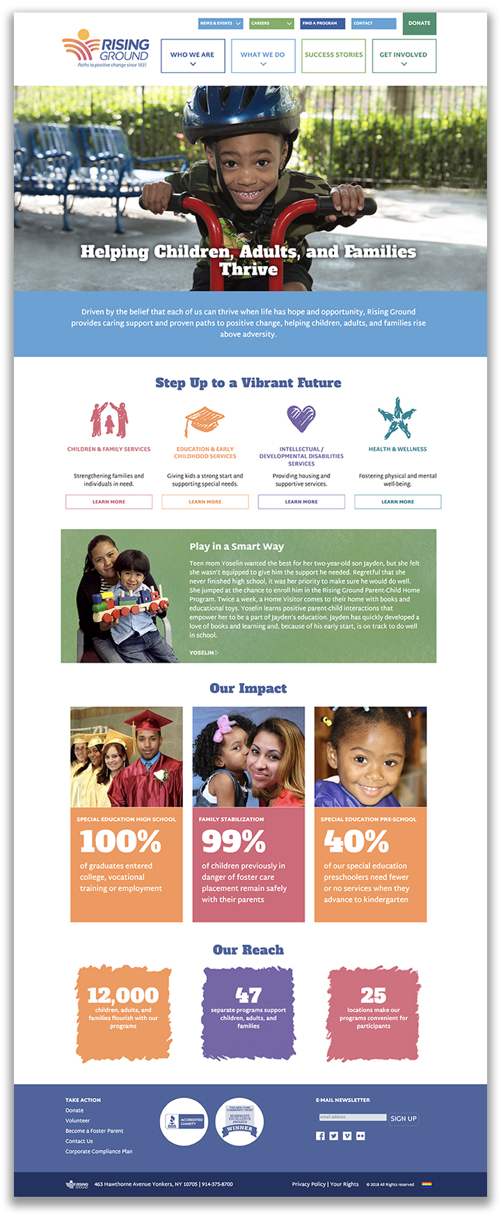
We planned, wrote, designed, and developed a completely new website for the organization. We created a positive experience that showcases the agency’s mission of helping people rise above adversity.

Brand Launch

Announcing the new name was an opportunity to renew enthusiasm for the organization. To facilitate the transition, we drafted a Why We Changed Our Name document, letters to each stakeholder group, FAQs, a video, and other materials. The launch events generated lots of excitement and the name was well received by staff and donors, and garnered some media coverage (handled by a PR firm).

Outcomes

Rising Ground’s new brand eliminates the confusion with their old name, inspires donors with an uplifting message, and gives staff a clear purpose to rally around.

Most importantly, Rising Ground is positioned as a leader in the social services sector — one not known for bold changes. Leake & Watts’ transformation to Rising Ground has sent a signal to the sector that it is leading the way with bold decisions. They are seen as an attractive potential partner for acquiring other agencies, and their new brand is serving them well as in vying for attention and funding in these uncertain political times.

“Howard and the entire team at Red Rooster Group truly went above and beyond with our project – the rebranding and renaming of a venerable 185+ year organization. It wasn’t easy! Red Rooster Group took the time to really listen to what we believe in and what we wanted to achieve. Their process was strategic, creative, and inventive from start to finish. All throughout, Red Rooster Group made sure we stayed true to the core themes of our work that we collectively identified. No detail was too small and no request unsatisfied. You couldn’t ask for a team more dedicated. Today, we have a new name, visual identity, website, messaging, and mission and vision statements that are truly reflective of our impact in the community. Our new brand positions us with confidence as we look to the future and ways to further increase our impact. Red Rooster Group was a tremendous partner. We are delighted with the results of our work together!”

Meredith Barber

— Meredith Barber
Senior Director of Institutional Advancement
Rising Ground

Introducing a Complex Concept

Credible Messenger Justice Center

Credible Messenger Header

Introducing a Criminal Justice Mentoring Model

When an alliance of three parties came together to promote the Credible Messenger approach used for mentoring at-risk youth, they needed a way to explain the concept, present their affiliation, and build support for the movement. Red Rooster Group developed a brand to tell their story in a powerful way.

Services

  • Market Research
  • Brand Strategy
  • Naming
  • Messaging
  • Visual Identity & Brand Guidelines
  • Marketing Collateral
  • Website Copy, Design & Development/span>

Creating a Brand to Transform Lives

The Center for Credible Messengering is a consortium of the New York City Department of Probation, a nonprofit organization called Community Connections for Youth, and the Silberman School of Social Work at Hunter College. They came together to develop programs to harness the power of people who had been through the justice system and had transformed their lives, and to train them to become mentors for youth who might otherwise end up in jail. Our task was to create a brand for the consortium that was using this credible messenger approach.

Framing the Approach

We visited the programs and conducted interviews to learn about the valuable role that Credible Messengers play and perceptions about the justice system. We explored the issues around how to present this unique and sensitive approach to transforming individual lives, communities.

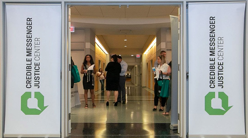
Signage

Crafting Brand Language

We developed a brand platform to define their brand — creating Mission and Vision Statements, Brand Pillars, Brand Personality, and other messaging components. We galvanized the brand around the concept of “Relationships that Transform,” and crafted messaging to support it.

A New Name

We wanted to address the awkwardness of ”Credible Messengering” in the original name — The Center for Credible Messengering — and give a clear focus on the words ”Credible Messenger.” After generating many options, we recommended the name Credible Messenger Justice Center to put ”Credible Messenger” first, and add ”Justice” to give context to the name.

Visual Identity

We then developed options for a visual identity that would give credibility to the alliance and help tell its story of Credible Messengers in dialogue with youth.

Website

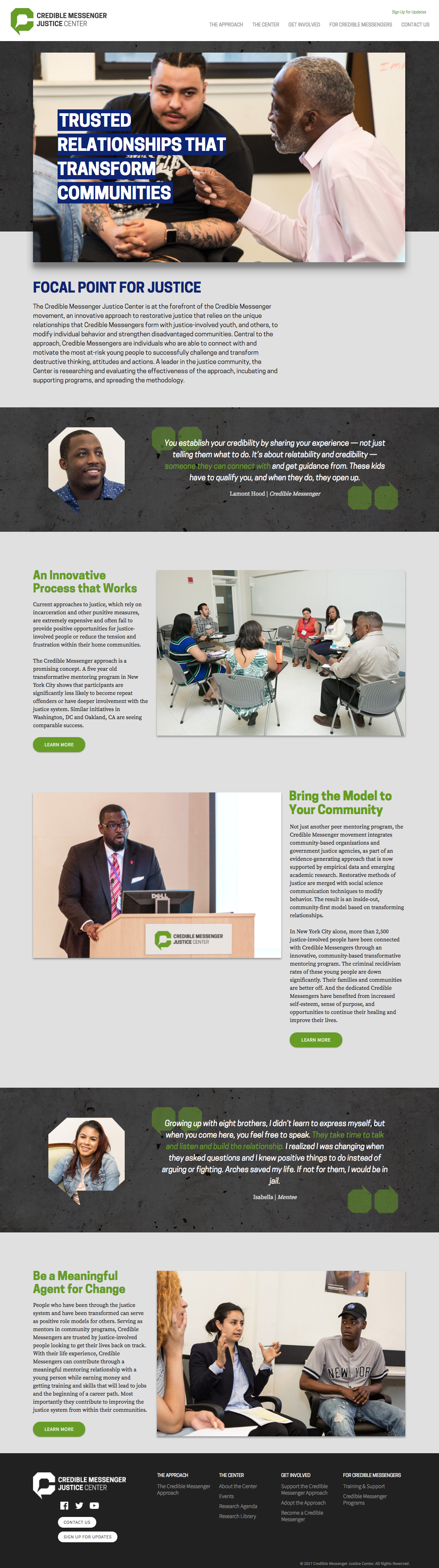
We wrote, designed, and developed a website to showcase the Center, including pages that appealed to potential Credible Messengers, and a searchable Research Library for those looking for information on the effectiveness of the approach. Testimonials from Credible Messengers were used throughout the website.

CMJC Homepage

Print Collateral

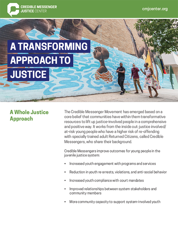
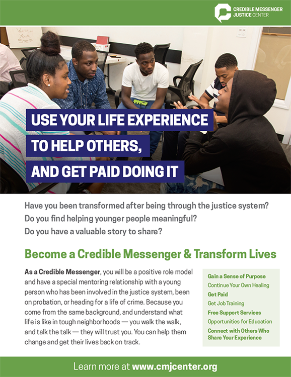
We created overview sheets to promote the Center to professionals, and flyers to attract potential Credible Messengers.

Overview Sheet
CMJC Flyer

Results

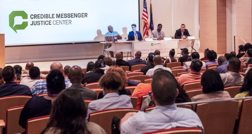
The brand, which was introduced a conference showcasing the Credible Messenger approach, was very well received, conferring credibility to the new venture.

Conference Session

Updated Messaging & Materials Breathe New Life Into Social Service Agency

How does a 112-year-old social service agency increase its visibility to engage participants and donors?

A clear, purposeful message, unified voice, and visual look with consistency across all marketing galvanized staff and inspired donors.

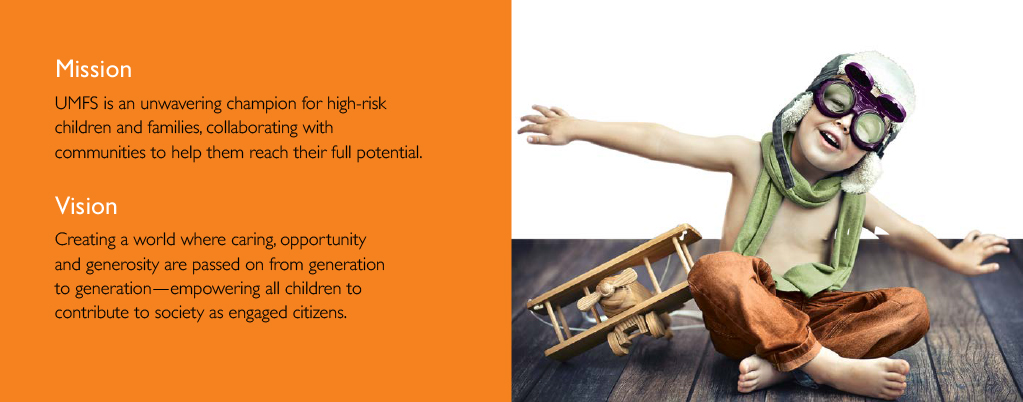
UMFS had a cliché mission statement: Touching lives. Creating futures.

We gave them a new one around the theme of unwavering champions for high-risk children and families.

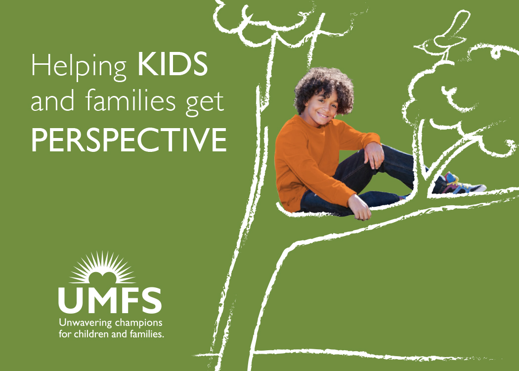
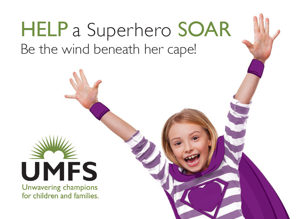
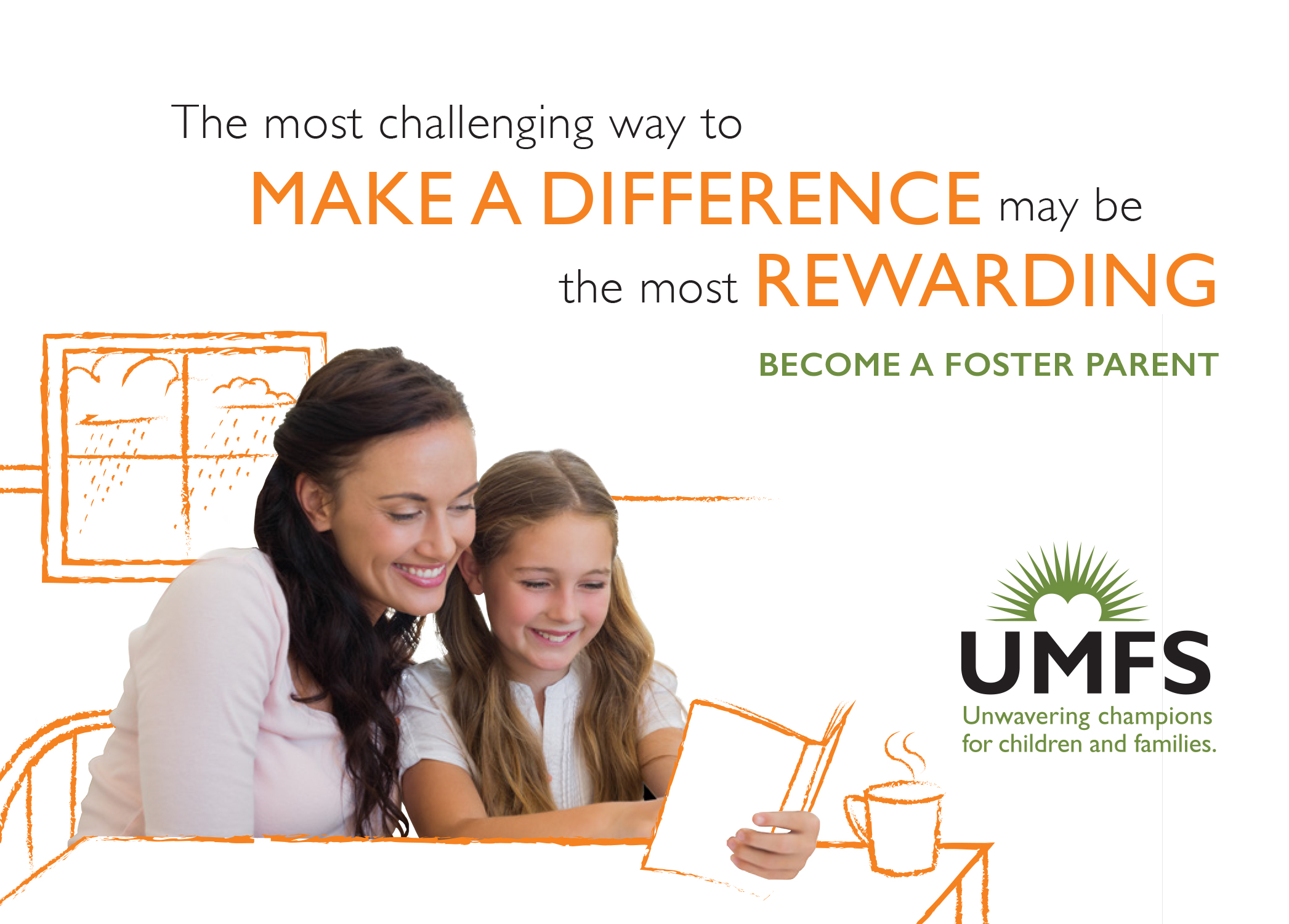
We created a cohesive and recognizable visual look with inspiring headlines around their theme that helps UMFS stand out from other social service agencies.

UMFS Organizational Brochure
UMFS Brochure 3
UMFS Brochure 5
UMFS_DonorBrochure
UMFS Brochure 4
UMFS Brochure 6

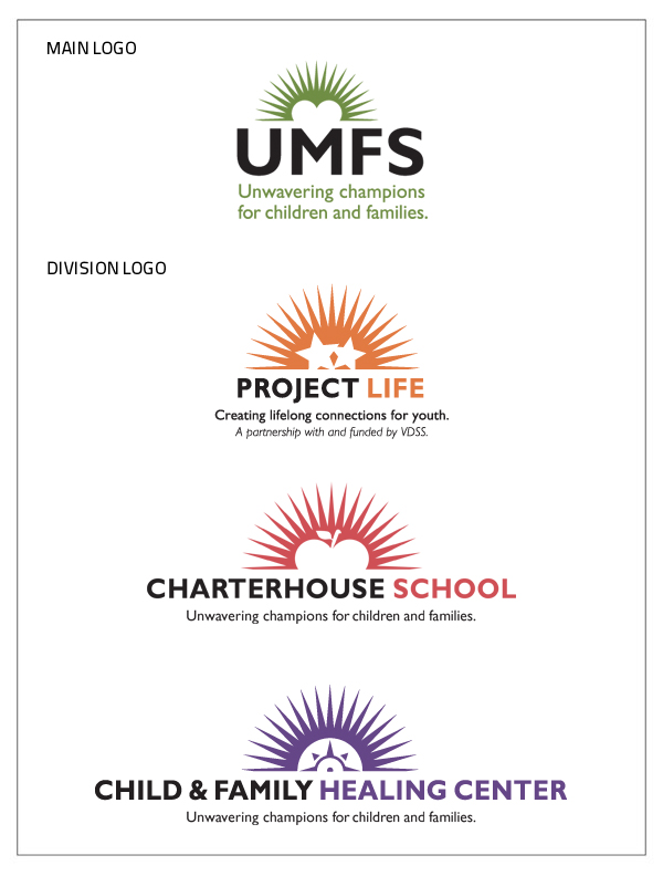
We unified their visual identity so that all divisions have appropriate symbols that connect to the parent organization.

UMFS Brand Architecture

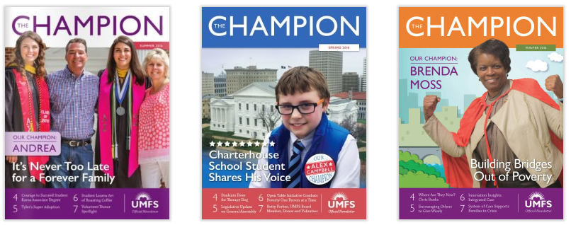
To reflect UMFS’ new messaging we changed the name of their newsletter from Guardian to The Champion and showcased people who are living the organization’s mission.

Champion Newsletters

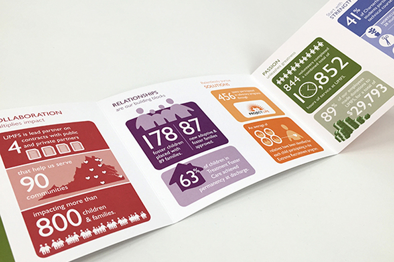
To communicate the organization’s successes in a compelling way in their Impact Report, we created infographics visualizing accomplishments in five areas corresponding to their values.

UMFS Impact Brochure

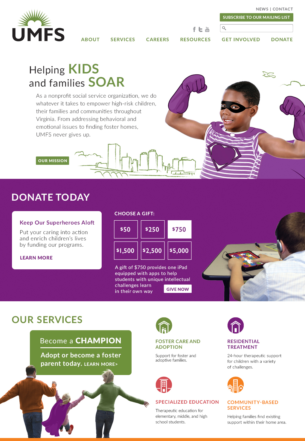
We developed a responsive website that appealed to clinicians, parents, and donors. We wrote and designed the website to make it easy for users to understand UMFS’ services and take action, as well as for staff to update.

UMFS Homepage

A benefit-oriented headline, short copy, and unique graphics greet site visitors.

A rollover invites site visitors to explore donation levels.

Information is presented in small increments and reflows when viewed on tablets and phones.

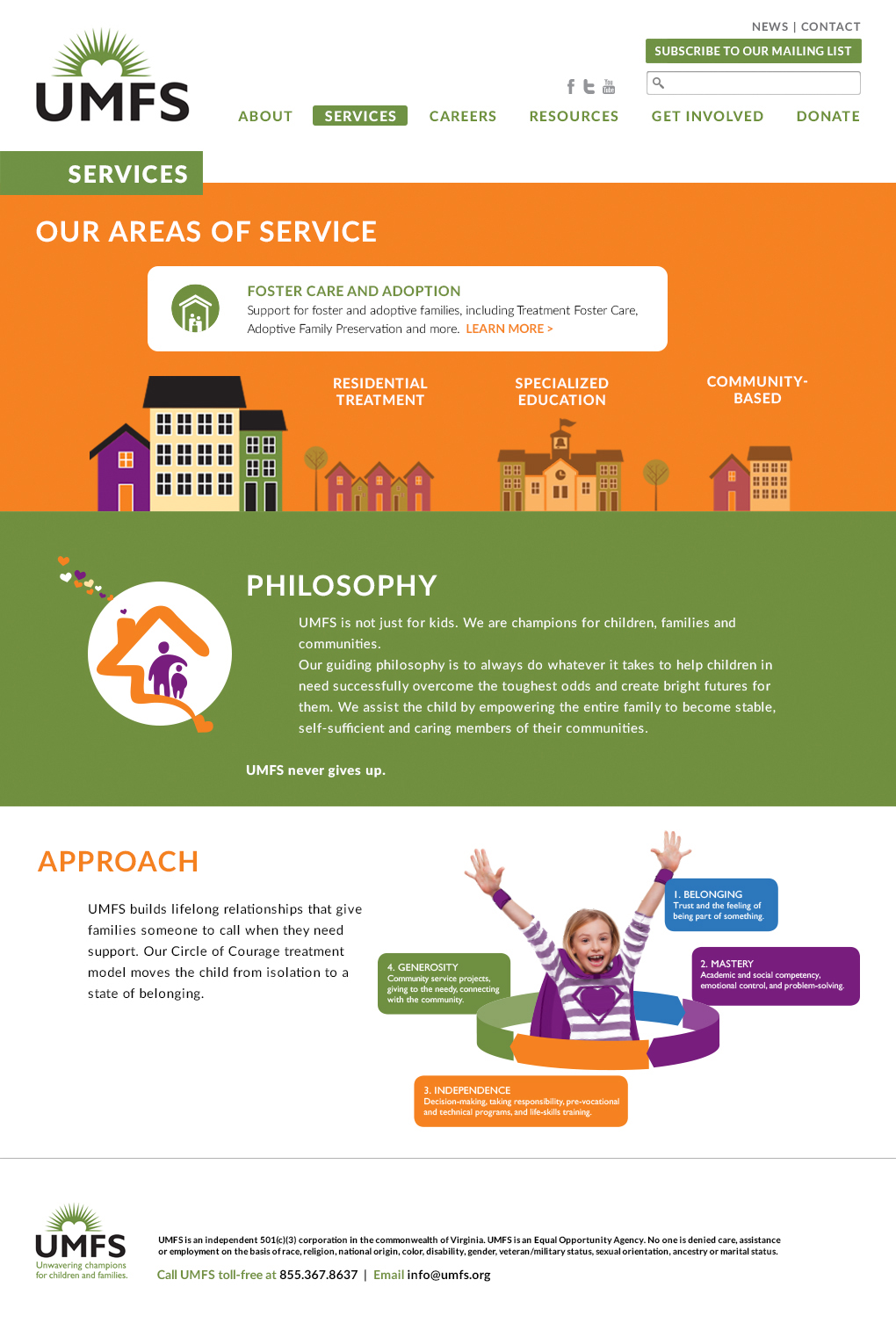
Throughout the site, stylized illustrations contribute to a design that’s both inviting and informative. Pages for each division of the agency thoughtfully address the concerns and challenges faced by each demographic.

A rollover invites site visitors to explore services.

Modular block system makes pages interesting, and can be easily updated by the client.

UMFS106_5_Services copy

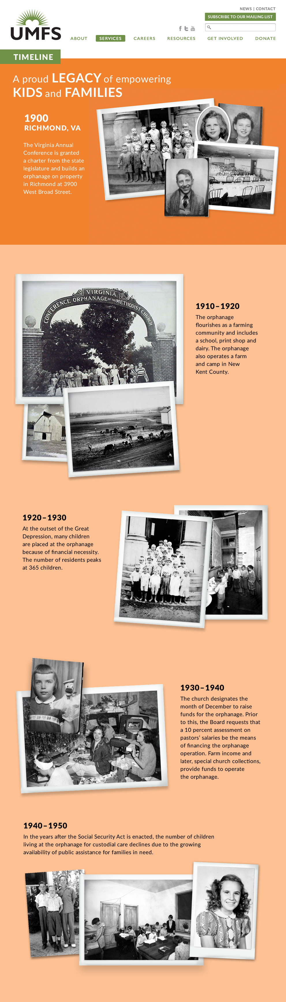
The History page features a vertical timeline with vintage photos.

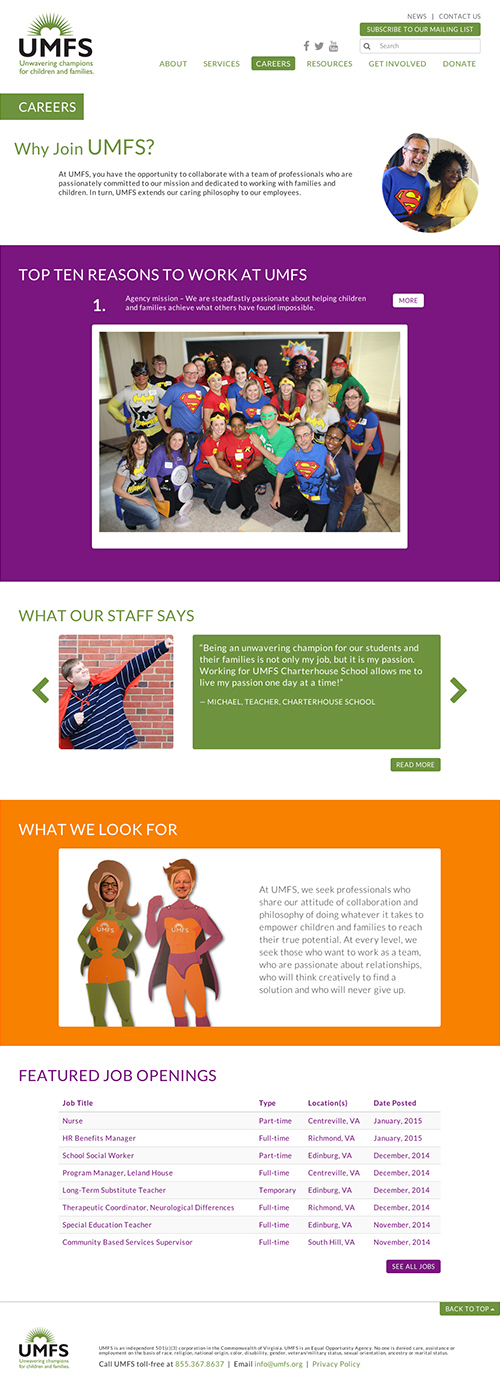
The Careers page was designed to attract high-quality staff.

Updated Messaging & Materials Breathe New Life Into Social Service Agency
UMFS_Careers

To help UMFS communicate its message to its 300 employees statewide, we created a brand book that illustrates key points in an easy-to-understand way. 

UMFS Brand Book

UMFS Brand Book11
UMFS Brand Book13
UMFS Brand Book14

We held brand workshops for key staff and the board to help them understand and embrace the brand messages. The sessions included hands-on activities to create enthusiasm for their brand.

UMFS Brand Launch 1

Red Rooster Group staff introduce UMFS’ new messaging.

UMFS Brand Launch 2

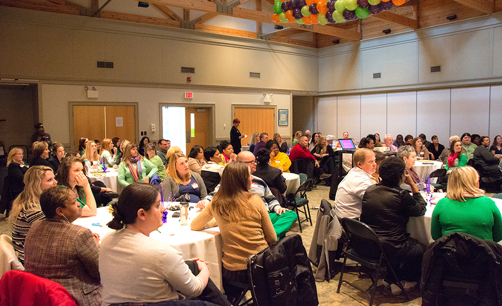
About 80 key staff attended the workshop. We held a separate session for the board.

UMFS Brand Launch 6

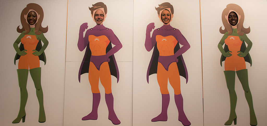
To emphasize the message of ”Unwavering Champions,” we created cutouts so people could photograph themselves as champions.

UMFS Brand Launch 3

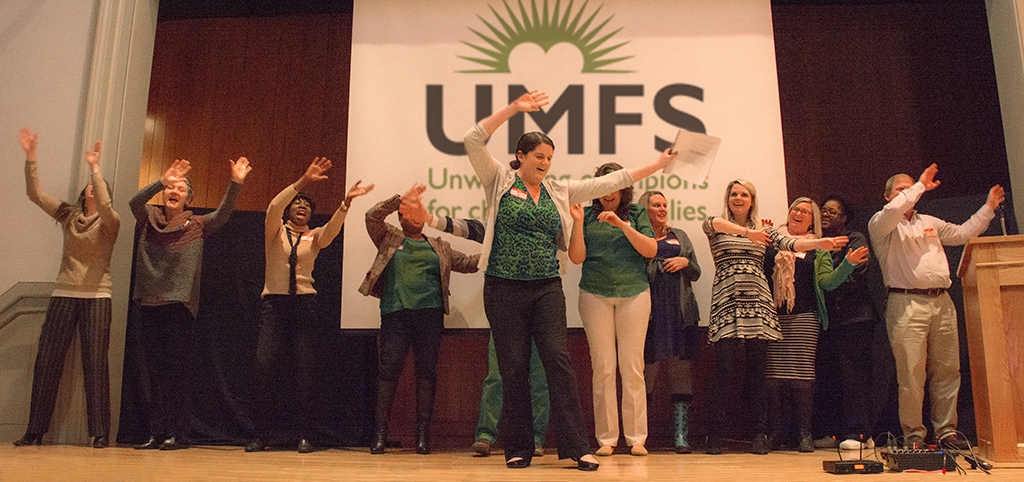
For one activity, participants wrote and performed a song using UMFS’ new messages.

UMFS Brand Launch 4

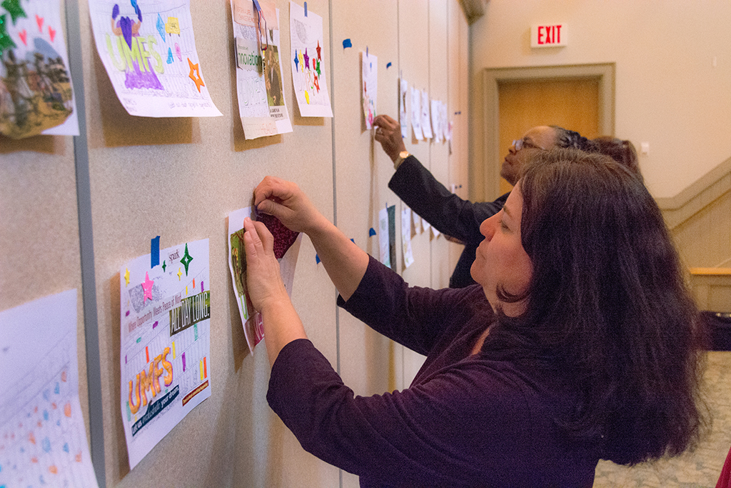
We asked participants to decorate and post a sheet depicting the wall surrounding their campus to demonstrate what’s behind the wall.

UMFS Brand Launch 5

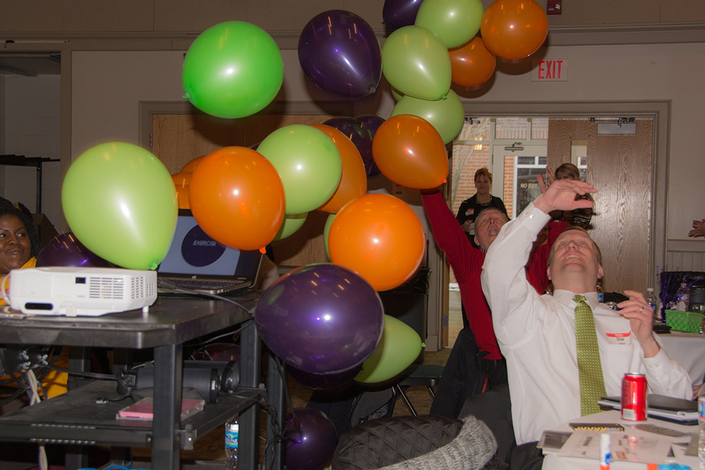
A balloon drop helped generate excitement and underscore the importance of the brand initiative.

“You guys really nailed what we are all about. I really feel I understand our messages, and embrace them.”

BRAND WORKSHOP PARTICIPANT”

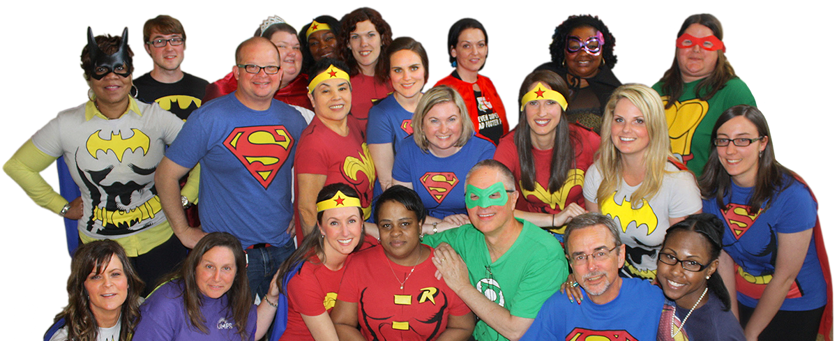
The UMFS staff is now living their brand!

UMFS Champions

“Red Rooster Group captured the social impact and organizational DNA that was a part of our culture. Due to our new mission, we proudly refer to ourselves as unwavering champions for high-risk children and families. Our board and staff have rallied around this bold new message and our donors, customers, and competitors have taken notice.”

Greg Peters_casualEdit

GREG PETERS
UMFS, President & Chief Executive Officer

Brand Update Promotes Largest Educational Organization In India

Pratham USA

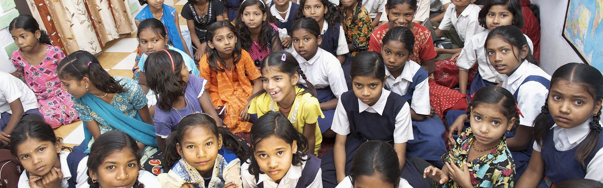
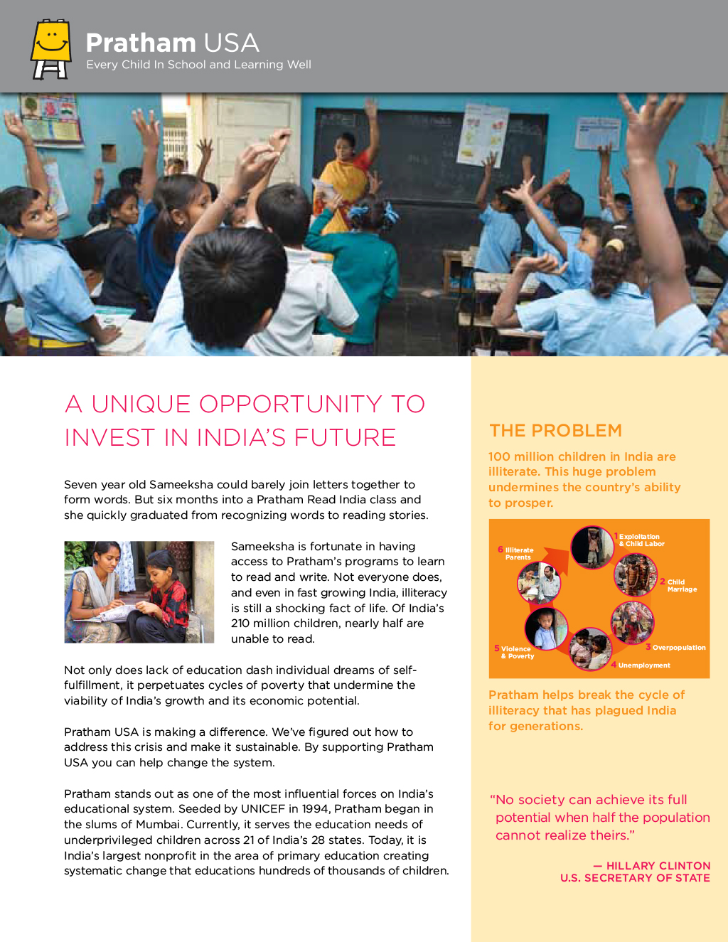
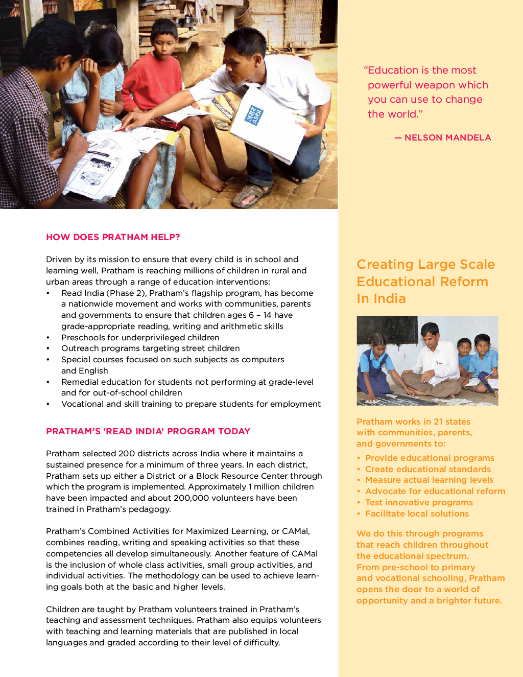
Pratham-Group-of-Children

Promoting the Largest Educational Organization in India

Pratham USA wanted to strengthen its image and give its 15 chapters the communication tools they needed to be more effective in raising money for the organization. Red Rooster Group was brought in to develop a comprehensive brand, marketing strategy, and fundraising materials.

Services

  • Discovery
  • Workshops
  • Communications Assessment
  • Communications Plan
  • Marketing Plan
  • Brand Strategy
  • Brand Architecture
  • Core Fundraising Messaging
  • Case for Support
  • Donor Brochure
  • Donor Presentation
  • Annual Report
  • Website
  • Peer-to-Peer Fundraising

Building Marketing Foundations for Success

Pratham has taken on one of the worst problems in the world — literacy — with innovative yet proven tactics. It is one of the few nonprofits in the world that invests in Randomized Control Trials, an expensive but accurate way to assess effectiveness. 

Pratham’s methods are used in 14 countries on three continents. The results guide government policy as well as help ascertain the best methods to teach reading to children. 

Pratham USA raises money to support these efforts. Because the challenges are so great — 300,000 children in India cannot read — Pratham needed a marketing and fundraising strategy to get the word out about Pratham’s impact and expand its base of supporters.

We developed a marketing strategy as well as fundraising and communications plans and marketing materials to drive their outreach efforts.

Conducting Research

To find out why fundraising had plateaued and laid the foundation for their marketing and fundraising strategy, we conducted the following research to identify the challenges and opportunities.

  • Researched similar organizations in the sector.
  • Conducted a survey of donors.
  • Conducted workshops for national and chapter leaders.
  • Reviewed the past year of email and other communications with donors.
  • Determined marketing priorities.

Communications Plan

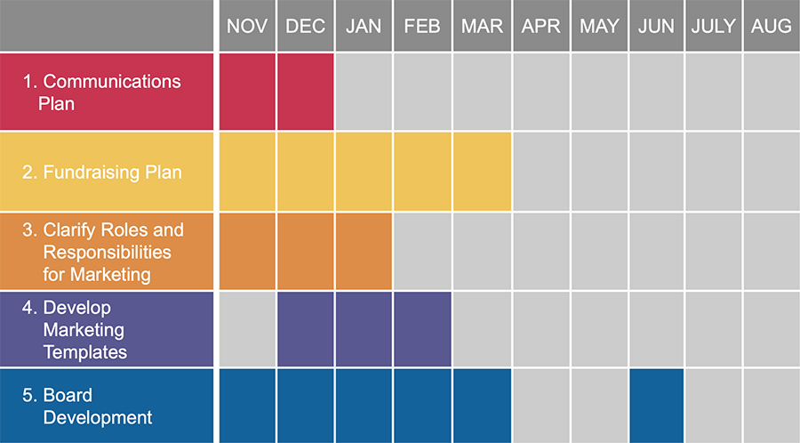
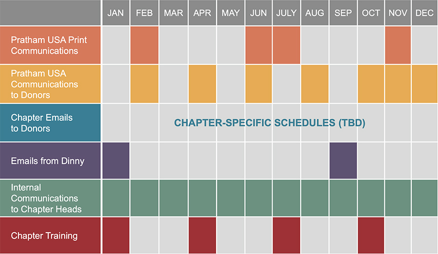
During our research, we found that communications with donors were sporadic and visually inconsistent. We developed a 24-month communication plan that coordinated the outreach of the national office with that of all the chapters. The communications schedule ensured that donors were not hit with multiple asks and that all events and campaigns were well-publicized. In addition, we provided templates for each chapter so their outreach would be visually consistent as well as timely.

Marketing Chart
Communications Plan

We strengthened their brand, updated their messaging, and gave each chapter the tools needed to fundraise effectively.

Unifying the Visual Identity

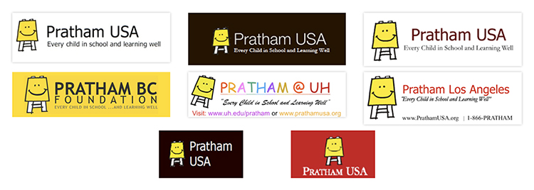
Pratham lacked guidelines for their logo, which resulted in different typefaces, colors and layouts being used, as well as inconsistent treatments for the names of chapters and affiliates.

While Pratham has a clear mission, a logo, and brochures, the organization conveys a very fractured image. This can confuse donors and represent a lost opportunity to build equity in the brand. Another factor is that Pratham in other countries convey their brand slightly differently as well, with different typefaces for the logo and different designs for the website.

BEFORE

Before Logos

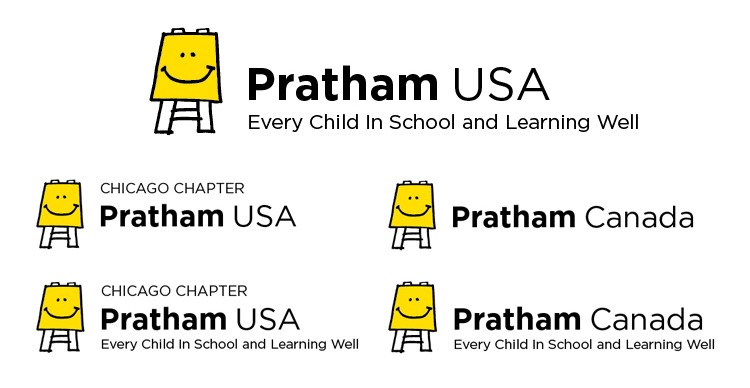
AFTER

Pratham Chapter Logos

During the brand review, we assessed that the logo was used in a wide variety of ways in the marketing materials, creating a fractured image for the organization. And chapters were setting their names in different typefaces and colors, undermining the professionalism of the organization.

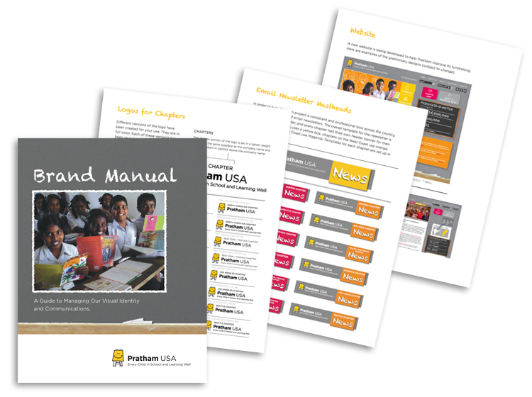
To address this problem, we developed a comprehensive brand architecture for the organization that defined the relationship of the logo and tagline, created consistency for the chapter names and their treatment in the logo, and determined how international affiliates should be styled. We then developed versions of all the logos (15 chapters plus international partners) with and without the tagline in formats for print and web use.

Pratham Brand Manual Pages

Message Development

A core part of the strategy for Pratham USA was articulating Pratham’s global impact in developing and validating new tactics to increase literacy. To help Pratham and all the chapter heads tell their story in a compelling way to appeal to donors, we developed the following messaging tools:

  • A Case for Giving that describes the problem that Pratham addresses, how Pratham helps, Pratham’s impact, and ways donors can get involved and make a difference.
  • Brand Story that summarizes the case for giving.
  • Boilerplate that can be used to remind donors of Pratham’s mission and impact and urge them to donate.

Brand Story

At a time when half of the children in India cannot read, Pratham provides a low cost method to address the problem effectively on a large scale. Pratham is the only organization that empowers individuals through education as well as driving systemic change through a bottom-up approach. By training 60,000 volunteer teachers in 21 states, we are able to provide support for educating the entire population.

Pratham’s successes break the cycle of poverty for families in villages and cities and contributes to the economic and political vitality of India. Pratham has successfully reached more than 34 million children across India. Millions of children who could not even recognize the alphabet when they began now read fluently and with passion. Pratham’s methods have been recognized by leading foundations, including Skoll, Gates, and Hewlett, as a model worth emulating. Pratham’s methods are now being employed to help other countries facing similar educational challenges. Pratham USA, a 501(c)(3) nonprofit organization with a four-star rating (the highest possible) from Charity Navigator, accepts tax deductible contributions from U.S. donors. We depend upon generous donors like you to create educational reform throughout India and the world.

Boilerplate

Pratham is one of he world’s leading non-governmental organizations working to provide quality education to underprivileged youth. With a budget of less than $15 million, we use very low cost and scalable methods and work in collaboration with the government, local communities, parents, teachers and volunteers across the country to educate hundreds of thousands of children every year. Pratham USA, a 501(c)(3) nonprofit organization with a four-star rating (the highest possible) from Charity Navigator, accepts tax deductible contributions from U.S. donors. We depend upon generous donors like you to create educational reform throughout India.

Case for Support

We developed their Case for Support around what the donors need to know:

  1. The Problem: What is the problem that the organization is addressing? We humanized the problem of widespread illiteracy in India by telling a story about one girl’s plight. We also provided a visually demonstrated the problem by creating a graphic showing the cycle of poverty that plagues many in India.
  2. The Solution: What is Pratham doing about the problem? We describe Pratham’s programs to build literacy and create systemic change for education in the country
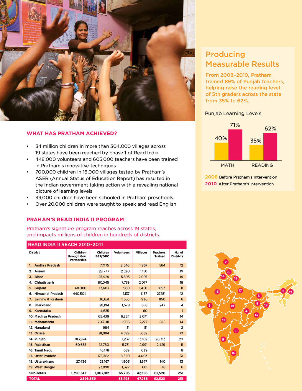
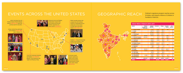
  3. The Impact: How effective is the organization in addressing the problem? To demonstrate Pratham’s success, we presented a chart showing the results of Pratham’s signature program, Read India II, in 21 states across India.
  4. The Appeal: How can donors support Pratham? We describe the different ways that people can support and get involved with the organization.

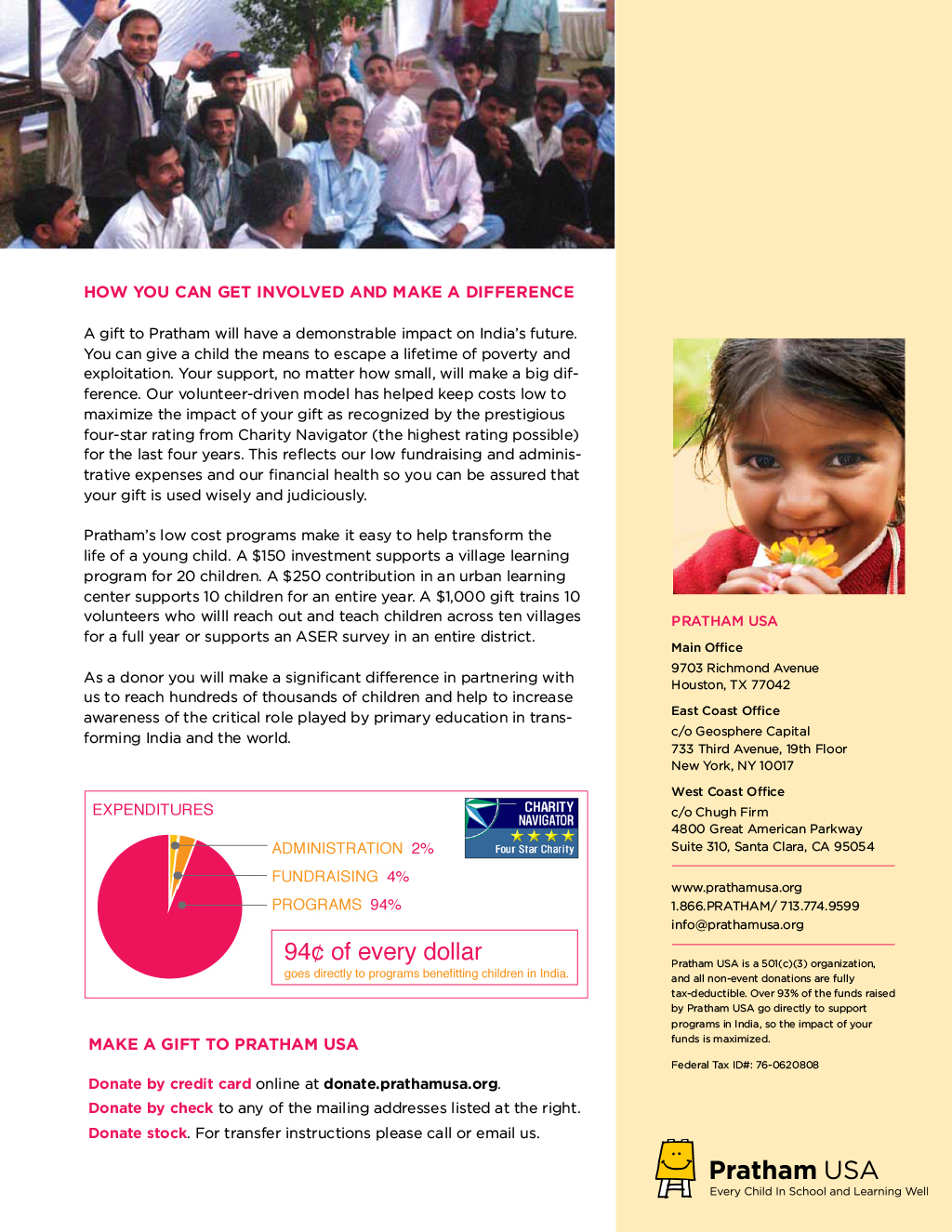
We designed the document to be easy to read and support Pratham’s brand, with photos that help to help people understand what Pratham does — overall a clear and compelling case for supporting Pratham.

Pratham Case for Support 1
Pratham Case for Support 2
Pratham Case for Support 3
Pratham Case for Support 4

Brochure

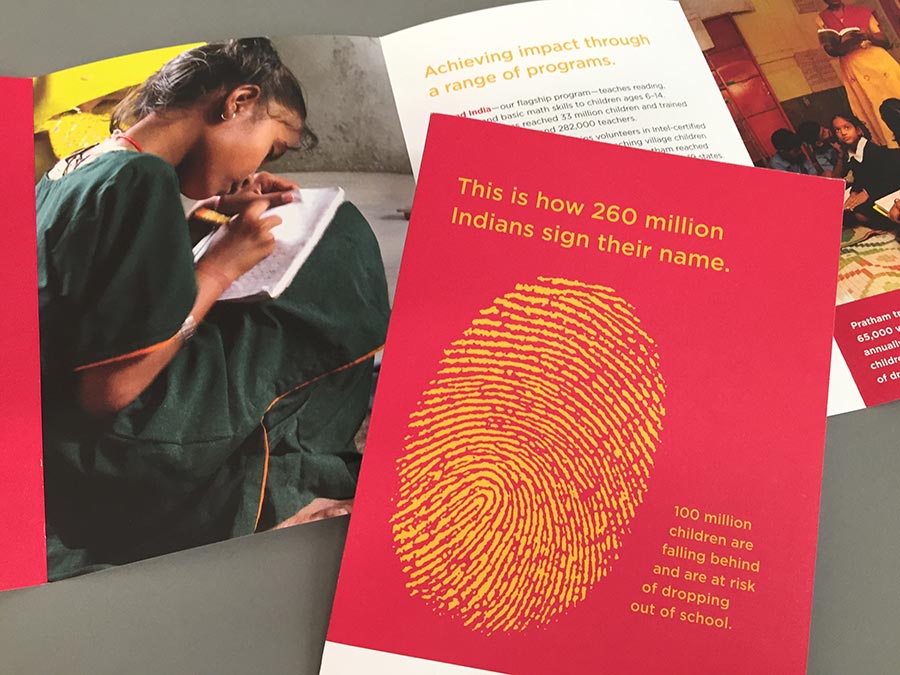
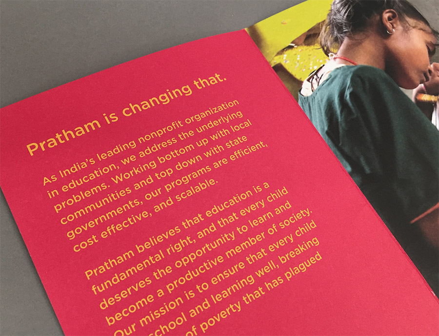
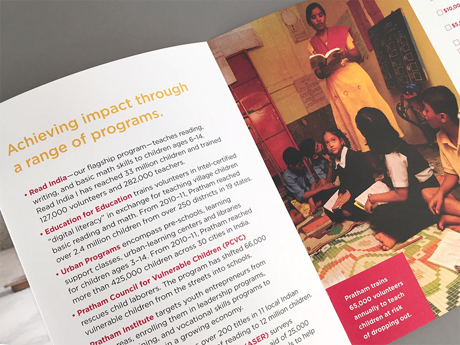
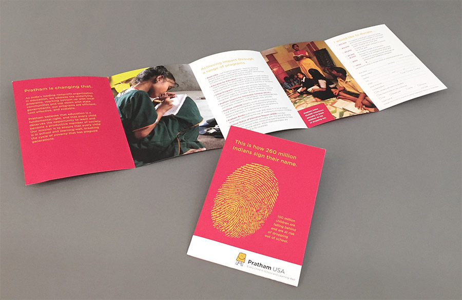
We created a brochure that could be handed out widely at galas and other events for fundraising purposes. The brochure makes a bold statement about the the vast scope of illiteracy in India, and describes how Pratham is addressing it.

Pratham Brochure
Pratham Brochure
Pratham Brochure
Pratham Brochure

Annual Report

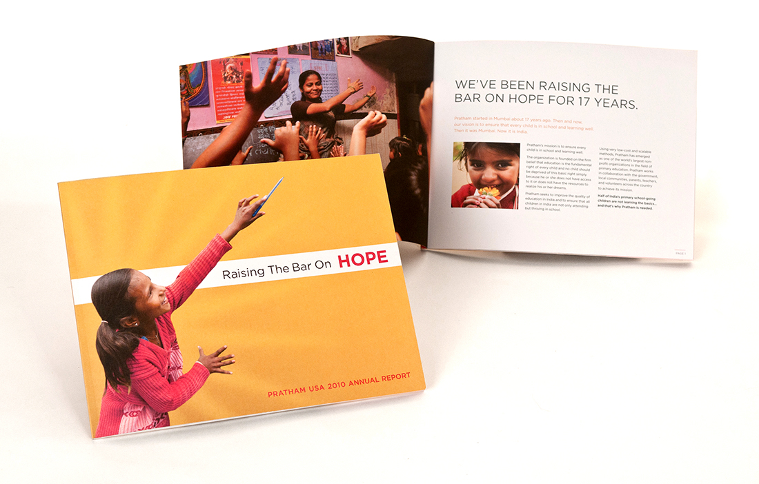
We redesigned the organization’s annual report as part of an overall brand refresh for the organization. The theme of Raising the Bar on Hope was aimed at reinvigorating interest in the organization’s donor base which was experiencing some fatigue with Pratham’s message.

Pratham Annual Report
Pratham_AR_Spread_4BW

Marketing Templates

We created a consistent brand look for all materials so that donors can recognize them as Pratham’s. This reinforced the brand in people’s minds and made it easier for staff to create collateral materials, such as:

  • Email Newsletters
  • Email Blasts
  • Print Newsletters
  • Gala Invitations

Clarifying Roles & Responsibilities

Plans are only as good as their implementation. We helped Pratham USA put the structure in place that would facilitate implementation.

  • Identify the required roles and clear assignment of marketing tasks.
  • Determine what can be handled in-house and what needs to be outsourced.
  • Establish accountability for delivery.
  • Develop procedures for creating, reviewing, and approving fundraising materials.

Board Development

Pratham had not fully utilized the board as brand and fundraising ambassadors. We suggested ways in which board members could improve their fundraising effectiveness by giving them succinct messaging and collateral materials to guide them as they talked with potential donors. During our time, Pratham USA attracted Fareed Kazaria to its board.

Peer-to-Peer Fundraising

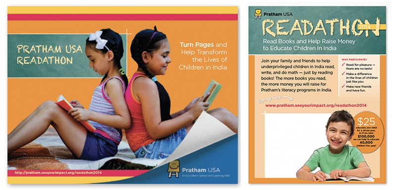
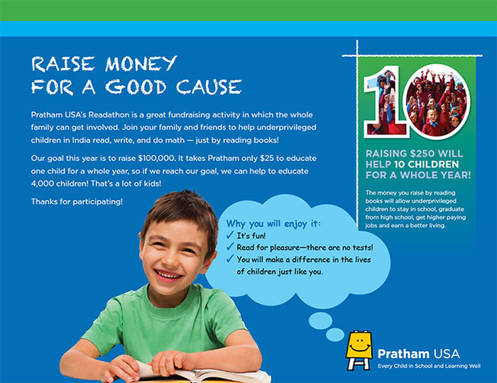
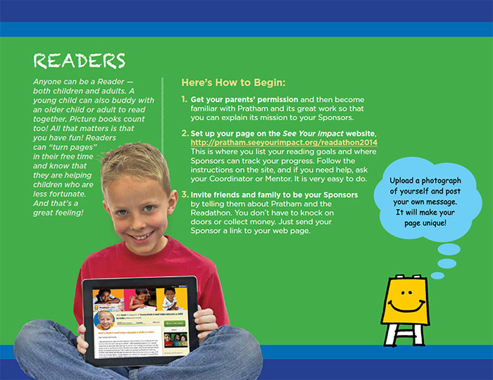
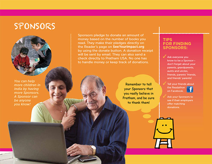
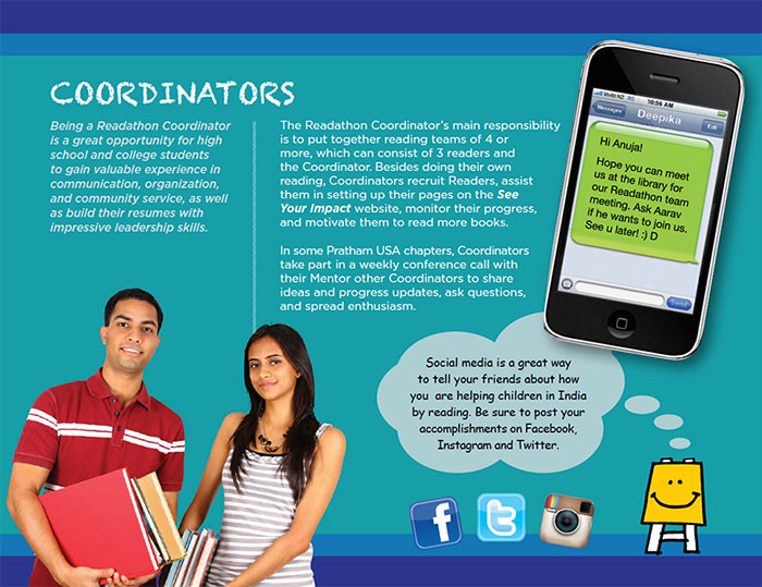
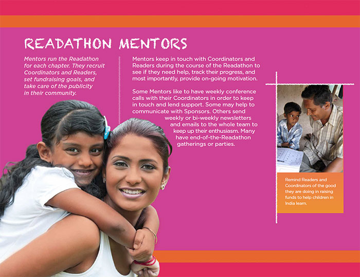
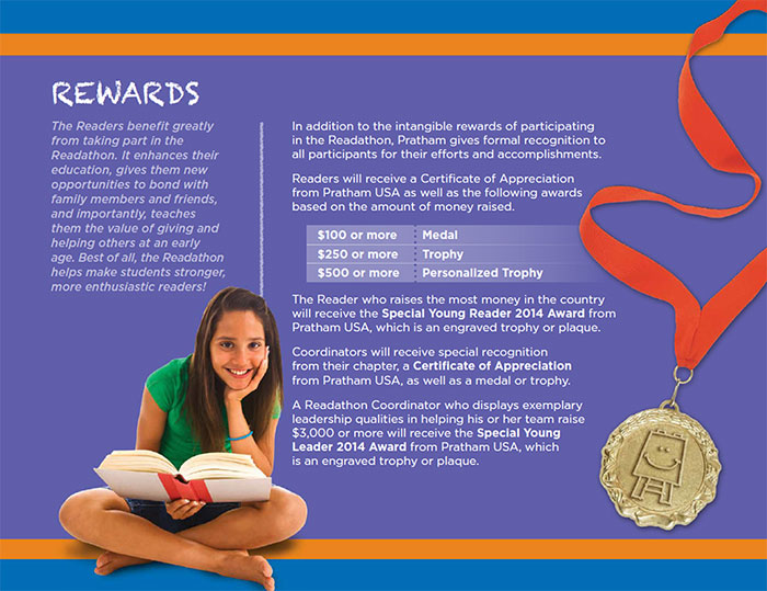
We promoted their readathon by creating materials for recruiting local hosts, as well as promoting the readathon locally in the community through digital and print materials. We increased the average donation from $76 to $102 over the prior year’s event.

RESULTS

36% Increase

Over Prior Year

Pratham Readathon

Readathon
Readathon
Readathon
Readathon_5W
Readathon
Readathon

National Nonprofit Refreshes Its Focus, Name, Visual Identity, and Outreach

Tourette Association of America

National Nonprofit Refreshes Its Focus, Name, Visual Identity & Website

Like many disease and disorder organizations, the Tourette Syndrome Association (TSA) wanted to increase public awareness in order to foster a greater acceptance of this condition. Red Rooster Group was called in to refresh the organization’s brand by refining its focus, evolving its name, updating its visual identity, and developing a new website.

Services

  • Brand Analysis
  • Website Assessment
  • Competitive Review
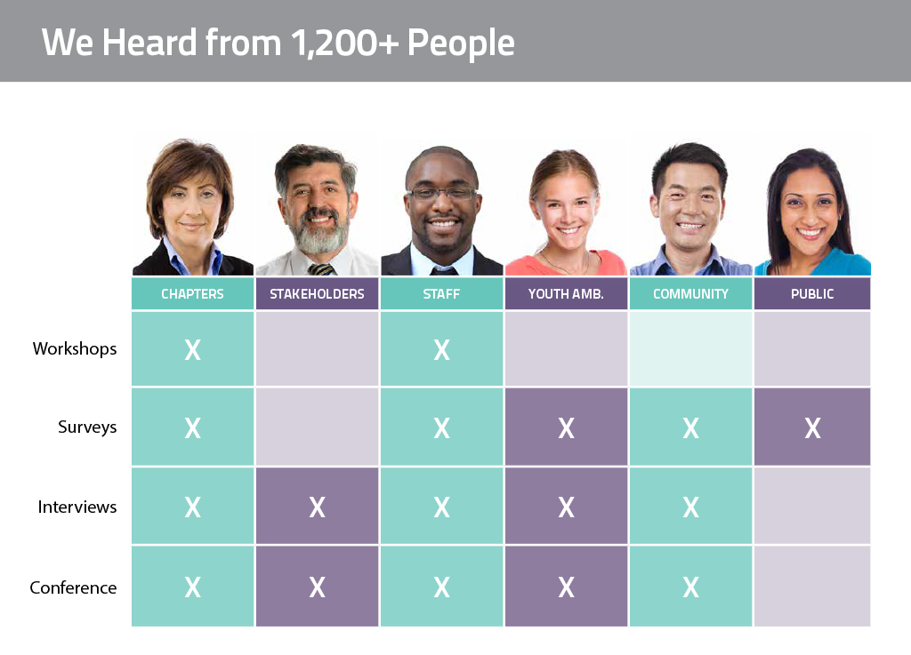
  • Stakeholder Interviews & Surveys
  • Focus Groups & Brand Workshops
  • Audience Needs Mapping
  • Brand Positioning & Messaging
  • Renaming
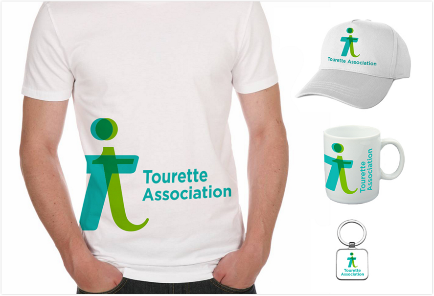
  • Visual Identity System
  • Brand Style Guide
  • Website User Experience
  • Website Copywriting
  • Website Design
  • Website Development & Integrations

Assessing the Needs

Founded in 1972, the Tourette Syndrome Association (TSA) is the only national nonprofit organization that helps individuals and their families deal with the many issues associated with Tourette Syndrome and tic disorders. With more than 30 chapters nationwide, its main mission is to increase awareness and knowledge about Tourette Syndrome while advocating for public policy issues, and investing in medical research to better understand this little-known but widespread condition.

Refreshed Brand

TSA wanted to refresh its brand with a new logo and tagline in order to bring uniformity and consistency to the organization’s image and messaging, and do it in a way that thoughtfully transitions the organization from its historical look and feel toward a more hopeful, energetic, and professional identity.

Updated Website

Part of the project was also to simplify and reorganize the current website to help showcase the array of services that TSA offers, help users more easily find the information they need, and engage people in taking action and joining the community.

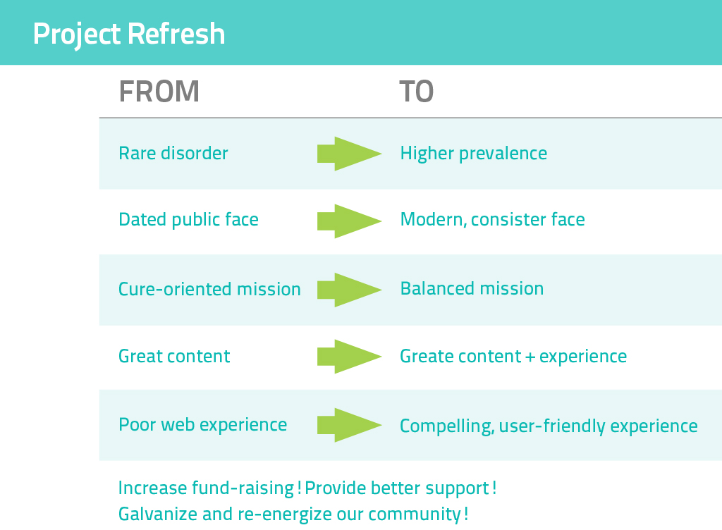
TA Project Refresh
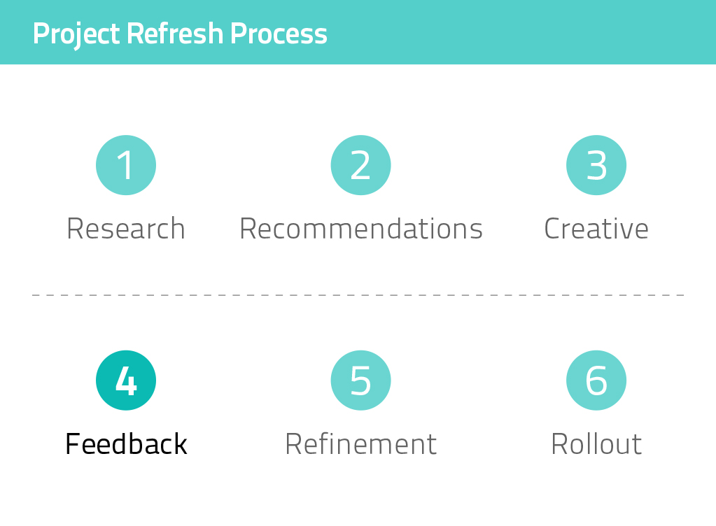
TA Project Refresh Process

Discovery

To begin the project, we conducted research to provide us with key information  for developing TSA’s brand. This included:

  • Reviewing TSA’s internal and external documents and materials to learn more about the organization and the issues it addresses.
  • Facilitating workshops with TSA staff and chapter heads to understand chapter needs and perspectives.
  • Hosting a feedback table at TSA’s annual conference for in-person engagement.
  • Conducting individual interviews with a range of constituents.
  • Holding one-on-one discussions with TSA staff about each department’s needs.
  • Conducting surveys with the TSA community, general public, and other groups.

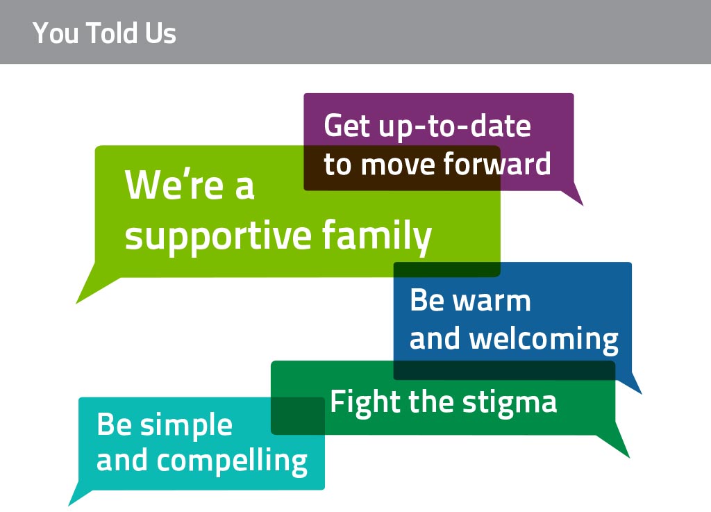
Key Takeaways

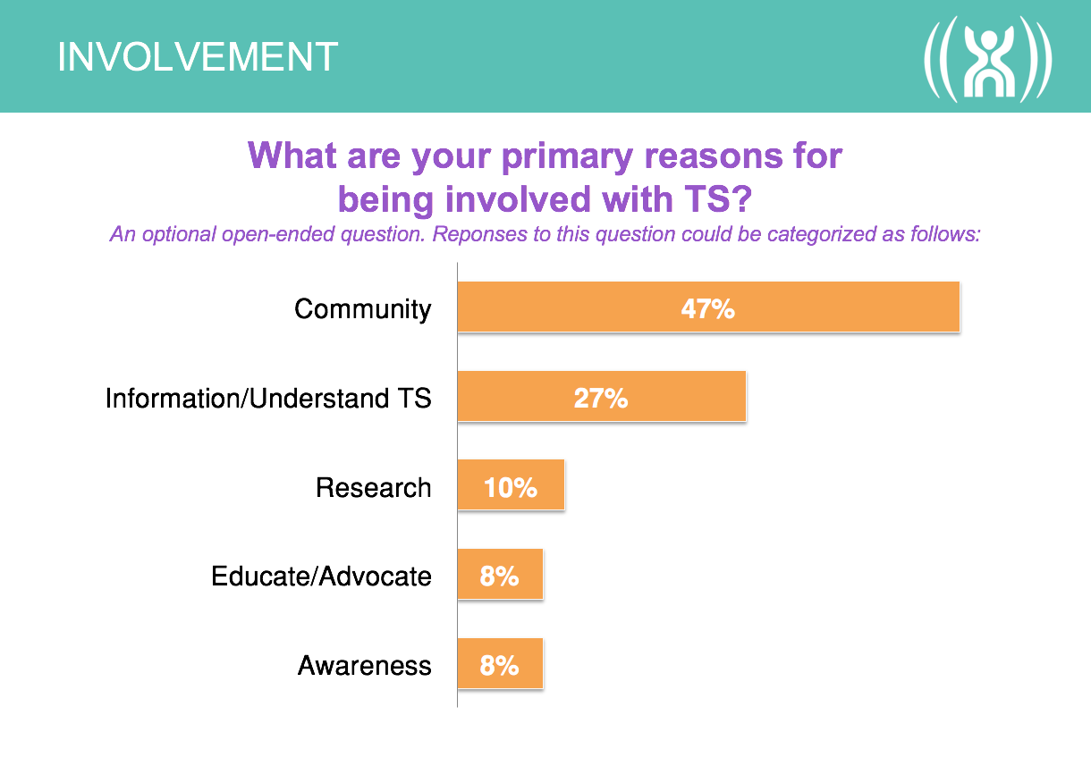
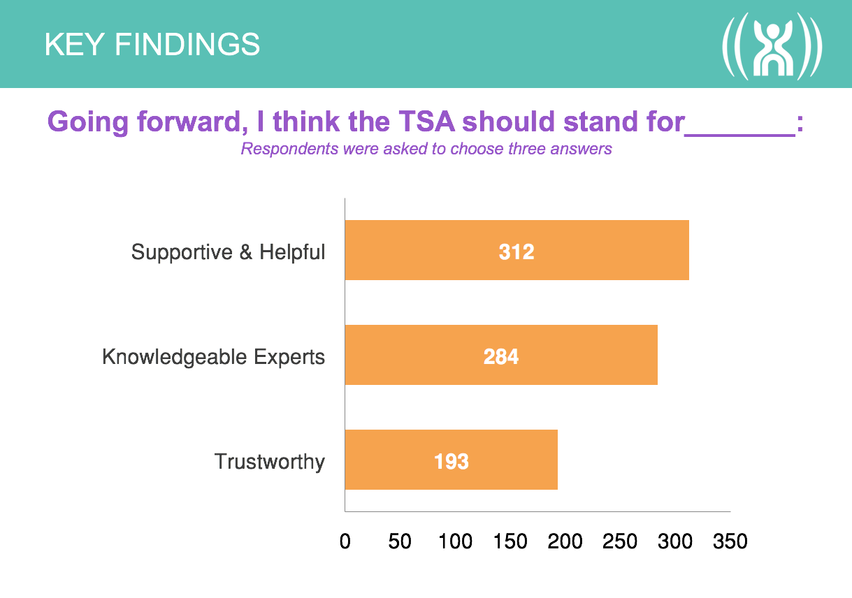
TA Survey
TA-Survey-Comments
Survey Chart 1
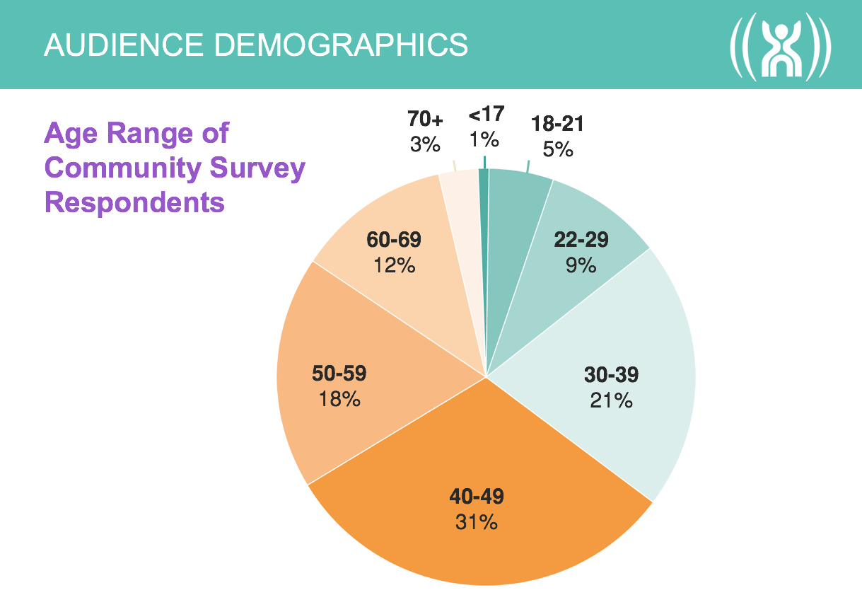
Demographics
Survey Chart 3
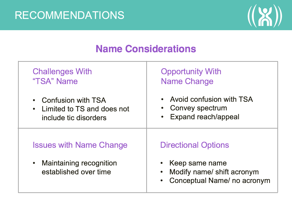
Name Considerations Chart

Defining the Message

Mission

Red Rooster Group worked with TSA to develop internal and external messages for the organization. A core part of the branding initiative was to update the organization’s Mission Statement to reflect its current focus. This included a shift in the outcomes of the medical research, being more positive and inclusive, and increasing the focus on awareness of Tourette Syndrome. We worked with organizational leadership to refine the language and get feedback from various constituents.

Mission Before

To identify the cause of, to control the effects of, and find a cure for Tourette Syndrome through education, research, and service.

Mission After

The Tourette Association is dedicated to making life better for all people affected by Tourette and Tic Disorders.

Refining the Name

Organizational Name

The branding process was the perfect opportunity to examine whether the organization’s name — Tourette Syndrome Association — should be changed in any way because the name was long, it was often shortened to TSA, and consequently confused with the Transportation Security Administration. The organization was exploring ways to improve the current name, rather than develop an entirely new name.

The main name considerations included:

  • Whether the word ”Syndrome” should be dropped from the name. The word had medical significance, people with Tourette Syndrome identified themselves that way and, yet, to the general public and newly diagnosed, that word can make the disorder seem more scary. Since Tourette Syndrome is referred to as TS, how would dropping ”Syndrome” work using ”TS?”
  • Whether there would be any designation of a national presence in the name. The organization is both national and international in scope and wants to be recognized as distinct from the chapters. Yet, adding another word would lengthen the name and increase the likelihood of abbreviation.
  • If the name is shortened to Tourette Association, whether or not to use an apostrophe on Tourette’s. Formally, an apostrophe is used, but how would that complicate the name and URL?

Iterations of the name were presented and discussed with leadership. We then tested the reaction of the Tourette community to the naming options in focus groups, eliciting feedback that helped shape the decision to use Tourette Association.

Before

TSA_Logo_Stacked_Black

After

TAA-Name-2

Revitalizing the Visual Identity

Recognizing Brand Equity

A major component of this branding initiative was to update TSA’s logo, which had been in use for decades. While people had an affinity for the symbol due to familiarity, feedback from surveys told us that while people liked the sense of movement, they thought the logo looked dated and that the figure looked isolated and trapped.

TA Old Logo
Original Logo

Exploring Concepts

Our goals with the redesign were to update the symbol to be more dynamic, with a sense of energy and a suggestion of the positive aspect of living with TS successfully, rather than feeling inhibited by it. We explored a wide range of graphic expressions that could showcase the organization, while being sensitive to not misrepresenting Tourette Syndrome. These concepts included abstract symbols, representation of motion, community, figurative icons, and other concepts.

Visual Identity Exploration

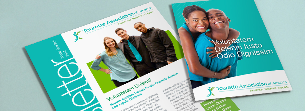
After rounds of refinement, two logos emerged as final contenders. To provide a sense of how the logos would work in real-world applications, we applied them directly to both new and existing media.

TA Logo Concept 1

TA Logo 1 Mockup 1 Large

TAA_Logo_Stacked_Tag

TA Logo 2 Mockup 2

Logo Testing in Focus Groups

The two final logos, as well as the shortened organizational name and the tagline, were tested in focus groups with TSA’s community in various cities. The feedback helped us gauge how people with Tourette Syndrome would feel about changes to the organizational brand as well as giving us specific feedback on each brand element. As a result of this feedback, we further refined one of the logos.

Logo Testing in Internal and External Surveys

To understand how people who were not familiar with Tourette Syndrome would perceive the logo and tagline, we conducted a survey of the general public. The following logos were tested, using the existing logo as a baseline. Option B was the winner.

A

Concept-1

B

Concept-2

C

Concept-3

Presentations for Internal Buy-In

During the course of the engagement, TSA leadership solicited input from various internal stakeholders, such as a leadership advisory team, the board, and a chapter council. Red Rooster Group created presentations showing the evolution of the brand elements so that the President could successfully pave the way for organizational changes by allowing input while addressing resistance to change and concerns about any of the brand elements.

Creating a New Website

Creating a Content Strategy

The site contained a massive amount of information but was very difficult to navigate. We cataloged the content from more than 1,000 pages and reorganized huge amounts of information so various audiences have a clear path to what they need. In addition to pages written for specific audiences, the site contains a searchable Resource Center to access a variety of media resources.

Developing a Modular Content System

The site is designed to be completely responsive for mobile, tablet, and desktop users, and has a robust administration area in the WordPress CMS to make it easy for staff to update. The unique modular block system we developed provides the ability to create interesting pages easily. Red Rooster Group handled the entire website development process including site architecture, copywriting, wireframing, design, development, and final testing.

Before

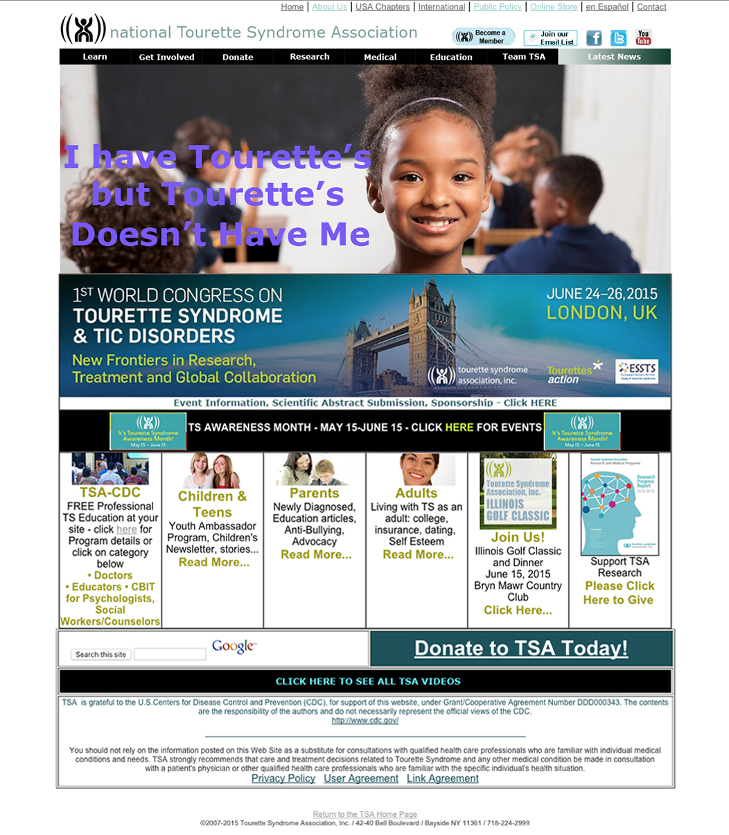
TSA Homepage Before

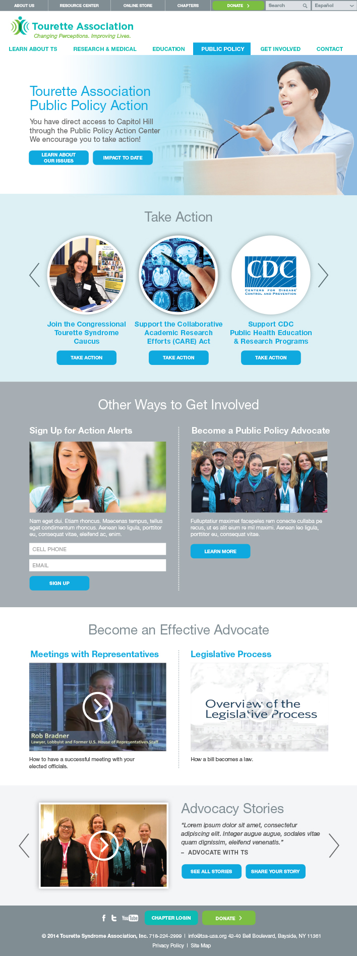
Rotator provides a quick overview of the organization.

Quick access to relevant content for key audiences.

The Did You Know feature appears on different pages with different facts.

Get Involved and Take Action modules encourage user engagement.

After

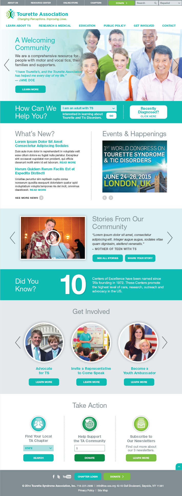
TA Website Home
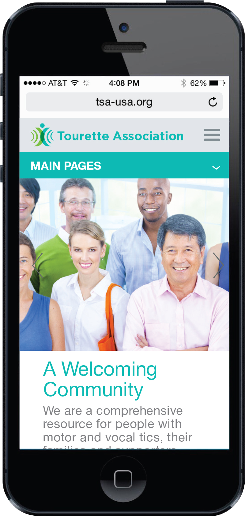
TSA Mobile

The website is fully responsive for viewing on tablets and other mobile devices.

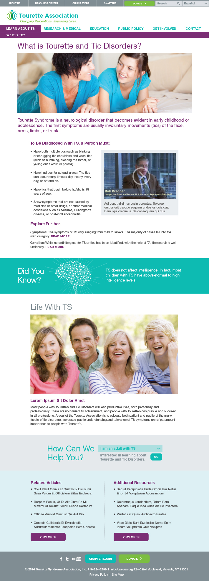
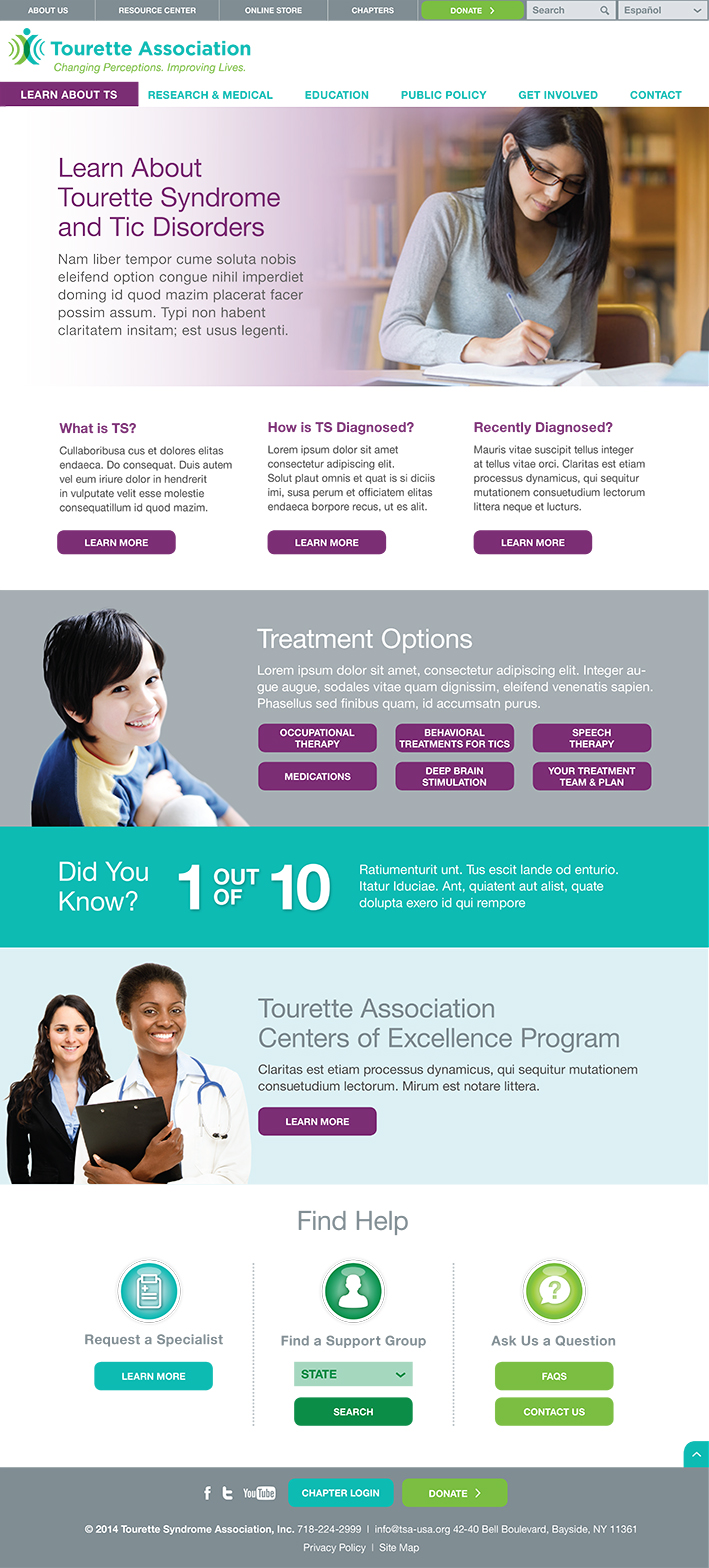
What is TS?

This subpage is used to provide information for those new to Tourette Syndrome.

TA Website What is TS

Learn About

Main section pages were designed to engage users and allow easy navigation to audience-specific resources.

TA Website Learn About

Color-coded header modules for each section welcome users and help them acclimate to the section.

Three-column format provides choices for users without overwhelming them.

This module allows an image and multiple buttons.

Certain modules allow set content to appear on different pages throughout the site.

Action modules are present throughout the site to encourage interaction and provide help to site visitors.

Blocks of volunteer opportunities showcase the many ways users can donate
their time.

This page offers quick links to other ways users can support the organization.

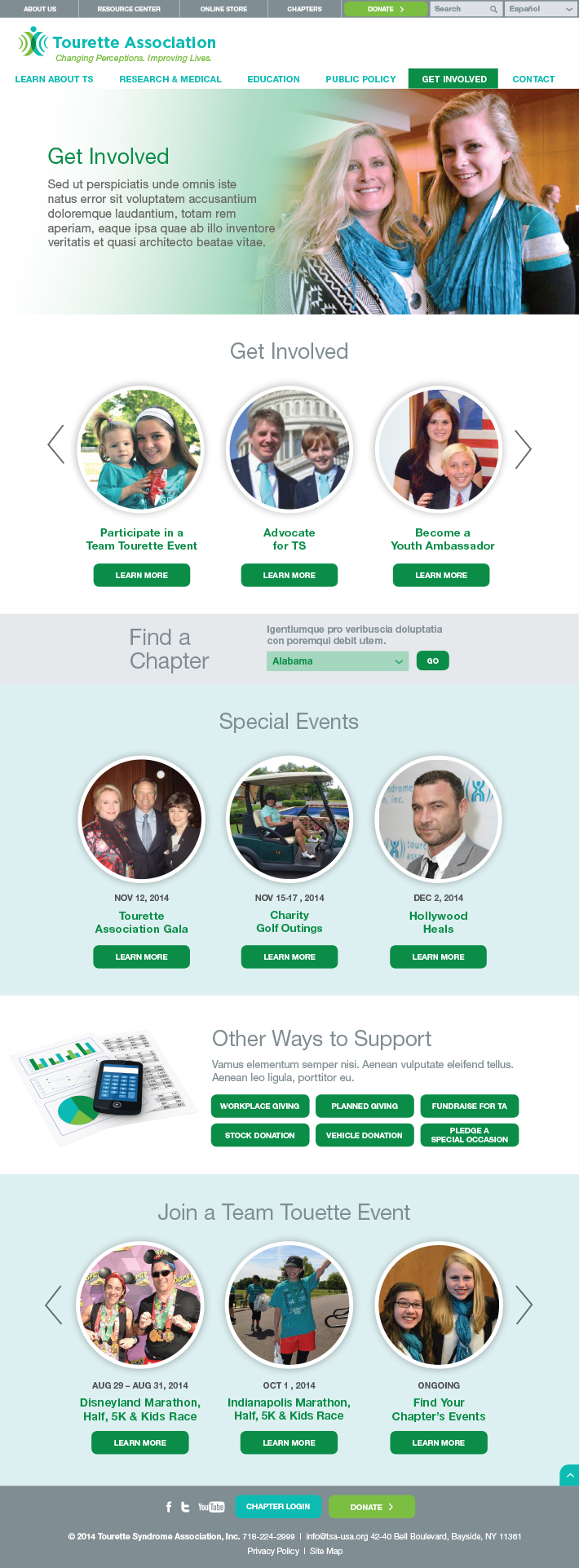
Event modules allow users to sign up and get involved with events in their area.

Get Involved

Tourette Association offers a variety of ways in which users can get involved with the organization.

TA Website Get Involved

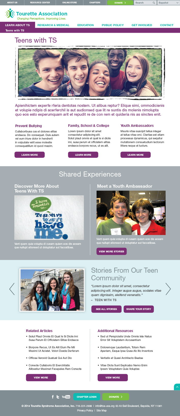
Teens with TS

Teenagers with TS face particular challenges so we created a page with information written specifically for them.

TA Website Teens

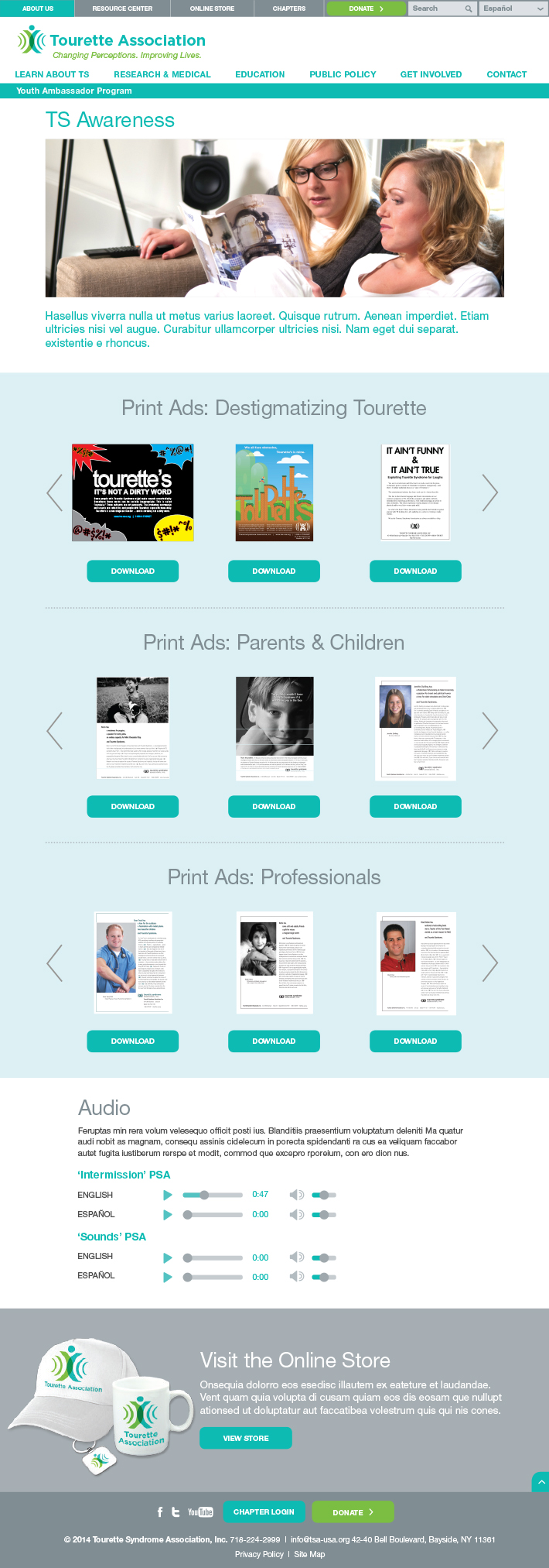
TS Awareness Main Page

Easy access is provided to publications, ads, audio lectures, and other resources.

TA Website Awareness

Advocacy Main Page

The site presents quick and easy ways to support and advocate for the Tourette Association’s issues.

TA Website Advocacy

Integration with advocacy software allows users to engage with and take action on current issues.

Action items to engage users are embedded throughout the site.

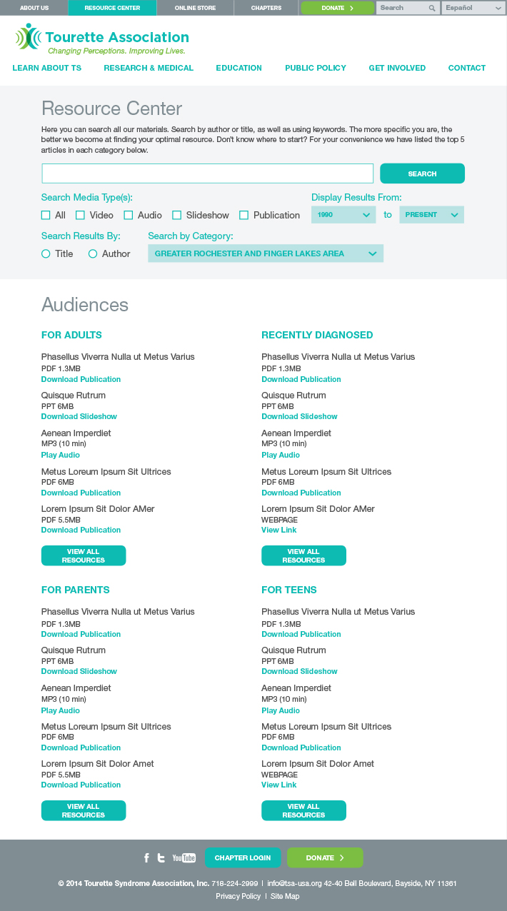
A specialized search functions allows users to filter and sort thousands of resources.

Quick link sections provide easy access to content.

Resource Center

By aggregating years of past publications, articles, videos and slide shows, the Resource Center allows users to quickly and easily search for reference materials that meet their needs and answer their questions.

TA Website Resource Center

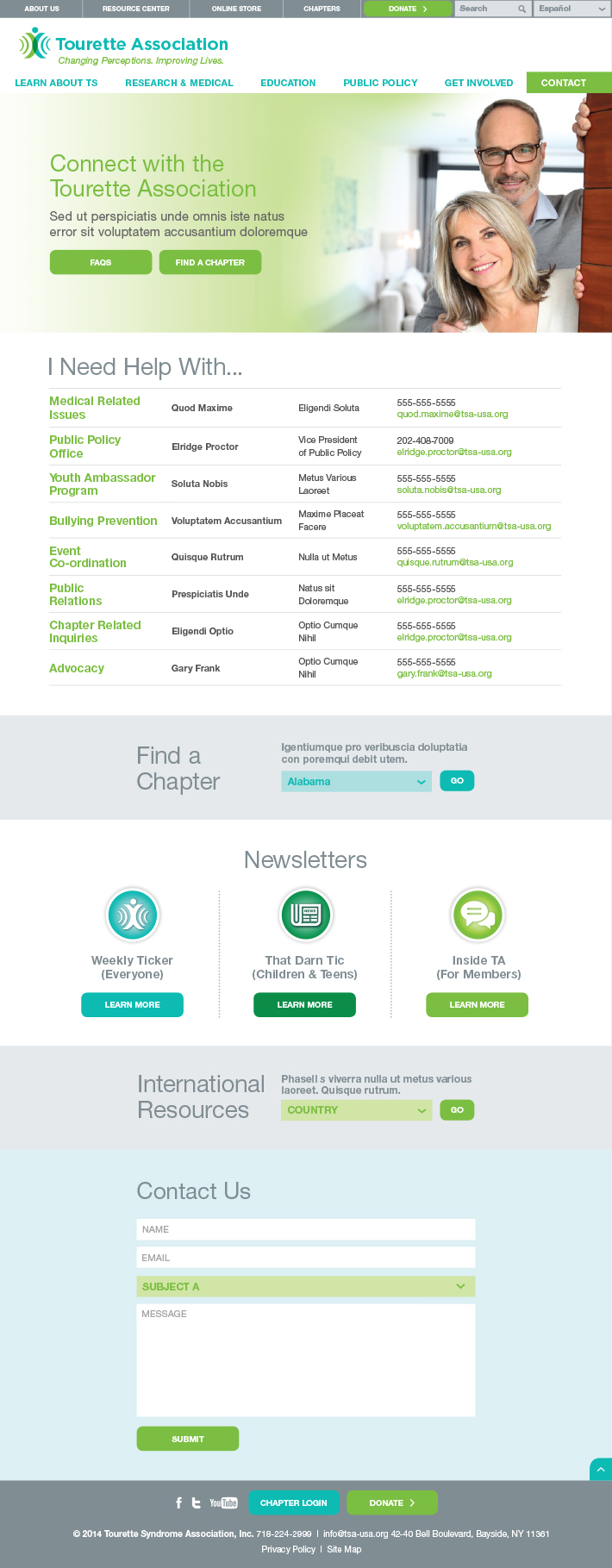
Connect with TA Main Page

With contact information, newsletters, and feedback forms built right into the site, the Tourette Association welcomes all who come to it for information, assistance, or even some friendly advice.

TA Website Connect

New Brand Helps Three Camps Merge into One

UJA Federation of New York

Camp Header_Image_R2

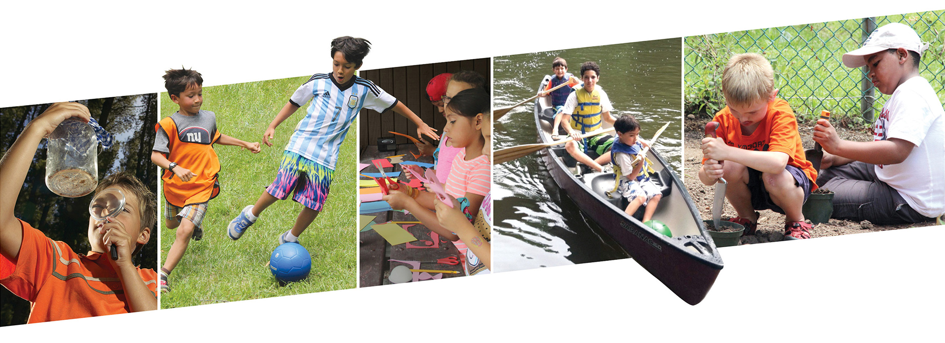
Merging Three Camps Into One Leads to Increased Enrollment

Three well-respected day camps were merging into one while introducing a new camping model. They needed to maintain current campers and gain new ones. We helped them do that.

Services

  • Discovery
  • Brand Positioning
  • Messaging
  • Naming
  • Visual Identity
  • Consumer Testing
  • Marketing Collateral
  • Website

Challenge

The three camps that make up the new camp are each long-time providers of Jewish camping experiences. One challenge was maintaining the loyalty and respect of existing supporters while igniting enthusiasm for the new organization. The additional challenge was introducing a new camp model in which campers choose one track of activities for a week at a time. The camp also had to appeal to Jewish campers without putting off non-Jewish ones. Equally important is a name that embodies the values of the new camp in a process that generates buy-in from existing stakeholders. Red Rooster Group worked with the three entities to craft a unified brand to successfully launch the new camp.

Organizations Merging Their Camps

Discoveryy

Our process began with a Discovery Phase which lays the foundation for the name, logo, branding, and marketing strategy. This provided a deep understanding of all the organizations involved in this merger and a clear picture of the potential market for the new camp. Discovery included interviews, competitive reviews, and a review of existing research that had been done for the camp merger.

Discovery Findings

Camp Similarities

The three existing camps share many attributes including position, values, and goals. Their common denominators were:

  • Commitment to quality programming and staff.
  • Dedication to Jewish values.
  • Reputation as best option in local area for the price.
  • Community, personal feel, familiarity.

Current equities: quality reputation of delivering on promise, trust, reliability, child-centric, focused, customer service and communications, ”best game in town.”

Local Differences

The research also uncovered unique differences for each of the three existing camps that had to be reconciled in the brand. For example, parents at one of the institutions based in the city felt a strong need for their children to be outside and in green space. At the entity in NJ, the population was homogeneous, contrasting with the diversity in the city. The third camp had a more educated and more Jewish/religious population.

Audiences
  • Current camper base is more than half non-Jewish or unaffiliated Jewish families.
  • Parents are looking for their child to be safe, grow, learn to be better human beings, feel good about themselves, make friends, and have fun.
  • They are looking for a camp that will provide a long day of coverage, safety, convenience, attractive pricing – many campers are on scholarships.
  • Child is engaged, busy, happy, making friends, learning, and growing emotionally.
  • Middle class working families prefer quality experience over bells and whistles.
Competitive Situation
  • Trend in short-term attendance at specialty camp instead of camp all summer.
  • Highly competitive focus on a single area in specialty camp can cause burn out.
  • Private camps are significantly more expensive, have ”brand name” instructors, many ”bells and whistles.”
  • Town camps are significantly less expensive with corresponding limited facilities and programming.
  • Competition is increasing from summer programs at schools and synagogues as well as community offerings.
New Camp Competitive Position
  • The new camp will hold a center position at the crossroads between expensive to inexpensive, and specialty to traditional.
  • Offers what the expensive camps have at an affordable price.
  • Serves campers who wants a specialty experience without giving up other activities.
  • The pre-eminent place in the area to send your child.

Group

Positioning

Goals

The camp’s marketing goal is to increase the collective camp attendance by 300 to 800 in 2015. Reaching this goal requires raising awareness of the new brand and the value of the camping experience it offers while communicating a consistent narrative about the new entity formed from three different organizations.

Brand Positioning

We wrote a brand positioning statement to set the new camp apart from other camps serving families — both Jewish and non-Jewish — in the Upper Manhattan-Bronx-Tarrytown area. In developing the new camp’s messaging, we explored the concepts from the Discovery Phase to clearly differentiate the new camp from its competitors and appeal to parents.

Brand Positioning Statement

New Camp provides your children with a well-rounded summer day camp experience where they get to choose specialty programming that interests them while also enjoying all of the other activities that you would expect from a camp. Because this new model offers campers freedom of choice, it also aids families in making the best camp choices for their children.

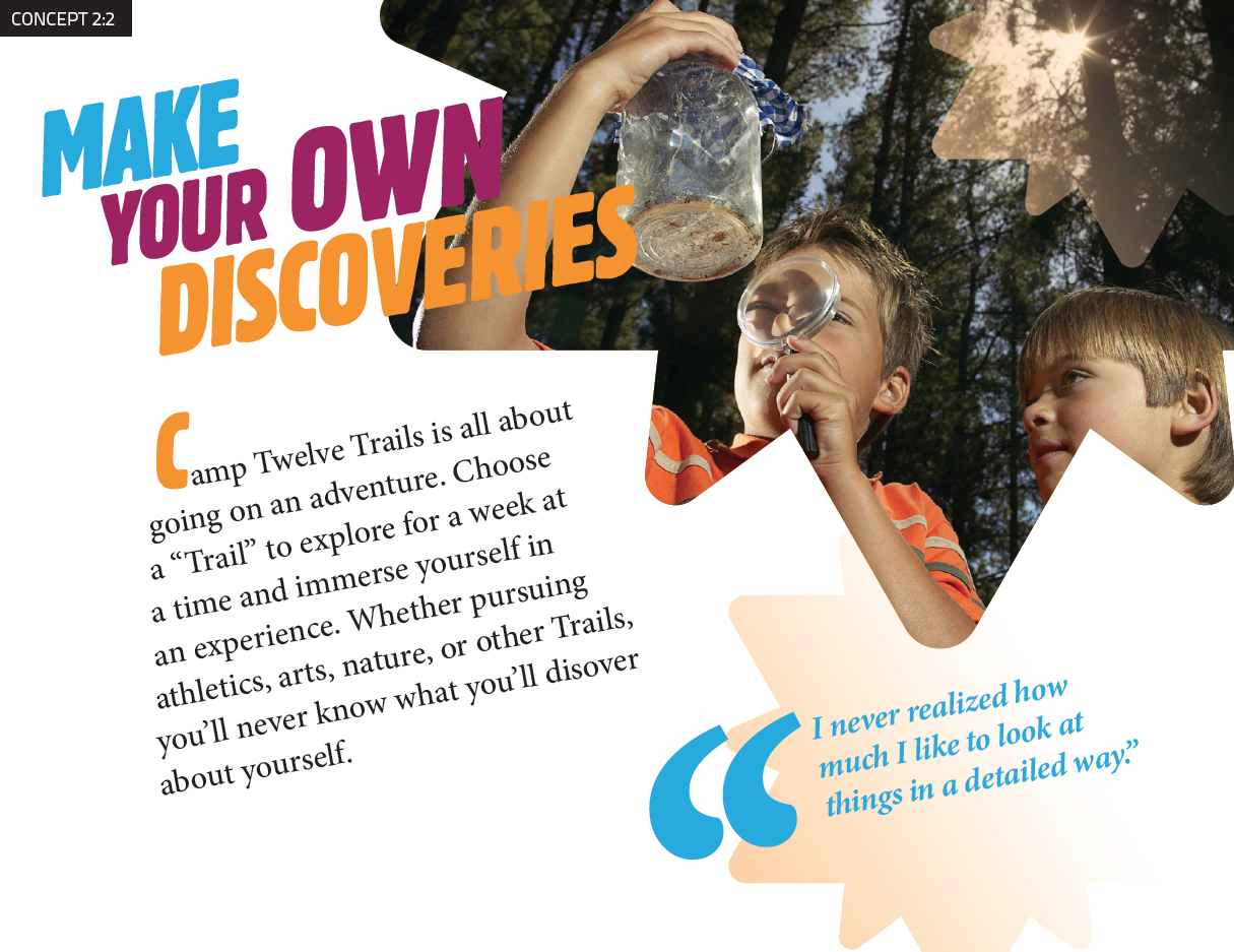
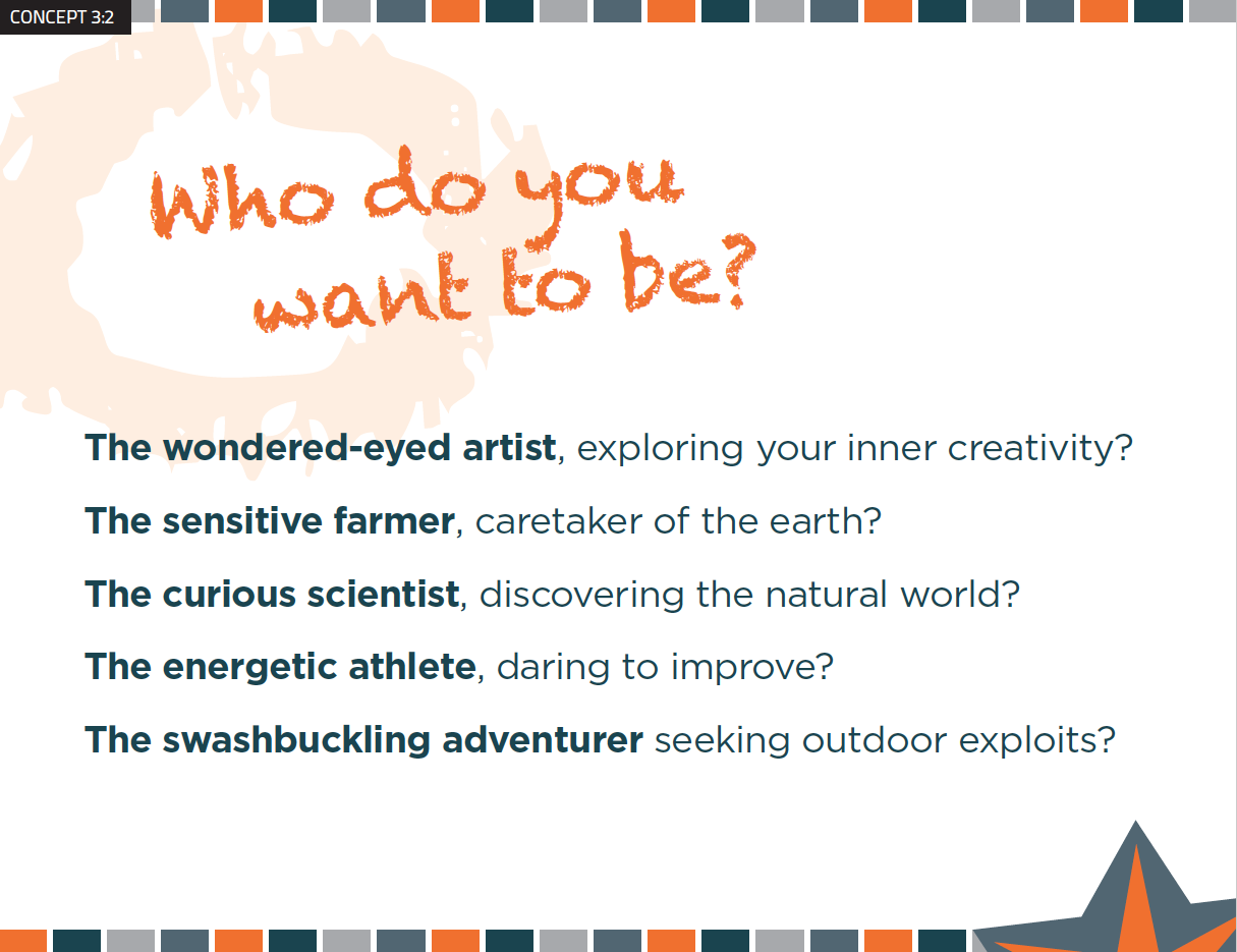
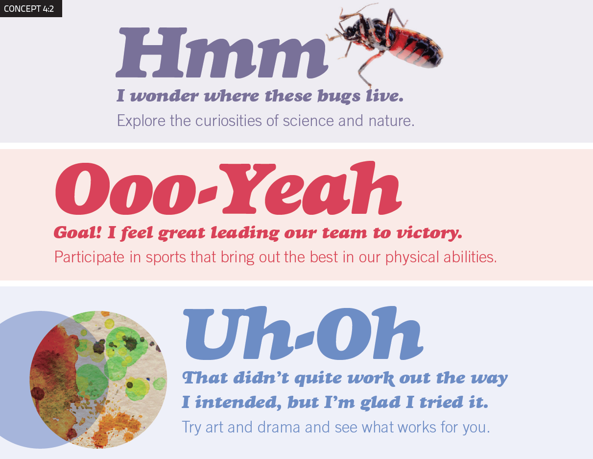
Like choosing a major at college, children select from different “Neighborhoods” or “pockets  of interest” for a week at a time, allowing them to explore new activities, learn new skills, and strengthen those they already have. This Neighborhood concept allows campers to focus on their favorite specialty area and then to explore other areas if they want to. Deep friendships evolve as the children explore these activities with others kids who share their interests. The Neighborhoods include: Fitness and Athletics, Arts and Drama, Science and Nature, Outdoor Adventure, and Farm to Table

Campers spend their time in a warm, nurturing environment where the framework of Jewish values actively teaches them to care for their bodies, the environment, and for other people.

Naming

Naming

The camp’s name is the first point of contact with parents and campers. It must convey something that makes people — staff as well as parents — want to engage with the organization. The new camp needs a name and tagline that accurately represents the new organization and can serve as a foundation for growth.

Naming Process

Our process is to generate a wide-ranging selection of names and home in on those that meet the naming criteria.

  1. We wrote a Creative Brief that described the naming criteria that had been determined through the Discovery process.
  2. We collected the names of 1,000 camps, analyzed them and found that they could be sorted into 8 different categories, providing a framework for exploring potential camp names.
  3. We then generated hundreds of name ideas for the camp, exploring a range of different types of names, from Descriptive to Evocative. The names explored how to communicate some level of Judaism without being too overt.
  4. After rounds of refinement and vetting to eliminate names that had conflicts with other entities, we presented a refined list of names for consideration.
  5. After review by the three decision-makers and others from the three entities, three names were selected for field testing.

Refined List of Names

Camp Mavenhood

Camp Mavenwood

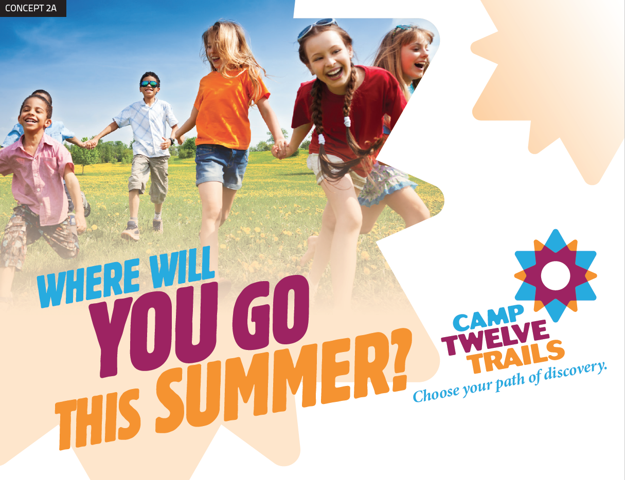
Camp Twelve Trails

Camp 12 Stones

Camp Starpoint

Camp Blue Jay

Camp Cluster

Camp Oola, Oola Day Camp

Camp Kiskadee

Camp Plentifun

Fantastikids Day Camp

Camp Visioneer

Camp WonderQuest

Camp WonderScope

Camp Wonderville

Three Names Selected for Testing

Camp Twelve Trails

Camp Starpoint

Camp Oola

Discover

Developing the Concepts 

To bring the names to life, we developed conceptual approaches for each of the names to show the logos and overall visual direction for the marketing materials.

Camp Moodboard 2-1
Camp Moodboard 2-2
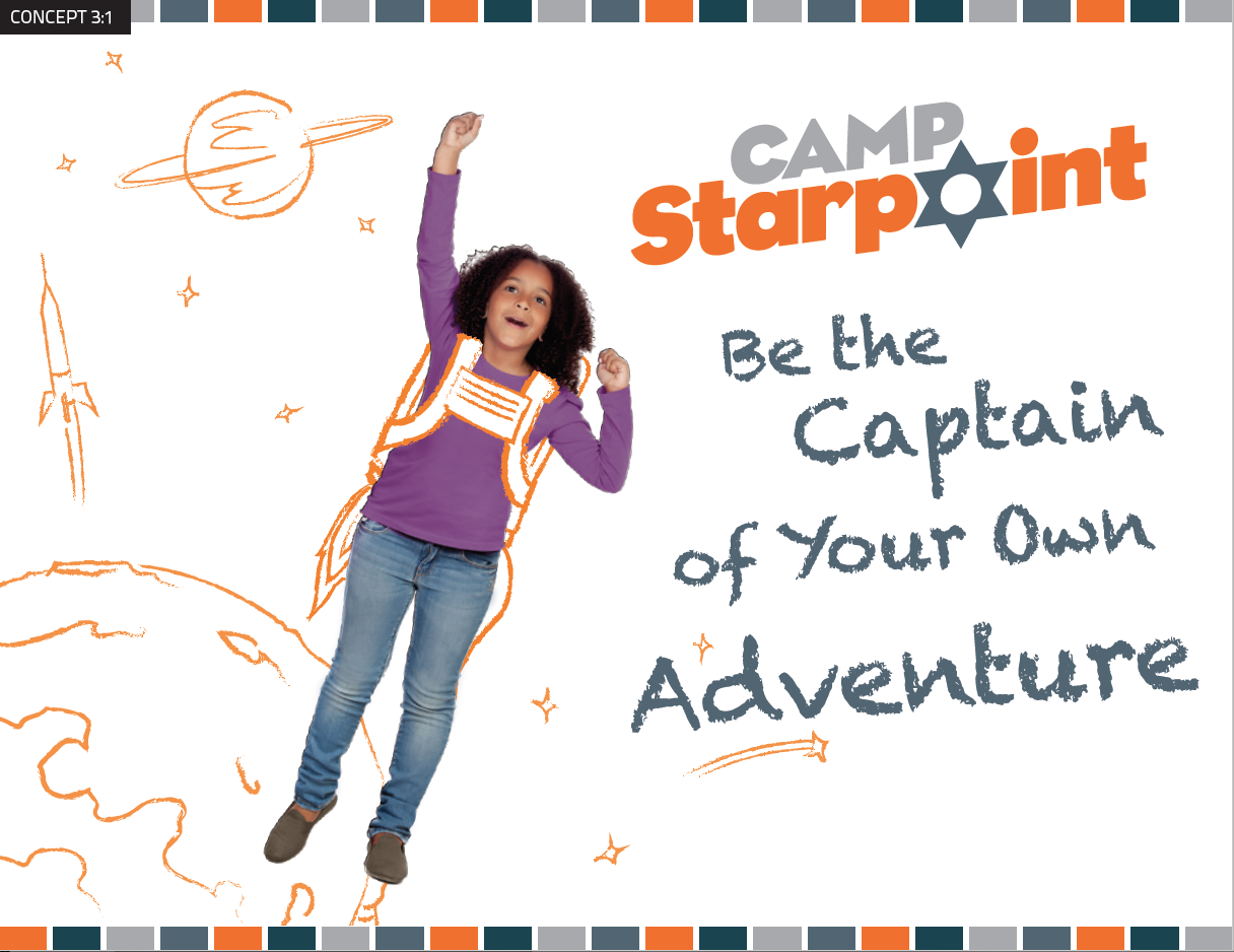
Camp Moodboard 3-1
Camp Moodboard 3-2
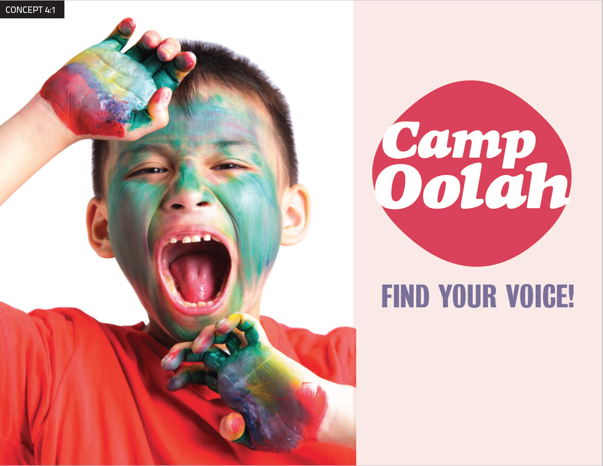
Camp Moodboard 4-1
Camp Moodboard 4-2

Getting Parent Feedback

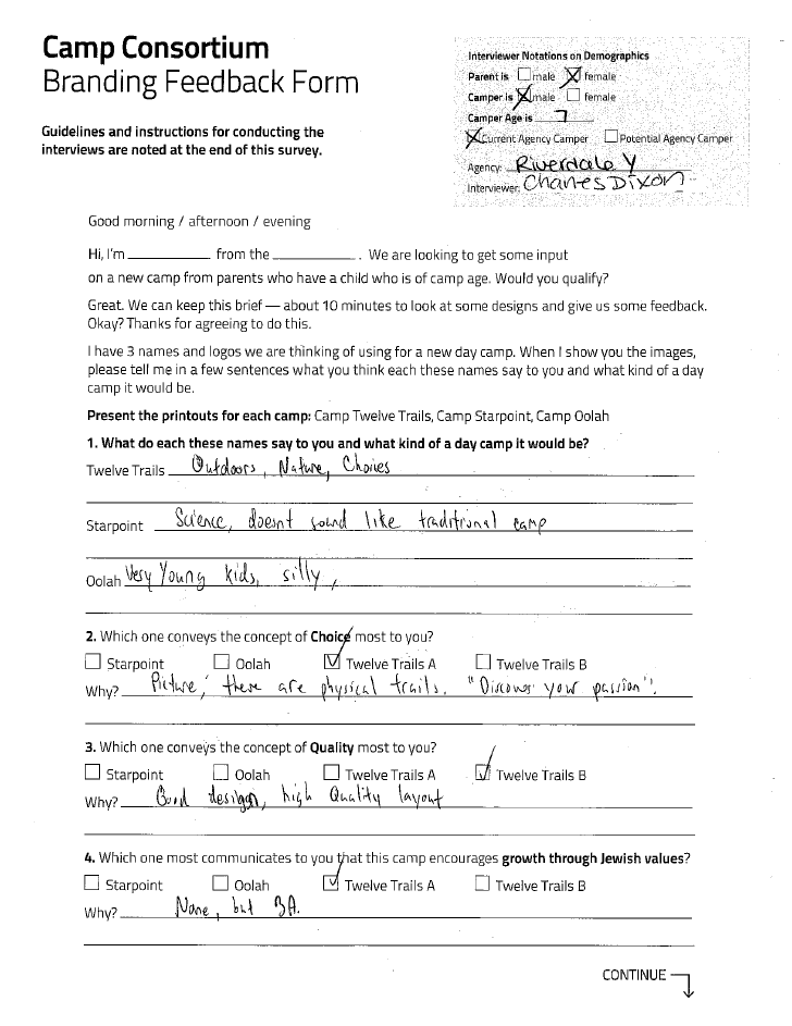
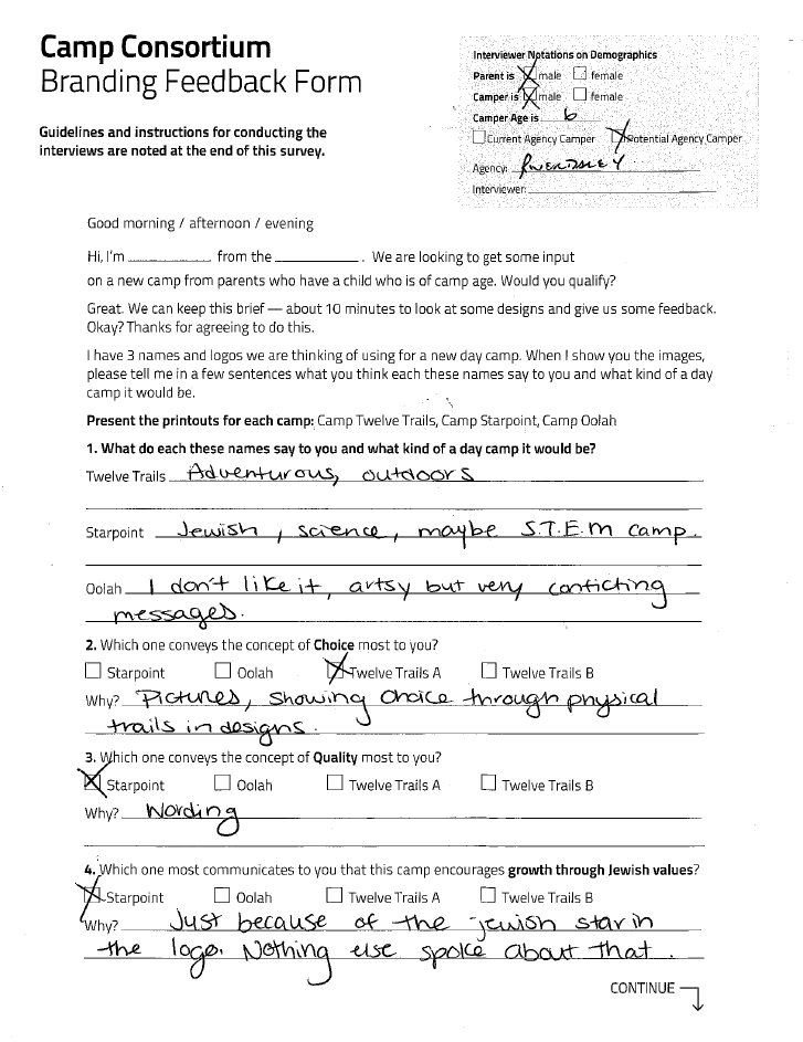
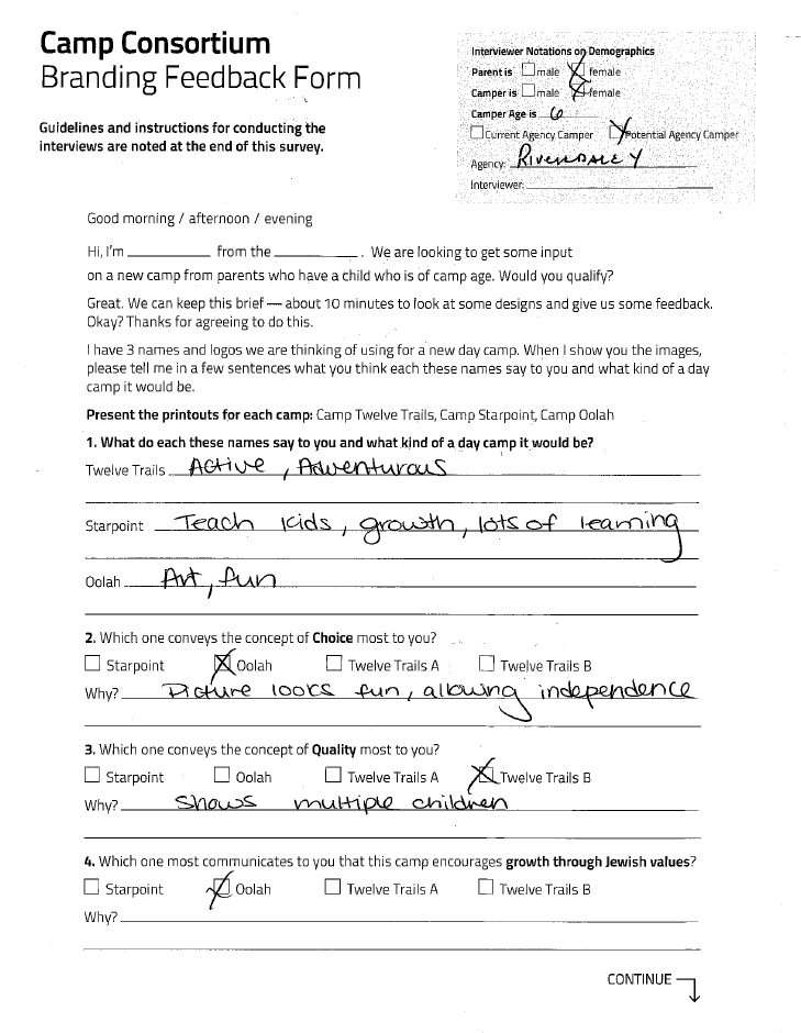
We gathered feedback on the concepts from parents at the venues. The questionnaire was carefully crafted to ask people to rate the concepts based on how well they met specific criteria, allowing us to evaluate which concept best met the camp’s needs rather than just gathering subjective opinions.

Camp Feedback 6
Camp Feedback 5
Camp Feedback 4

Selected Name & Visual Approach

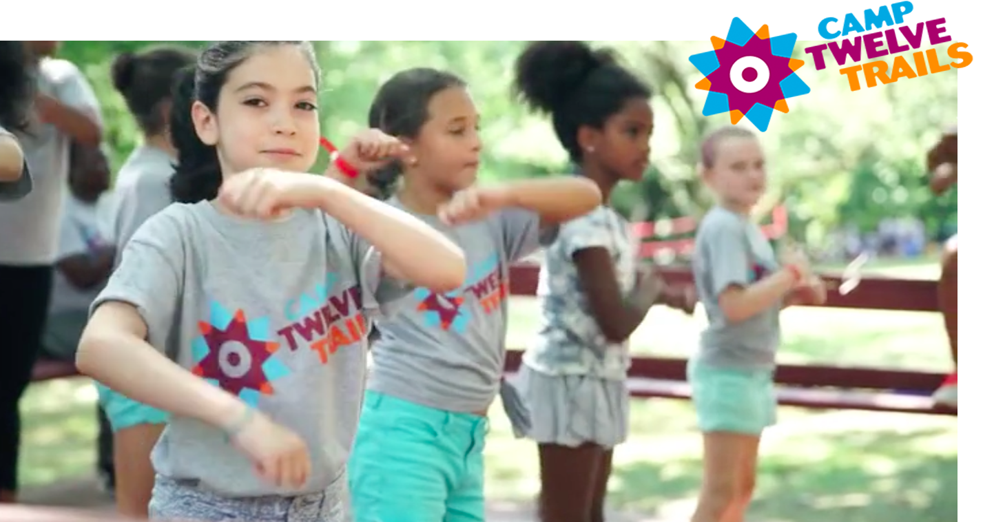
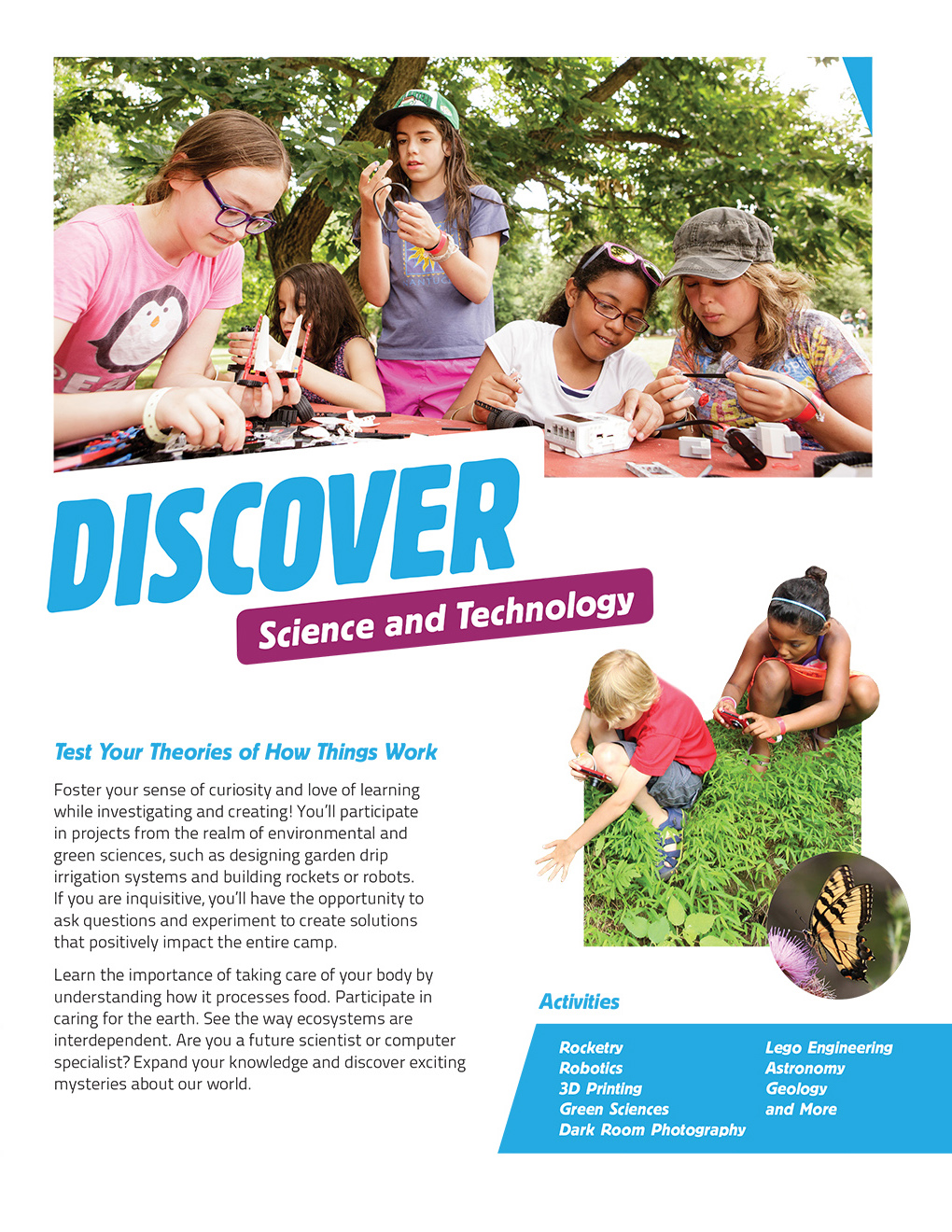
Camp Twelve Trails was the name chosen to best convey the array of choices and adventure that campers face, with a subtle reference to the twelve tribes of Israel. A sense of Judaism is also subtly conveyed in the logo — two overlapping Jewish stars create a compass with 12 points.

Camp Selected Concept

Brand Manual

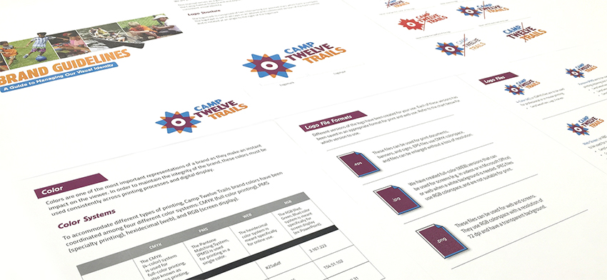
To help the camp manage their brand, we developed a Brand Manual that describes the brand elements and shows correct and incorrect ways to use the logo. The package also contains a full set of logos created for use in print and online.

Camp Brand Manual

Brochure

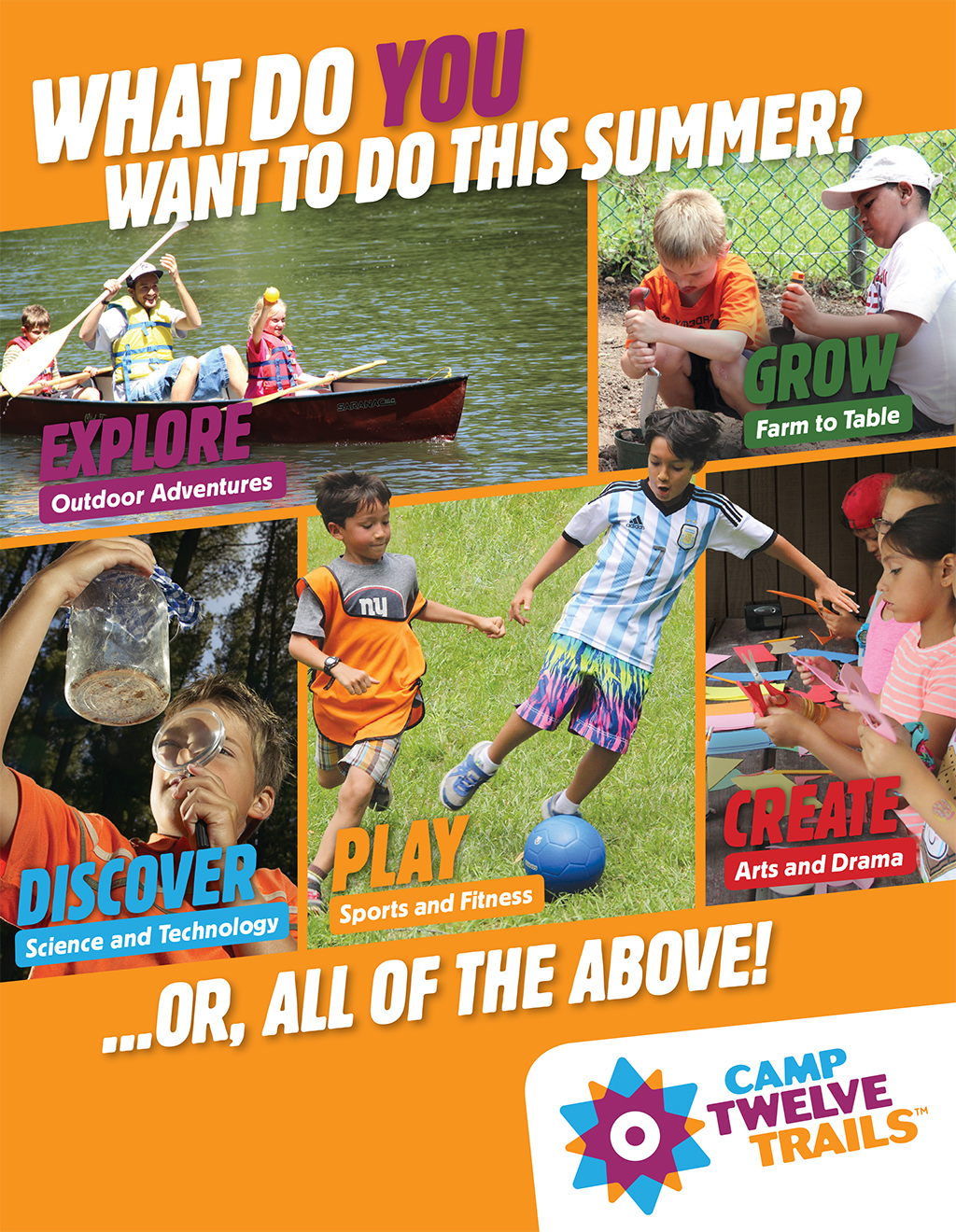
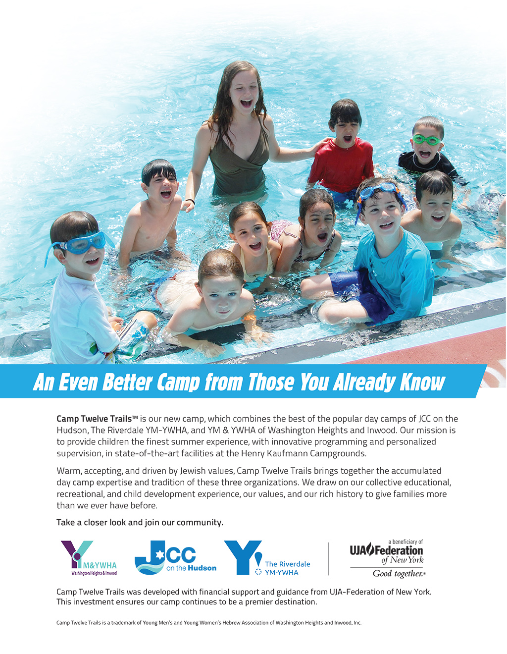
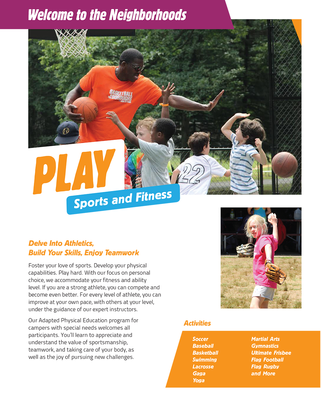
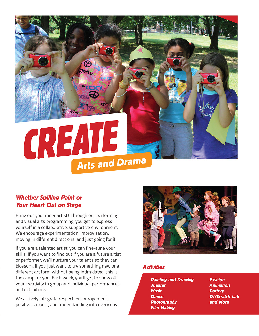
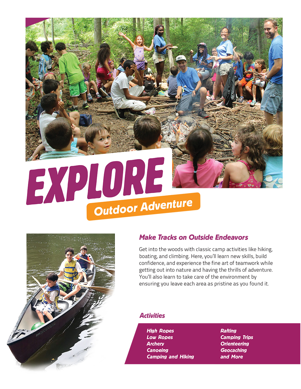
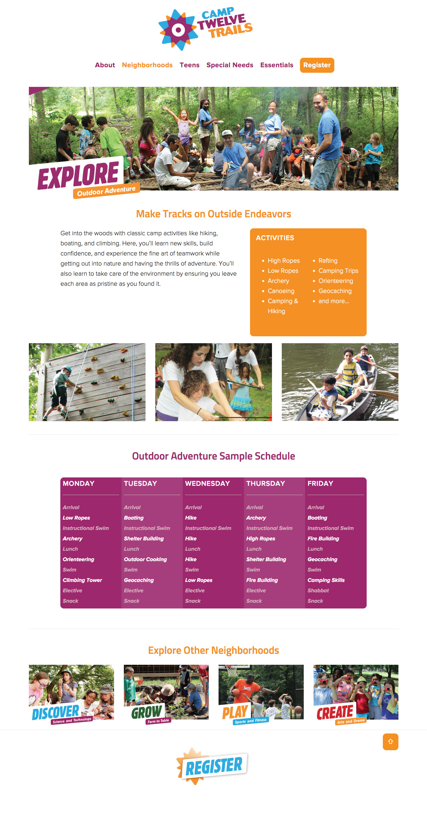
We wrote and designed a brochure to showcase the camp’s unique Neighborhood model, which allows campers to select one specialization for a week at a time. The brochure addressed the issue of connecting to the three merging organizations, and addressed the camp’s Jewish values in a section called Our Philosophy. The visual look of the brochure established the look for the website.

YMHA Brochure Cover
C12T Brochure Back
YMHA Brochure Play
YMHA Brochure Discover
YMHA Brochure Create
YMHA Brochure Explore

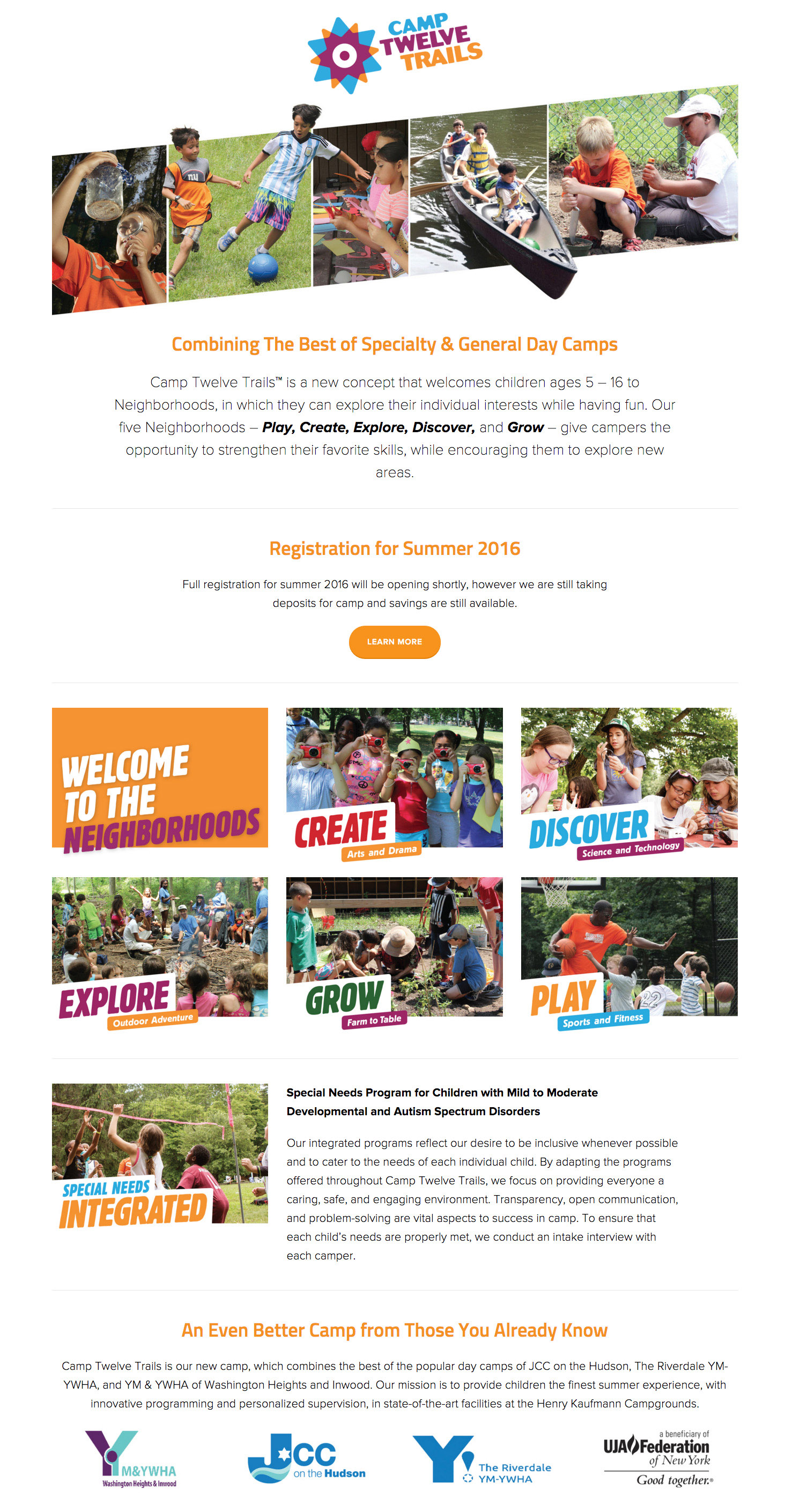
Website

As the first point of contact with many potential campers, the website showcases the new identity and makes a compelling case that positions the Consortium as a singular camping experience for Jewish and non-Jewish children. We created an engaging design to capture people’s attention while maintaining a professional, unified look for the organization that is consistent across the website and reinforces the brand messages.

The website features visual storytelling to showcase the vibrancy of the programs and tell the stories of campers. A clean navigation and user experience let site visitors easily find the specific information they need. Templates allow flexibility in the management of the site moving forward and responsive design adapts to tablets and mobile devices.

New Brand Helps Three Camps Merge into One

Results

The new camp has been successful in attracting campers.

In the first year, the new camp exceeded the combined registrations for the 3 camps from the prior year. The camp has received the most early bird registrations they have ever received with 205, compared with 180 the previous year.

Early Bird Registrations

205 in first year of new camp

180 previous year

Renaming a National Nonprofit Organization and Its Programs

Partnership With Native Americans

Renaming a National Nonprofit for Increased Fundraising Impact

The country’s largest charity supporting Native American communities came to Red Rooster Group to address its brand challenge — its fundraising sub-brands were generating diminishing returns. Our comprehensive assessment and new naming strategy returned the organization to fundraising profitability within 6 months.

Services

  • Brand Analysis
  • Competitive Analysis
  • Stakeholder Interviews
  • Brand Positioning & Messaging
  • Naming
  • Field Testing & Surveys
  • Visual Identity System
  • Brand Style Guide

Challenge

Key Issues

  • The parent name did not reflect the mission of the organization and had little recognition outside the current donor base.
  • Multiple program areas had separate brand identities which confused donors and cannibalized revenue from each other.
  • Combining names might result in lost revenue.

Objectives

  • Re-position the parent organization while reducing the confusion caused by the many operating brands.
  • Better distinguish the organization from similar organizations so it becomes the charity of choice for donations to Native American causes.
  • Implement the new brand without negatively affecting fundraising efforts.

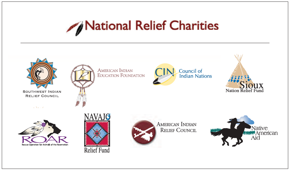
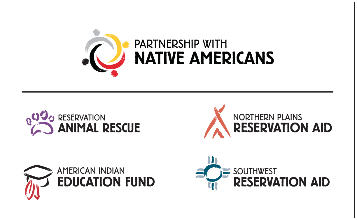
BEFORE 

AFTER 

Research

Our research phase included:

  • Reviewing Existing Research: We started by assessing the fundraising base and demographics to gain an overview of how NRC raised funds through direct mail and telemarketing, and with an extensive breakdown by program type and donor analysis and trends.
  • Competitive Review: We looked at more than 100 Native American relief and related organizations to understand the dynamics of the landscape.
  • Brand Workshop: This session with the organization’s leadership provided the opportunity to share NRC’s history as it pertained to moving the brand forward, explore NRC’s brand uniqueness, and clarify the issues and expectations around the naming the organization.

Name Development

Creative Brief for the Name

Before generating names, we wrote a Creative Brief to get everyone on the same page about what the name should accomplish and to list the criteria and considerations for the name. The Creative Brief included Image Criteria, Functional Criteria, Directional Naming Considerations, and the Decision-Making Process for choosing the name. We also wrote a Brand Statement that summarized what NRC is all about in order to provide direction for generating names.

Generating Names

We explored broadly generating names for the parent brand, developing Descriptive and Evocative Names, names that were literal, benefit-oriented, metaphorical, and action-oriented. We discussed the initial list of names with the client to assess the types of names that would be suitable. It was determined that Descriptive names would best work for the organization and that the word ”partnership” resonated as a leading term.

We discussed the initial list of names with the client. The goal at this stage was to assess the types of names that would be suitable. It was determined that Descriptive names would best work for the organization, and so the Evocative names were discarded. The word ”partnership” resonated as a leading term.

Testing

We tested the names in the following ways:

Interviews

We conducted 18 in-depth interviews with a range of constituents to generate qualitative feedback on three primary themes and name options, in order to determine which resonated best with key stakeholder groups.

Surveys

We conducted a randomized survey of NRC’s internal donor base to field-test the appeal of various parent names and get insight into program loyalties. Variations of the survey were created for donors to each of the eight sub-brands. More than 700 donors completed the surveys.

Sub-Brand Naming

Assessing the Sub-Brands

A goal of the re-branding effort was to consolidate its eight program sub-brands in a way that both supported the new parent name while preserving the funding appeal of the organization’s three primary focus areas:

  • Geographic Focus (Plains, Southwest)
  • Type of Service (health, medical, economic, education)
  • Long vs. Short-term Impacts (capacity-building vs. short-term relief)

In considering directions for the sub-brand renaming strategy, we evaluated the strengths and weaknesses of each program name and focus of service and made recommendations for the sub-brands based on the findings that:

  • Donors had stronger allegiances to the general mission of supporting Native American communities than to any particular program.
  • Certain programs (e.g., animal care) had significant name recognition and loyalty.

Visual Identity

Developing a Brand Architecture

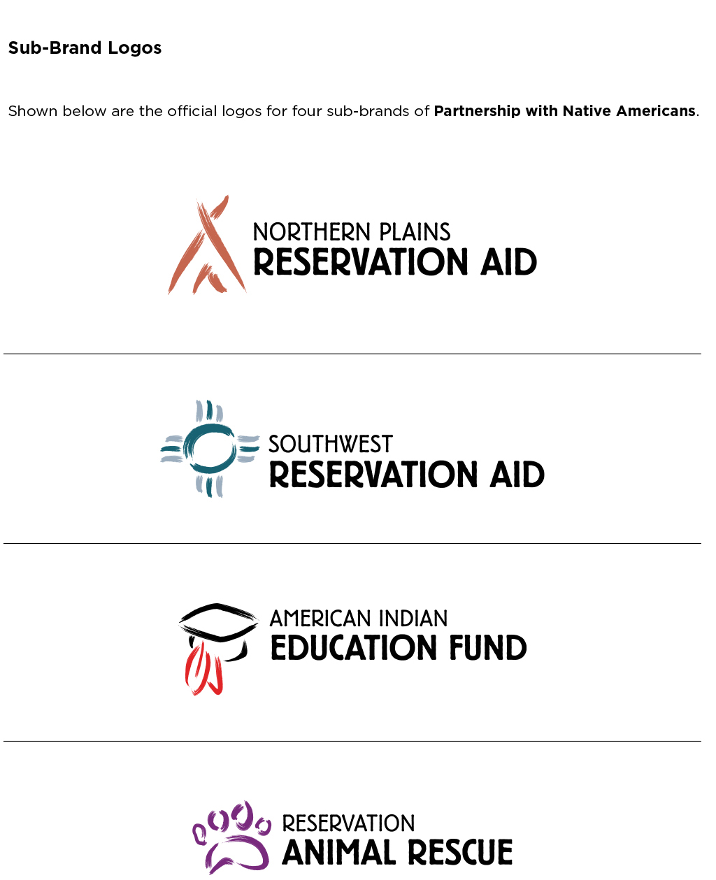
After the names had been established, we started designing a brand architecture that unified the parent brand and its sub-brands into a cohesive brand family that could be easily recognized by supporters of all the programs. This would allow the organization to take credit for all of its programs and expand its fundraising appeal.

Given the task of building out the sub-brand logos in a way that connected them with the parent logo, we rendered the medicine wheel concept with brush strokes, allowing us to use that style for the sub-brands to create a consistent look across the organization. We then explored colors that would best represent each of the sub-brands.

PWNA Main Logo
PWNA RAR Brand
PWNA AIE Brand
PWNA NPRA Brand
PWNA SRA Brand

Brand Manual

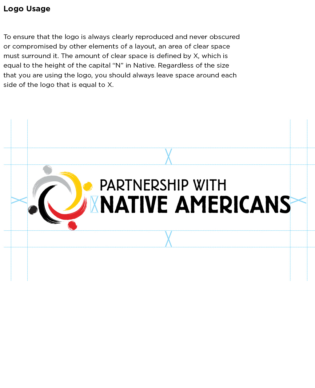
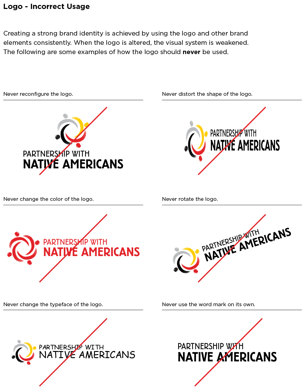
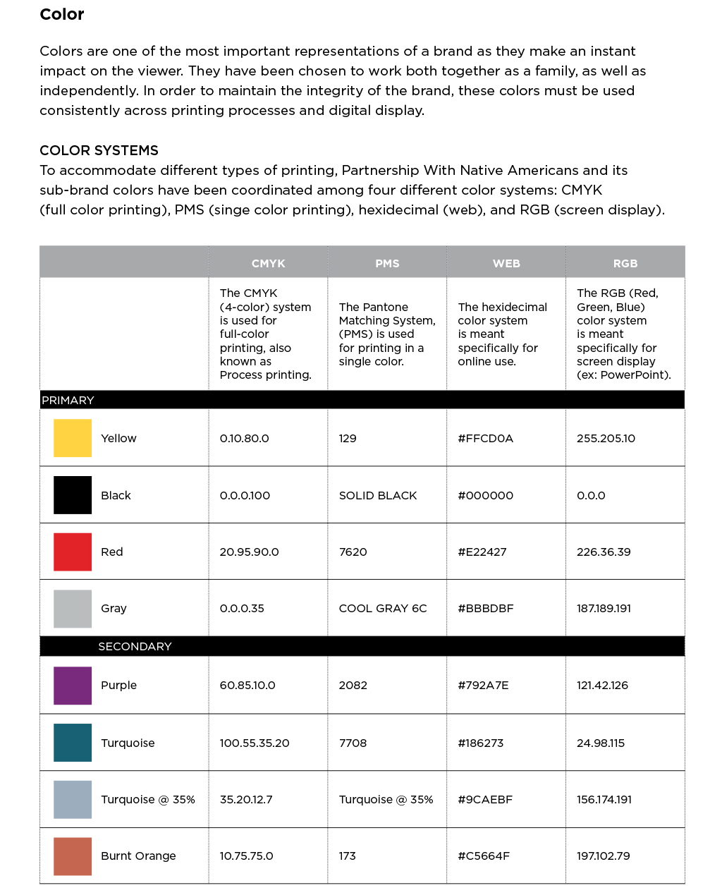
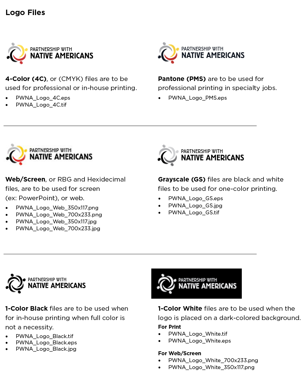
Once the logos were finalized, we developed a Brand Manual that included the brand elements and usage guidelines.

PWNA Brand Guidelines 1
PWNA Brand Guidelines 2
PWNA Brand Guidelines 3
PWNA Brand Guidelines 4
PWNA Brand Guidelines 5
PWNA Brand Guidelines 6

Outcomes

By reducing the number of sub-brands that it uses for fundraising, the organization was able to consolidate its fundraising efforts, cut the amount of direct mail it sends in half, and reduce costs significantly.

“Within the first six months, our brand awareness achieved parity with our old brand that had been used for 25 years.”

“We chose Red Rooster Group to help us develop a brand identity with maximum impact. They were quick to grasp our business and highly respectful of the unique culture and tradition of the Native American communities we serve. Our new name – Partnership With Native Americans – helps donors, the media, and the public understand that we partner with and invest in Native American communities. Having our brand immediately associated with our work and easily found through Internet searches is helping us achieve our mission by connecting us with those interested in Native causes.”

“We applaud Red Rooster Group for their exceptional guidance on this critical investment.”

— Robbi Rice Dietrich, President, Partnership with Native Americans

Naming, Branding & Brochure for New Child Welfare Peer Learning Initiative

Annie E. Casey Foundation

Transforming the Way Child Welfare Agencies Provide Services

Launching a peer learning initiative for the social service sector.

Services

  • Discovery
  • Brand Positioning
  • Messaging
  • Naming
  • Visual Identity
  • Marketing Collateral

The Annie E. Casey Foundation wanted to help more of its grantee organizations update their approach to a community-based model of supporting children. They tapped into best practices used by organizations to launch a new peer-to-peer consulting service. The goal is to pair organizations that want to adopt those practices with the providers that exemplified them.

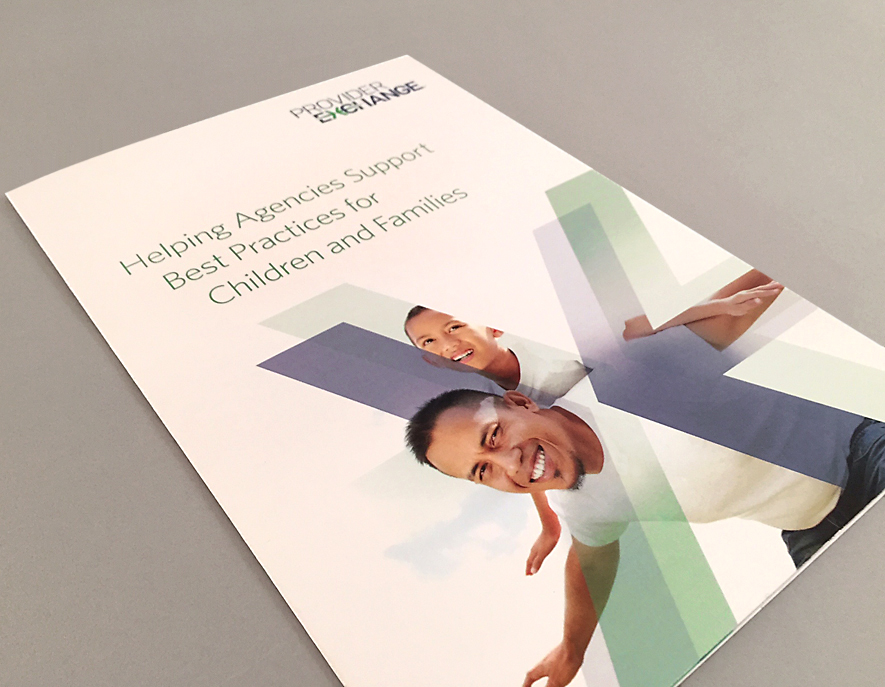
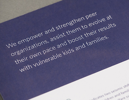
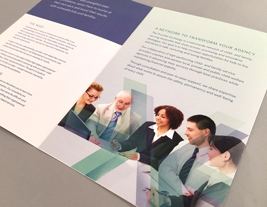
Red Rooster Group laid the groundwork with discovery and messaging for the initiative, developed the name, Provider Exchange, created the logo, and wrote and designed the brochure to launch the initiative.

Discovery

The Need for the Provider Institute

  • To provide support for organizations that are trying to evolve, keep up with the changing needs of those they serve, and respond to recent research in the field.
  • To provide both the tutorial and cultural transformation support – how to achieve practice improvement and innovation.
  • To provide an opportunity to open eyes to other options and help change their thinking – helping organizations see possibilities.
  • To share best practices and help guide implementation.

Audiences

  • Executive Directors / CEOs
  • Boards
  • Foundations
  • Donors
  • Nonprofit Staff

Provider Institute’s Advantages

  • Provides agencies with a trusted source to turn to.
  • Provides “the playbook” and the people to provide specific guidance.
  • The Providers are doing the work every day, so they understand all the ramifications and can steer others around the pitfalls.
  • We will be one of the few to have done the work with hands-on knowledge.
  • Bringing very relevant work to the sector.

Primary Messaging Concepts

Transformation

The Institute’s fundamental goal is to help agencies transition to residential care to family-based care that may begin with short-term residential treatment.

Peer-to-Peer Support

Connecting agencies directly with high-quality technical assistance and guidance on best practices from fellow agencies.

Family-Centric Care

Focused on helping each child grow and succeed; individual nurturing.

Effective Solutions

Building capacity and effectiveness within agencies to help them improve outcomes and succeed financially.

Key Message Points

  • Each provider has specific areas of expertise and is committed to sharing information about transformation in their agencies with their peers.
  • The intention is to scale up practices that are effective.
  • Hands-on advice from those who have done it. About practical implementation, not just theoretical. Documented in robust toolkits.
  • Peer consultations can be individualized to the needs of each agency in a way that is sensitive to agencies’ concerns about change.
  • Targeted to organizations that are ready for a transformation.
  • Provides different entry points for agencies to engage in the process.
  • Providers work collaboratively with other agencies to meet a transformational goal.

Boilerplate Language

Descriptive

The Provider Institute, a group of successful child welfare agencies with specific areas of expertise, is committed to sharing information and providing practical, peer-to-peer support to help fellow agencies make needed organizational changes. The objective is to scale up the most effective practices in community-based care that improve services and outcomes for youth and their families. By providing hands-on support, one Institute provider helps one agency identify and leverage particular services that can best facilitate change over time.

The Provider Institute, a unit of the Annie E. Casey Foundation and the only organization providing this kind of peer-to-peer support, is dedicated to helping agencies achieve better results more quickly and to drive needed change throughout the sector.

Narrative

Child welfare agencies that recognize the value of providing care for children in family settings rather than in congregate care may face a difficult time in transitioning their agencies to this model of service. Facing boards and donors that may be concerned about change and leadership that may lack the knowledge of how to usher in transformation, agencies don’t know where to turn for help.

Until now.

Understanding that agencies would best learn from each other, the Annie E. Casey Foundation marshaled its expertise in the child welfare sector to bring together the best practices for nonprofits around the county that have undergone this transformation themselves. The selected agencies will provide hands-on assistance through “modules of excellence” in service models and administrative functions to other agencies looking for this help.

Called the Provider Institute, this is the only entity providing peer-to-peer support in the sector — an empowering way for organizations to engage in change through the entry point that is best for them, and to learn in a way that respects the needs of their individual organizations.

The approach of working one-on-one with agencies around the country is intended to inspire a sea change across the child welfare landscape, ultimately resulting in better opportunities for tens of thousands of children to recognize their full potential.

Naming

Naming Criteria

Should
  • Should position the Institute as a different type of entity (not a nonprofit organization).
  • Should connote peer-to-peer learning (or at least not contradict that – not emanating from a single source).
  • Focus on outcomes.
  • Should be “practical” and about real change and implementation.
Should Not
  • Should not use the word “training.”
  • Should not sound like the name of a child welfare nonprofit agency or association.
  • Should not be associated with Annie E Casey Foundation.
Can
  • Can be an evocative name, but also wants to see names that are slightly descriptive.
  • Can potentially use a metaphor.
Considerations
  • May need to work under the auspice of the Association of Children’s Residential Centers.

Basic Types of Names and Taglines

Descriptive: Names that state the message simply and clearly (Children’s Aid Society, Marin Abused Women’s Services)

Evocative: Names that suggest the message emotionally or psychologically (Kickstart International, Crossroads, Kaboom!)

Abstract: Names that attract the demographic without addressing the message directly, or perhaps not at all (Lighthouse International, Apple, Xerox, Amazon)

The names we are initially exploring for the Provider Institute fall into the Descriptive to Evocative range. Since a name and tagline must work together and complement each other, the following strategies will help us to determine how the two elements can work together.

Viable Name and Tagline Strategies

Typically, a more evocative name might be paired with a more descriptive tagline, and vice versa. And sometimes a descriptive name is paired with a descriptive tagline, thus creating a further level of messaging.

Here are examples of how these three strategies might work for the Provider Institute. The name examples, below, are just that, examples of types of names to illustrate the strategies. The taglines also have been composed just for this illustration, and have not gone through a process of creative development.

Evocative Name with Descriptive Tagline

InterStrength

Providers sharing best practices for optimal outcomes.

Descriptive Name with Evocative Tagline

Progressive Providers Network

Strategizing a better future for every child.

Descriptive Name with Descriptive Tagline

Best Care Collaborative

An inter-agency network of progressive care providers.

Initial Name Ideas

This initial list of naming ideas can be used to gauge your expectations and preferences for the main messaging concepts to be conveyed, the types of names preferred, and specific words that resonate, resulting in a direction to pursue for the next round of name exploration.

Peer to Peer

Peer Exchange

PracticeShare

PeerShare

PeerVision

InterShare

ActionPact

Practice Sharing Institute

Field Practices Network

Agency Practices Network

Effective Solutions

Best Care Collaborative

Best Practices Collaborative

Effective Practice Advocates

Child/Family First

Transforming

Transition Partners

Progressive Providers Network

Progressive Practices Exchange

Care Evolution Institute

Catalyst Collaborative

Peers Forward

New Vision Network

Outcomes

Advocates for Better Outcomes

Best Outcomes Initiative

Brighter Futures Institute

Safe & Well Net

Going Home

Selected Name: Provider Exchange

Visual Identity

Results

After a successful first year, the program is now serving a new cohort of organizations, including member agencies of Lutheran Services in America.

“Our partnership with the Provider Exchange® provides technical assistance on models of care and strategies that truly make a difference in the lives of older youth. We are excited about the learnings that will come from this group and the opportunity to share these findings more broadly with our members and the Harvard Kennedy School.”

— Charlotte Haberaecker, President, Lutheran Services in America

Education Nonprofit Rebrands for Greater Awareness

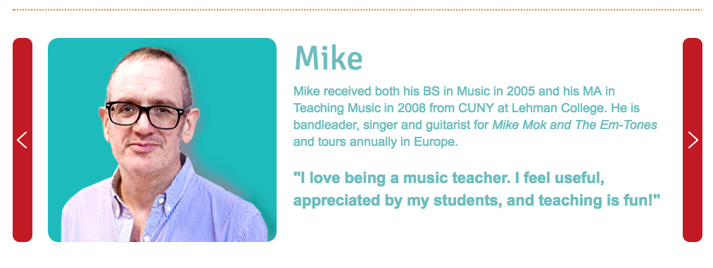
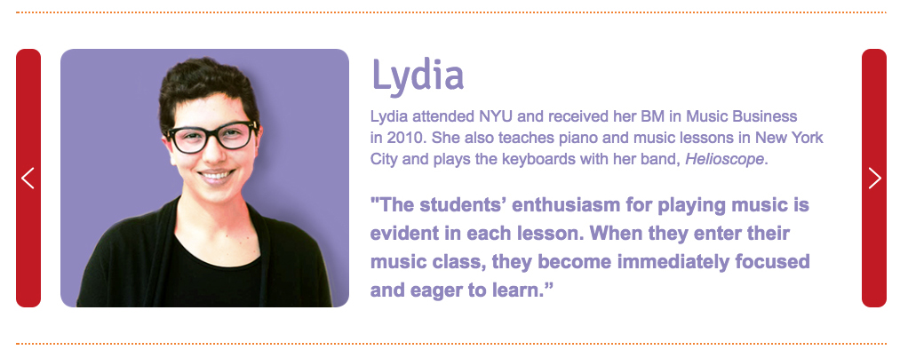
Musican

Musican Header

A New Brand Boosts an Educational Organization

A powerful new name, mission, and website created a professional face for this young organization that improves awareness and fundraising results.
Services

  • Leadership Discussions
  • SWOT Analysis
  • Brand Positioning & Messaging
  • Organizational Naming
  • Visual Identity
  • Brand Style Guide
  • Website Writing, Design & Development
  • Fundraising Campaign

The CWB Foundation for Children and Music provides music instruction for students in New York City public schools that lack funding for arts programs. Red Rooster Group developed a new name, visual identity, message, and website to rejuvenate their brand so that it could attract more donors.
Old Name & Logo

New Name & Logo

Market Research

To understand what makes The CWB distinct among other music programs in New York City public schools, we conducted a comprehensive competitive review and SWOT analysis.

We discovered CWB is the only program in New York City offering music that is culturally relevant to the students, which can make a big difference in how kids perceive and participate in the program.
Goals

We helped the organization to define its vision and develop its goals:

1. Expand the program from three schools to six schools in New York City in the next two years.

2. Expand the organization’s fundraising base and double revenue in three years.

To achieve these goals, we energized the Mission Statement by including the outcomes: equipping students with the discipline, confidence, and team-building skills necessary to reach their full potential.

Naming & Visual Identity

The next major area to tackle was the name.

The CWB Foundation for Music & Children was long and cumbersome, and mischaracterized the entity as giving money away rather than providing programs. A new name needed to convey a positive and inspiring message about the benefits of music.

After writing a Creative Brief to ensure what everyone was on the same page about what we were aiming for, we generated a list of 200 names. We culled the list down to 12 that best represented the mission:

Benefit Oriented Combined Multiple Word Coined
Brighter Beats LifeChords FutureBeat Music MusiCan
Keys for the Future SongRise Momentum Music Posibeats
Lifenotes Kids PlayChime Sound Unbound Posikidity

The chosen name, MusiCan, suggests that music can be empowering to children.

The name was brought to life with a vibrant, contemporary, and friendly logo that evokes the youthful energy of the program

Website

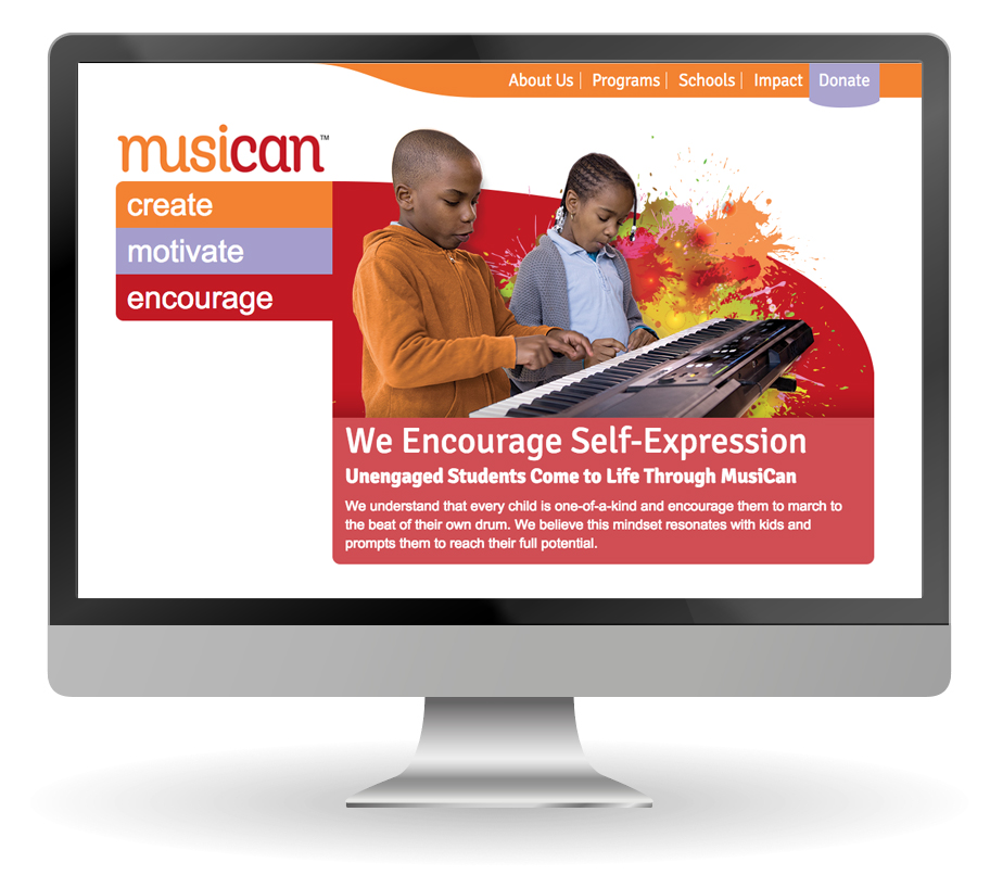
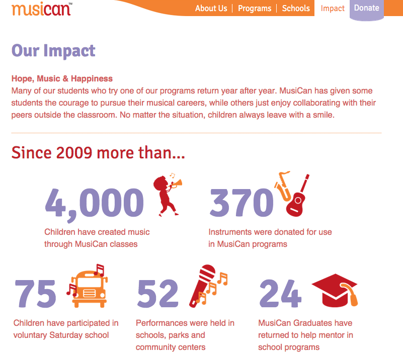
The website we created tells how music can empower children to achieve more, showcases the program, features testimonials, and describes the organization’s impact.

“Red Rooster Group impressed us at every turn. They provoked us to think deeply about our work and how we wanted to present ourselves to the world. Their systematic approach, as well as intrinsic understanding of our values and aspirations, enabled the team to hit the ball out of the park on the first try with every single creative aspect, from naming our organization, to branding our image, to fashioning our website. Our experience has been flawless. We are thrilled with the results.”

LISA WIXON, Director of Operations
, MusiCan