CLIENT: Grafton
Providing services for people with a range of mental disabilities including autism, Grafton School was perceived as the last resource for help. With three locations in Virginia, the organization was calling out to be rebranded as a regional powerhouse in behavioral healthcare. Red Rooster Group repositioned Grafton as a centralized source for hope in the Mid-Atlantic region. We updated an old tagline and introduced a new visual look.
Brand Architecture
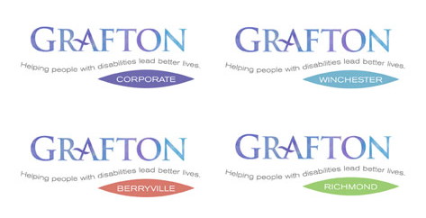
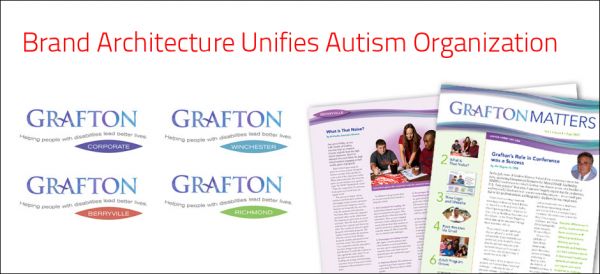
Our research uncovered that one of Grafton’s strengths, the specialized expertise and dedication of its staff, was not being conveyed. We shortened the official name of Grafton School to Grafton and established a brand hierarchy to unify the organization’s four locations under one brand name.
Brand Manual
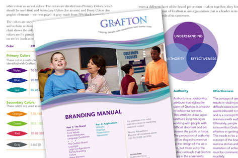
We created a brand manual to explain the brand – what the organization stands for — and specifies colors, typefaces, graphics and guidelines for the brand. This has allowed the client manage their own brand effectively.
Website
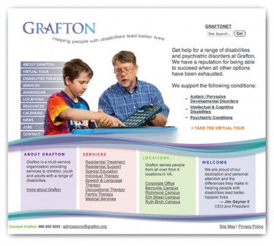
After a strategic assessment of competitors and the users, we redesigned the website around the needs of the users. The redesign has been receiving rave reviews. grafton.org
Newsletter
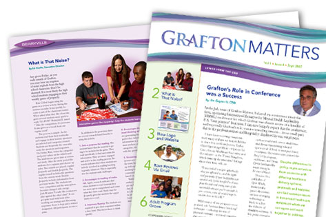
Grafton’s internal newsletter to its 700 employees at their three locations keeps employees informed and generates enthusiasm for the organization.
Display
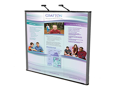
A flexible system of interchangeable panels helps make their display adaptable for fairs, attracting potential students and employees.


