Nature Israel Website

Nature Israel Website

American Society for the Protection of Nature in Israel

Website Helps Environmental Nonprofit Engage Donors

Creating a website for Israel’s largest environmental organization to appeal to donors in the United States.

Services

  • Brand Strategy
  • Website Strategy
  • Website Copywriting
  • Website Design
  • Website Development

The Challenge

Despite its impressive accomplishments in preserving wildlife, protecting open spaces, and providing environmental education, the Society for the Protection of Nature in Israel, going by the name Nature Israel in the United States, was not well known here. They needed a modern website that introduced the brand to the American public, conveyed the breadth of their programs, and engaged donors in their mission. We delivered.

Creating a Fundraising Website for this Nonprofit

We created a new website to help this nonprofit appeal to donors in the United States. The website was part of our larger nonprofit branding engagement in positioning Nature Israel, establishing the fundraising foundation, and creating campaigns to generate leads.

The site leveraged Israel’s reputation as a start-up nation for innovation to position Nature Israel as the green beacon for the world. As one of the most dense, diverse, and developed countries on Earth, Israel’s environmental solutions could have far-ranging impact for other countries.

In creating the website, we started from scratch, reimagining the user experience, writing all the copy, designing the interface, and developing the interactive features to engage donors.

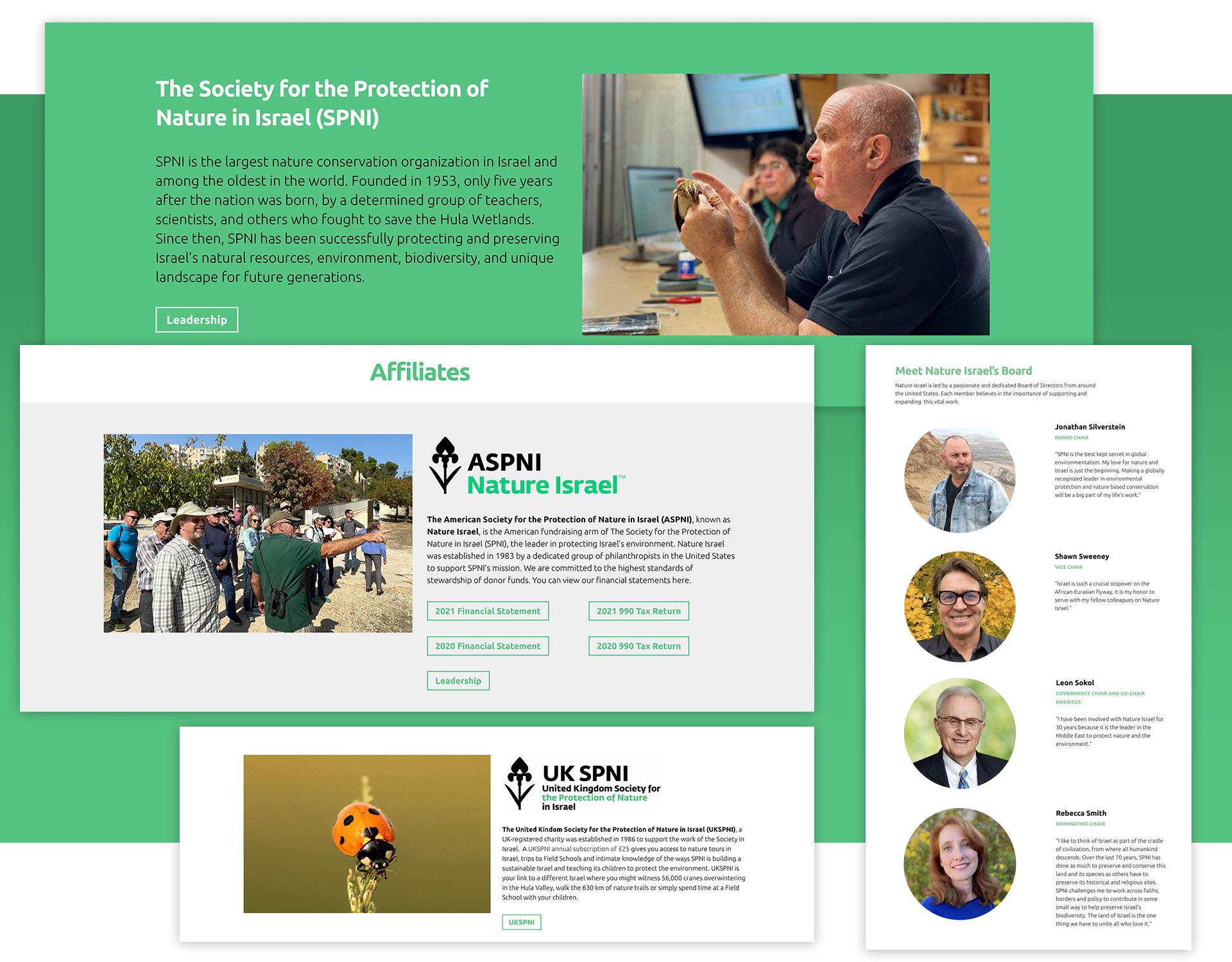
Describing the Organization

Nature Israel, formally known as the American Society for the Protection of Nature In Israel raises funds for the Society for the Protection of Nature In Israel. It’s the largest of several other international organizations raising funds for the work done in Israel. The website describes the relationship between the two entities.
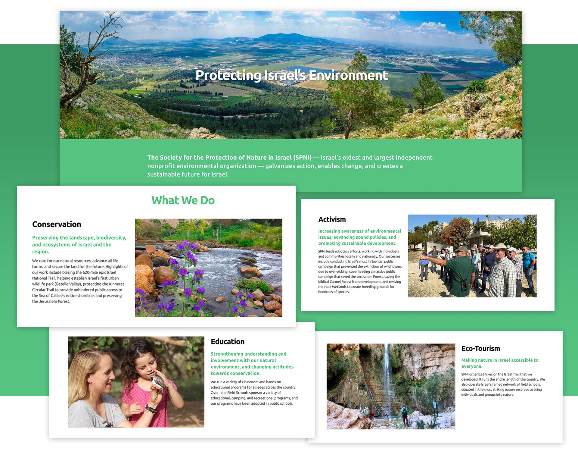
Conveying Areas of Service

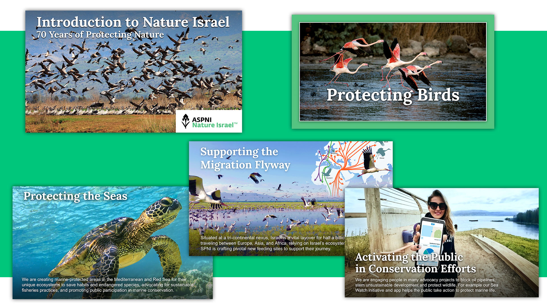
The organization focuses on conservation, education, activism, and eco-tourism. The site features current initiatives and invites site visitors to learn more. An RSS feed brings in news stories about the organizations so people can see how the organization is making an impact through its various programs.
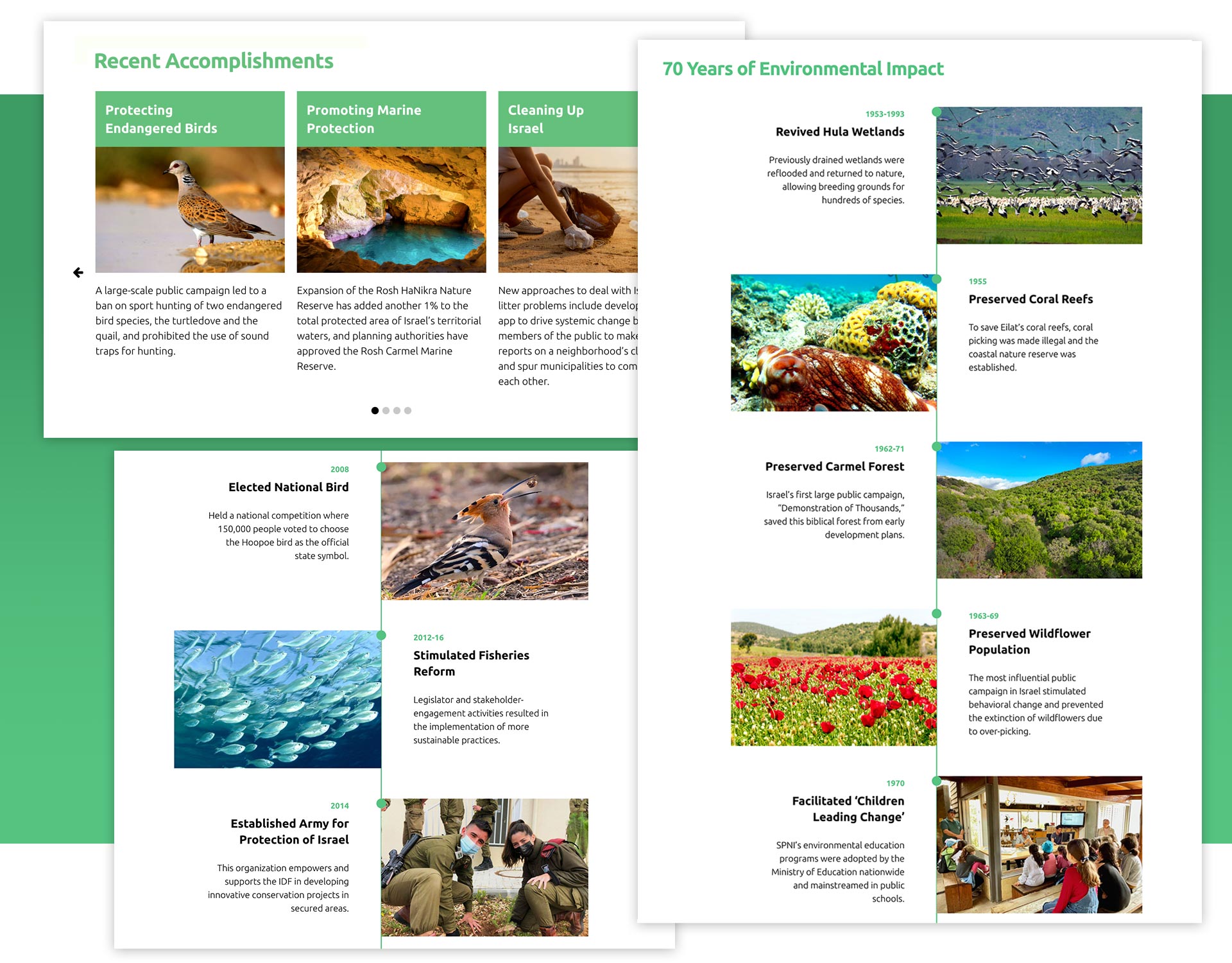
Communicating Impact

The Society for the Protection of Nature In Israel has an impressive 70-year track record of results in protecting wildlife. A slider showcases recent accomplishments, while a vertical timeline presents seven decades of environmental wins to bolster the credibility of the organization.
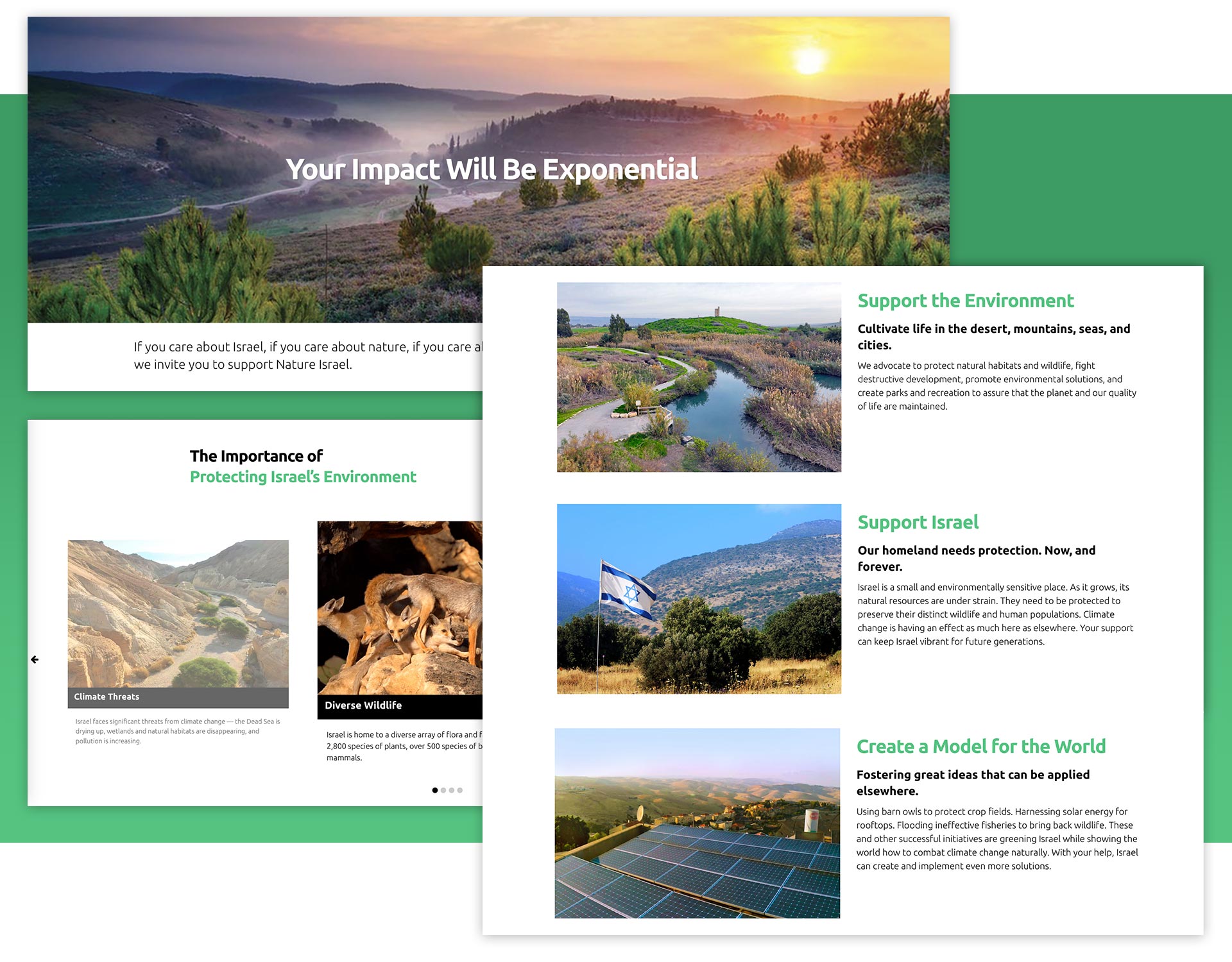
Telling the Fundraising Story

To solicit support for the organization, we made a clear case in pages that describe the need and reasons to support Nature Israel. One page builds on the main message about how supporting Israel helps the world, while another page describes how the Middle East is warming at twice the global average and that Israel is increasingly vulnerable to the impacts of climate change.
Engaging Website Visitors

The Society for the Protection of Nature in Israel conducts webinars every two weeks on a variety of environmental topics. The webinars are featured prominently on the site as a way to engage new donors.
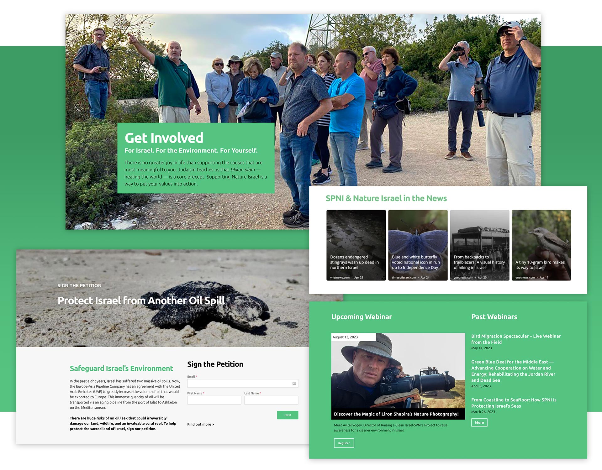
Get Involved Features

Promoting Eco-Tourism

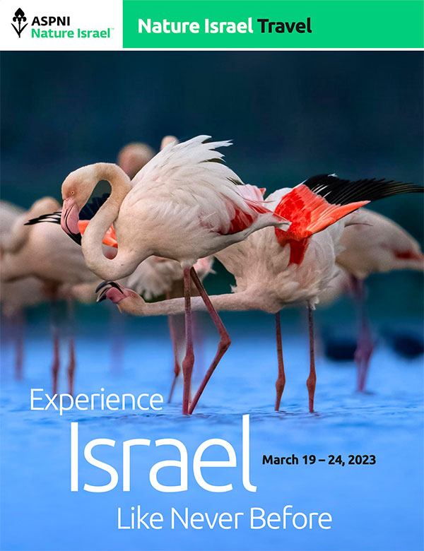
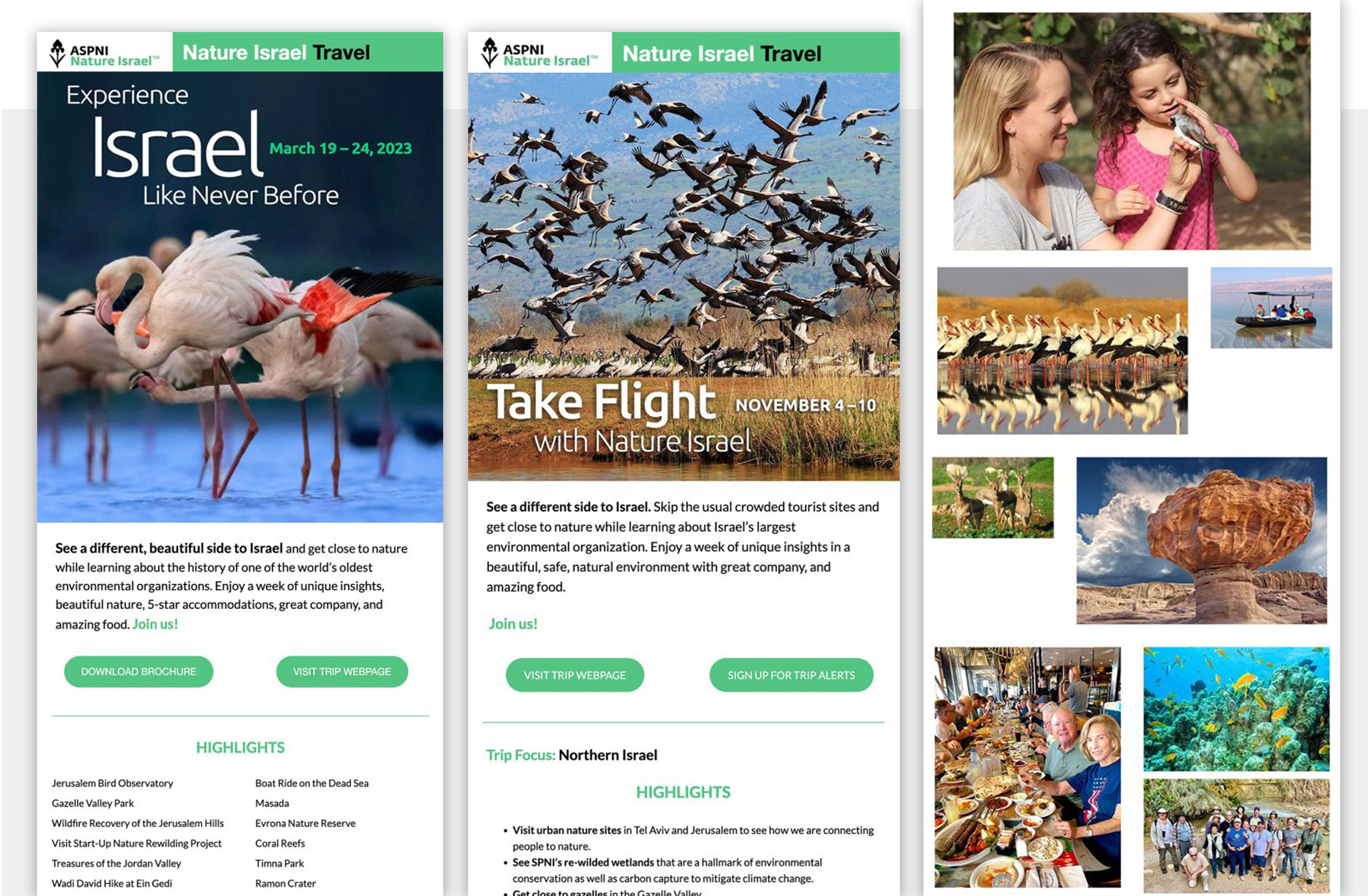
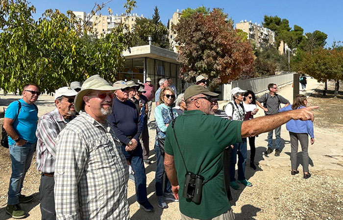
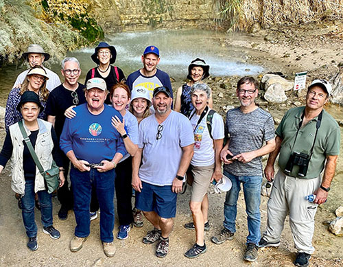
Travel to Israel is an important part of cultivating donors and a core part of the strategy. The trips are positioned as a different way to experience Israel — with access to special wildlife sites. We are promoting trips with web pages, brochures, and emails and encouraging registration and building a list of people interested in the trips.
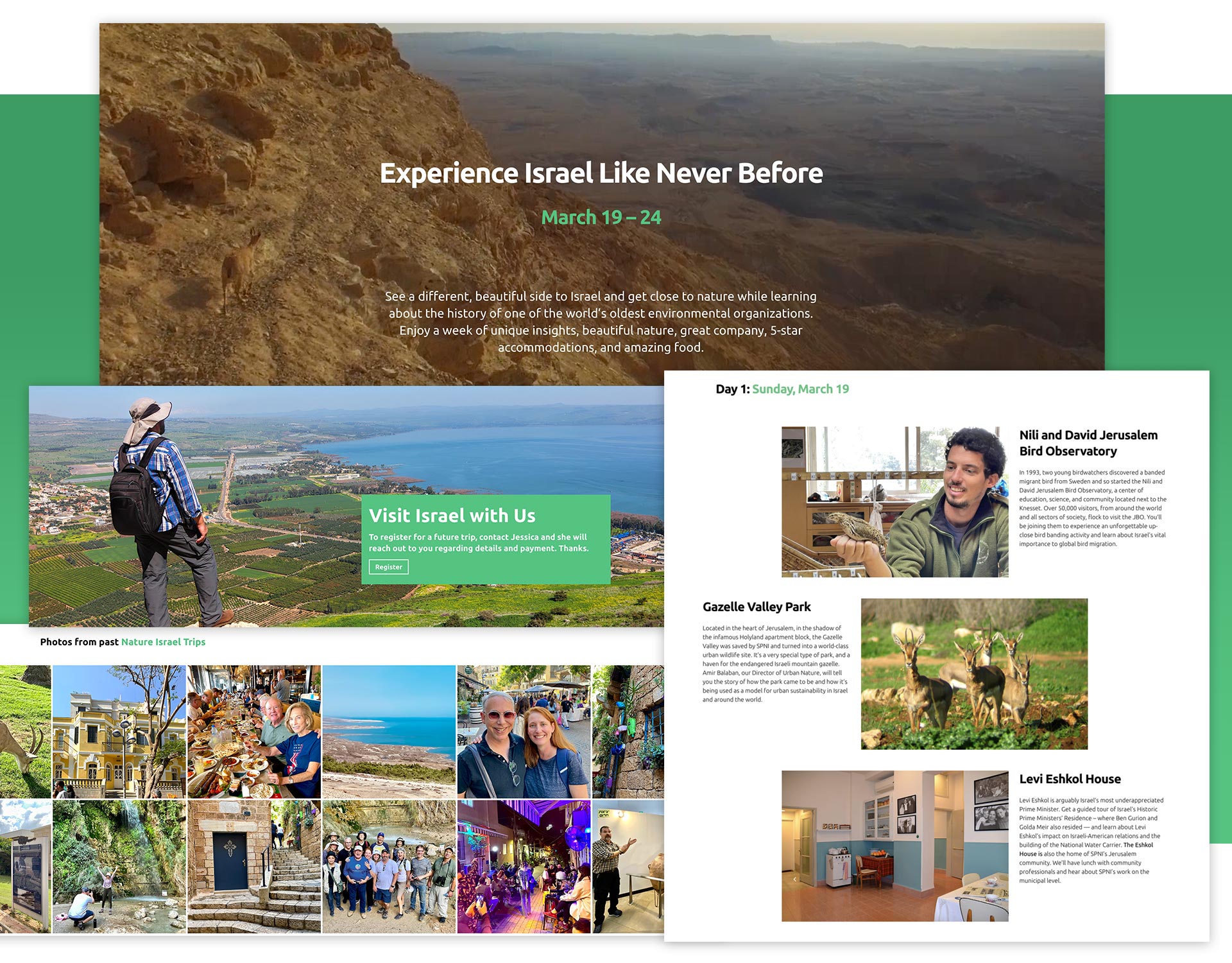
A Powerful Tool

The organization now has a powerful tool to tell its story and engage donors. The website is part of a larger engagement strategy for cultivating donors in the United States.

Helping an Environmental Organization Take Flight

American Society for the Protection of Nature in Israel

Helping an Environmental Organization Take Flight

We helped Israel’s largest environmental organization build its fundraising capacity and reach donors in the U.S. with a new brand, website, and digital campaigns.

Services

  • Brand & Website Analysis
  • Brand Positioning & Messaging
  • Membership Benefits
  • Website Copywriting
  • Website Design
  • Website Development
  • Digital Donor Acquisition Campaigns
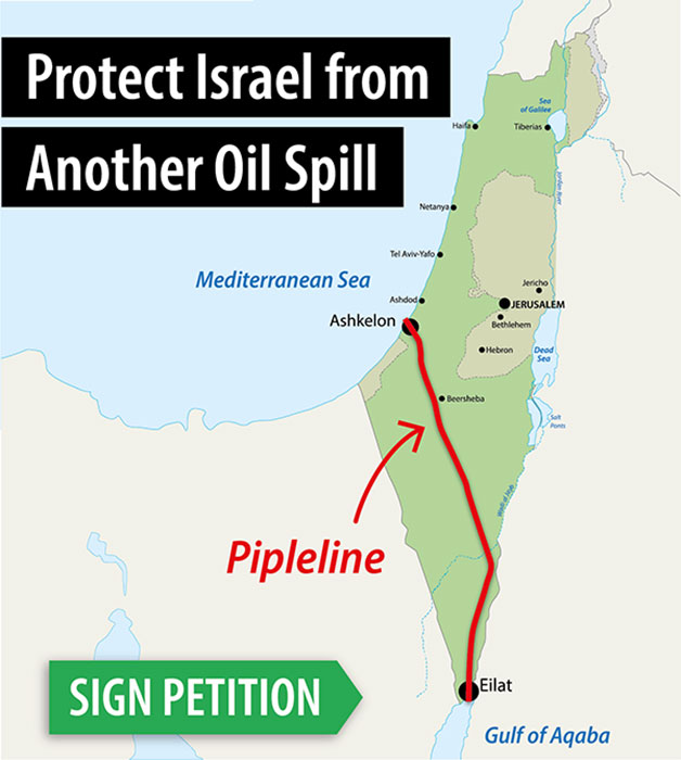
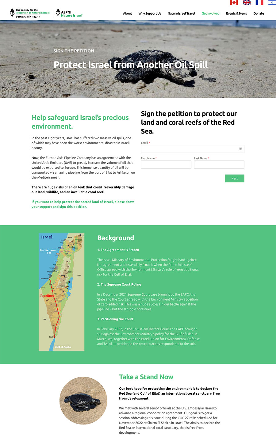
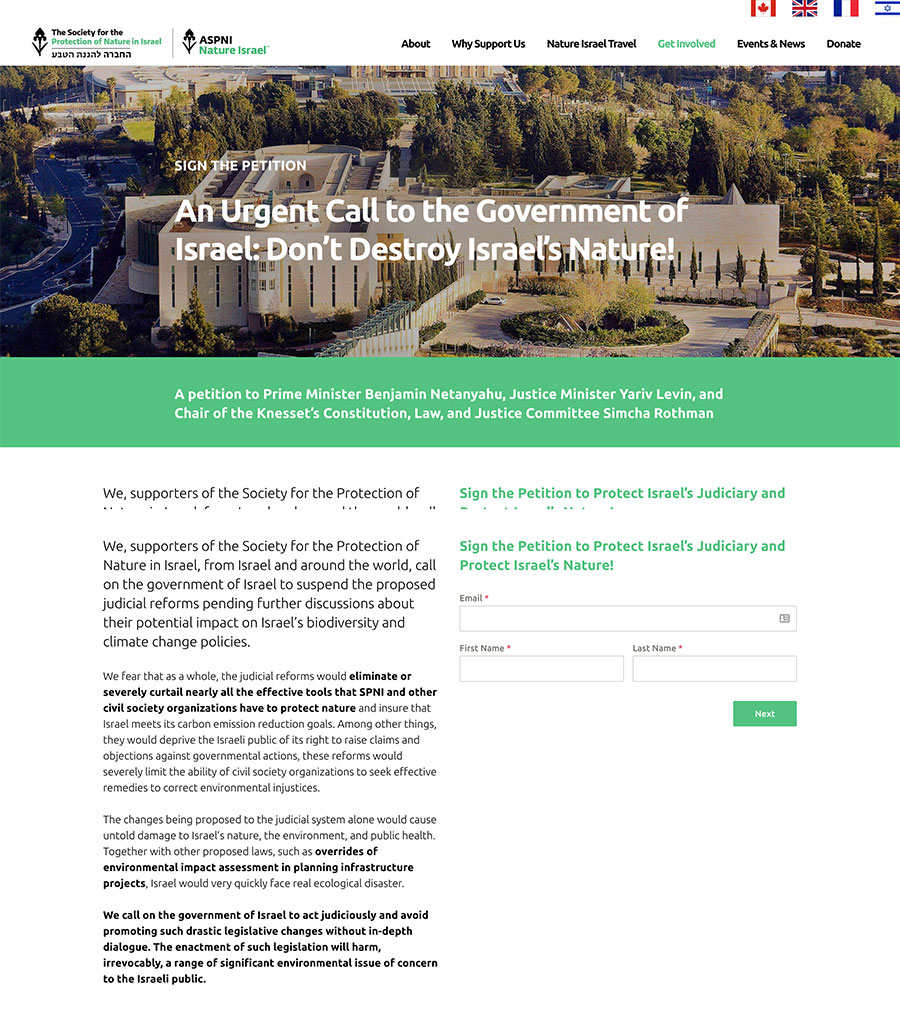
  • Advocacy Petitions
  • Webinars
  • Fundraising Emails
  • Fundraising Direct Mail
  • Promoting Travel to Israel

3.3 Million

IMPRESSIONS

1.6 Million

PEOPLE REACHED

8,500

NEW PROSPECT EMAILS COLLECTED

“Howard’s thought partnership helped Nature Israel take a great leap forward. Our new website has brought us new major donors, including several major corporate entities. I highly recommend Red Rooster Group.”

– Rachel Canar, Executive Director

The Challenge

Established at the country’s founding, the Society for the Protection of Nature in Israel is the oldest and largest environmental organization in Israel. But it is not well known in the United States, making fundraising a challenge. Red Rooster Group was brought in the elevate its American fundraising arm, known as Nature Israel, and build a base of supporters in the United States.

What We Accomplished

  • Developed the brand positioning and created a donor presentation.
  • Built a new donor-focused website to improve awareness in the United States.
  • Established the Nature Israel Travel Brand, webpages, and brochures, and generated leads of people interested in their trips.
  • Significantly increased the awareness of Nature Israel reaching 1.6 million people with 3.3 million impressions.
  • Built a prospect database of 8,500 emails of people who have taken an action for the organization. (such as signing a petition).

Defining the Brand

Our first step was to leverage unique insights to establish a clear brand value. The organization had presented itself as protecting wildlife, advocating for nature, educating the public, and providing recreational opportunities in nature.

But to get the brand noticed in the United States, something more was needed.

Leveraging Israel’s reputation as a start-up nation for innovation —with its technology improving lives globally — we positioned Nature Israel as the green beacon for the world. As one of the most dense, diverse, and developed countries on Earth, Israel’s environmental solutions could have far-ranging impact for other countries.

Telling the Story

In order to engage donors in the organization’s work and impact, we created a presentation that describes its success in conservation, education, activism, and eco-tourism.

Webinar to Introduce this Nonprofit’s Brand

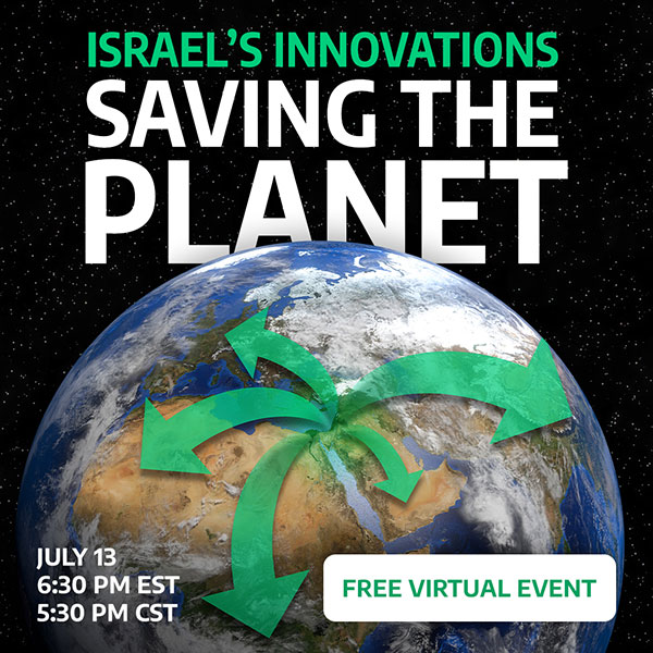
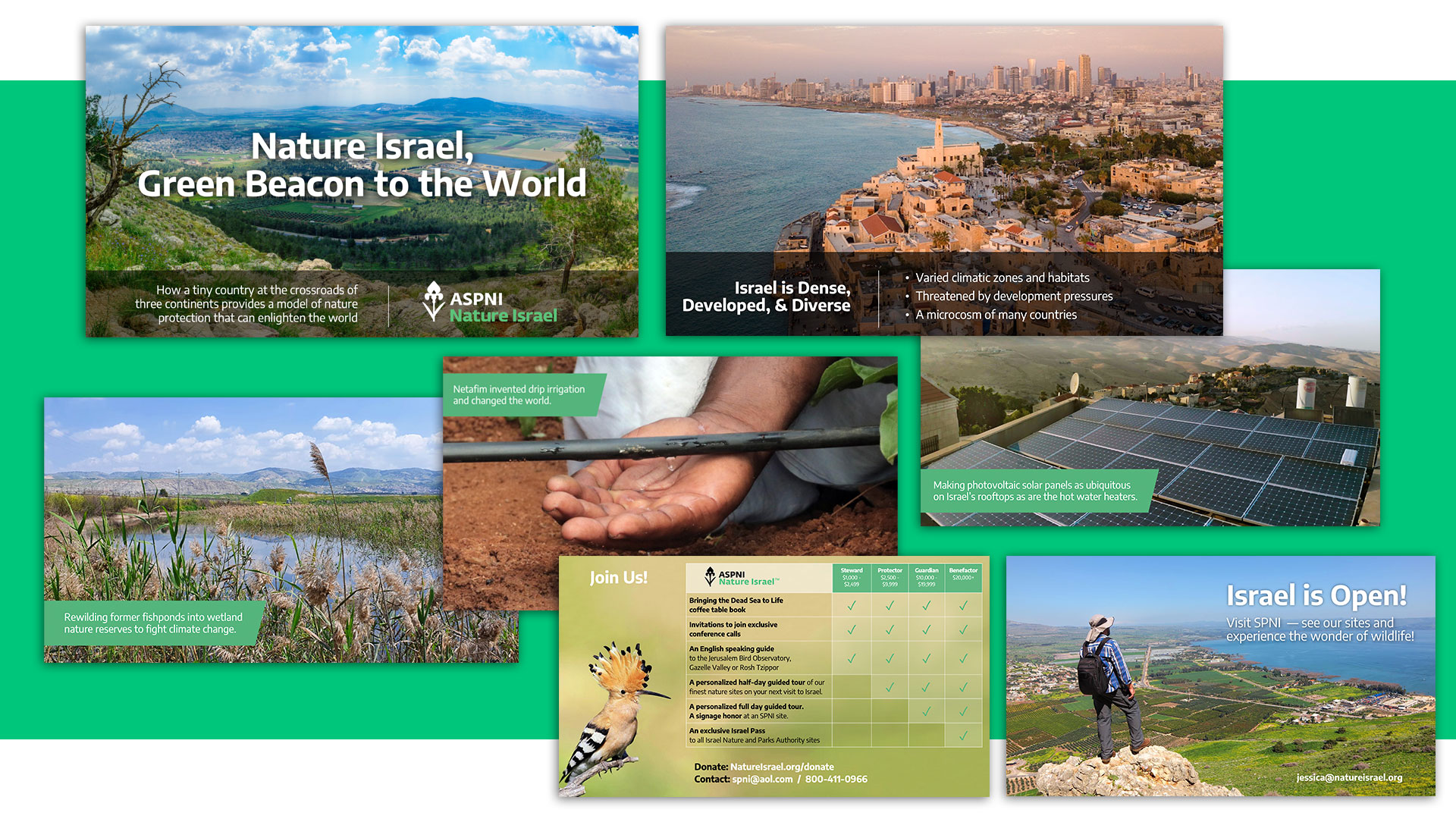
We created a webinar as a way to introduce Nature Israel to American audiences and generate leads, promoting it on Facebook with various audience targeting strategies. The webinar highlighted environmental technology that came out of Israel, featured the membership benefits chart we developed to engage people in membership, and invited webinar participants to visit the organization’s sites in Israel.

Creating a Fundraising Website 

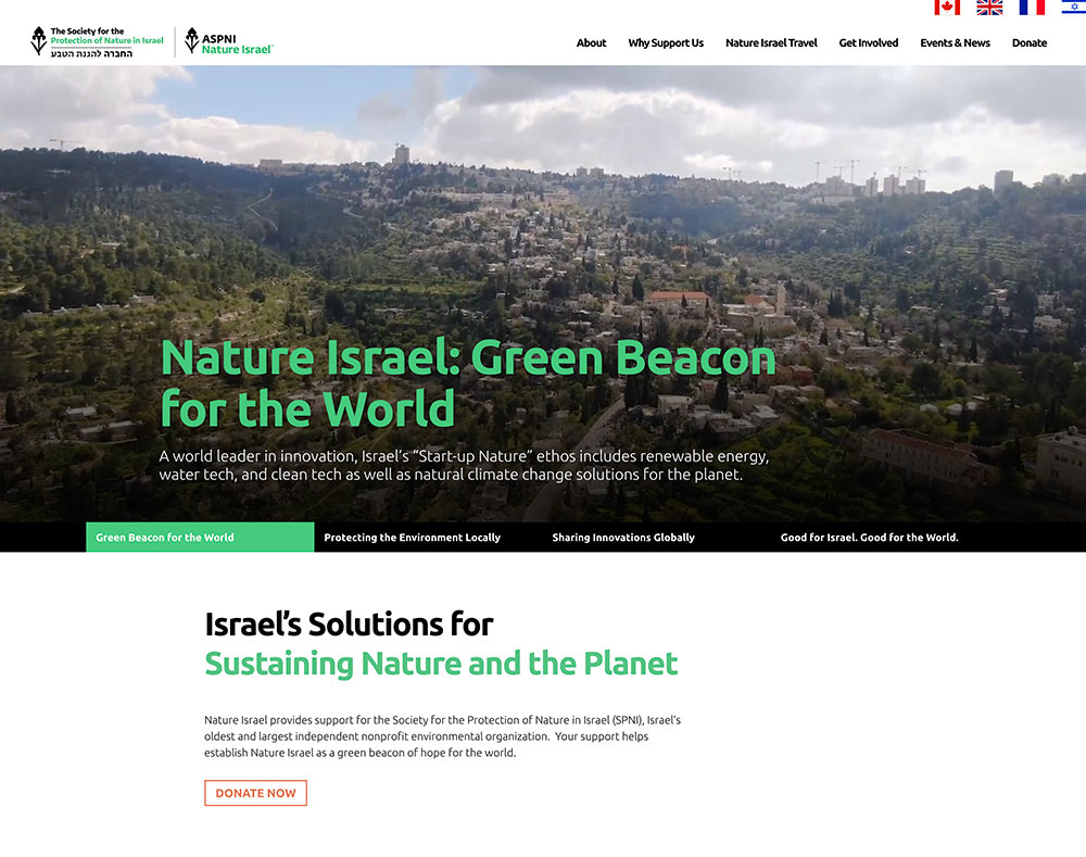
We created a new website for this nonprofit to appeal to donors in the United States. This website serves as their prime vehicle for fundraising. We started from scratch, reimagining the user experience, writing all the copy, creating the design, and developing the interactive features.

The website features the organization’s current initiatives, a timeline showcasing 70 years of impact, multiple pages describing reasons to support Nature Israel, customized news feeds and other features.

Digital Campaign to Attract Prospective Donors

To engage audiences, the website features webinars, a travel section, petitions, and other features to generate leads and cultivate prospective donors. The lead generation features are integrated into MailChimp and Salesforce to create a robust database for the organization.

Using Petitions to Generate Leads

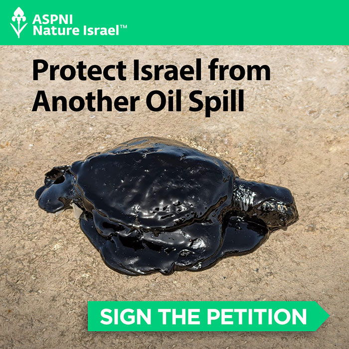
Our fundraising goals include generating new leads for Nature Israel and cultivating them as potential donors. To accomplish this, we implemented a 2-stage process. We attracted new leads by promoting petitions, a webinar, and blog posts on Facebook.

The campaigns led people to a Facebook form or landing page where we collected emails. We used five different audience targeting strategies, and A/B split testing on all ads. This has enabled us to collect more than 7,000 leads in a short period of time. The next phase involves cultivating these prospects into donors through a series of email campaigns.

Promoting Eco-Tourism

To cultivate larger donors, Nature Israel is running trips to experience “the wild side of Israel” — its amazing wildlife and nature sites. We created a Nature Israel Travel section on the website with extensive pages about each trip, brochures, email campaigns, and social posts.

Travel Emails

Building a Fundraising Infrastructure

As Nature Israel’s strategic fundraising partner, we are setting a foundation for their growth by:

  • Creating an Operations Manual that documents all fundraising and marketing processes and is continually updated as needed.
  • Providing critical technological support in setting up and maintaining their back-end systems, including the WordPress website, MailChimp, Classy, and integrations between systems.
  • Cleaning up lists in MailChimp by consolidating tags.
  • Creating an Editorial Style Guide to ensure consistent communications throughout the organization.
  • Developing a master Marketing Calendar including emails, fundraising, event promotion, and other activities.
  • Coordinating marketing and fundraising activities with the Israel team.
  • Creating direct mail packages, handling printing and mailing management.
  • Introducing personalization and custom gift arrays in their direct mail.
  • Producing special fundraising projects, including Tribute Books.
  • Promoting organizational events in the United States.

Achieving Results

Foundation

Nature Israel now has a clearly defined brand, an engaging website, and a solid foundation to support its fundraising.

Prospects

Our digital outreach campaigns have generated more than 8,000 emails of people who have taken action on behalf of the organization.

Travel

Our travel promotion has resulted a list of several hundred people interested in their trips as well as groups visiting Israel to see the organization’s work first-hand.

4.1 Million
Impressions

43,654
Link Clicks

8,439
Emails Collected

“Howard and his team managed a rebrand and new website launch for Nature Israel. They really helped bring our organization into the 21st century. The website that they created is just beautiful and we are constantly getting this feedback. The SEO optimization they implemented is truly awesome, bringing us many new people from organic searches. Most importantly, this has brought it new major donors, including several major corporate entities looking for water offsets and environmental organizations in the region. Howard’s thought partnership helped Nature Israel take a great leap forward and he remains a true friend of our organization. He remains responsive to this day. I highly recommend him.”

– Rachel Canar, Executive Director

Launching a New Financial Certification

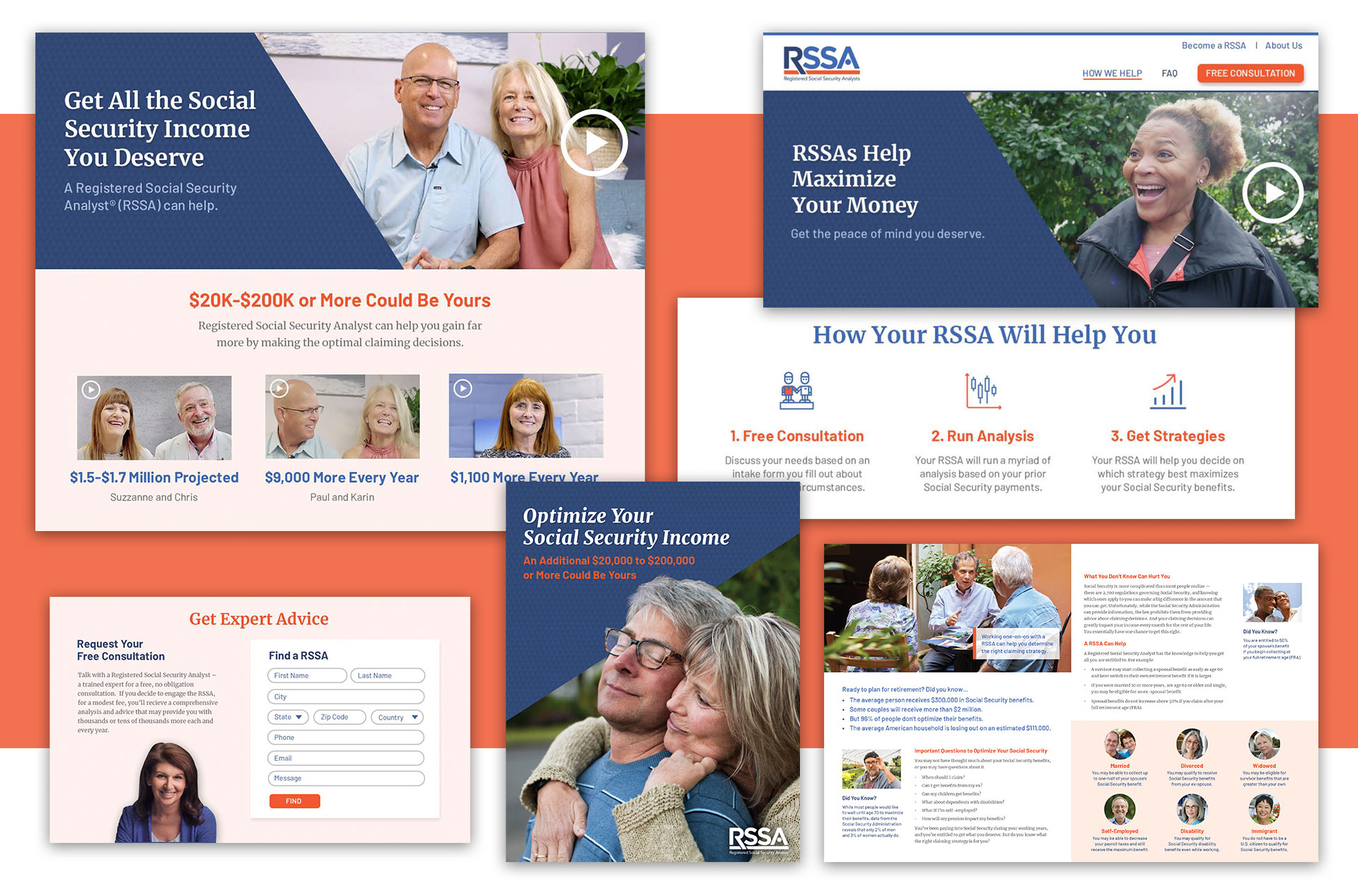
National Association of Registered Social Security Analysts

Launching a New Financial Certification Company

A new financial service needed to assess its market, establish itself as a trusted brand, and attract both financial analysts and consumers. We analyzed their business challenges and developed their strategy, brand, marketing materials, and website for a national launch.

Services

  • Market Viability
  • Marketing Strategy
  • Brand Strategy
  • Messaging
  • Visual Identity & Brand Guidelines
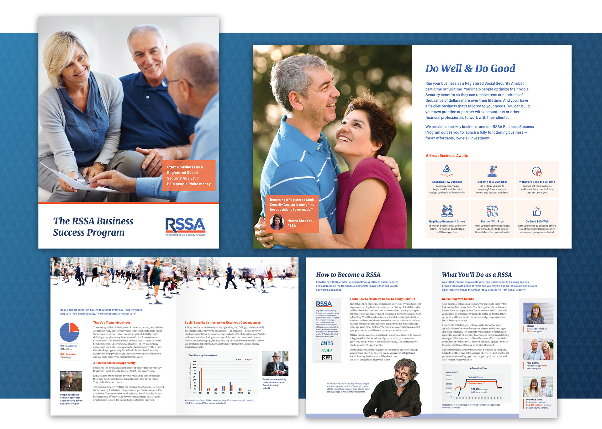
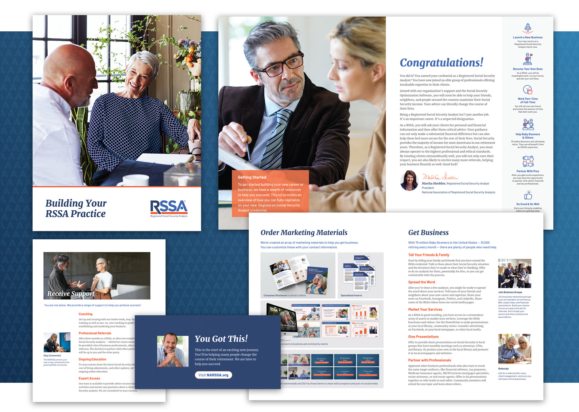
  • Printed Materials for Analysts
  • Consumer Brochures
  • Customizable Print-On-Demand Materials
  • Sales Presentations
  • Consumer Video Series
  • “Did You Know“ Video Series
  • Integrated Website Strategy
  • Website Copy, Design & Development for Consumer & Analyst Sites

A New Service for Seniors

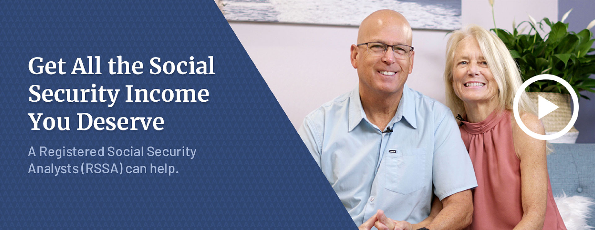
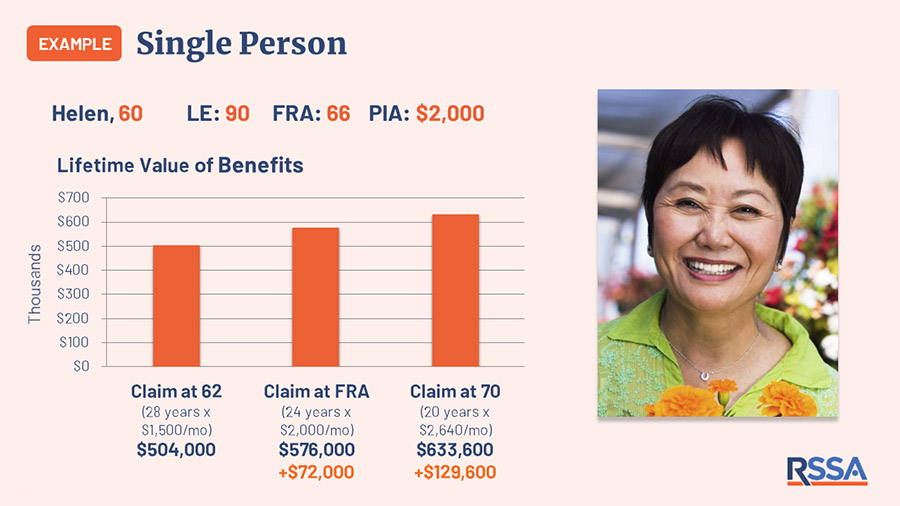
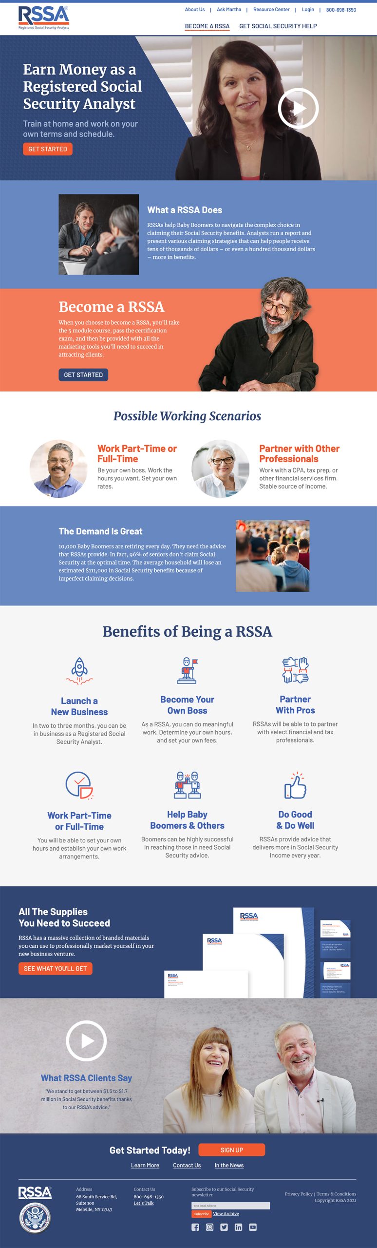
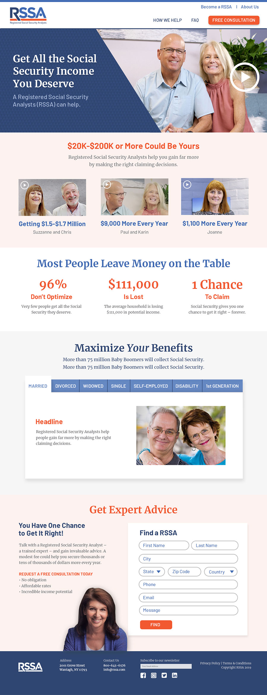
Many people do not realize that they have options when collecting social security. Factors such as age, marital status, disability, and self-employment, among others, can affect the amount of money received. Registered Social Security Analyst (RSSA) created a certification program to train professionals to guide people in optimizing their benefits.

An Untapped Market for Financial Professionals

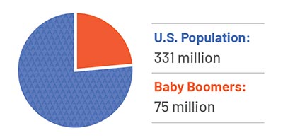
With 10,000 Baby Boomers retiring every day, the market for advice about social security benefits is huge. RSSA provides a new professional certification to tap into that market. Financial professionals can enhance their practice, and someone seeking an encore career could start a business. 

From Concept to a Thriving Business

Who would become an RSSA? How much would people pay for this service? Would people welcome entering this new profession? We conducted focus groups and research to ascertain the viability of this new financial service and how to attract professionals and clients. We helped RSSA define and launch the business model.

Developing the Value Propositions

Potential analysts need to know about the training and the value of adding this certification to their services. We developed the value proposition that guided the marketing to recruit analysts and attract soon-to-be-retirees to the service.

Crafting the Brand

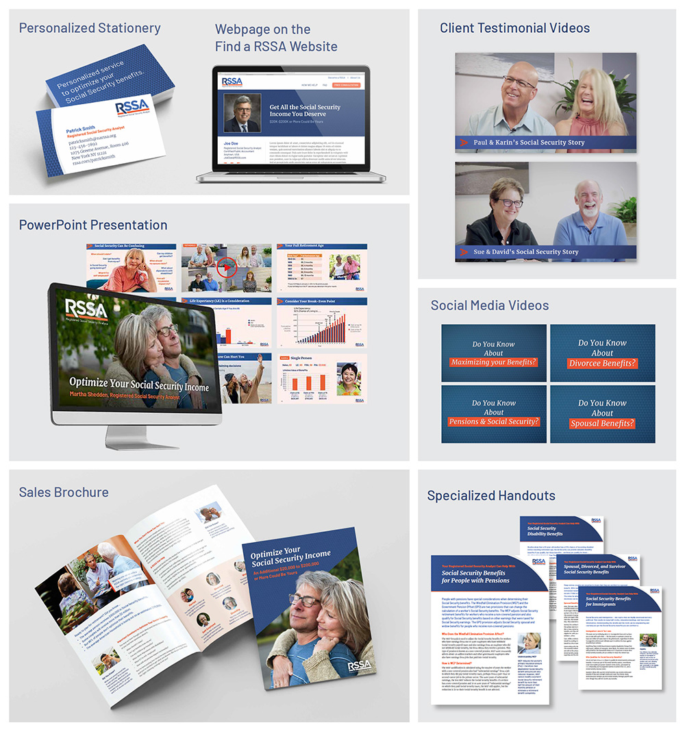
RSSA needed a recognizable logo that would have the same respect as “CPA” or other financial certifications. Branded as a personalized service to optimize your Social Security benefits, we designed a logomark that could be used on everything, from business cards to marketing materials to stationery by professionals across the country.

Developing a Unified Web Strategy for Analysts & Consumers

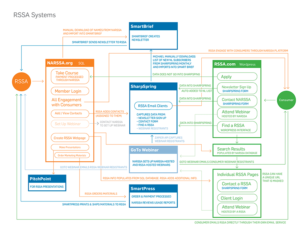
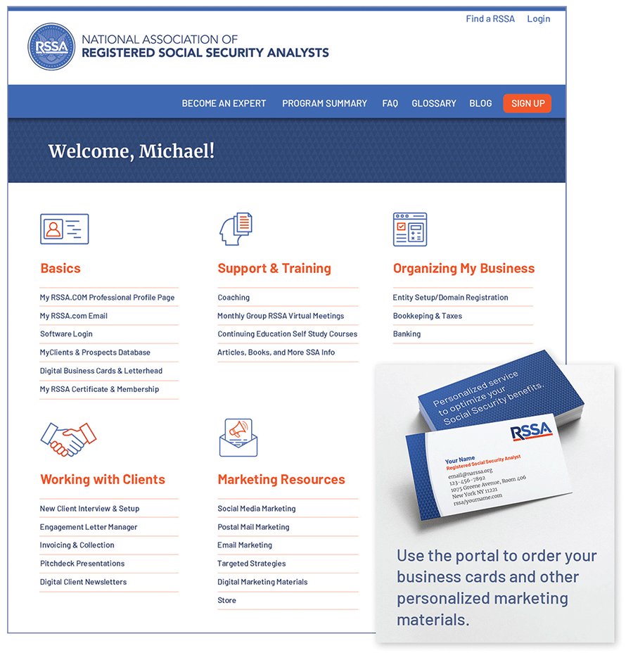
Professionals need a website for training, customizing and printing their marketing materials, finding leads, and keeping up to date on changes. Their website is a one-stop shop, with links to training modules and the certification exam. 

When they become analysts, they have access to marketing materials, from business cards to social media posts as well as continuing education. They can add their name to the list of qualified analysts so potential customers will find them easily.

Consumers need a website that explains the value of RSSA and helps them find an analyst near them.  Although the material presented here is different from that on the analysts’ site, the two are seamlessly integrated at the back end so clients and analysts can find each other and communicate seamlessly.

Recruiting RSSAs

We identified the types of people who make good RSSAs and developed marketing outreach materials, including a sales kit, to attract them.

Creating a Turnkey Business Operation

Reaching the market of soon-to-be-retired people required both print and online materials as well as a marketing strategy that includes emails, postcards, social media, and a consumer-facing website. With just one login, an analyst can set up a profile, create marketing materials, invoice clients, do bookkeeping, and get support.

Attracting Consumers

To attract consumers, we crafted the value proposition, marketing materials, including print, digital, and videos, and the lead-generation system to drive leads to RSSAs.

Creating Customizable Marketing Materials

The new analyst can open a business immediately because the NRSSA website has everything that they need to promote their practice:

  • A customizable web page that helps consumers find them
  • Marketing brochures
  • Pring-on-demand, customizable stationery, and business cards
  • PowerPoint presentations
  • Videos that can be posted on social media
  • Monthly newsletter
  • Coaching and continuing education

Success

The National Association of Registered Social Security Analysts is now a respected source of financial information, frequently quoted in publications such as Financial Advisor Magazine, MarketWatch, Accounting Today, and TheStreet. It has a partnership with the National Association of Enrolled Agents so tax planning can include social security benefits. The organization has attracted RSSAs who are providing valuable expertise to help people maximize their Social Security benefits.

Research Institute Gets Independent Brand

Agriculture and Food Systems Institute

Agriculture & Food Systems Institute

Research Institute Gets Independent Brand

Helping a research institute establish independence and engage researchers with a new brand and website.

Services

  • Brand & Website Analysis
  • Competitive Analysis
  • Stakeholder Interviews
  • Audience Needs Mapping
  • Brand Positioning & Messaging
  • Visual Identity Iconography
  • Brand Style Guide
  • Website User Experience
  • Website Copywriting
  • Website Design
  • Website Development
  • Registration System
  • E-learning Integration
  • Content Migration & Customization

Results

Increased Pages Per Session

6.56 v. 3.9

Increased Session Duration

6:43 mins. v. 3:10

Decreased Bounced Rate

24% v. 62%

Evolving the Organization

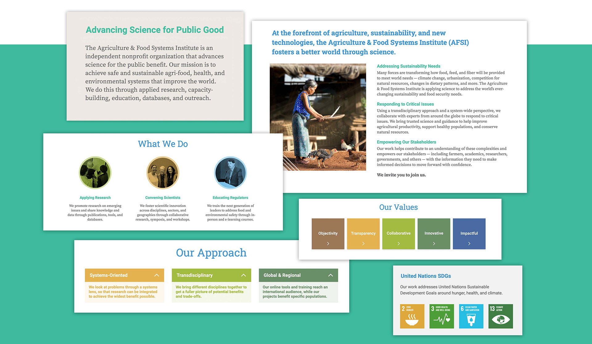
The Agriculture & Food Systems Institute separated from an international trade association. After adopting a new name, they approached us to craft the strategy that would help them stand on their own and set a foundation for growth.

Our extensive research uncovered valuable opportunities to:

  • Distinguish the organization with a new unified message.
  • Engage their audiences in new ways with a redesigned website.
  • Increase their funding potential by emphasizing their impact.
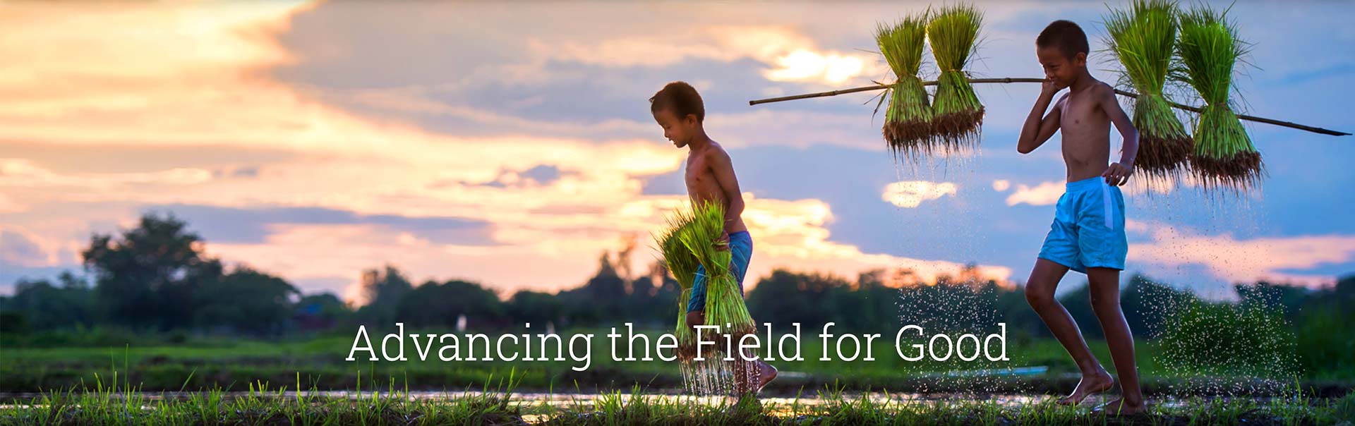
Advancing the Field for Good

Defining Their Message

Previously, AFSI’s message had focused on their work. Using the insight we uncovered from our discovery process, we crafted new messaging that focused on the positive impact they are having on the world.

AFSI Messaging

Creating a Unique Visual Identity

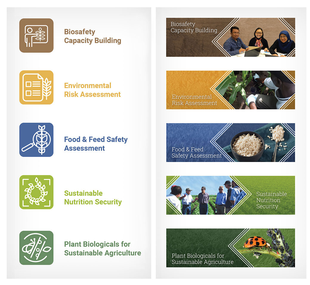
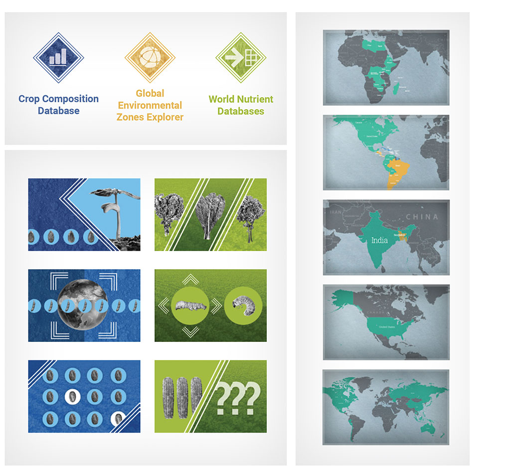
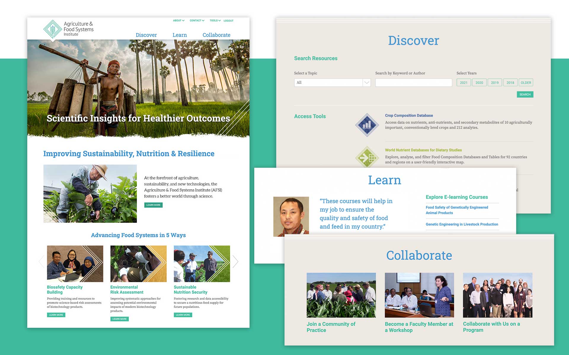
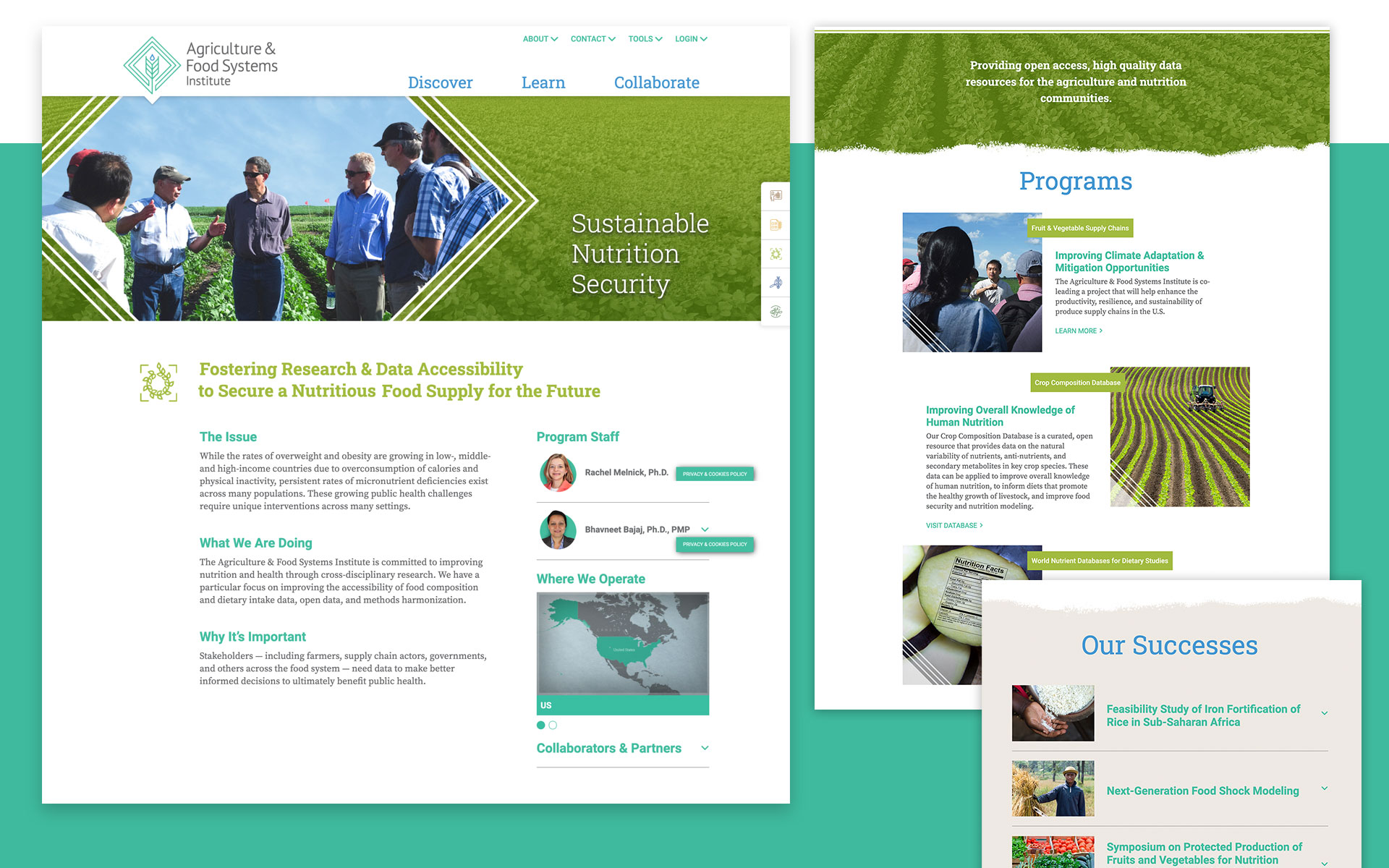
We designed a comprehensive visual identity system for AFSI including icons and custom graphics for their main program areas, databases, e-learning courses, and program maps. Combined with a palette of colors, angled rules, textures from nature, and ragged edges, AFSI now has a unique look that helps them stand out in the sector.
Developing an Engaging User Experience

We completely reinvented the homepage with a new navigation system to invite more users to discover content. The homepage introduces the new brand, making it easy to engage with the primary research areas, publications, and tools. It also promotes the e-learning courses and invites collaboration and participation.

Describing AFSI’s Areas of Research

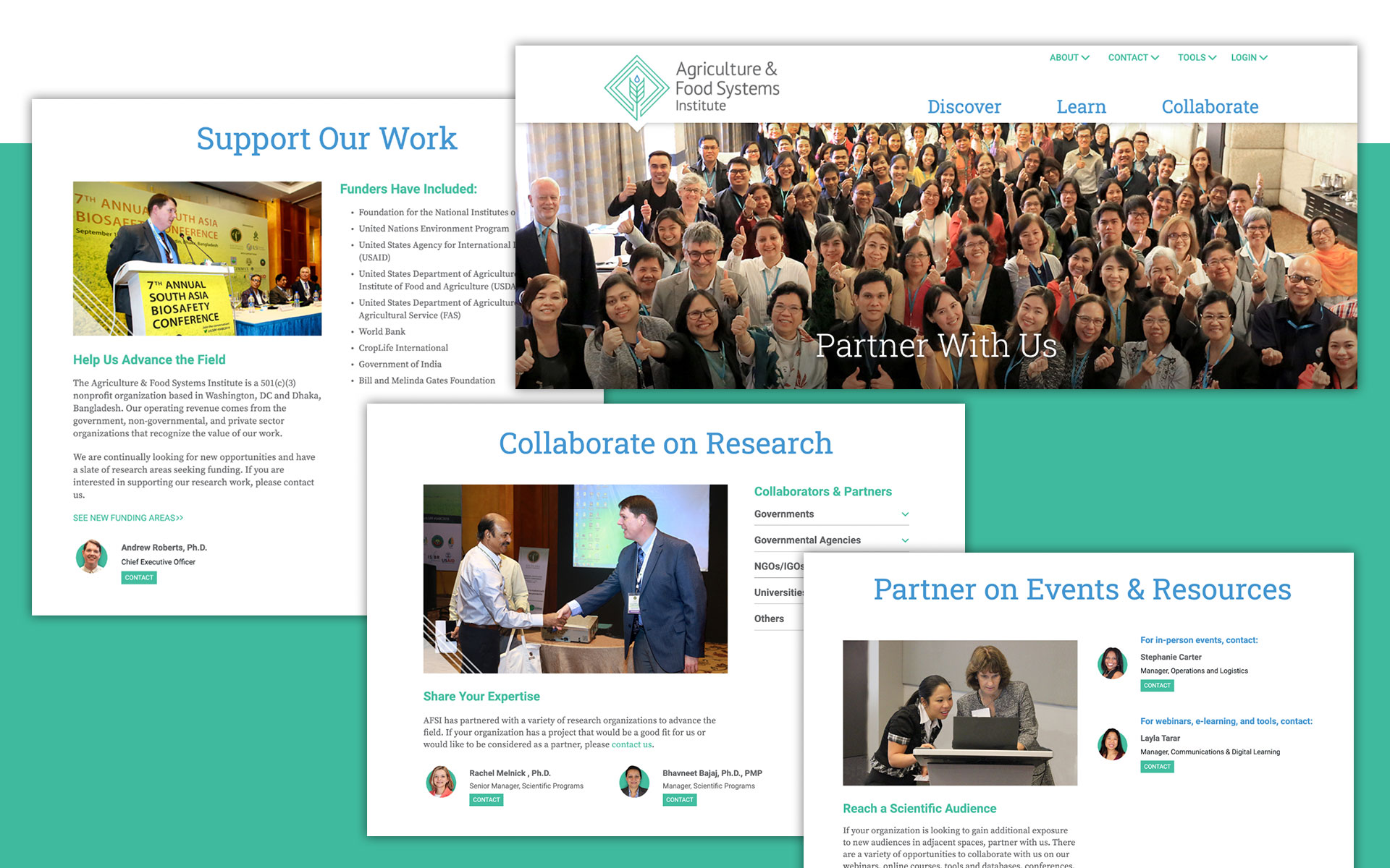
To expand AFSI’s audience, we provided context for each program — a description of the issue, what AFSI is doing about it, and why that research is important.  Site visitors can learn about the relevant staff for that issue, see maps of the locations, a list of collaborators, and explore past successes and related publications.
Inviting Participation

​​We identified ways for stakeholders to engage with AFSI and created new sections to invite stakeholders to do so. A Looking Ahead section suggests future funding opportunities.
Creating Seamless Online Learning

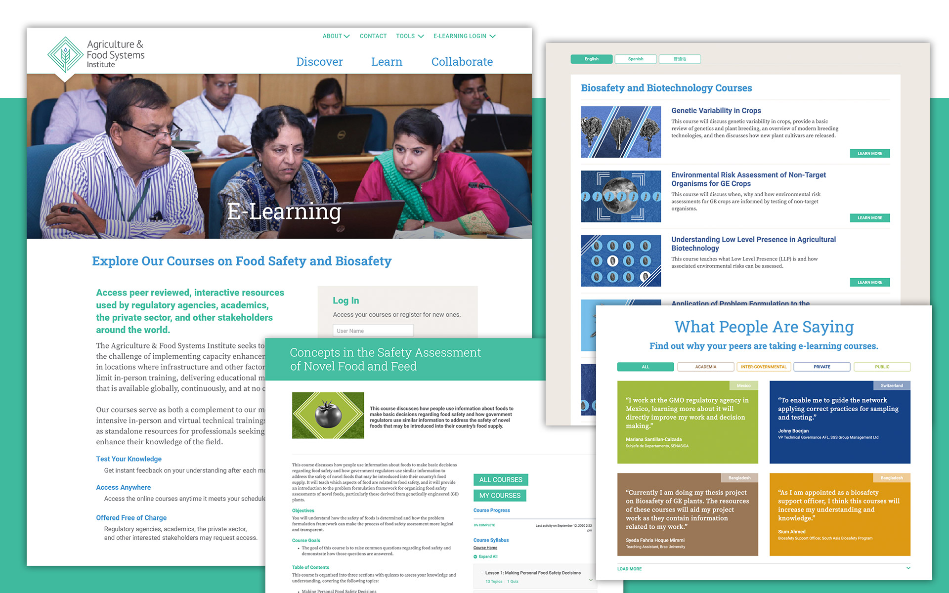
Users now have a seamless online educational experience. We created an e-learning section that’s integrated with the third-party LearnDash system and completely customized for AFSI. A single login now allows users to access online courses and AFSI’s tools while providing AFSI with user tracking. A new sortable database of testimonials promotes e-learning.

Results

Increased Pages Per Session

6.56 v. 3.9

Increased Session Duration

6:43 mins. v. 3:10

Decreased Bounced Rate

24% v. 62%

“Congratulations to you Howard, and many thanks to you and the team! The site looks great and it was a real pleasure to work with you to bring this to fruition.”

Morven McLean
Executive Director, Agriculture & Food Systems Institute

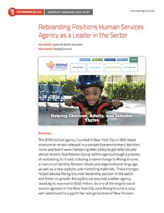
Rebranding Positions Human Services Agency as a Leader in the Sector

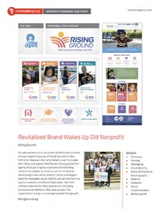
How does a $100 million social service agency remain relevant in a competitive environment?

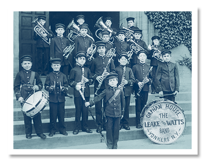
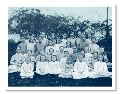
Founded in New York City in 1831, Leake & Watts had evolved from an orphanage to a multi-faceted agency with more than 40 different programs. But their name and brand were hampering their ability to get referrals and attract donors.

We created a new name, message, and visual identity that positions it as a leader in the sector. Here’s how we did it.

Challenges

The organization needed to address the problems with its name and retain a sense of history while moving forward to appeal to donors and funders.

Discovery

We conducted a thorough Discovery process that was designed to help us uncover brand perceptions and communication issues:

  • A Brand Audit that assessed all touchpoints with the public.
  • A Competitive Review of other human services agencies to identify key differentiators.
  • 25 Interviews with leadership, Board members, and donors.
  • An Interactive Workshop with two dozen senior leaders to explore brand strengths.
  • Five Focus Groups with different departments to understand their brand challenges.

Naming

The leadership, Brand Committee, and Board were engaged in a thorough process to develop and test a new name that would meet their needs around the theme of “Rise.”

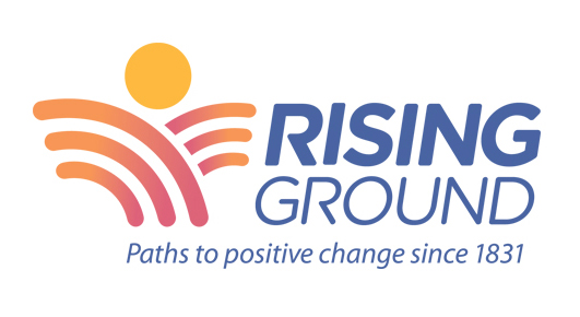
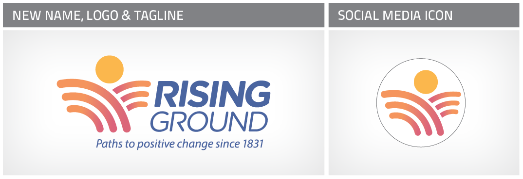
After exploring more than 1,400 naming ideas, field testing for perceptions, and conducting legal vetting, the Brand Committee selected the name Rising Ground. This conveys how the organization helps people rise above adversity regardless of what they are facing. The tagline, ”Paths to positive change since 1831” amplifies the message and connects to their history.

Rising Ground Logo

Messaging

As part of the branding process, we updated the Mission and Vision Statements, Values, and other brand messaging.

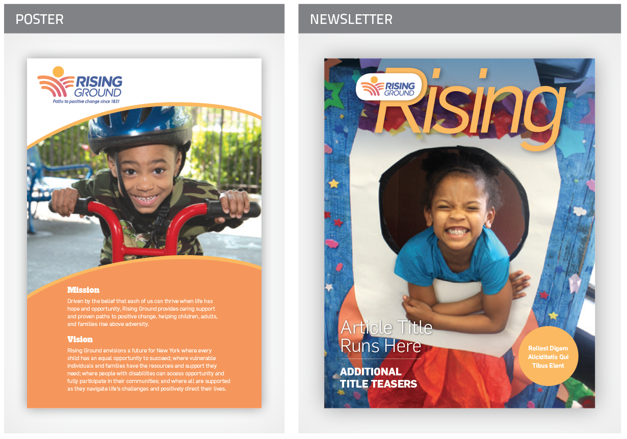
Mission

Driven by the belief that each of us can thrive when life has hope and opportunity, Rising Ground provides caring support and proven paths to positive change, helping the most vulnerable children, adults and families rise above adversity.

Vision

Rising Ground envisions a future for New York where every child has an equal opportunity to succeed; where vulnerable individuals and families have the resources and support they need; where people with disabilities can access opportunity and fully participate in their communities; and where all are supported as they navigate life’s challenges and positively direct their lives.

Boilerplate

Rising Ground is a leading nonprofit social service organization, providing the most vulnerable children, adults and families in the Greater New York City area, with the resources and skills needed to rise above adversity and positively direct their lives.

Visual Identity

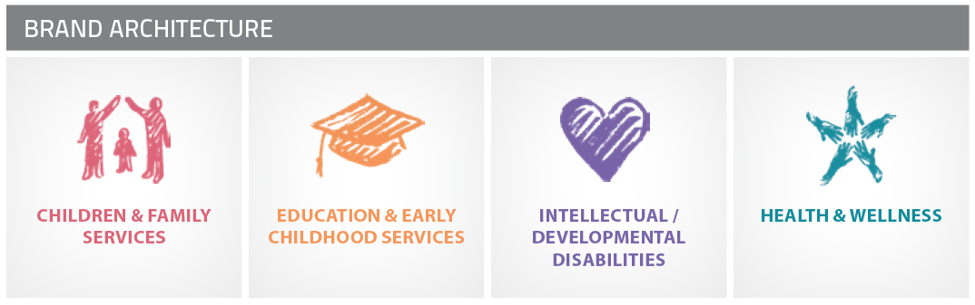
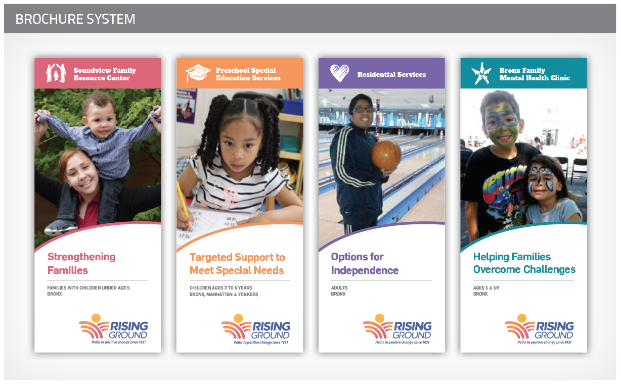
We created a new visual identity that is expressive, contemporary, and evokes the agency’s personality. The visual identity system consists of:

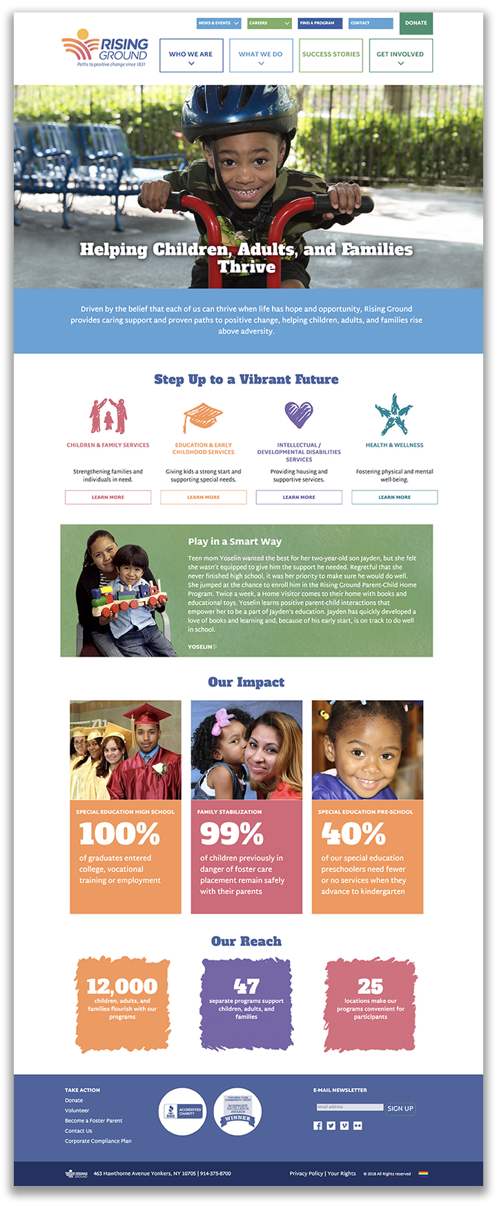
Website

We planned, wrote, designed, and developed a completely new website for the organization. We created a positive experience that showcases the agency’s mission of helping people rise above adversity.

Brand Launch

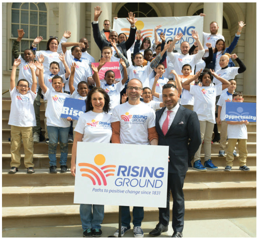
Announcing the new name was an opportunity to renew enthusiasm for the organization. To facilitate the transition, we drafted a Why We Changed Our Name document, letters to each stakeholder group, FAQs, a video, and other materials. The launch events generated lots of excitement and the name was well received by staff and donors, and garnered some media coverage (handled by a PR firm).

Outcomes

Rising Ground’s new brand eliminates the confusion with their old name, inspires donors with an uplifting message, and gives staff a clear purpose to rally around.

Most importantly, Rising Ground is positioned as a leader in the social services sector — one not known for bold changes. Leake & Watts’ transformation to Rising Ground has sent a signal to the sector that it is leading the way with bold decisions. They are seen as an attractive potential partner for acquiring other agencies, and their new brand is serving them well as in vying for attention and funding in these uncertain political times.

“Howard and the entire team at Red Rooster Group truly went above and beyond with our project – the rebranding and renaming of a venerable 185+ year organization. It wasn’t easy! Red Rooster Group took the time to really listen to what we believe in and what we wanted to achieve. Their process was strategic, creative, and inventive from start to finish. All throughout, Red Rooster Group made sure we stayed true to the core themes of our work that we collectively identified. No detail was too small and no request unsatisfied. You couldn’t ask for a team more dedicated. Today, we have a new name, visual identity, website, messaging, and mission and vision statements that are truly reflective of our impact in the community. Our new brand positions us with confidence as we look to the future and ways to further increase our impact. Red Rooster Group was a tremendous partner. We are delighted with the results of our work together!”

Meredith Barber

— Meredith Barber
Senior Director of Institutional Advancement
Rising Ground

Redesigned Website Promotes Affordable Housing

IMPACCT Brooklyn Website
AffordableHousing
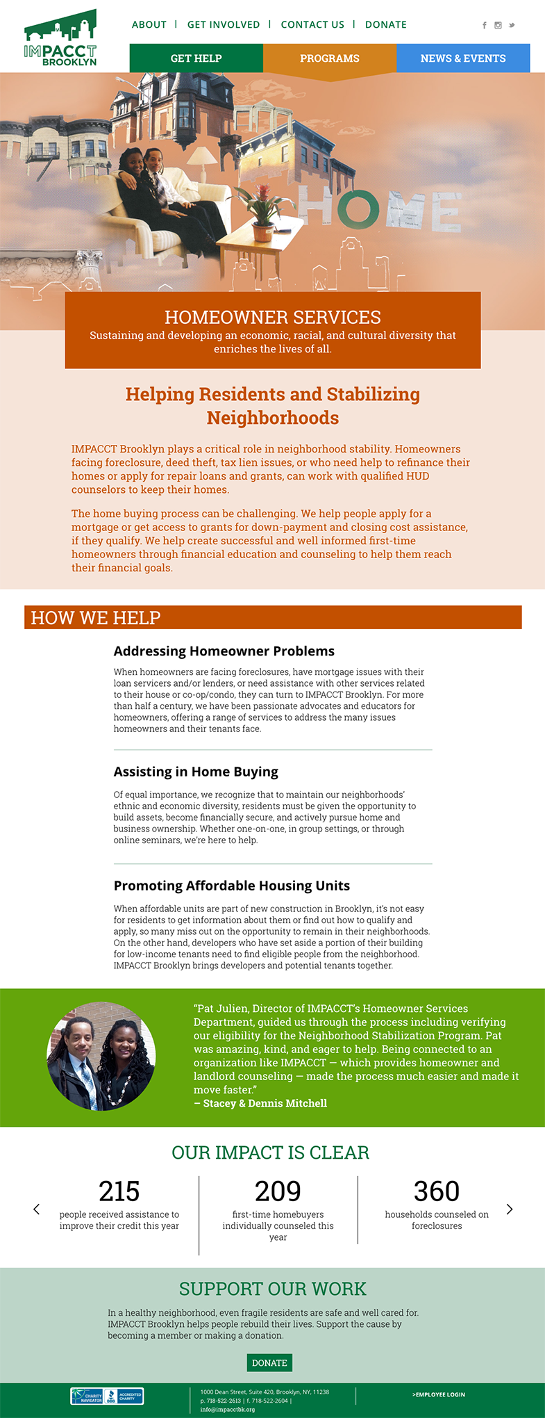
IMPACCT Brooklyn Homeowner Services

CLIENT: IMPACCT Brooklyn

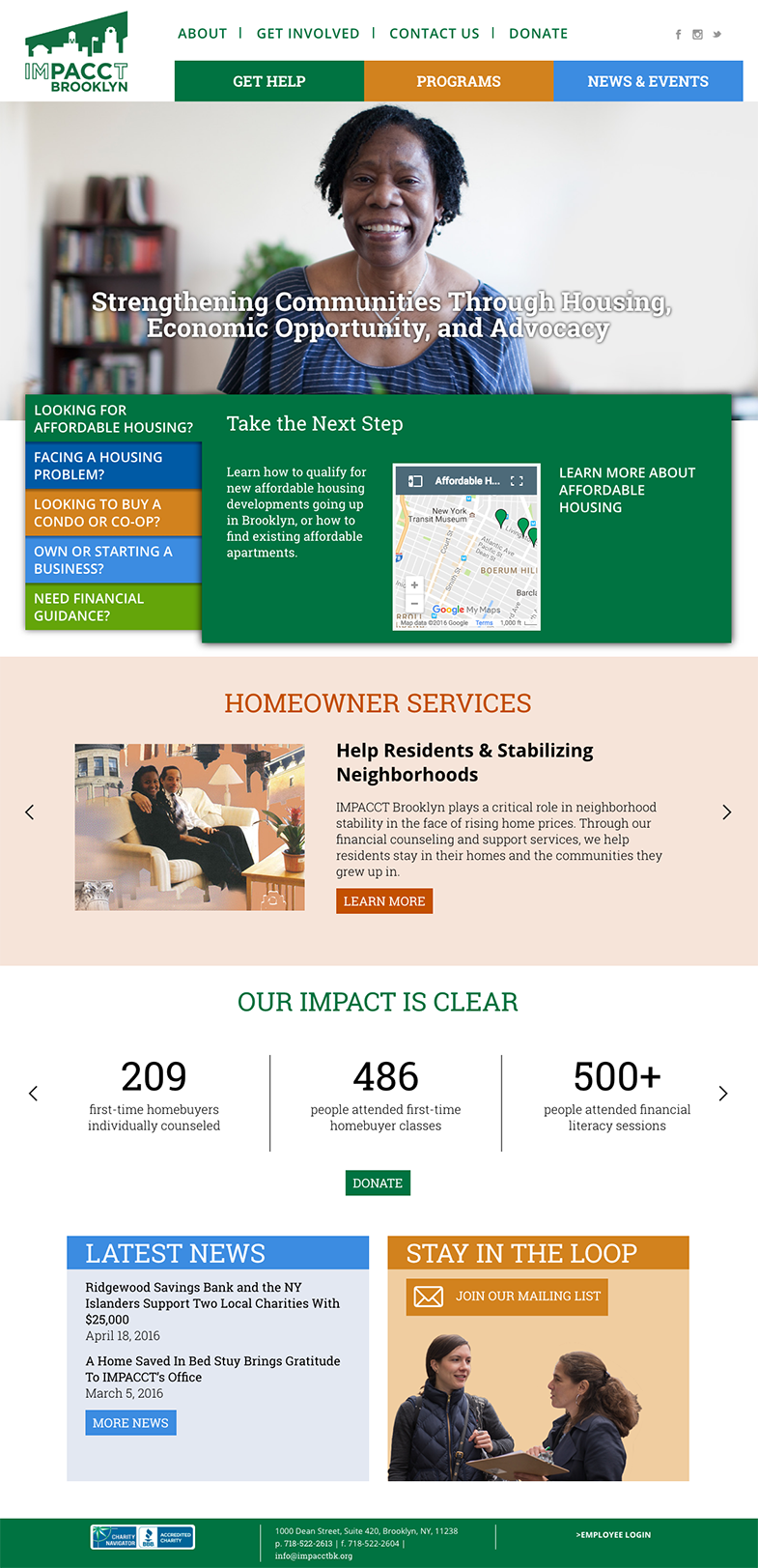
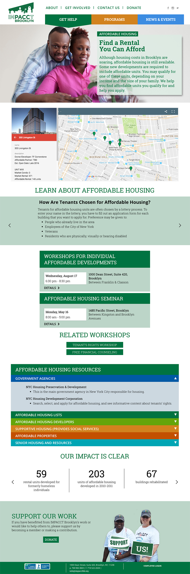
We completely redesigned the website for this affordable housing organization in Brooklyn to make it easier for people to access services. After dissecting all of the services, we created Get Help pages around users needs. Instead of having to search through each program area, users can how easily find relevant services and events. Custom collages bring life to the Program pages.

We developed a custom events section that allows the client to store information for recurring events, such as the descriptions, locations, and contact information so that it can be easily used repeatedly and changed universally throughout site with a single change.

The website is making a huge difference in how people engage with the organization’s services, and is much easier for the client to maintain.

Red Rooster Group helped us completely rethink our website from the bottom up. They revamped our website to being through the eyes of the people we serve, making it much easier for them to access services. Throughout the process, Howard and his team over-delivered, going above and beyond what was in our Agreement. They created a sophisticated system for managing our events, they wrote copy for the website with the right tone to reflect our brand, they created collages to engage our visitors, and developed an illustrated timeline for our history. Throughout the process, they were very professional, and persistent in following up on all details that led to a terrific website. As a result, we are in much stronger position to be resource for people, raise our profile, and gather donations.
— Deb Howard, Former Executive Director

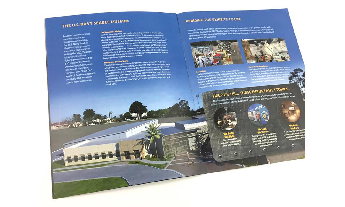
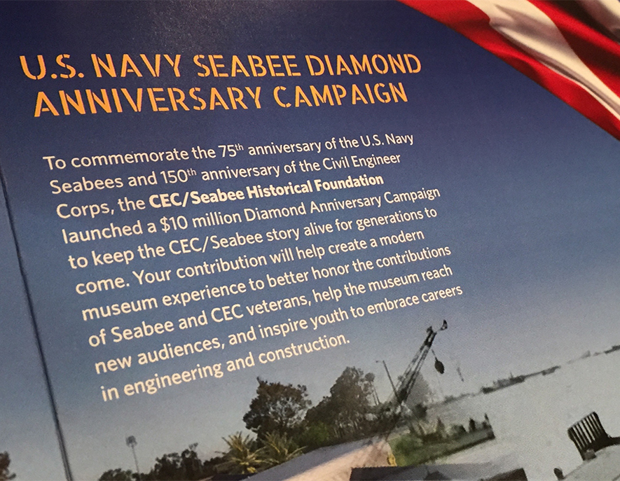
Capital Campaign Website for U.S. Navy Seabees

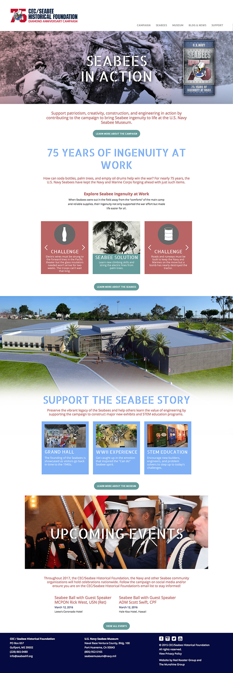
Seabee Homepage

CLIENT: U.S. Navy Seabee Historical Foundation

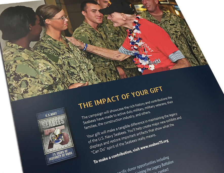
We developed this website as part of a $10 million capital campaign to preserve the legacy of the U.S. Navy’s construction battalions. Our approach for the website was to invite potential donors to explore the Seabees’ ingenuity while learning about the campaign, and the specifics of the museum. The website also describes the campaigns goals and shows mock ups of the exhibits to be created with donor funding. The blog features stories by famous Seabees such as football star Dick Butkus, and Fedex founder, Fred Smith.

Capital Campaign for U.S. Navy Seabee Museum

U.S Navy Seabees

Capital Campaign for U.S. Navy Seabee Museum

$10 Million Campaign

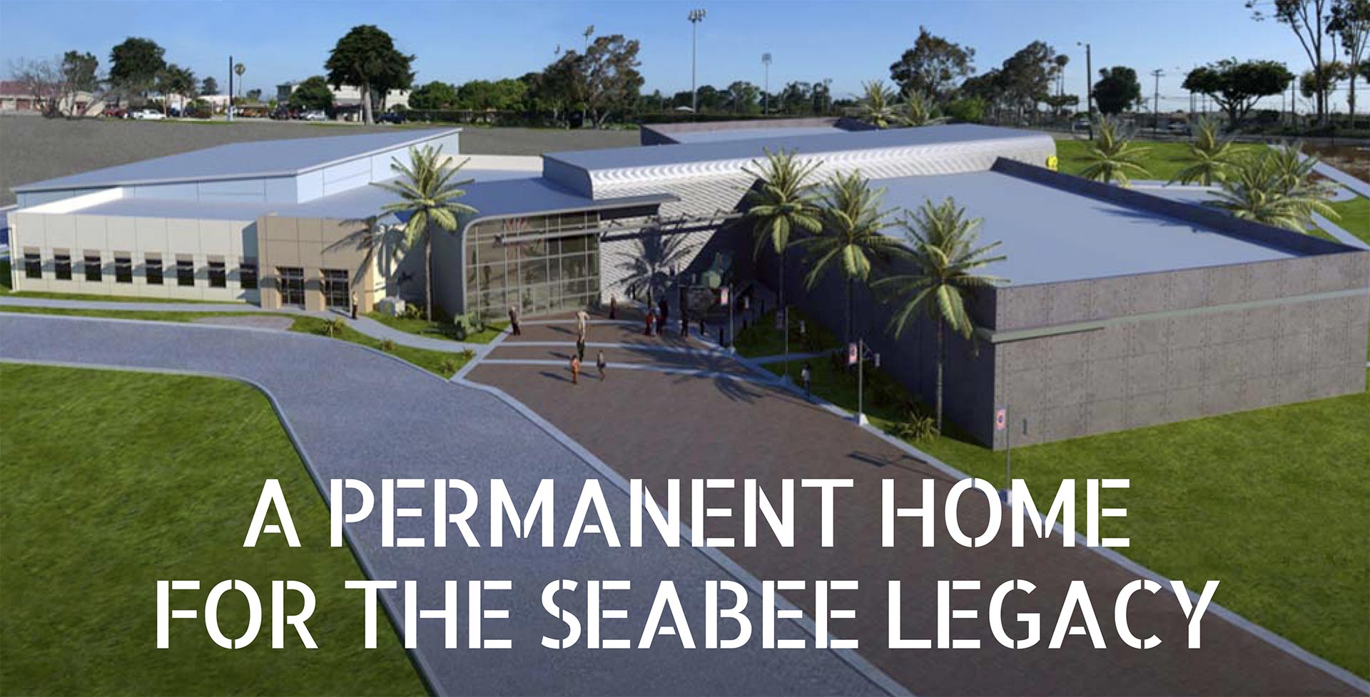
To preserve the legacy of the U.S. Navy’s construction battalions, the CEC/Seabee Historical Foundation conducted a $10 million capital campaign to fund state-of-the-art exhibits at the U.S. Navy Seabee Museum in Port Hueneme, CA.

Services

  • Competitive Analysis & Campaign Strategy
  • Campaign Theme
  • Core Fundraising Messaging
  • Campaign Identity & Logo System
  • Digital Assets & Style Guide
  • Campaign Website
  • Campaign Brochure

The Challenge

A Campaign That Had Stalled — and a Donor Base That Had Shrunk

The CEC/Seabee Historical Foundation had an ambitious goal: raise $10 million to fund state-of-the-art exhibits at the U.S. Navy Seabee Museum in Port Hueneme, CA. But the campaign needed more than a refresh. It needed to expand beyond its existing donor base of military veterans and their families to reach the construction and engineering industries, STEM educators and students, and the broader public. Without a compelling story that could speak to all of them, the campaign would keep fishing in the same small pond.

The Insight

What Makes the Seabees Different From Every Other Military Branch

We started with a competitive analysis of military and institutional capital campaigns. The question was simple: what makes the Seabees a cause worth supporting that no other campaign can claim?

The answer was in the stories.

On Iwo Jima, Seabees solved the problem of a hidden enemy patrol by pumping 500,000 gallons of water into their cave.

A Seabee got his engine running again by building a working condenser from tinfoil stripped off cigarette packs, waxed paper from a fruitcake box, and a discarded beer can.

In the field, Seabees converted 55-gallon drums into sewer pipes, roofing material, canoes, bathtubs, and solar-heated showers.

No other branch had stories like these. The Seabees didn’t just fight — they invented, improvised, and engineered their way through every obstacle.

Messaging Strategy

The Insight That Unlocked the Campaign

That pattern of solving impossible problems with whatever was at hand became our strategic foundation. It wasn’t just military valor. It was the same creative problem-solving that drives modern engineering, powers the construction industry, and defines what we want STEM education to produce.

Ingenuity was the thread that could connect a Seabee veteran to a construction executive, a museum donor to a high school student considering a career in the trades. It gave the campaign a story bigger than its history — and an audience far larger than its traditional base.

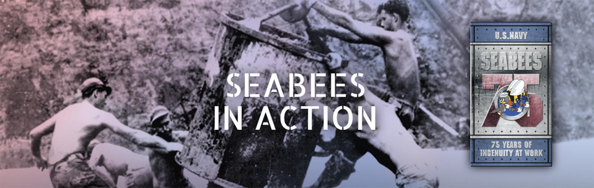
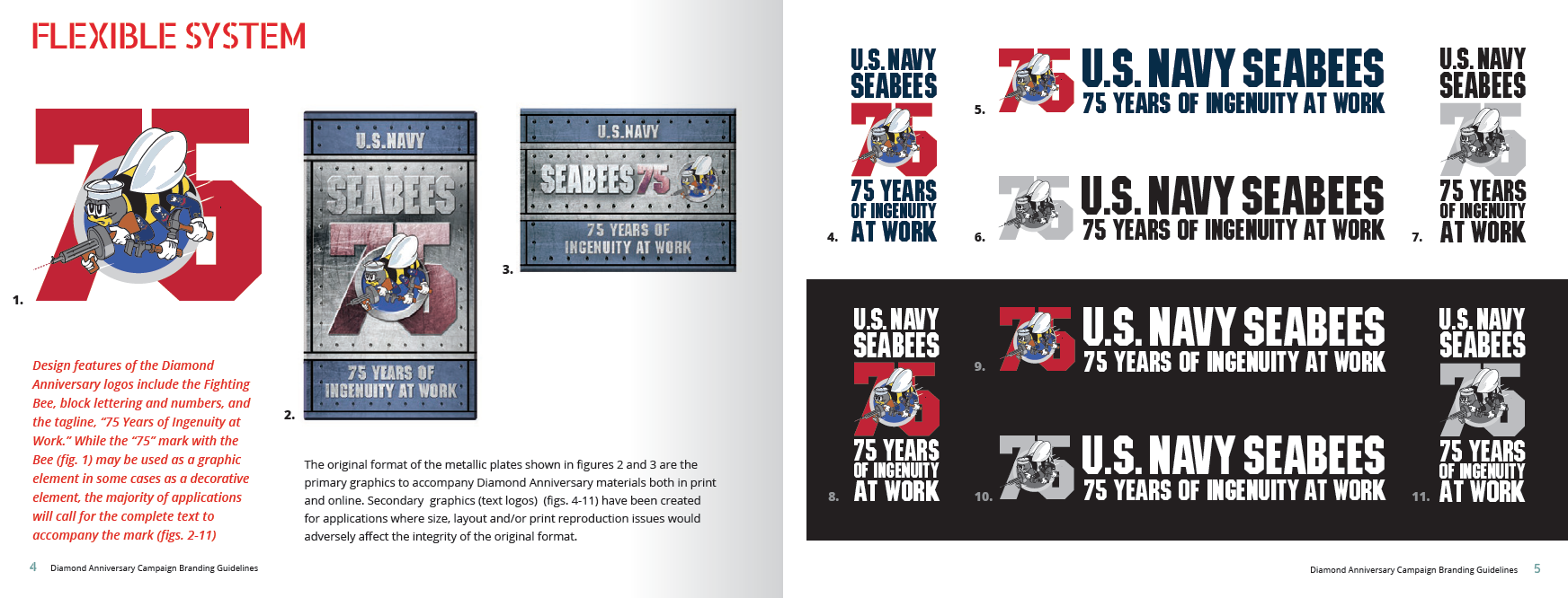
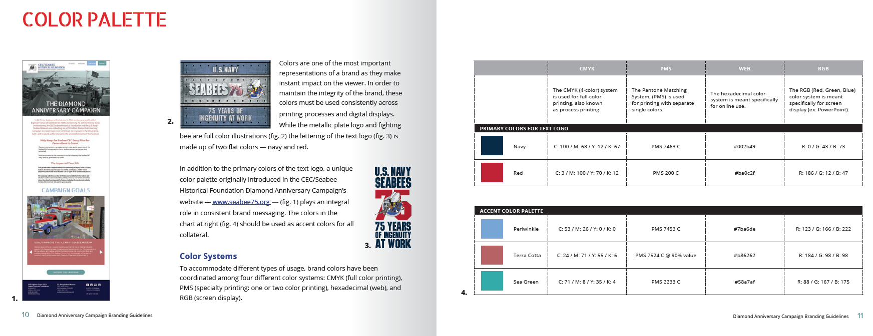
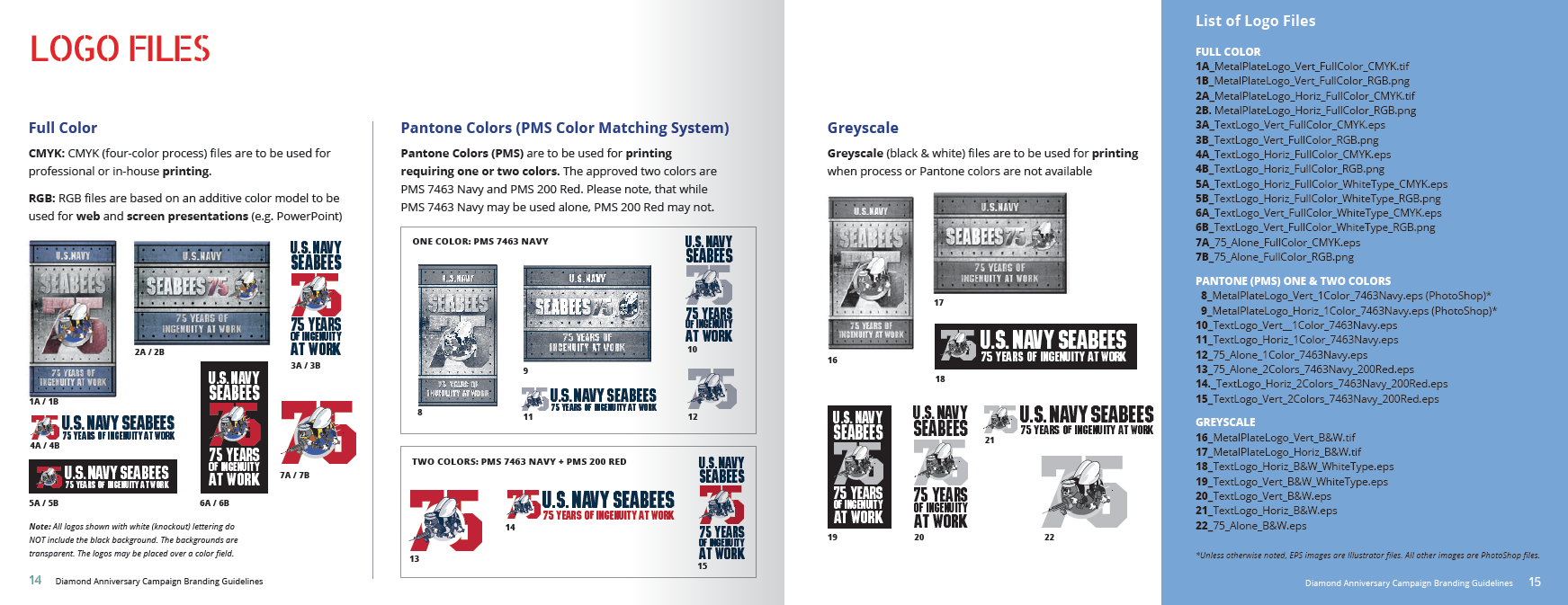
Campaign Theme & Identity: 75 Years of Ingenuity at Work

The theme we developed — 75 Years of Ingenuity at Work — anchors the campaign in the Seabees’ diamond anniversary while making their legacy relevant to audiences who may never have heard of them. The campaign logo and visual identity system were built around that idea: flexible enough to work across print, digital, and event materials, consistent enough to build recognition across a long campaign. We delivered a complete style guide with all assets so the Foundation’s team could execute independently across every fundraising touchpoint.

Seabee Brand Manual 1
Seabee Brand Manual 2
Seabee Brand Manual 3

A Website That Pulls Donors Into the Story

The campaign website was designed to do more than present information — it invites visitors to explore the Seabees’ ingenuity before ever asking them to give. Prospective donors learn who the Seabees were, what the museum represents, and specifically how their contribution will transform the visitor experience. The site gives every audience segment — veterans, industry leaders, educators, and first-time visitors — a reason to care.

Seabee Homepage

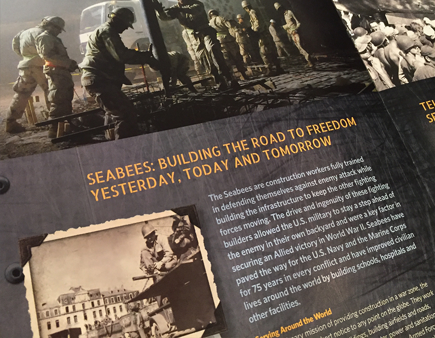
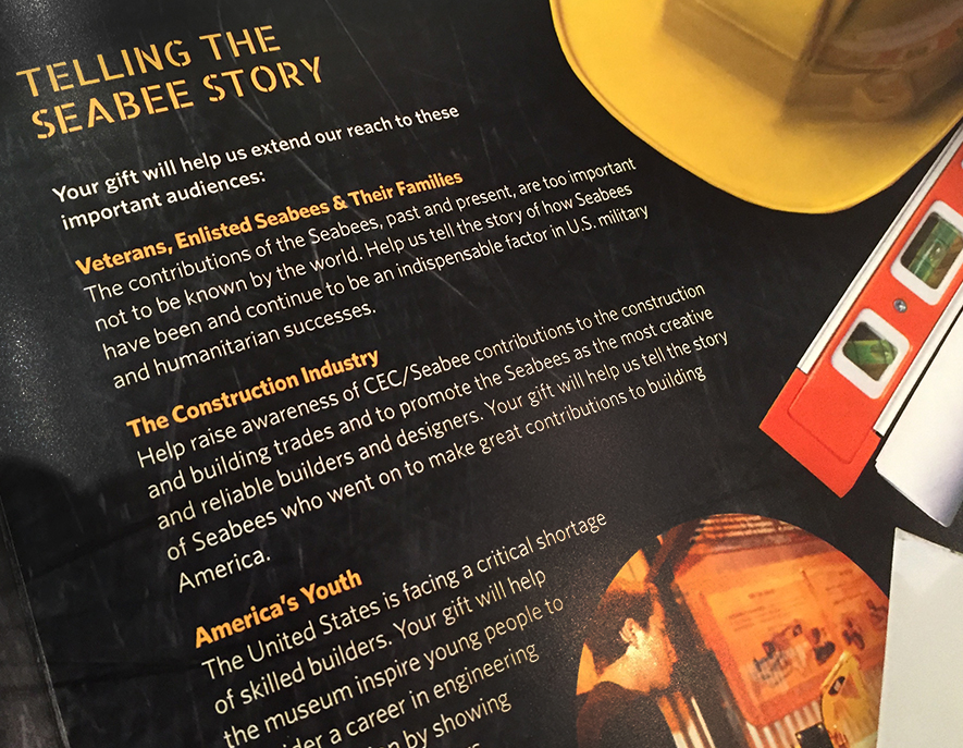
A Brochure Built on Action Design Principles

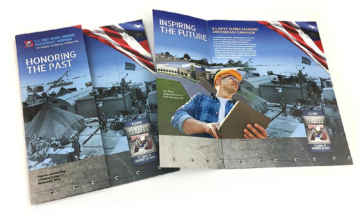
The campaign brochure was crafted using Action Design — a framework for moving readers from awareness to commitment. Rather than leading with need, it leads with identity: the pride military families feel in service, the relevance of Seabee skills to today’s workforce, and the power of the museum to inspire the next generation of engineers and builders. It makes the case that preserving the Seabees’ story isn’t nostalgia — it’s an investment in the future of American innovation.

Seabees Brochure
Seabees Brochure
SeabeeBrochure_2
SeabeeBrochure_3
SeabeeBrochure_4
SeabeeBrochure_6

A Legacy Preserved. A New Generation of Supporters Engaged.

The 75 Years of Ingenuity at Work campaign gave the Foundation the tools to tell a story that had never been told quite this way — and to tell it to audiences who had never heard it. By anchoring the campaign in the Seabees’ defining trait rather than their military history alone, we helped the Foundation move beyond its traditional donor base and make the case for a museum that belongs not just to veterans but to anyone who believes in American ingenuity, skilled labor, and the people who build things that matter.

To give the campaign lasting momentum, we built a communications strategy around the voices of core donors — Seabee veterans and their families, alongside business and industry leaders who connected with the mission. Their stories became the campaign’s most powerful fundraising tool, demonstrating the breadth of the Seabee legacy and the range of people it inspired.

The campaign website anchored the ongoing storytelling with a blog that kept the campaign alive between solicitations, featuring new Seabee stories, donor spotlights, and updates on the museum’s progress. It gave supporters a reason to stay engaged, share the campaign with their networks, and see themselves as part of something larger than a single gift.

Updated Messaging & Materials Breathe New Life Into Social Service Agency

How does a 112-year-old social service agency increase its visibility to engage participants and donors?

A clear, purposeful message, unified voice, and visual look with consistency across all marketing galvanized staff and inspired donors.

UMFS had a cliché mission statement: Touching lives. Creating futures.

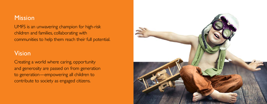
We gave them a new one around the theme of unwavering champions for high-risk children and families.

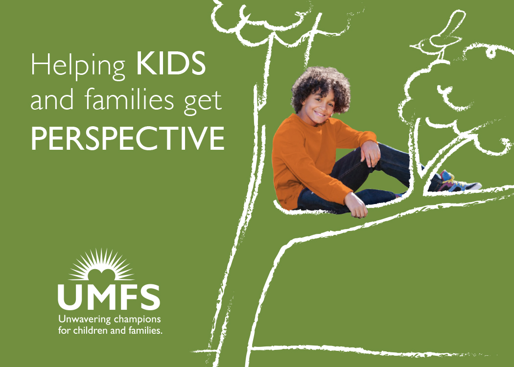
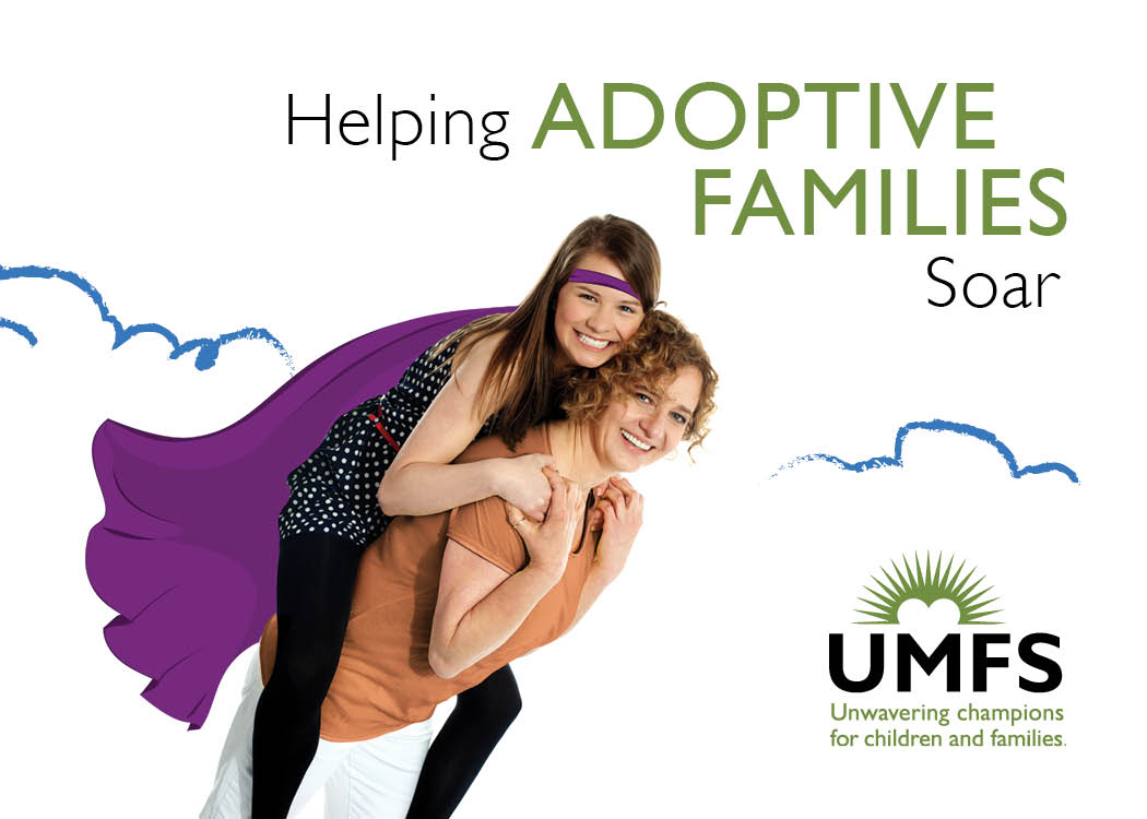
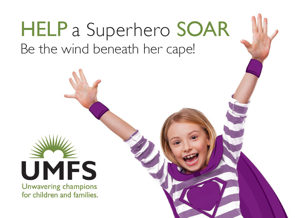
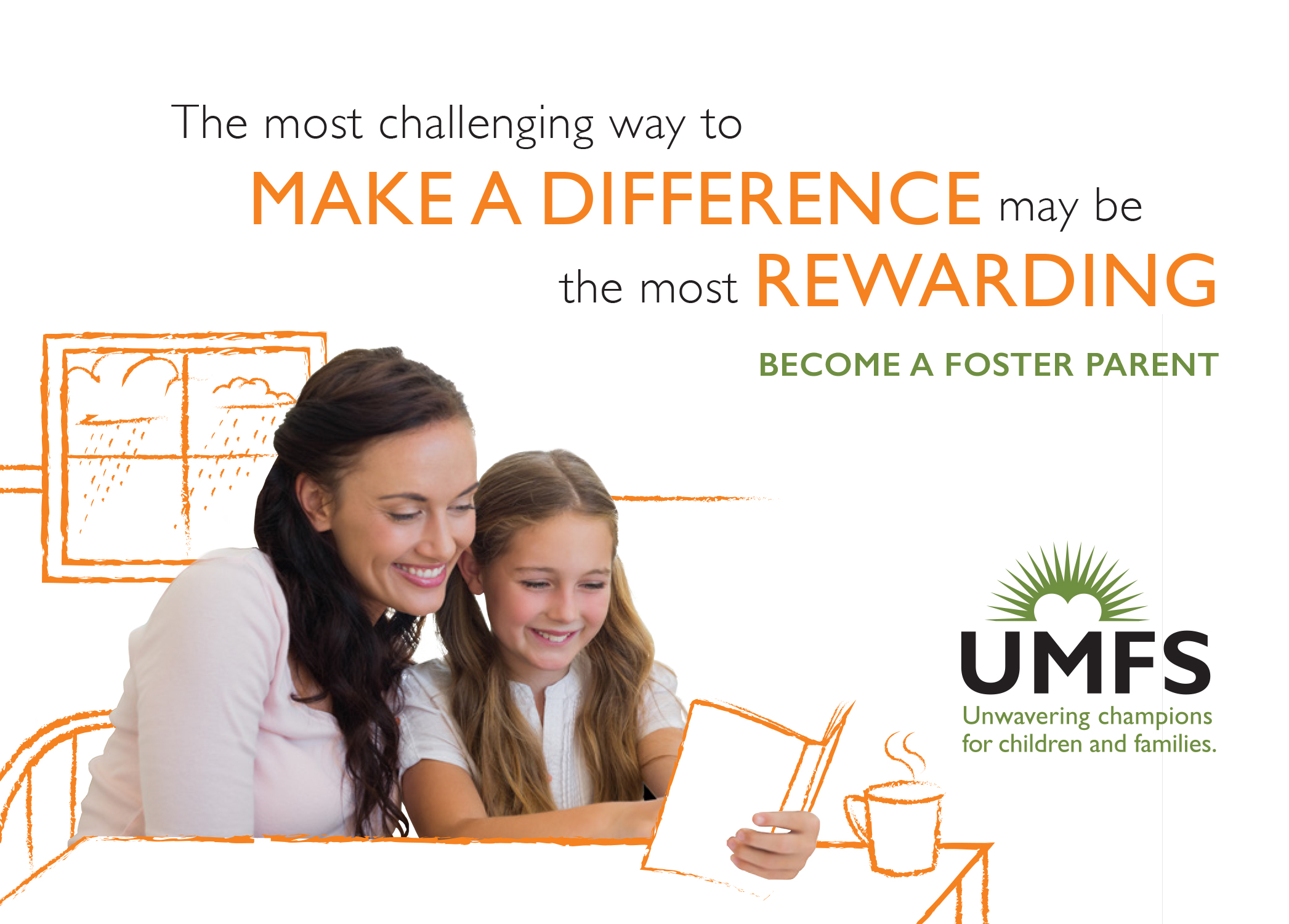
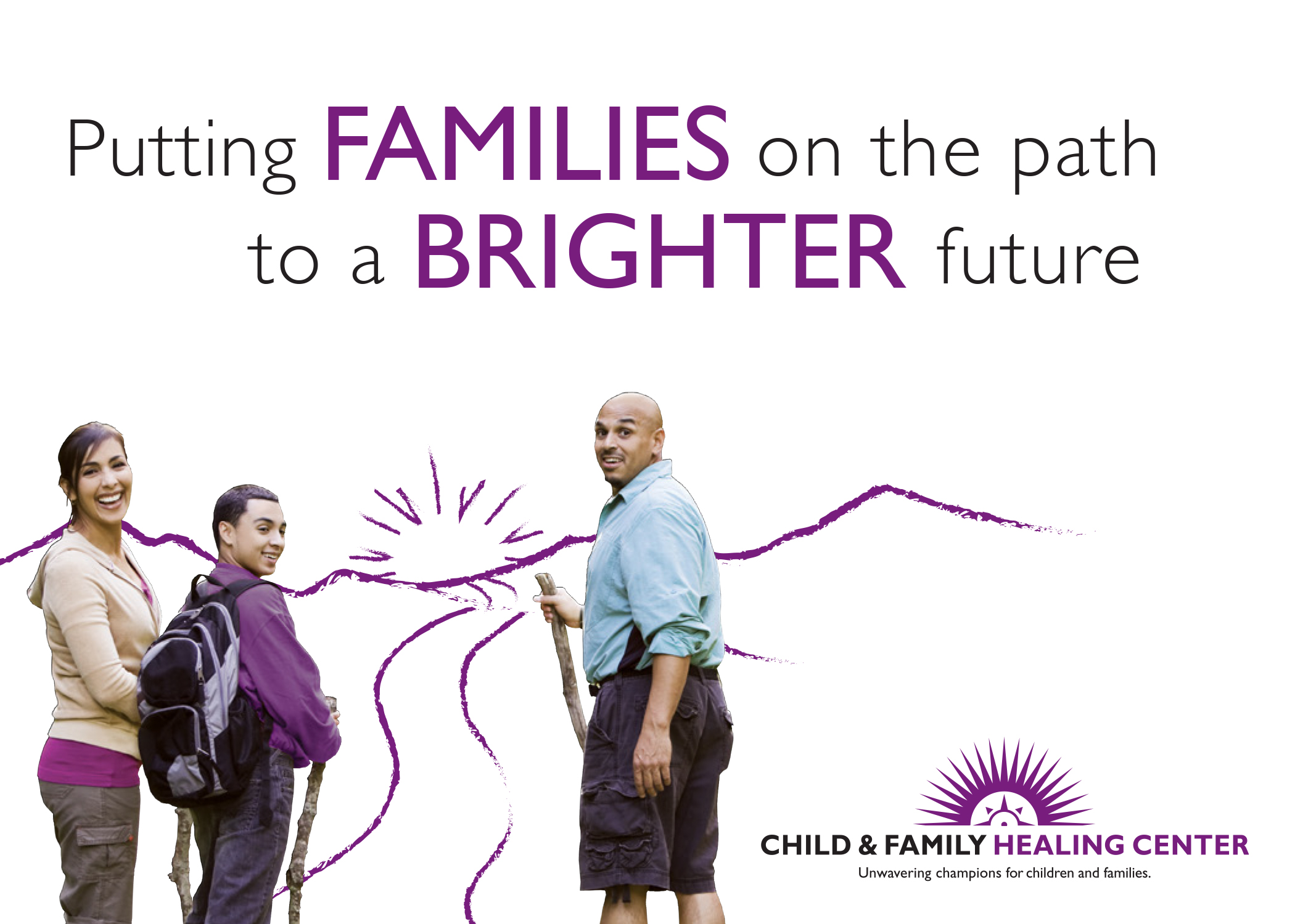
We created a cohesive and recognizable visual look with inspiring headlines around their theme that helps UMFS stand out from other social service agencies.

UMFS Organizational Brochure
UMFS Brochure 3
UMFS Brochure 5
UMFS_DonorBrochure
UMFS Brochure 4
UMFS Brochure 6

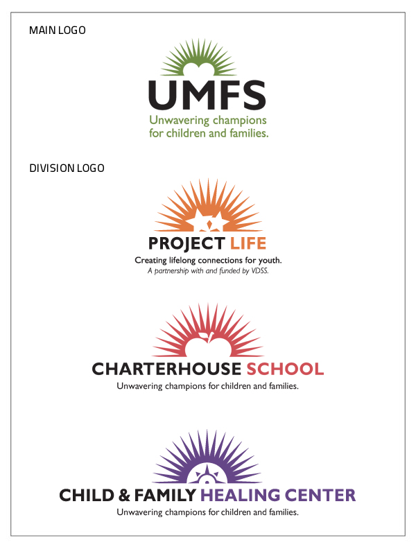
We unified their visual identity so that all divisions have appropriate symbols that connect to the parent organization.

UMFS Brand Architecture

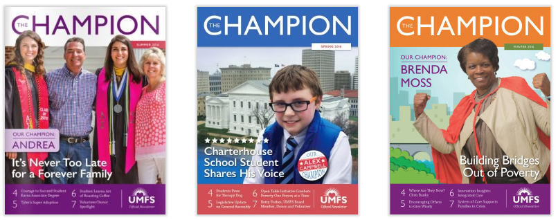
To reflect UMFS’ new messaging we changed the name of their newsletter from Guardian to The Champion and showcased people who are living the organization’s mission.

Champion Newsletters

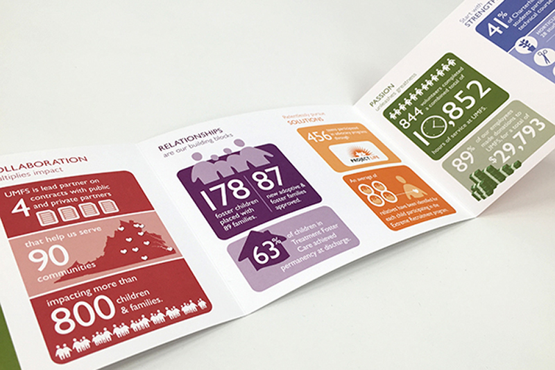
To communicate the organization’s successes in a compelling way in their Impact Report, we created infographics visualizing accomplishments in five areas corresponding to their values.

UMFS Impact Brochure

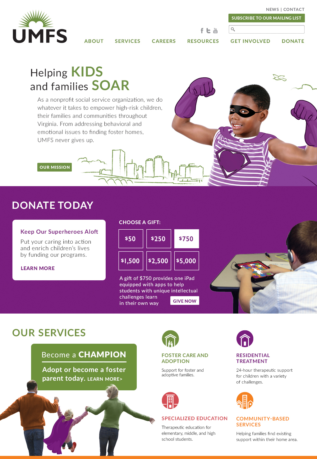
We developed a responsive website that appealed to clinicians, parents, and donors. We wrote and designed the website to make it easy for users to understand UMFS’ services and take action, as well as for staff to update.

UMFS Homepage

A benefit-oriented headline, short copy, and unique graphics greet site visitors.

A rollover invites site visitors to explore donation levels.

Information is presented in small increments and reflows when viewed on tablets and phones.

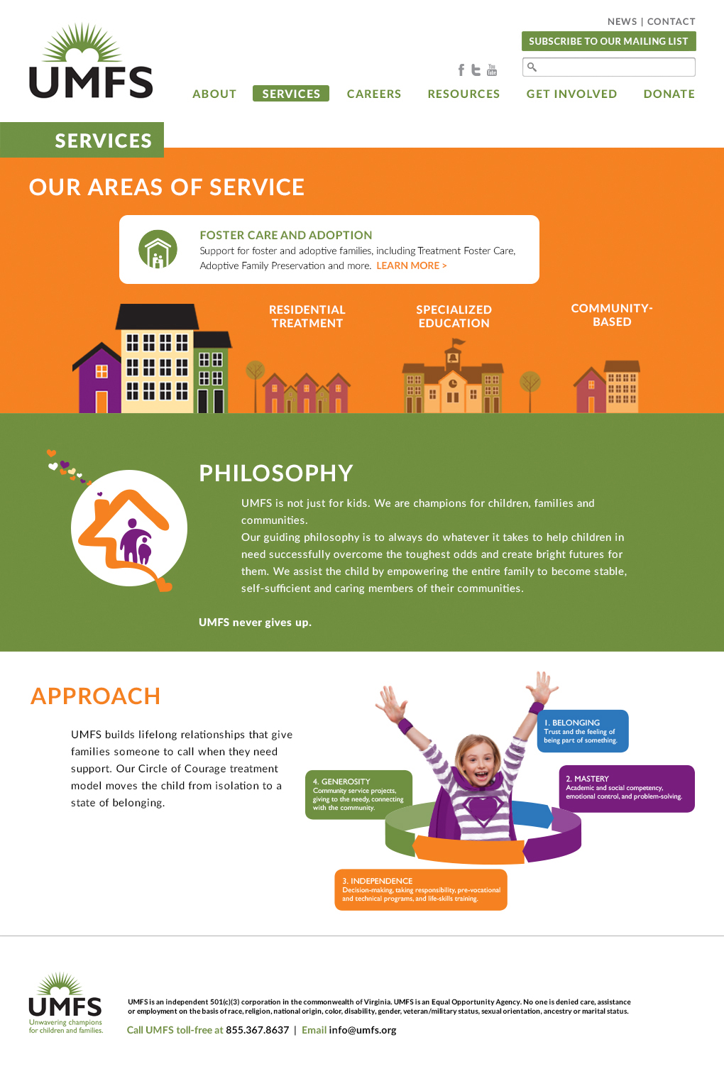
Throughout the site, stylized illustrations contribute to a design that’s both inviting and informative. Pages for each division of the agency thoughtfully address the concerns and challenges faced by each demographic.

A rollover invites site visitors to explore services.

Modular block system makes pages interesting, and can be easily updated by the client.

UMFS106_5_Services copy

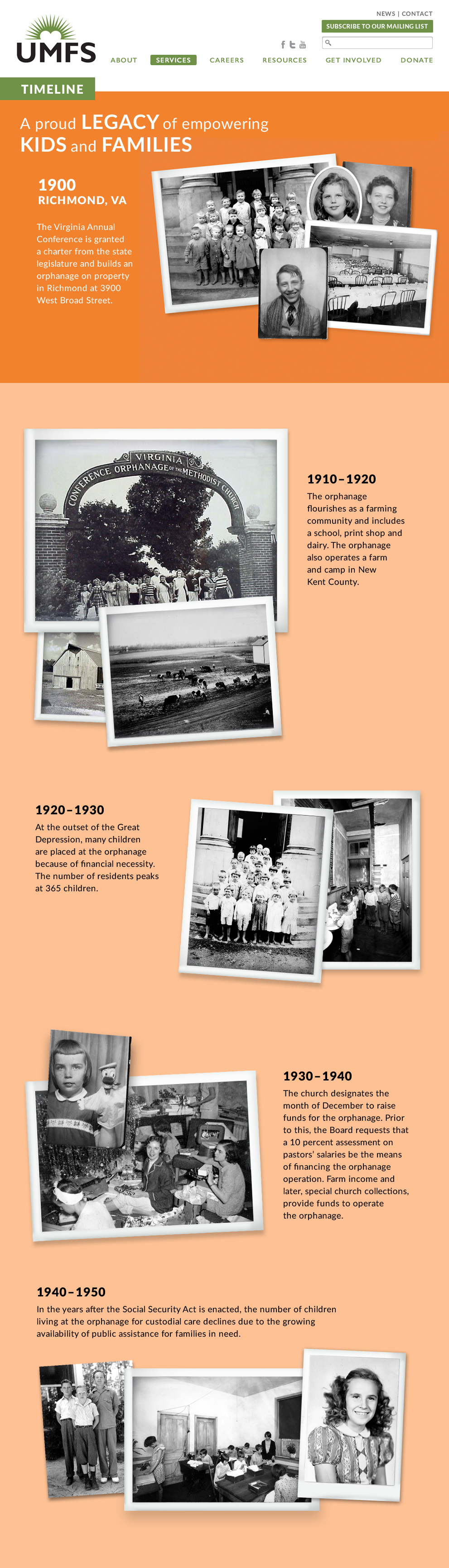
The History page features a vertical timeline with vintage photos.

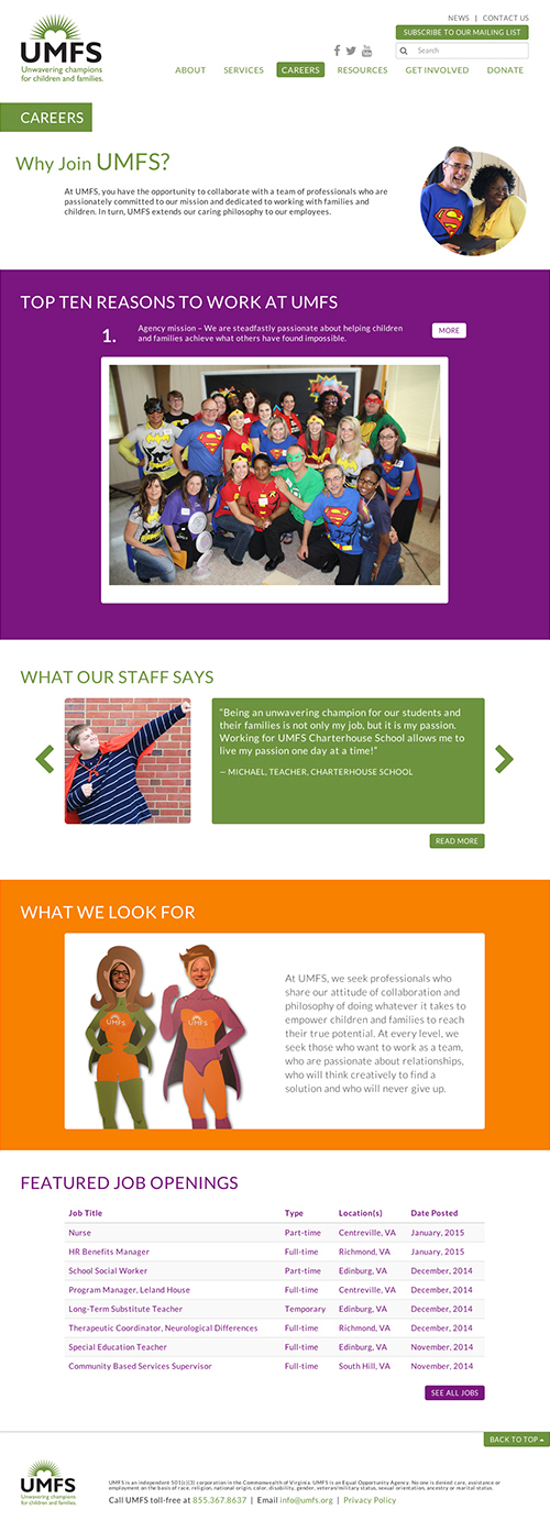
The Careers page was designed to attract high-quality staff.

Updated Messaging & Materials Breathe New Life Into Social Service Agency
UMFS_Careers

To help UMFS communicate its message to its 300 employees statewide, we created a brand book that illustrates key points in an easy-to-understand way. 

UMFS Brand Book

UMFS Brand Book11
UMFS Brand Book13
UMFS Brand Book14

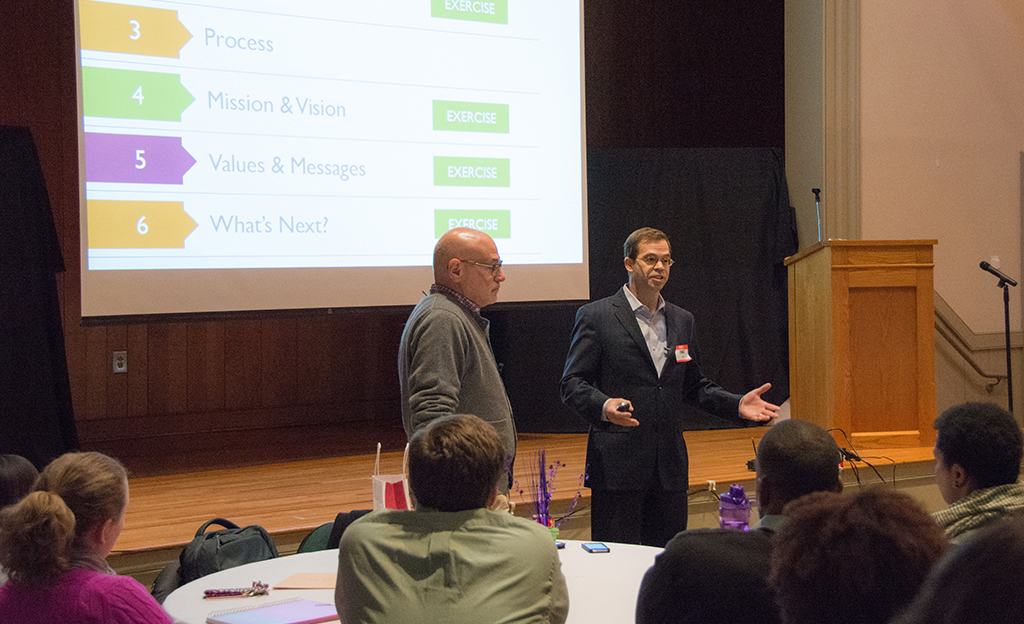
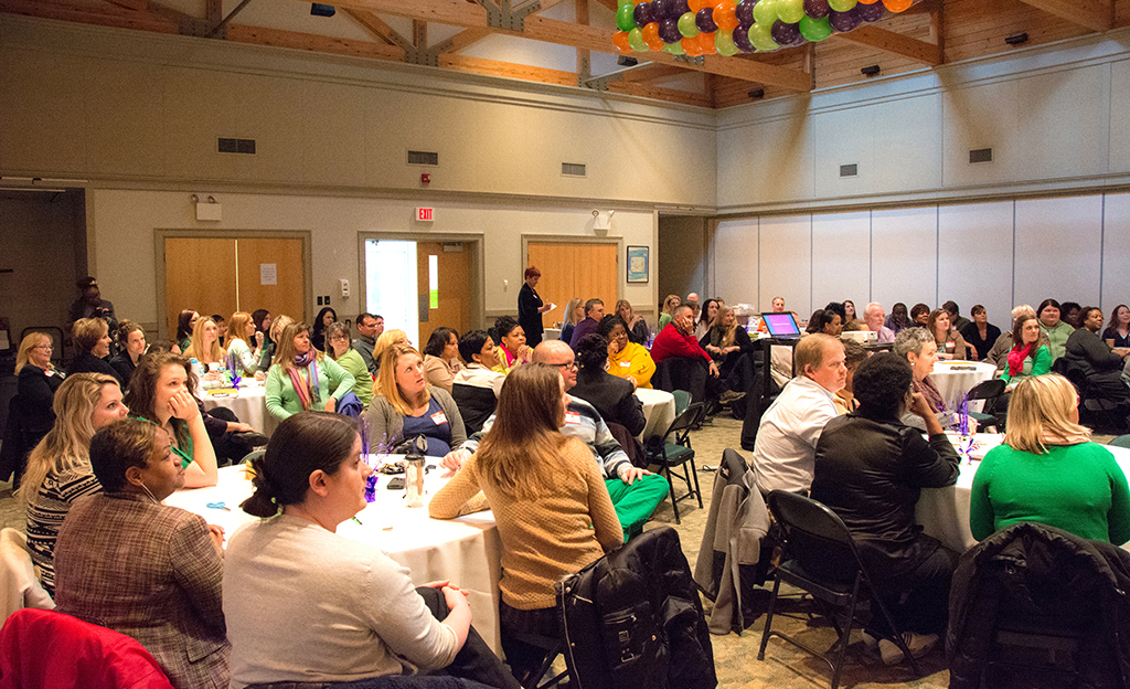
We held brand workshops for key staff and the board to help them understand and embrace the brand messages. The sessions included hands-on activities to create enthusiasm for their brand.

UMFS Brand Launch 1

Red Rooster Group staff introduce UMFS’ new messaging.

UMFS Brand Launch 2

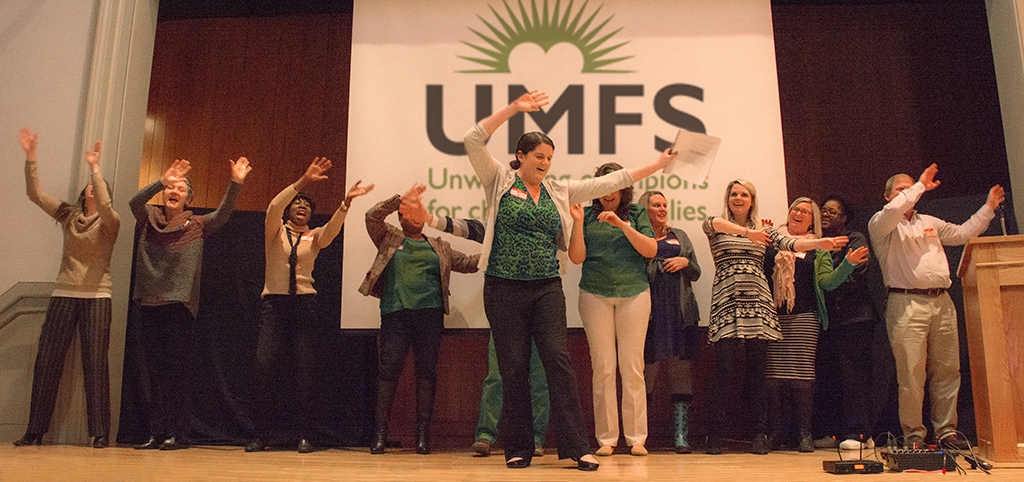
About 80 key staff attended the workshop. We held a separate session for the board.

UMFS Brand Launch 6

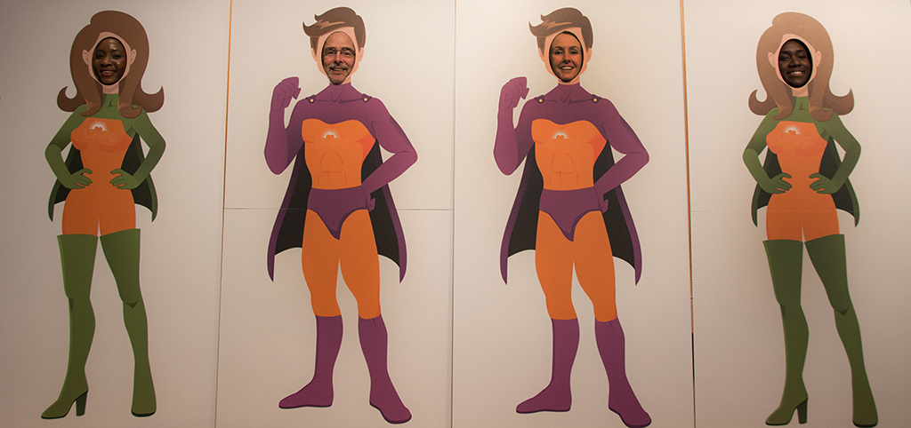
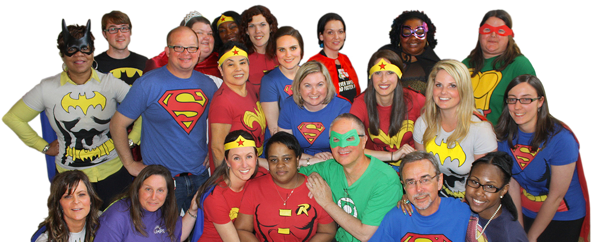
To emphasize the message of ”Unwavering Champions,” we created cutouts so people could photograph themselves as champions.

UMFS Brand Launch 3

For one activity, participants wrote and performed a song using UMFS’ new messages.

UMFS Brand Launch 4

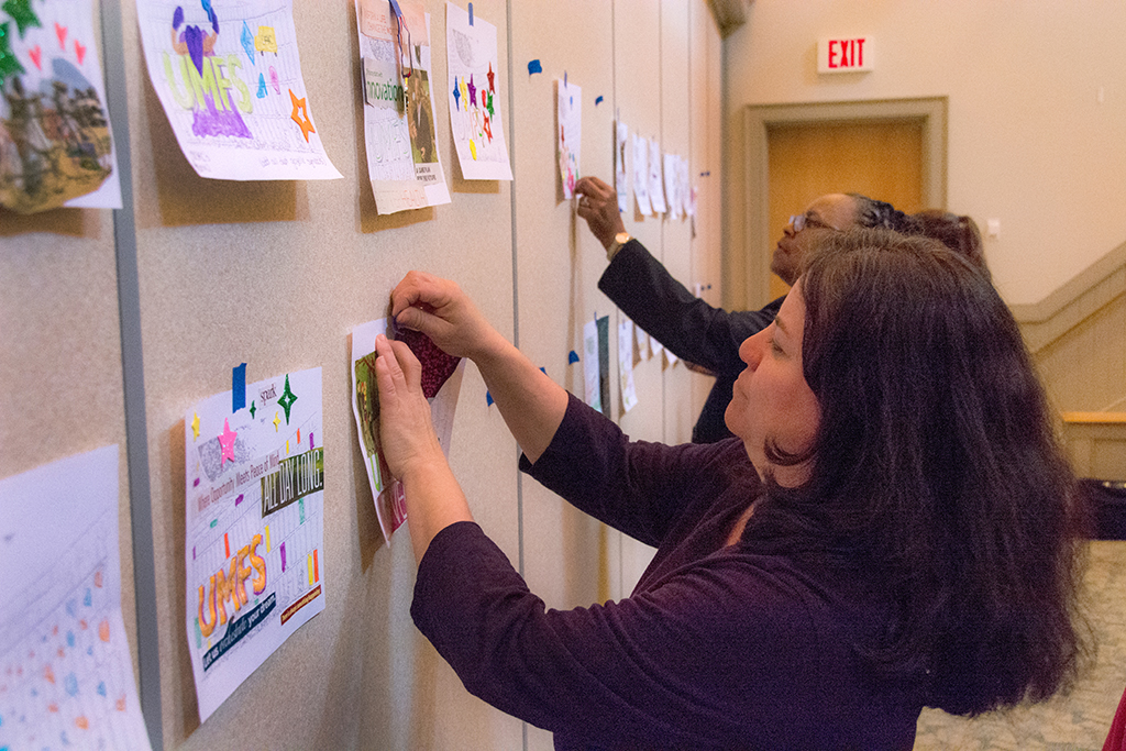
We asked participants to decorate and post a sheet depicting the wall surrounding their campus to demonstrate what’s behind the wall.

UMFS Brand Launch 5

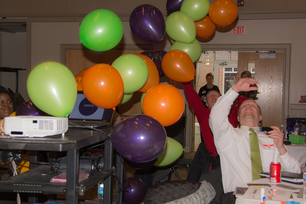
A balloon drop helped generate excitement and underscore the importance of the brand initiative.

“You guys really nailed what we are all about. I really feel I understand our messages, and embrace them.”

BRAND WORKSHOP PARTICIPANT”

The UMFS staff is now living their brand!

UMFS Champions

“Red Rooster Group captured the social impact and organizational DNA that was a part of our culture. Due to our new mission, we proudly refer to ourselves as unwavering champions for high-risk children and families. Our board and staff have rallied around this bold new message and our donors, customers, and competitors have taken notice.”

Greg Peters_casualEdit

GREG PETERS
UMFS, President & Chief Executive Officer

Responsive Website for Special Needs Schools

Charterhouse School Home

Client: Charterhouse School

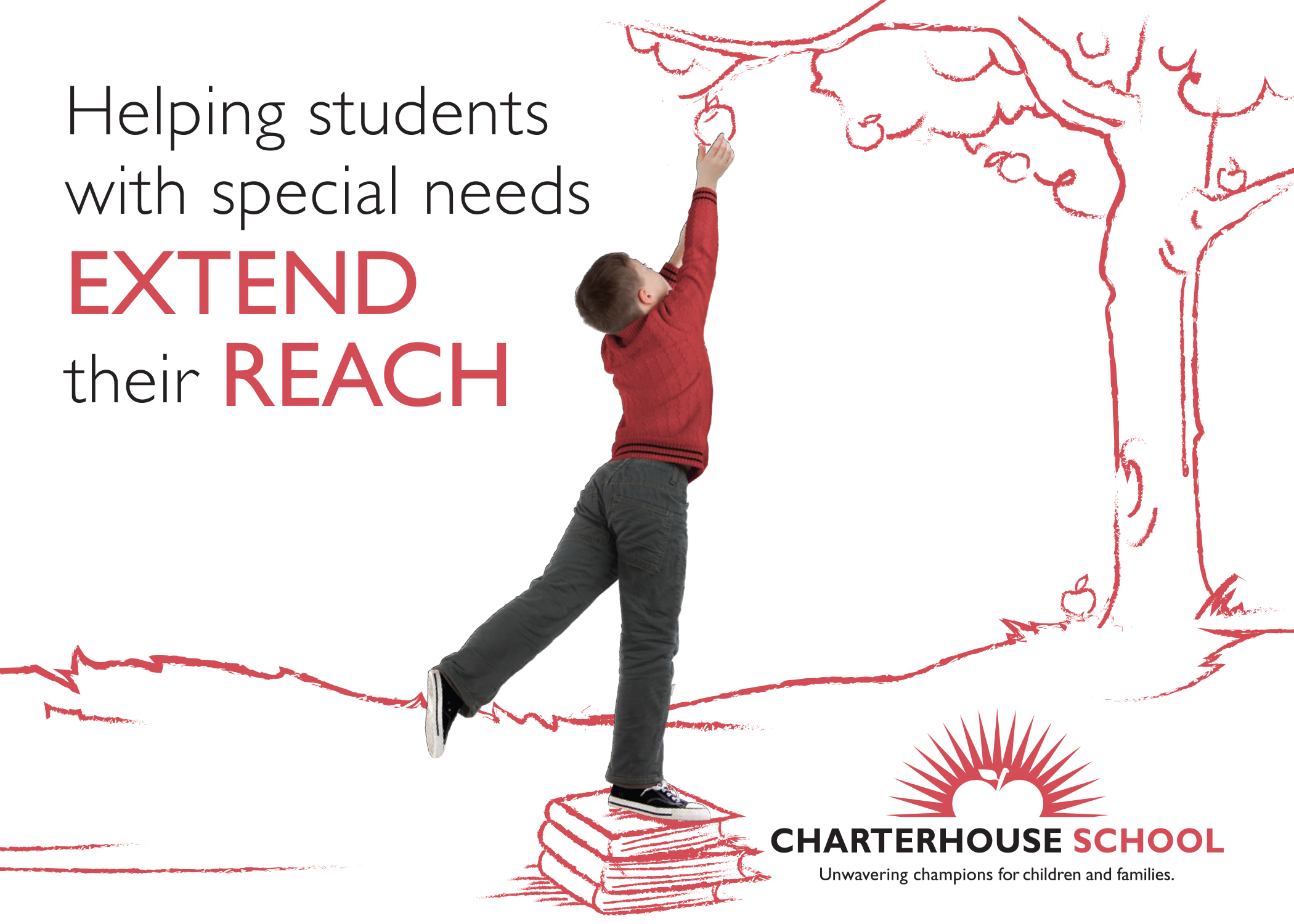
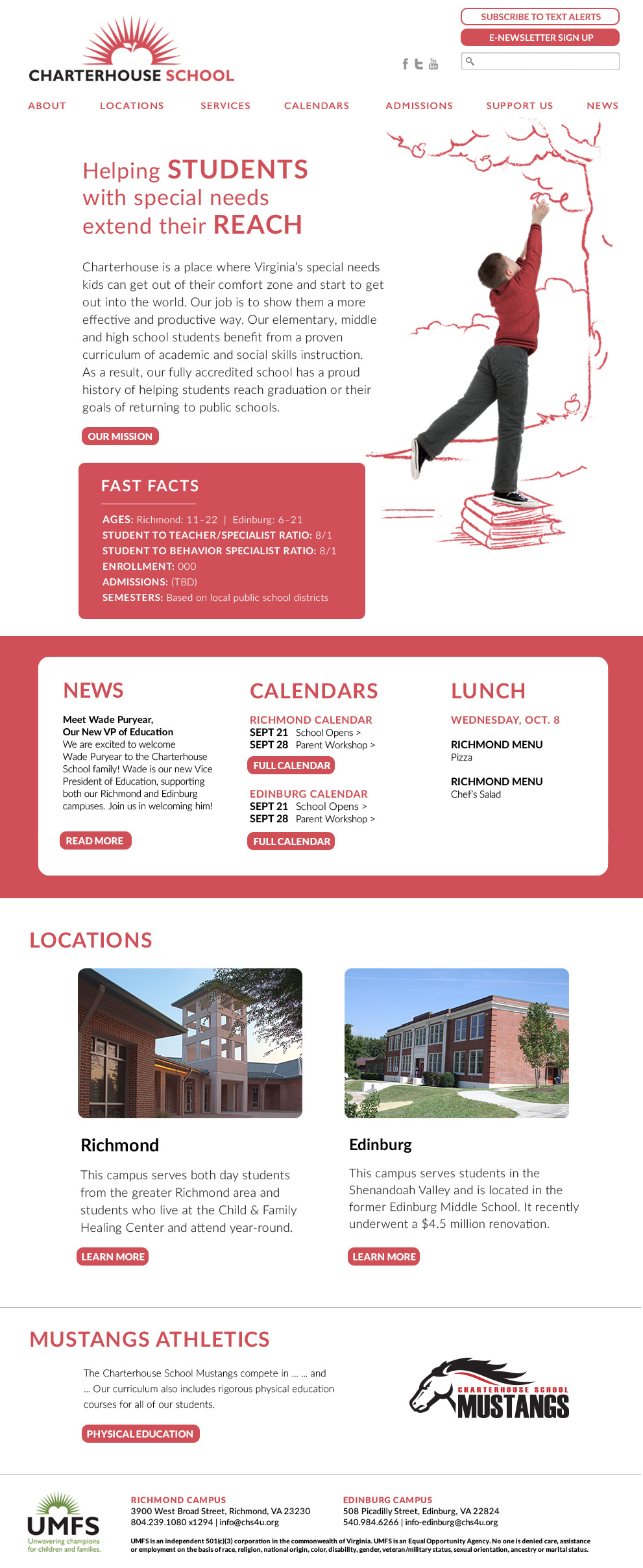
This website accommodates two schools serving youth with intellectual and developmental disabilities. We wrote, designed, illustrated, and developed the website to be easy to read and to be fully responsive for mobile and tablets. Features include a pages for each of the two locations, description of the services and curriculum, calendars, and a blog.

Branding: We designed the website to tie into the brand that we created for the parent organization, UMFS, combining photos with illustrations to create a custom look for the organization.

Content Management: The website was created in WordPress, allowing the client to update all content in the website. The website also connects to the main administrative login for the school’s parent organization, allowing management to manage the site with the same login they use for managing their parent website.

New Website Engages Youth and Those Who Help Them

Project LIFE Website Home
Project LIFE Website Age Timeline

Client: Project LIFE

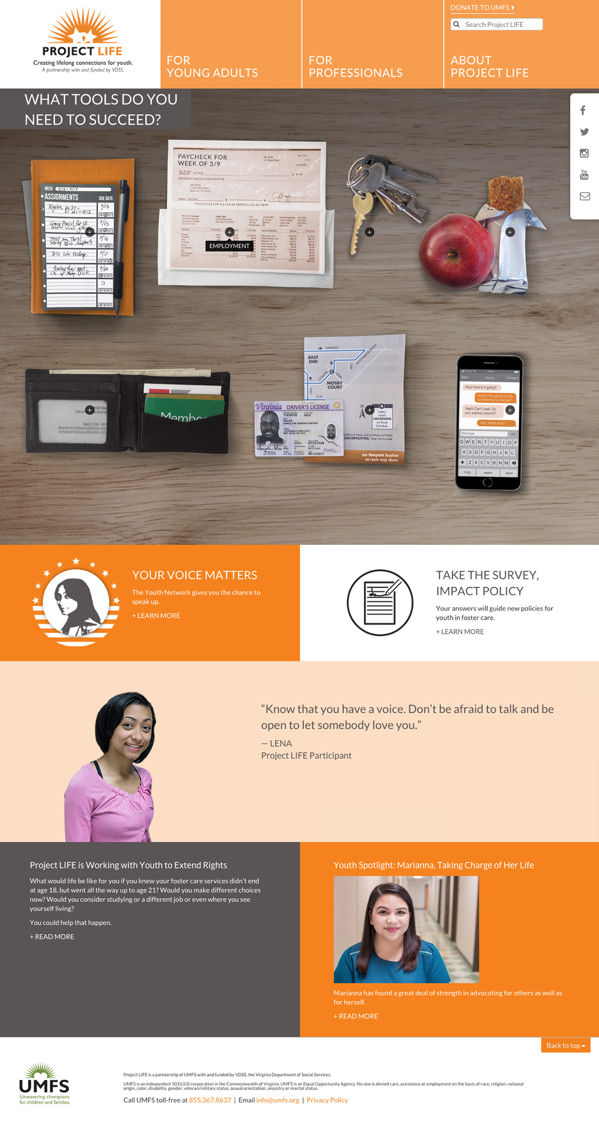
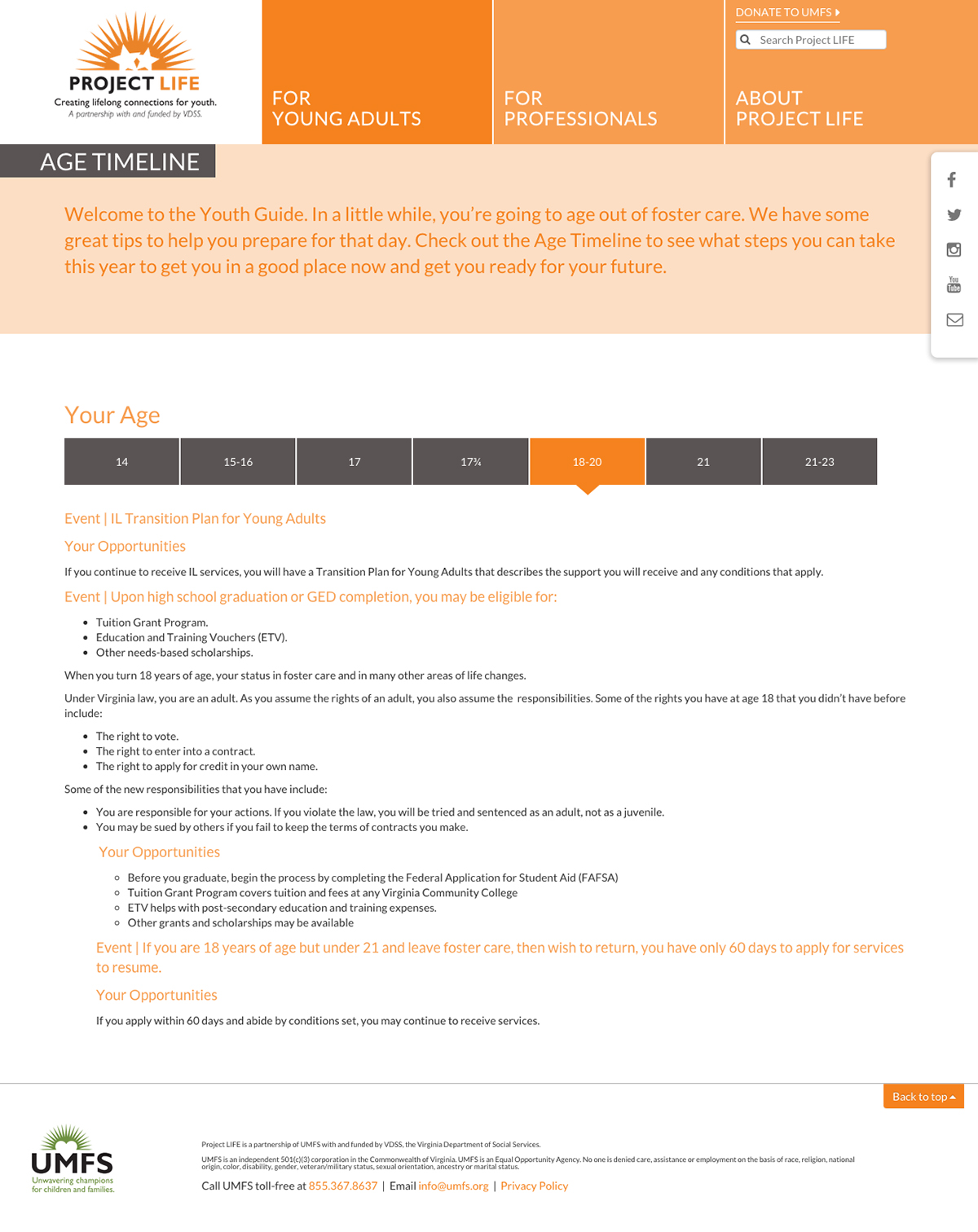
How can the state of Virginia tell youth in foster care what they need to know, when the government is the last party that youth in foster care will listen to?

Our solution was to have foster kids speak directly to other foster kids about their experiences. We interviewed and created videos that in which older youth described what they wished they would have known when they were younger. And so instead of the government preaching to kids about getting serious about getting a job, a former foster youth who experienced homelessness expresses how important it is to have somewhere safe to go, something foster youth can relate to.

Another aspect of the website as presenting resources for youth, as well as professionals, covering a range of areas from housing to employment. Rather than pandering with a youthful-looking design, we created an engaging interface that allows youth to explore the topics on their own, and wrote the copy in a way that engages them through questions, provides prompts for thinking through the issues and next steps, and provides resources for learning more.

The website, which is designed in WordPress and is fully-responsive for mobile and tablet, has been very well received by youth in foster care as well as professionals supporting them.

Interactive Site Interface Encourages Conversation About Conservation

EDF102_Wireframes

Client: Environmental Defense Fund

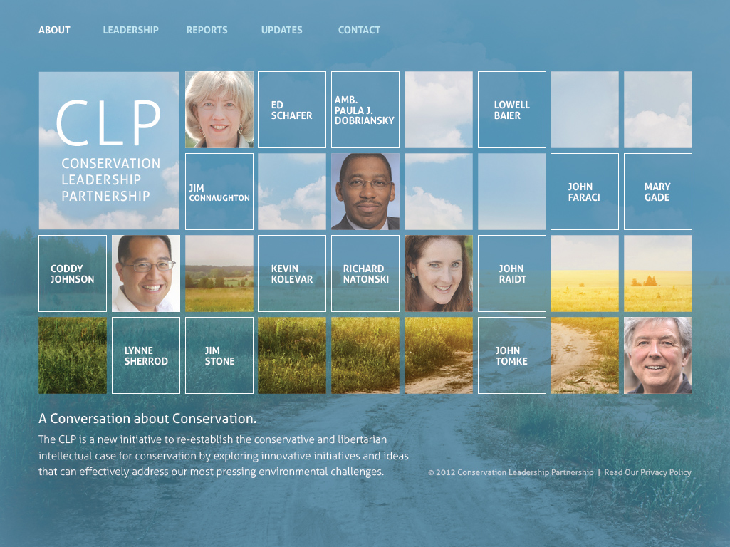
How can you engage people to read academic reports on conservation that address pressing environmental challenges? Through an engaging interface with a human connection. The CLP homepage features an interactive layout with rotating head shots of leaders that link to individual bios. Interior pages house sections for academic reports, leadership bios, and additional information about CLP. A clean interface with lush color photos encourages site visitors to linger and participate in a conversation about conservation.