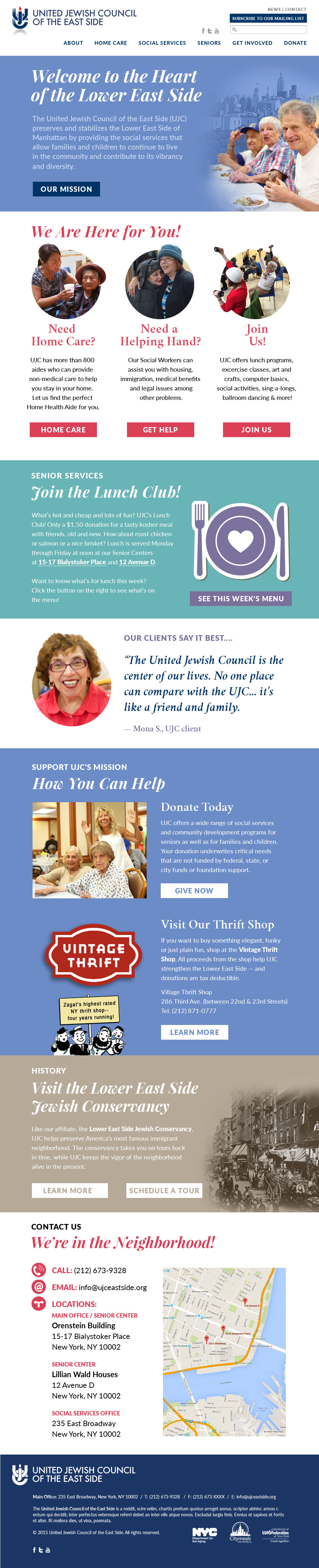
Website Helps Seniors Access Services in Multiple Languages

Website Helps Seniors Access Services in Multiple Languages

Client: United Jewish Council of the East Side

How you create an effective website for seniors?

Make it clear and easy to read. Make it relevant to their needs, and provide information in multiple languages.

Our website redesign for this social service agency delivers on all fronts. By interviewing the seniors served by the agency, we gained an intimate understanding of their needs that allowed us to write the content for the site to meet their interests, get testimonials to add human dimension, and take photos to bring the site to life.

The website features a lunch menu and activities calendar, as well as a strong donation section describing why the organization is worthy of support. Another interesting feature of the website is a page describing the benefits of their home health aide service to other referring professionals, the first time this was done in the industry.

The website was designed in WordPress, is fully-responsive for tablets and mobile devices, and is easy for the client to update.

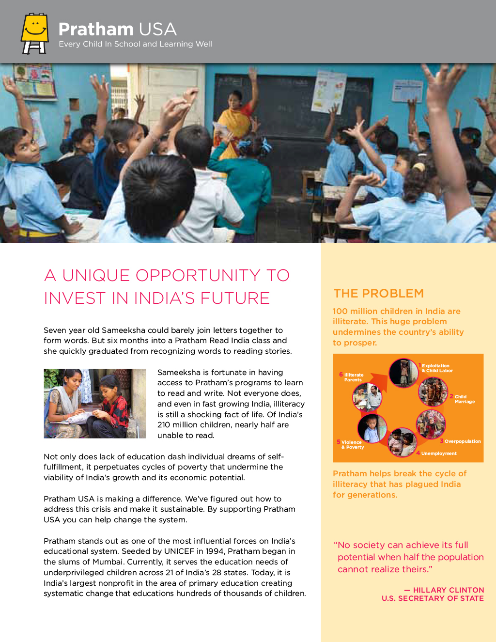
Redesigned Website for Largest Educational Organization in India

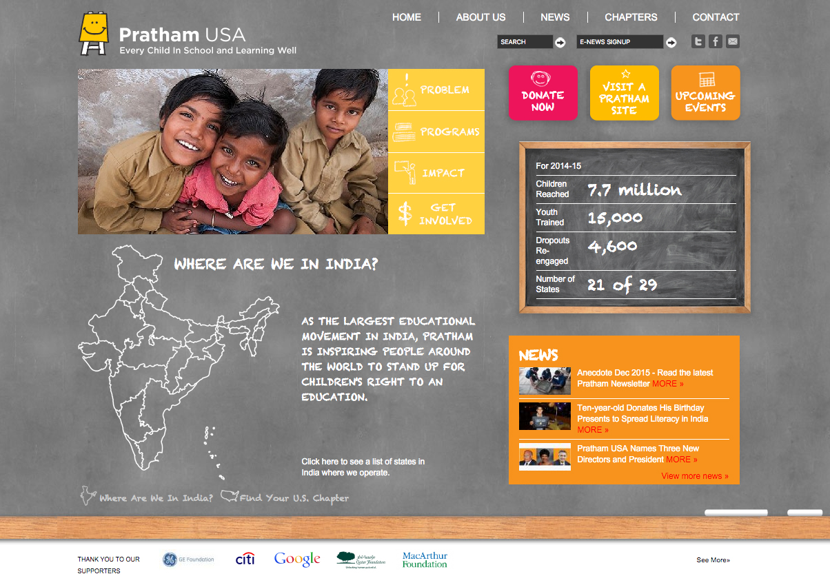
Pratham Website Homepage 2015
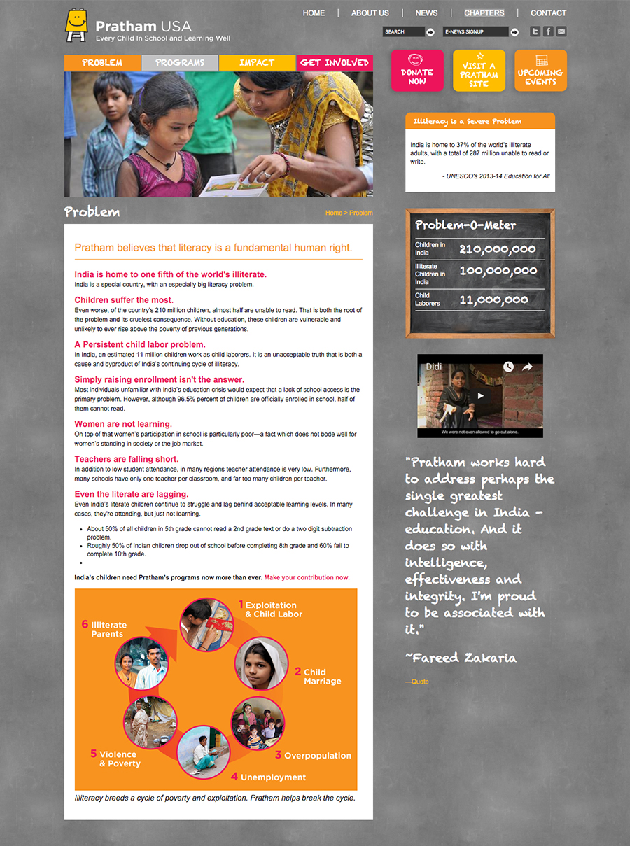
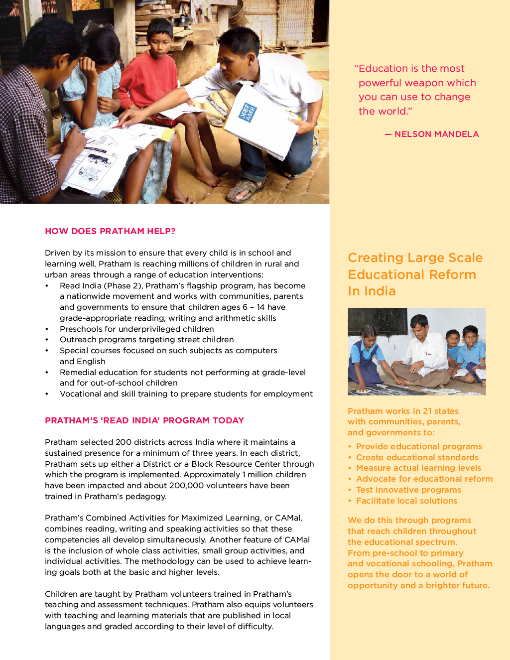
Pratham Website Problem 2015

Client: Pratham USA 

As part of an extensive brand and fundraising development effort, we created a fresh website for Pratham, an organization driven to educate the youth of India.The website is oriented around engaging potential donors to learn more about Pratham’s mission, find their local chapter and attend events.

Employing educational elements as part of the design, we used a chalkboard background to symbolize teaching and learning and feature rollover maps for the chapters, programs in India, and Pratham’s influence around the world.

The site clearly shows what the problem is, what they do, how it has helped and different ways for individuals to get involved. The news and events are clearly listed and categorized under different chapters. We incorporated emotional impact by using photos, videos, and stories of the children, teachers, volunteers, and donors.

Website Presents Updated Brand for Social Service Agency

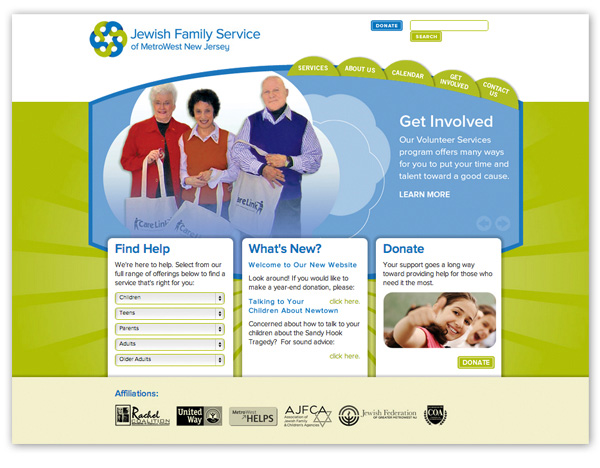
JFS_Homepage_GetInvolved
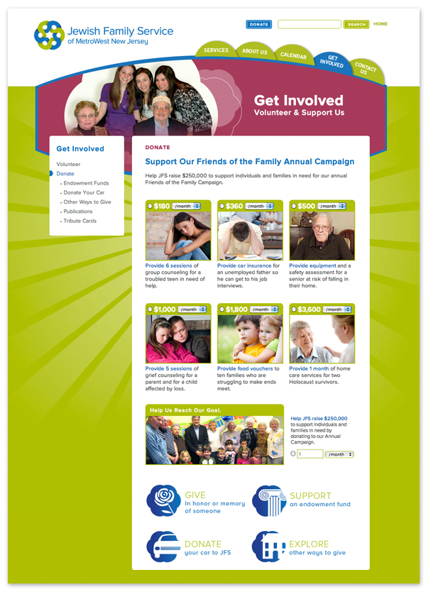
JFS_DonatePage

Client: Jewish Family Service

This social service agency was looking for an update on their brand. After an assessment of all their marketing materials and a review of similar organizations in the surrounding counties, we created a new language to describe agency, a new logo, a brand presentation, and a new website.

The website focuses on creating awaiting awareness of the services, soliciting donations, and appealing to volunteers. The homepage was designed around those three goals with a rotator image dedicated to each area, and pull down menu to provide easy access to the various services for youth, adults, and seniors. The site also features a calendar of events and a robust donation section providing access to many ways to give.

We created a very robust custom designed donation section that included a number of unique features not found on most nonprofit donation pages including the ability to give one-time and recurring donations with pre-determined levels as well as a write-in choice. Additional pages in the donation section allow visitors to donate their car, buy tribute cards, support endowment funds, or give in other ways.

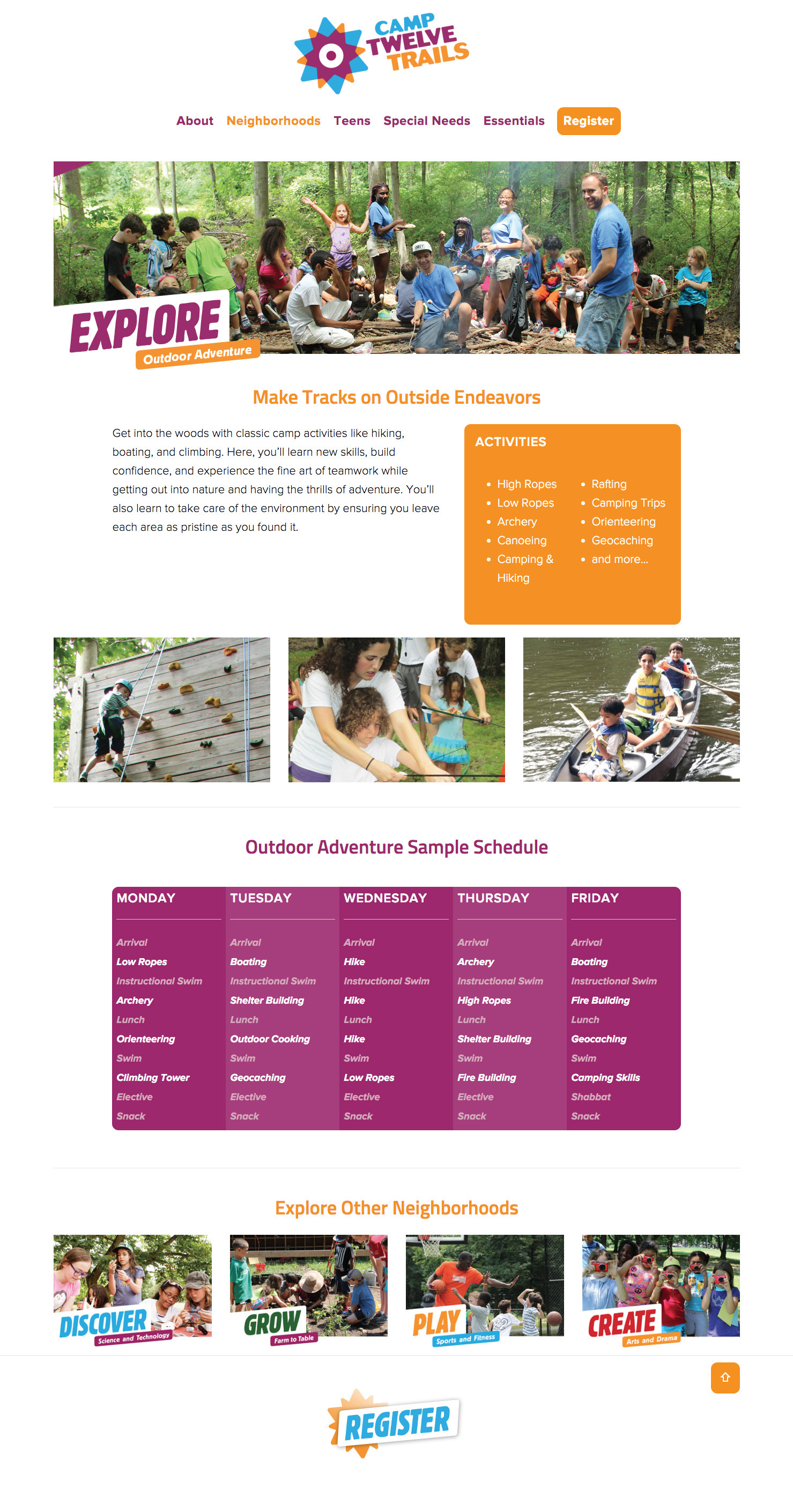
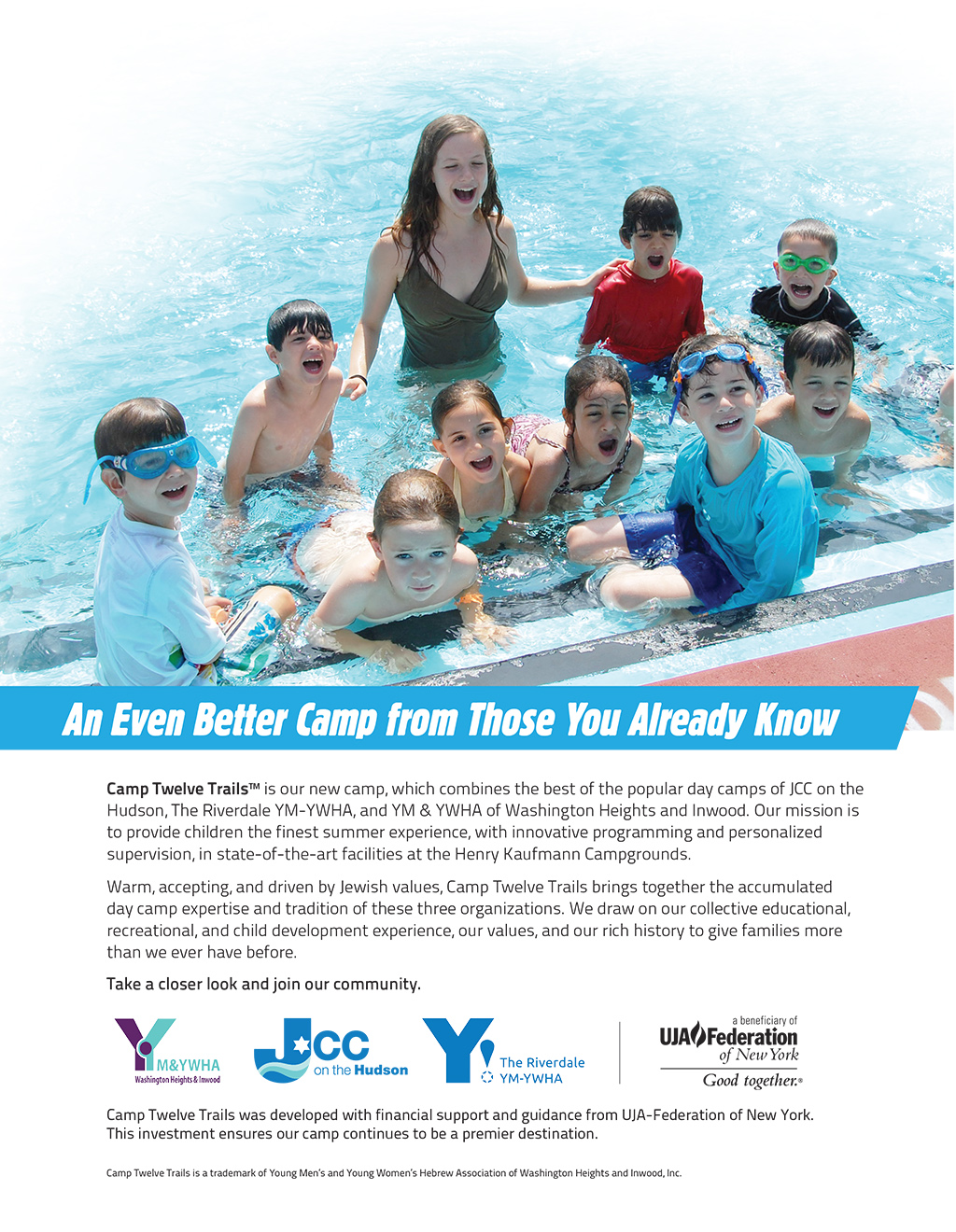
New Website Helps New Brand Helps Three Camps Merge into One

New Website Helps New Brand Helps Three Camps Merge into One

Client: Camp Twelve Trails 

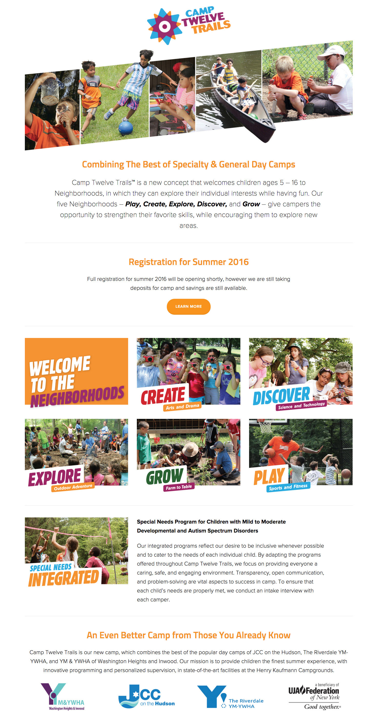
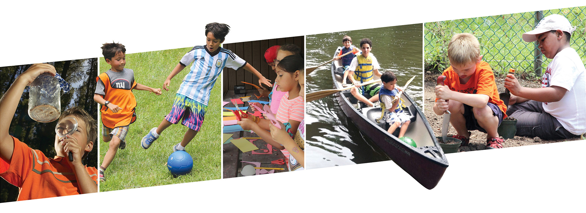
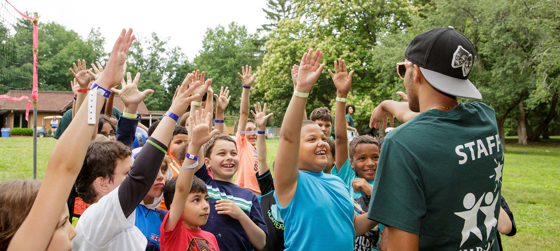
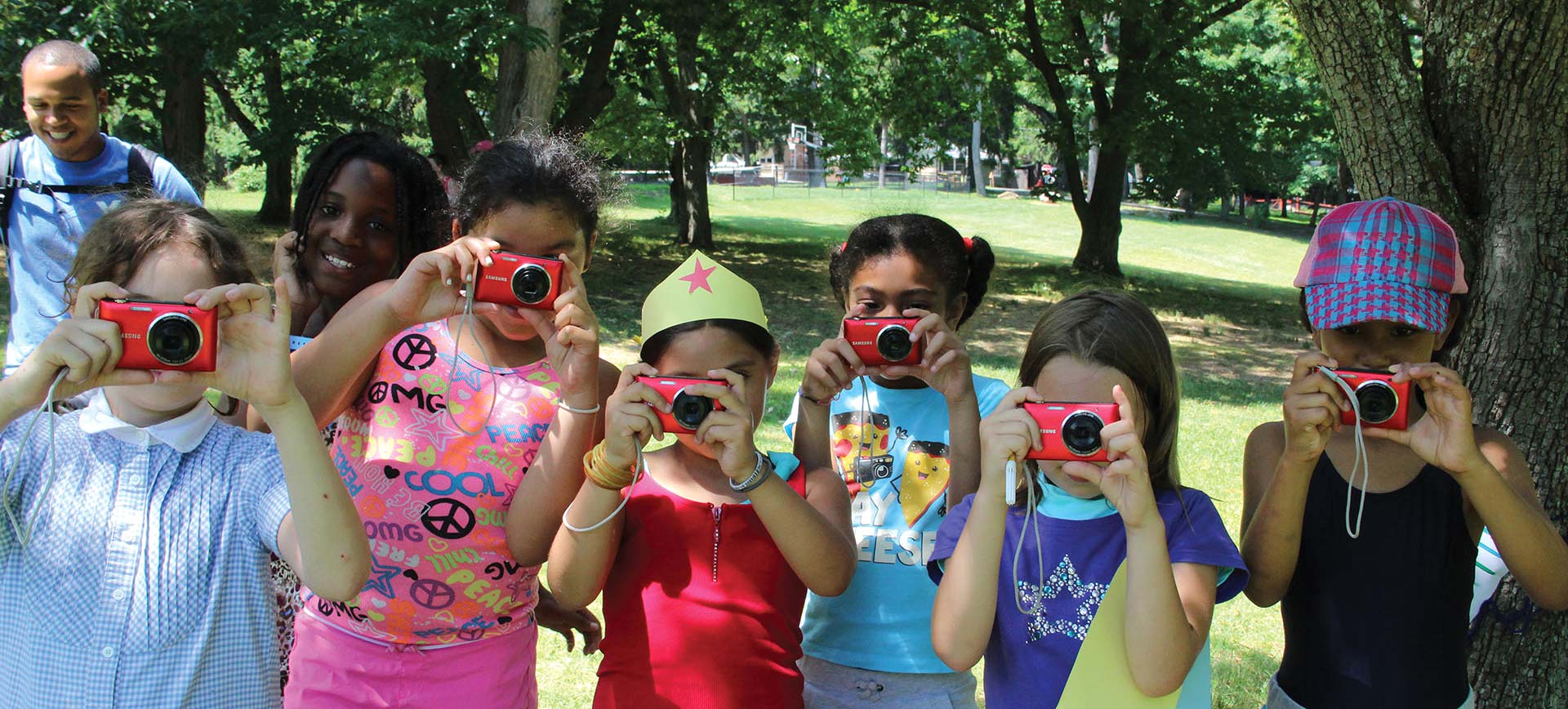
As the first point of contact with many potential campers, the website showcases the new identity and makes a compelling case that positions the Consortium as a singular camping experience for Jewish and non-Jewish children.

We created an engaging design to capture people’s attention while maintaining a professional, unified look for the organization that is consistent across the website and reinforces the brand messages. The website features visual storytelling to showcase the vibrancy of the programs and tell the stories of campers. A clean navigation and user experience lets site visitors easily find the specific information they need. Templates allow flexibility in the management of the site moving forward and responsive design adapts to tablets and mobile devices.

New Website Helps New Brand Helps Three Camps Merge into One

Website for Homeless Organization Appeals to Donors and the Homeless

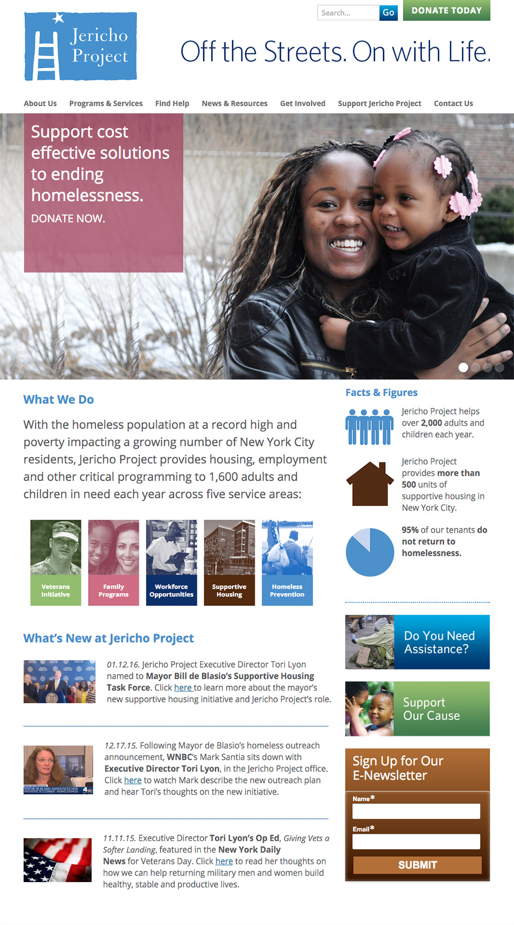
Jericho Project Homepage 1.21.16
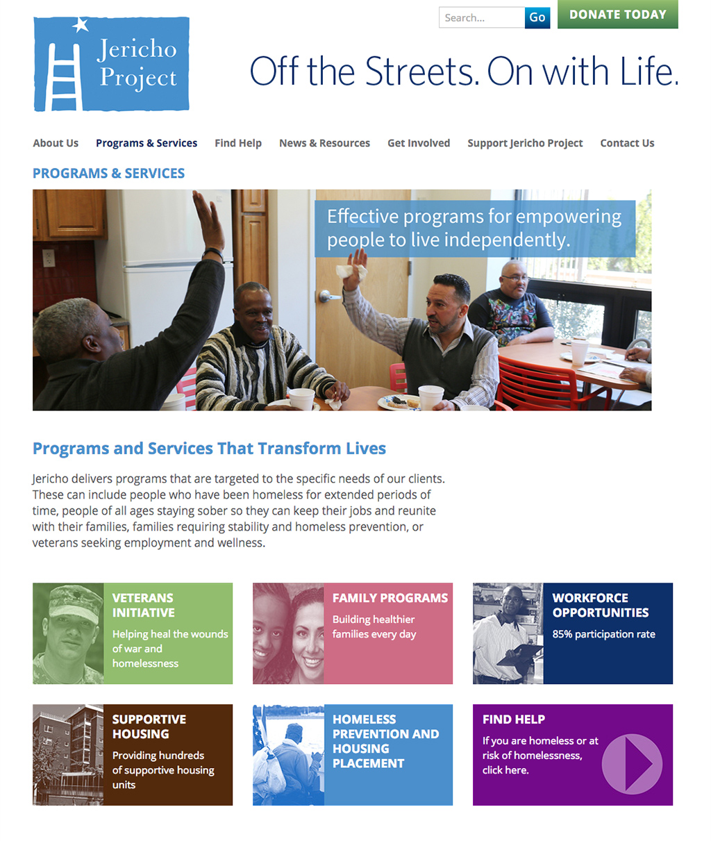
Jericho Project Program Page

Client: Jericho Project

A homeless organization had expanded its services and needed to revamp its website to reflect its expanded role in helping the homeless. The website was designed to appeal to donors as well as those who may be seeking services.

The clean design helps users easily find what they are looking for while reinforcing the organization as a leading provider of housing and services for the homeless in New York City. The website design for this nonprofit organization features an interactive timeline and drop down boxes for the staff bios.

Simple Website Makes Complex Information Accessible

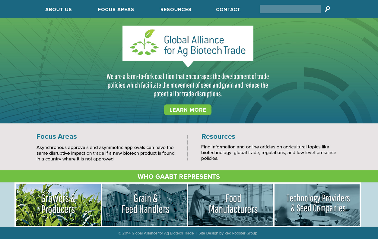
GAABT Homepage

Client: Global Alliance for Ag Biotech Trade

This site was designed to provide easy access to resources and information regarding global biotech trade issues. Lush imagery and pull quotes help offset the text-heavy content, and the responsive design allows the content to be viewed on a range of devices.

UMFS Website: Social Service Agency

UMFS Website: Social Service Agency

Client: UMFS

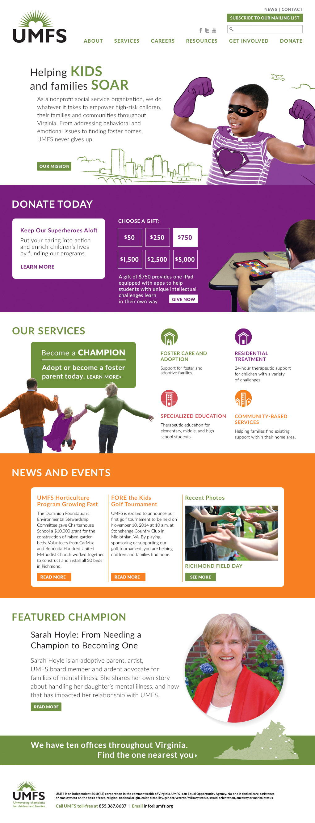
We developed a responsive website for this social service agency that showcases the organization’s new brand image and language and presents its services in a compelling way. The website was developed in WordPress around a flexible modular block system that allows for creating interesting pages throughout the site. Interactive features include the Donate Today section with rollover displaying gift descriptions, rollover exploration of services, and features to engage potential employees, among other features.

Website for Educational Foundation Engages Users with Organized Content

SEF Website Home

Client: Spencer Educational Foundation

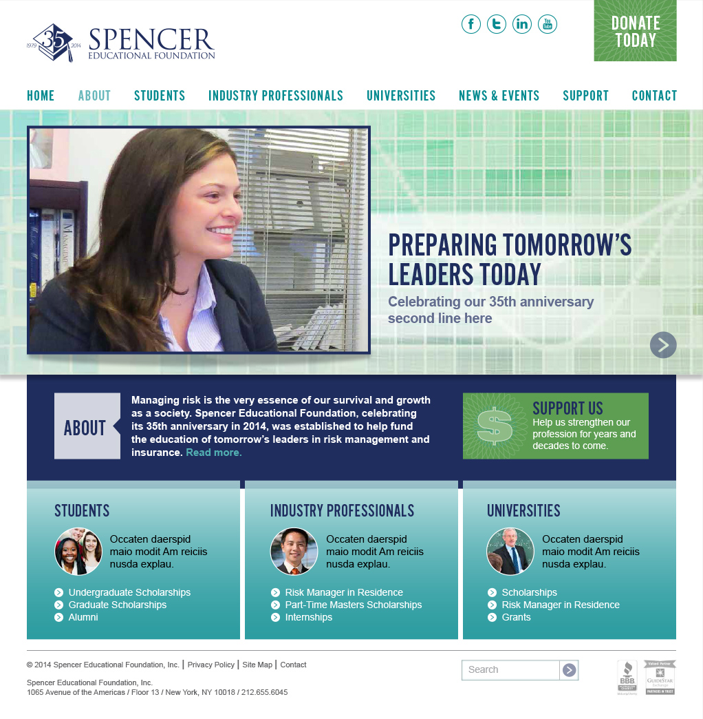
The educational foundation for the insurance and risk management sector was in need of a website that reflected the professional nature of the organization. The homepage features a rotating graphic with the latest news, pulled from the news section. To help the various audiences access relevant information, we re-organized all the content around users, creating sections for Students, Industry Professionals, and Universities. The website, which was developed in WordPress Content Management System, allows the client to update the website on an ongoing basis. The website is responsive, designed to re-format for desktop computers, smartphones, and mobile devices.

Brand Update Promotes Largest Educational Organization In India

Pratham USA

Pratham-Group-of-Children

Promoting the Largest Educational Organization in India

Pratham USA wanted to strengthen its image and give its 15 chapters the communication tools they needed to be more effective in raising money for the organization. Red Rooster Group was brought in to develop a comprehensive brand, marketing strategy, and fundraising materials.

Services

  • Discovery
  • Workshops
  • Communications Assessment
  • Communications Plan
  • Marketing Plan
  • Brand Strategy
  • Brand Architecture
  • Core Fundraising Messaging
  • Case for Support
  • Donor Brochure
  • Donor Presentation
  • Annual Report
  • Website
  • Peer-to-Peer Fundraising

Building Marketing Foundations for Success

Pratham has taken on one of the worst problems in the world — literacy — with innovative yet proven tactics. It is one of the few nonprofits in the world that invests in Randomized Control Trials, an expensive but accurate way to assess effectiveness. 

Pratham’s methods are used in 14 countries on three continents. The results guide government policy as well as help ascertain the best methods to teach reading to children. 

Pratham USA raises money to support these efforts. Because the challenges are so great — 300,000 children in India cannot read — Pratham needed a marketing and fundraising strategy to get the word out about Pratham’s impact and expand its base of supporters.

We developed a marketing strategy as well as fundraising and communications plans and marketing materials to drive their outreach efforts.

Conducting Research

To find out why fundraising had plateaued and laid the foundation for their marketing and fundraising strategy, we conducted the following research to identify the challenges and opportunities.

  • Researched similar organizations in the sector.
  • Conducted a survey of donors.
  • Conducted workshops for national and chapter leaders.
  • Reviewed the past year of email and other communications with donors.
  • Determined marketing priorities.

Communications Plan

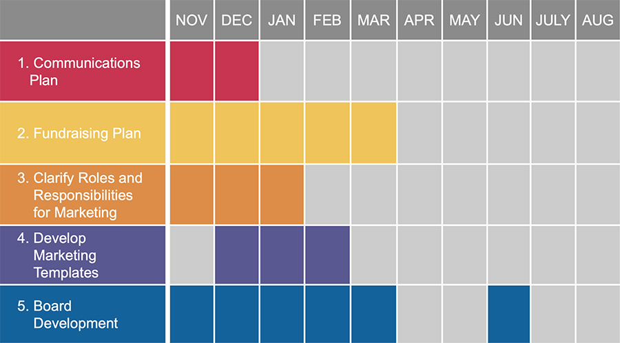
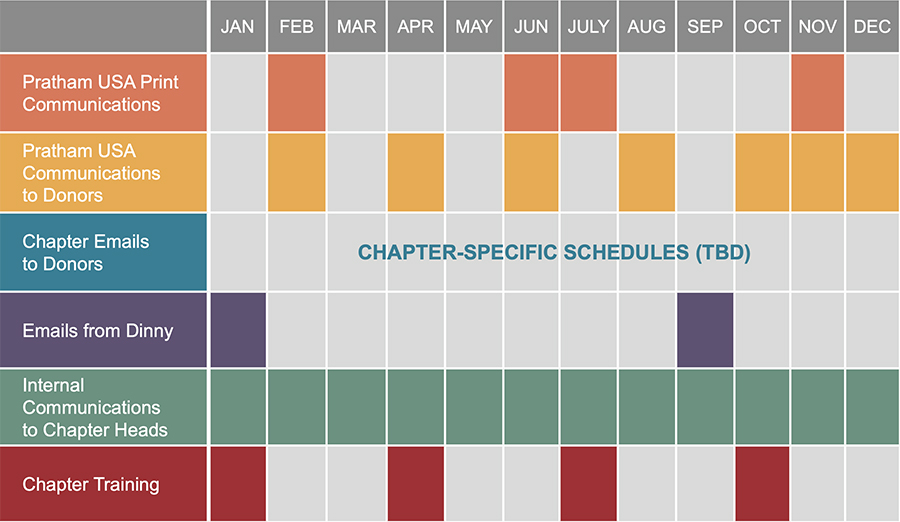
During our research, we found that communications with donors were sporadic and visually inconsistent. We developed a 24-month communication plan that coordinated the outreach of the national office with that of all the chapters. The communications schedule ensured that donors were not hit with multiple asks and that all events and campaigns were well-publicized. In addition, we provided templates for each chapter so their outreach would be visually consistent as well as timely.

Marketing Chart
Communications Plan

We strengthened their brand, updated their messaging, and gave each chapter the tools needed to fundraise effectively.

Unifying the Visual Identity

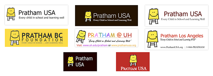
Pratham lacked guidelines for their logo, which resulted in different typefaces, colors and layouts being used, as well as inconsistent treatments for the names of chapters and affiliates.

While Pratham has a clear mission, a logo, and brochures, the organization conveys a very fractured image. This can confuse donors and represent a lost opportunity to build equity in the brand. Another factor is that Pratham in other countries convey their brand slightly differently as well, with different typefaces for the logo and different designs for the website.

BEFORE

Before Logos

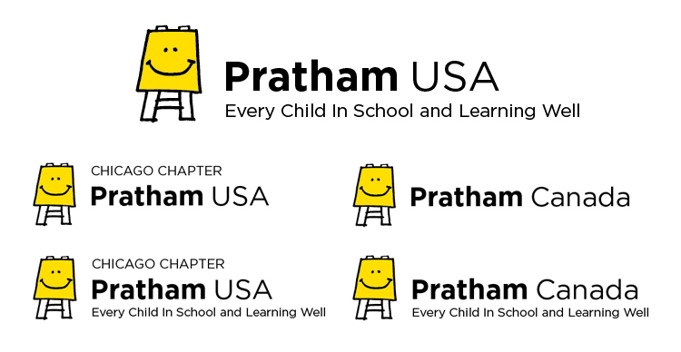
AFTER

Pratham Chapter Logos

During the brand review, we assessed that the logo was used in a wide variety of ways in the marketing materials, creating a fractured image for the organization. And chapters were setting their names in different typefaces and colors, undermining the professionalism of the organization.

To address this problem, we developed a comprehensive brand architecture for the organization that defined the relationship of the logo and tagline, created consistency for the chapter names and their treatment in the logo, and determined how international affiliates should be styled. We then developed versions of all the logos (15 chapters plus international partners) with and without the tagline in formats for print and web use.

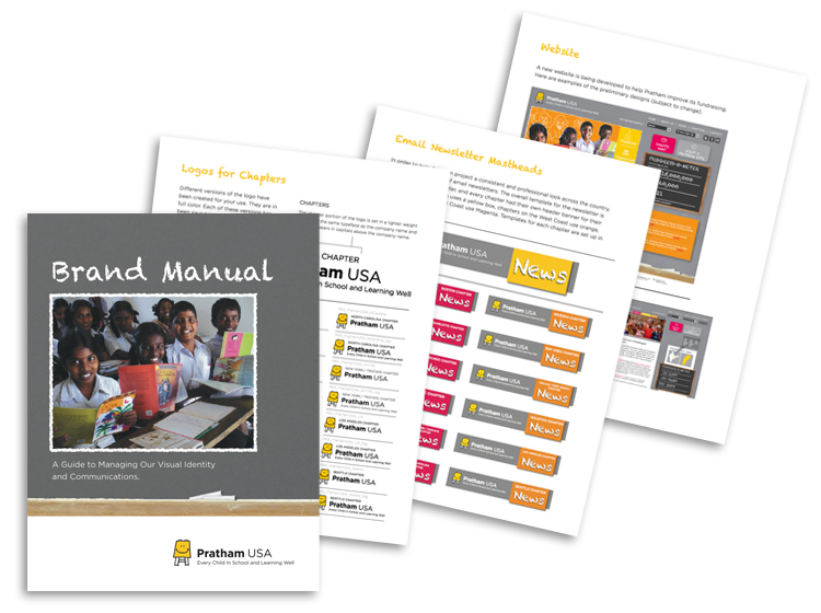
Pratham Brand Manual Pages

Message Development

A core part of the strategy for Pratham USA was articulating Pratham’s global impact in developing and validating new tactics to increase literacy. To help Pratham and all the chapter heads tell their story in a compelling way to appeal to donors, we developed the following messaging tools:

  • A Case for Giving that describes the problem that Pratham addresses, how Pratham helps, Pratham’s impact, and ways donors can get involved and make a difference.
  • Brand Story that summarizes the case for giving.
  • Boilerplate that can be used to remind donors of Pratham’s mission and impact and urge them to donate.

Brand Story

At a time when half of the children in India cannot read, Pratham provides a low cost method to address the problem effectively on a large scale. Pratham is the only organization that empowers individuals through education as well as driving systemic change through a bottom-up approach. By training 60,000 volunteer teachers in 21 states, we are able to provide support for educating the entire population.

Pratham’s successes break the cycle of poverty for families in villages and cities and contributes to the economic and political vitality of India. Pratham has successfully reached more than 34 million children across India. Millions of children who could not even recognize the alphabet when they began now read fluently and with passion. Pratham’s methods have been recognized by leading foundations, including Skoll, Gates, and Hewlett, as a model worth emulating. Pratham’s methods are now being employed to help other countries facing similar educational challenges. Pratham USA, a 501(c)(3) nonprofit organization with a four-star rating (the highest possible) from Charity Navigator, accepts tax deductible contributions from U.S. donors. We depend upon generous donors like you to create educational reform throughout India and the world.

Boilerplate

Pratham is one of he world’s leading non-governmental organizations working to provide quality education to underprivileged youth. With a budget of less than $15 million, we use very low cost and scalable methods and work in collaboration with the government, local communities, parents, teachers and volunteers across the country to educate hundreds of thousands of children every year. Pratham USA, a 501(c)(3) nonprofit organization with a four-star rating (the highest possible) from Charity Navigator, accepts tax deductible contributions from U.S. donors. We depend upon generous donors like you to create educational reform throughout India.

Case for Support

We developed their Case for Support around what the donors need to know:

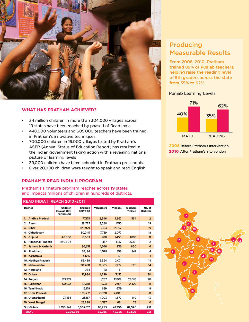
  1. The Problem: What is the problem that the organization is addressing? We humanized the problem of widespread illiteracy in India by telling a story about one girl’s plight. We also provided a visually demonstrated the problem by creating a graphic showing the cycle of poverty that plagues many in India.
  2. The Solution: What is Pratham doing about the problem? We describe Pratham’s programs to build literacy and create systemic change for education in the country
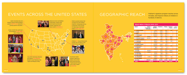
  3. The Impact: How effective is the organization in addressing the problem? To demonstrate Pratham’s success, we presented a chart showing the results of Pratham’s signature program, Read India II, in 21 states across India.
  4. The Appeal: How can donors support Pratham? We describe the different ways that people can support and get involved with the organization.

We designed the document to be easy to read and support Pratham’s brand, with photos that help to help people understand what Pratham does — overall a clear and compelling case for supporting Pratham.

Pratham Case for Support 1
Pratham Case for Support 2
Pratham Case for Support 3
Pratham Case for Support 4

Brochure

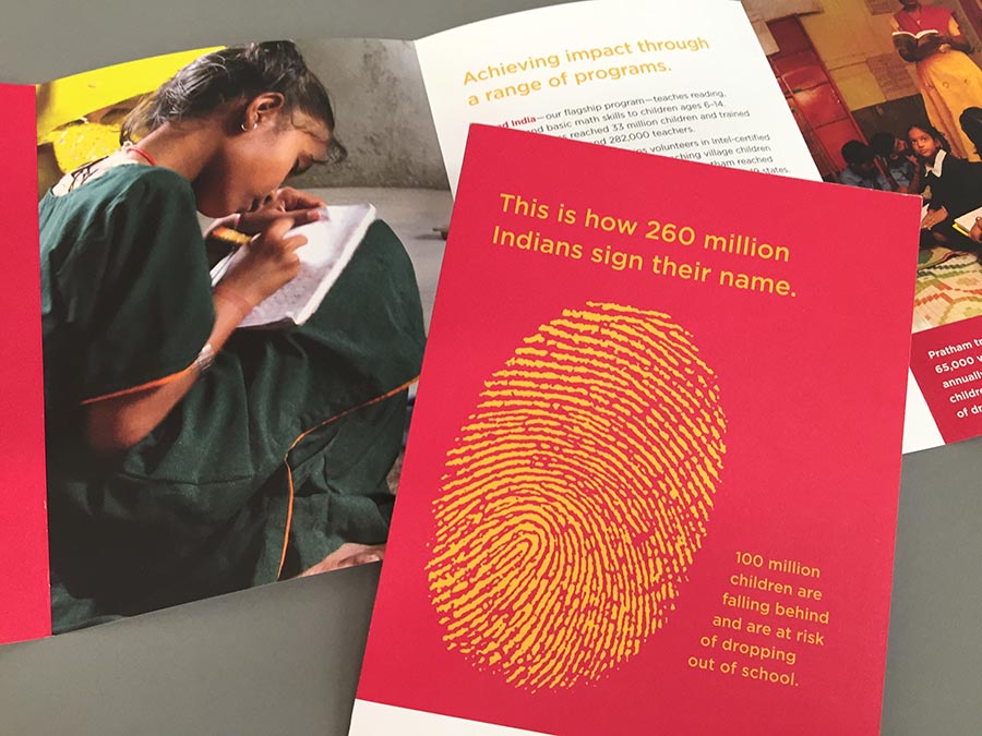
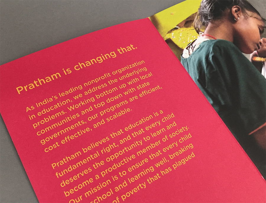
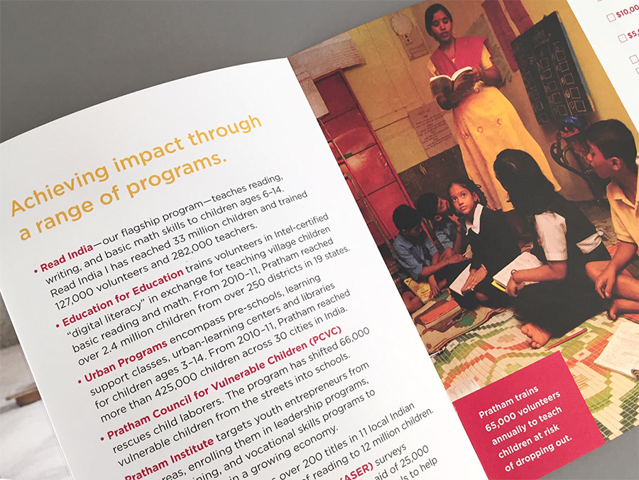
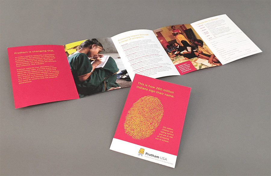
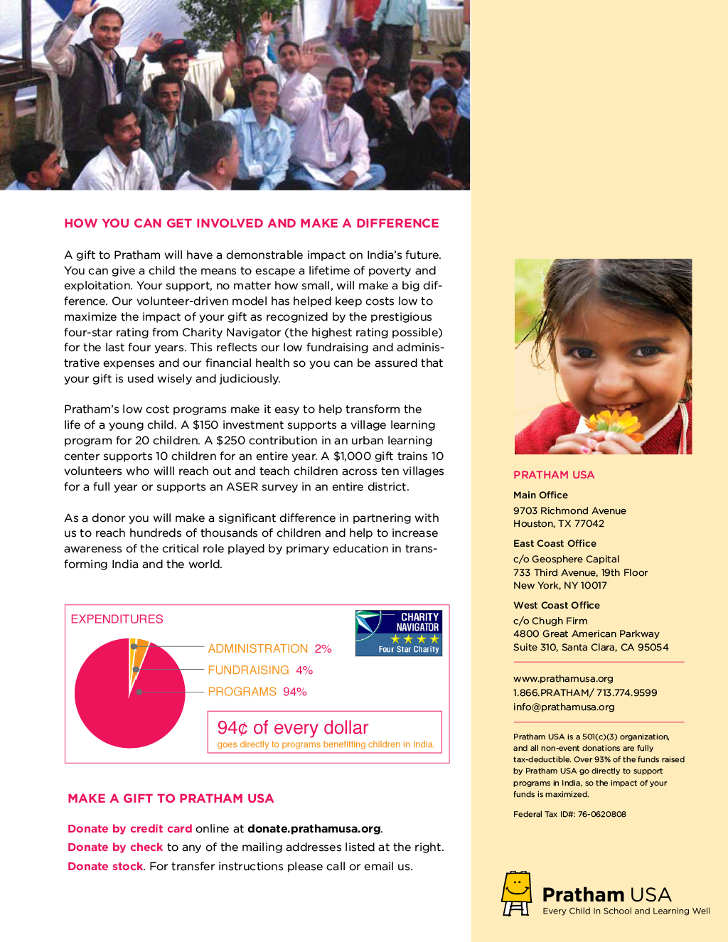
We created a brochure that could be handed out widely at galas and other events for fundraising purposes. The brochure makes a bold statement about the the vast scope of illiteracy in India, and describes how Pratham is addressing it.

Pratham Brochure
Pratham Brochure
Pratham Brochure
Pratham Brochure

Annual Report

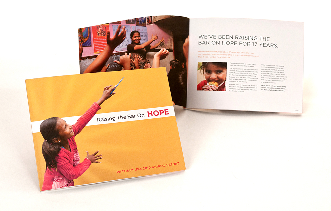
We redesigned the organization’s annual report as part of an overall brand refresh for the organization. The theme of Raising the Bar on Hope was aimed at reinvigorating interest in the organization’s donor base which was experiencing some fatigue with Pratham’s message.

Pratham Annual Report
Pratham_AR_Spread_4BW

Marketing Templates

We created a consistent brand look for all materials so that donors can recognize them as Pratham’s. This reinforced the brand in people’s minds and made it easier for staff to create collateral materials, such as:

  • Email Newsletters
  • Email Blasts
  • Print Newsletters
  • Gala Invitations

Clarifying Roles & Responsibilities

Plans are only as good as their implementation. We helped Pratham USA put the structure in place that would facilitate implementation.

  • Identify the required roles and clear assignment of marketing tasks.
  • Determine what can be handled in-house and what needs to be outsourced.
  • Establish accountability for delivery.
  • Develop procedures for creating, reviewing, and approving fundraising materials.

Board Development

Pratham had not fully utilized the board as brand and fundraising ambassadors. We suggested ways in which board members could improve their fundraising effectiveness by giving them succinct messaging and collateral materials to guide them as they talked with potential donors. During our time, Pratham USA attracted Fareed Kazaria to its board.

Peer-to-Peer Fundraising

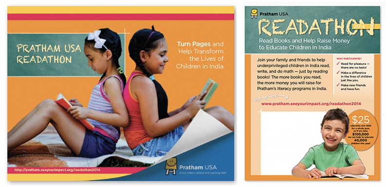
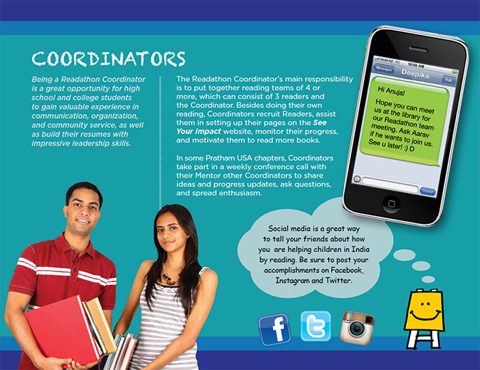
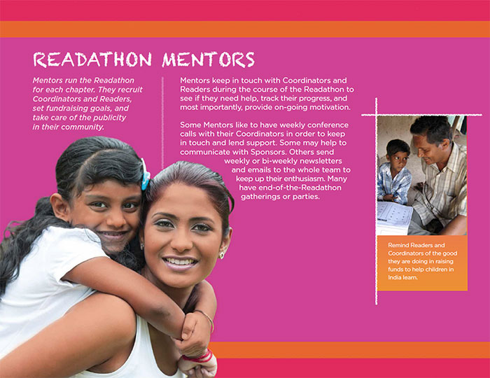
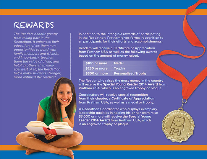
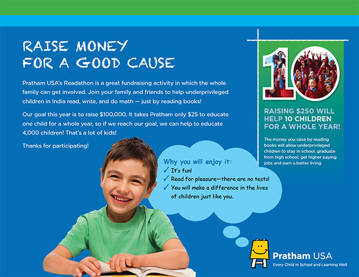
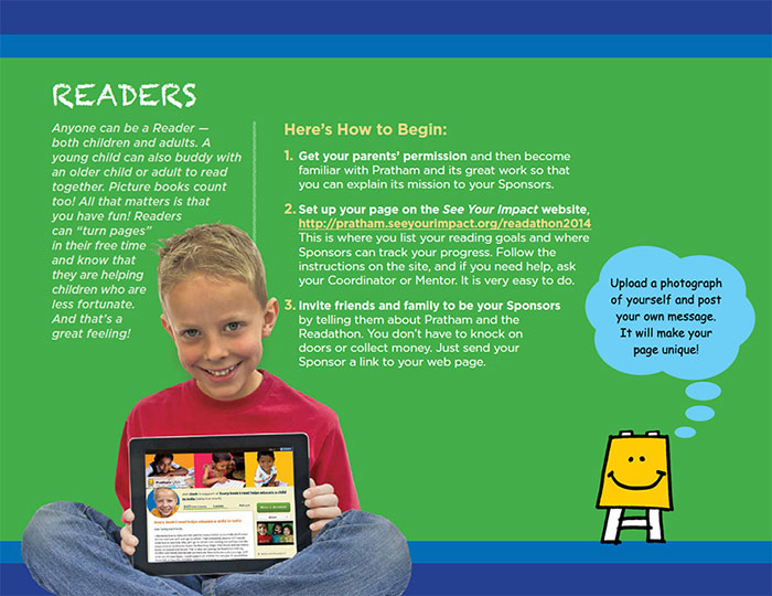
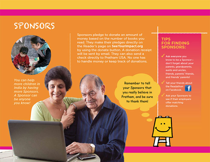
We promoted their readathon by creating materials for recruiting local hosts, as well as promoting the readathon locally in the community through digital and print materials. We increased the average donation from $76 to $102 over the prior year’s event.

RESULTS

36% Increase

Over Prior Year

Pratham Readathon

Readathon
Readathon
Readathon
Readathon_5W
Readathon
Readathon

National Nonprofit Refreshes Its Focus, Name, Visual Identity, and Outreach

Tourette Association of America

National Nonprofit Refreshes Its Focus, Name, Visual Identity & Website

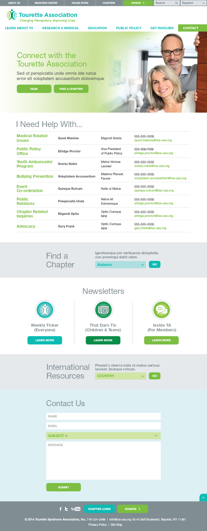
Like many disease and disorder organizations, the Tourette Syndrome Association (TSA) wanted to increase public awareness in order to foster a greater acceptance of this condition. Red Rooster Group was called in to refresh the organization’s brand by refining its focus, evolving its name, updating its visual identity, and developing a new website.

Services

  • Brand Analysis
  • Website Assessment
  • Competitive Review
  • Stakeholder Interviews & Surveys
  • Focus Groups & Brand Workshops
  • Audience Needs Mapping
  • Brand Positioning & Messaging
  • Renaming
  • Visual Identity System
  • Brand Style Guide
  • Website User Experience
  • Website Copywriting
  • Website Design
  • Website Development & Integrations

Assessing the Needs

Founded in 1972, the Tourette Syndrome Association (TSA) is the only national nonprofit organization that helps individuals and their families deal with the many issues associated with Tourette Syndrome and tic disorders. With more than 30 chapters nationwide, its main mission is to increase awareness and knowledge about Tourette Syndrome while advocating for public policy issues, and investing in medical research to better understand this little-known but widespread condition.

Refreshed Brand

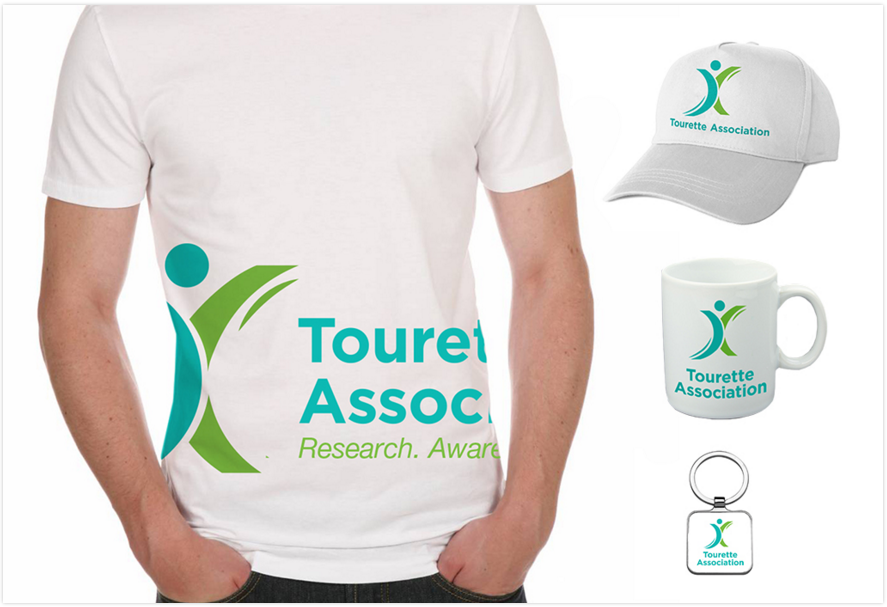
TSA wanted to refresh its brand with a new logo and tagline in order to bring uniformity and consistency to the organization’s image and messaging, and do it in a way that thoughtfully transitions the organization from its historical look and feel toward a more hopeful, energetic, and professional identity.

Updated Website

Part of the project was also to simplify and reorganize the current website to help showcase the array of services that TSA offers, help users more easily find the information they need, and engage people in taking action and joining the community.

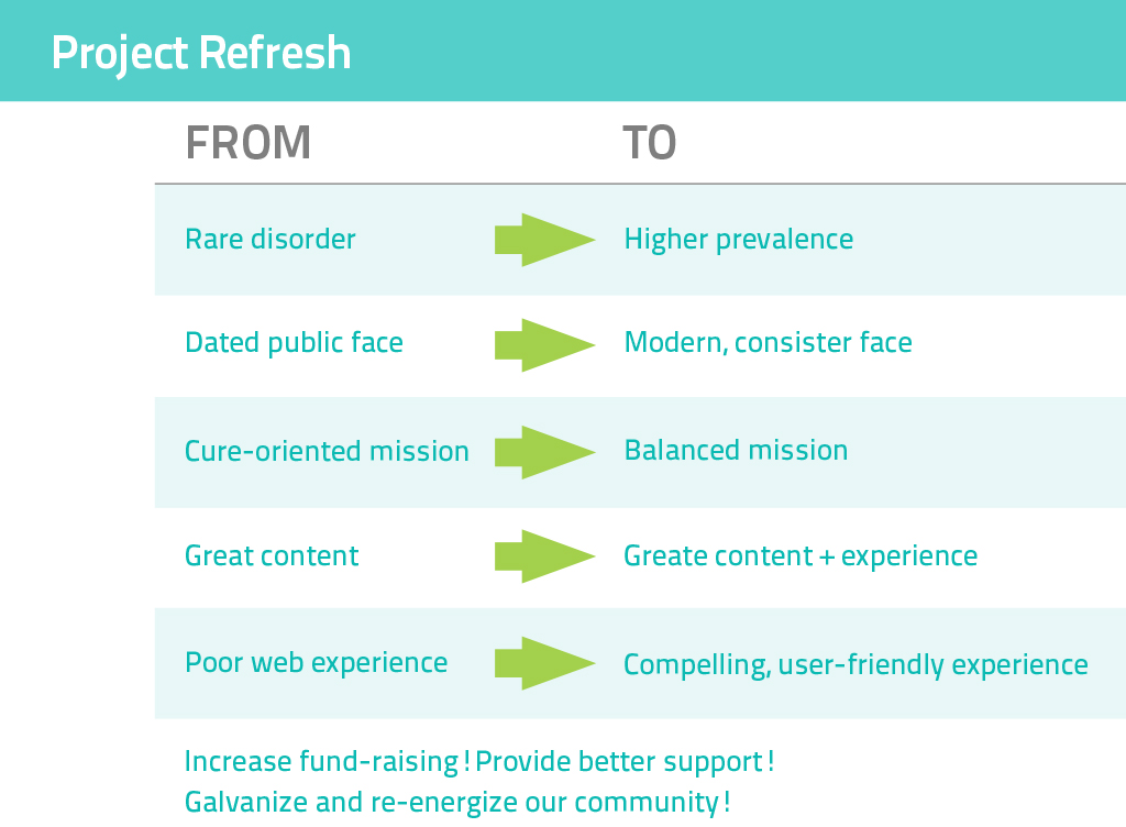
TA Project Refresh
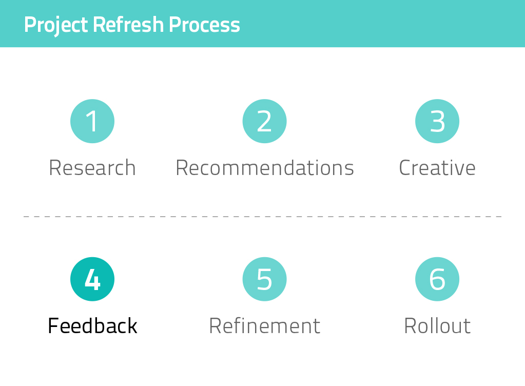
TA Project Refresh Process

Discovery

To begin the project, we conducted research to provide us with key information  for developing TSA’s brand. This included:

  • Reviewing TSA’s internal and external documents and materials to learn more about the organization and the issues it addresses.
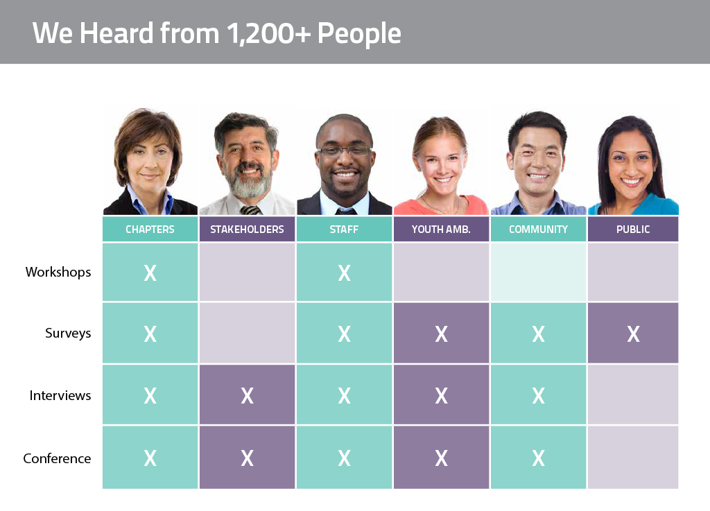
  • Facilitating workshops with TSA staff and chapter heads to understand chapter needs and perspectives.
  • Hosting a feedback table at TSA’s annual conference for in-person engagement.
  • Conducting individual interviews with a range of constituents.
  • Holding one-on-one discussions with TSA staff about each department’s needs.
  • Conducting surveys with the TSA community, general public, and other groups.

Key Takeaways

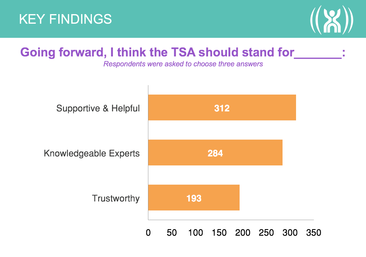
TA Survey
TA-Survey-Comments
Survey Chart 1
Demographics
Survey Chart 3
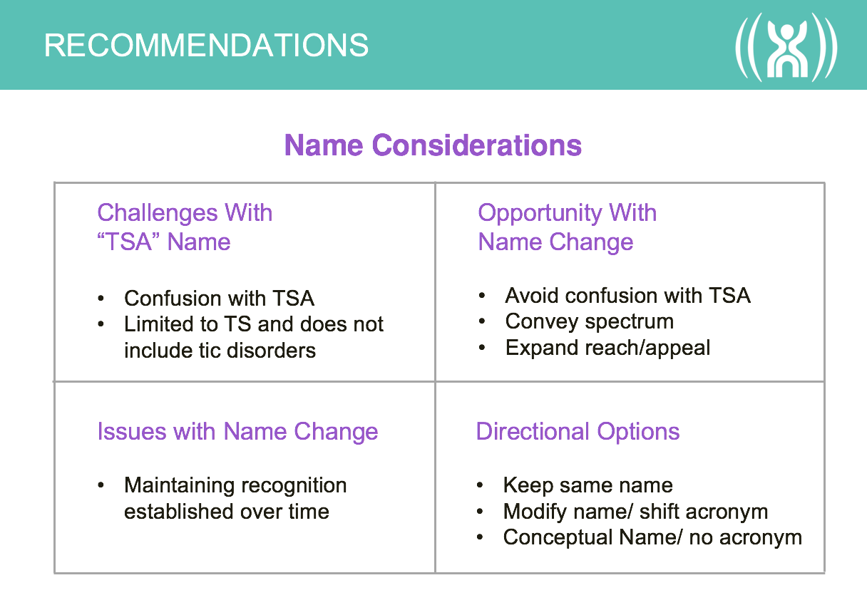
Name Considerations Chart

Defining the Message

Mission

Red Rooster Group worked with TSA to develop internal and external messages for the organization. A core part of the branding initiative was to update the organization’s Mission Statement to reflect its current focus. This included a shift in the outcomes of the medical research, being more positive and inclusive, and increasing the focus on awareness of Tourette Syndrome. We worked with organizational leadership to refine the language and get feedback from various constituents.

Mission Before

To identify the cause of, to control the effects of, and find a cure for Tourette Syndrome through education, research, and service.

Mission After

The Tourette Association is dedicated to making life better for all people affected by Tourette and Tic Disorders.

Refining the Name

Organizational Name

The branding process was the perfect opportunity to examine whether the organization’s name — Tourette Syndrome Association — should be changed in any way because the name was long, it was often shortened to TSA, and consequently confused with the Transportation Security Administration. The organization was exploring ways to improve the current name, rather than develop an entirely new name.

The main name considerations included:

  • Whether the word ”Syndrome” should be dropped from the name. The word had medical significance, people with Tourette Syndrome identified themselves that way and, yet, to the general public and newly diagnosed, that word can make the disorder seem more scary. Since Tourette Syndrome is referred to as TS, how would dropping ”Syndrome” work using ”TS?”
  • Whether there would be any designation of a national presence in the name. The organization is both national and international in scope and wants to be recognized as distinct from the chapters. Yet, adding another word would lengthen the name and increase the likelihood of abbreviation.
  • If the name is shortened to Tourette Association, whether or not to use an apostrophe on Tourette’s. Formally, an apostrophe is used, but how would that complicate the name and URL?

Iterations of the name were presented and discussed with leadership. We then tested the reaction of the Tourette community to the naming options in focus groups, eliciting feedback that helped shape the decision to use Tourette Association.

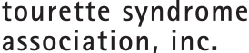
Before

TSA_Logo_Stacked_Black

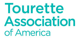
After

TAA-Name-2

Revitalizing the Visual Identity

Recognizing Brand Equity

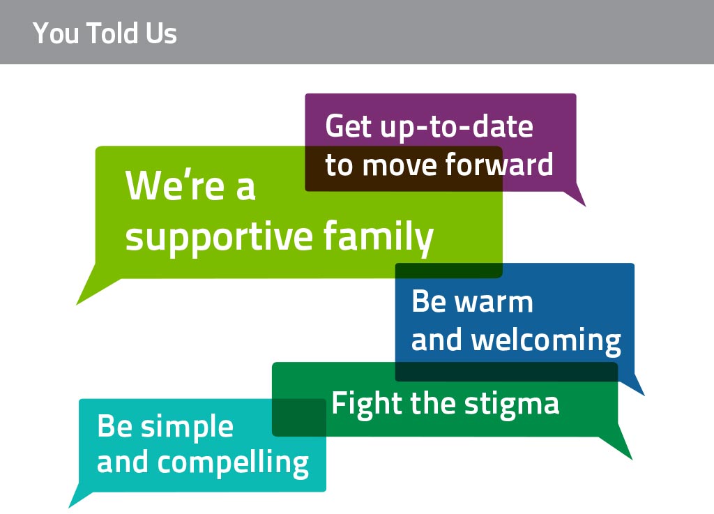
A major component of this branding initiative was to update TSA’s logo, which had been in use for decades. While people had an affinity for the symbol due to familiarity, feedback from surveys told us that while people liked the sense of movement, they thought the logo looked dated and that the figure looked isolated and trapped.

TA Old Logo
Original Logo

Exploring Concepts

Our goals with the redesign were to update the symbol to be more dynamic, with a sense of energy and a suggestion of the positive aspect of living with TS successfully, rather than feeling inhibited by it. We explored a wide range of graphic expressions that could showcase the organization, while being sensitive to not misrepresenting Tourette Syndrome. These concepts included abstract symbols, representation of motion, community, figurative icons, and other concepts.

Visual Identity Exploration

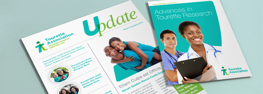
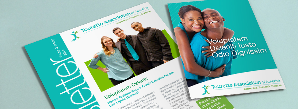
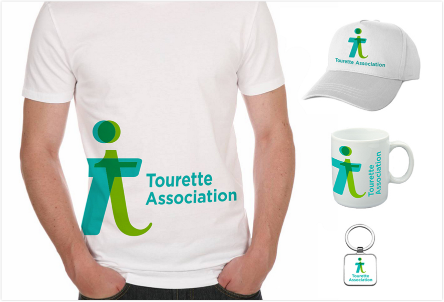
After rounds of refinement, two logos emerged as final contenders. To provide a sense of how the logos would work in real-world applications, we applied them directly to both new and existing media.

TA Logo Concept 1

TA Logo 1 Mockup 1 Large

TAA_Logo_Stacked_Tag

TA Logo 2 Mockup 2

Logo Testing in Focus Groups

The two final logos, as well as the shortened organizational name and the tagline, were tested in focus groups with TSA’s community in various cities. The feedback helped us gauge how people with Tourette Syndrome would feel about changes to the organizational brand as well as giving us specific feedback on each brand element. As a result of this feedback, we further refined one of the logos.

Logo Testing in Internal and External Surveys

To understand how people who were not familiar with Tourette Syndrome would perceive the logo and tagline, we conducted a survey of the general public. The following logos were tested, using the existing logo as a baseline. Option B was the winner.

A

Concept-1

B

Concept-2

C

Concept-3

Presentations for Internal Buy-In

During the course of the engagement, TSA leadership solicited input from various internal stakeholders, such as a leadership advisory team, the board, and a chapter council. Red Rooster Group created presentations showing the evolution of the brand elements so that the President could successfully pave the way for organizational changes by allowing input while addressing resistance to change and concerns about any of the brand elements.

Creating a New Website

Creating a Content Strategy

The site contained a massive amount of information but was very difficult to navigate. We cataloged the content from more than 1,000 pages and reorganized huge amounts of information so various audiences have a clear path to what they need. In addition to pages written for specific audiences, the site contains a searchable Resource Center to access a variety of media resources.

Developing a Modular Content System

The site is designed to be completely responsive for mobile, tablet, and desktop users, and has a robust administration area in the WordPress CMS to make it easy for staff to update. The unique modular block system we developed provides the ability to create interesting pages easily. Red Rooster Group handled the entire website development process including site architecture, copywriting, wireframing, design, development, and final testing.
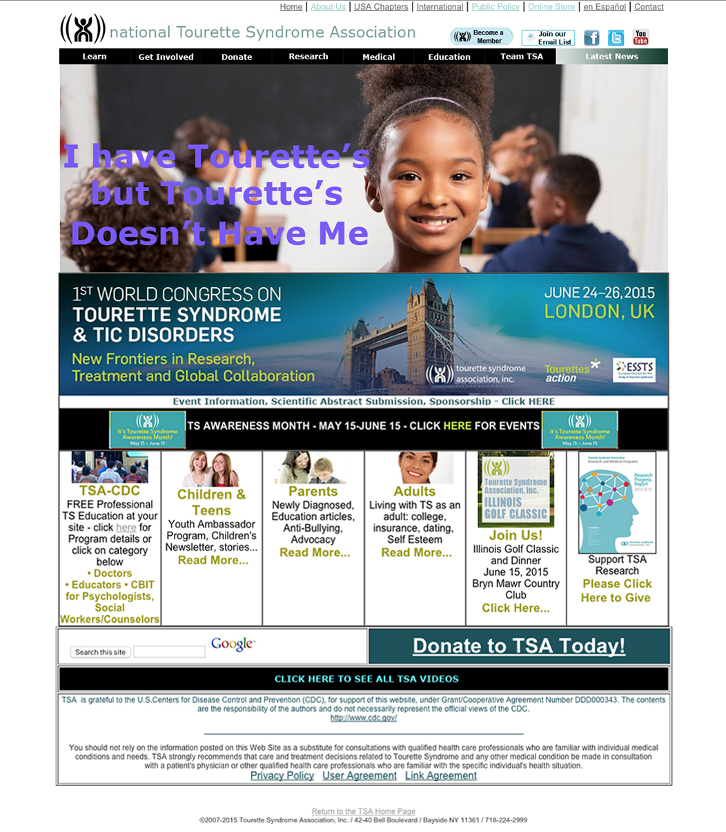
Before

TSA Homepage Before

Rotator provides a quick overview of the organization.

Quick access to relevant content for key audiences.

The Did You Know feature appears on different pages with different facts.

Get Involved and Take Action modules encourage user engagement.

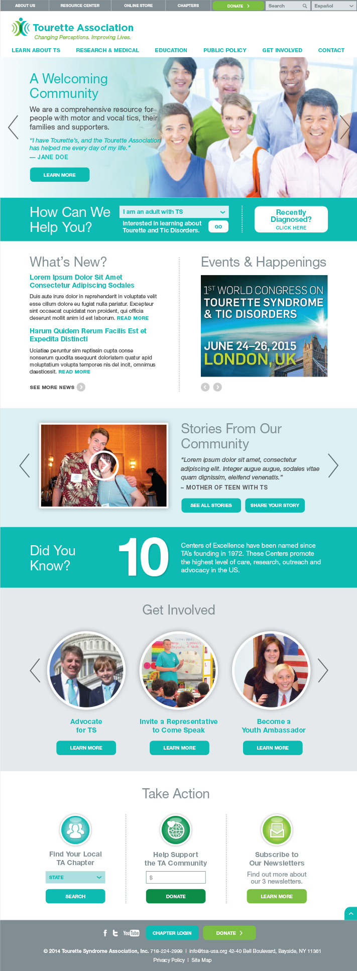
After

TA Website Home
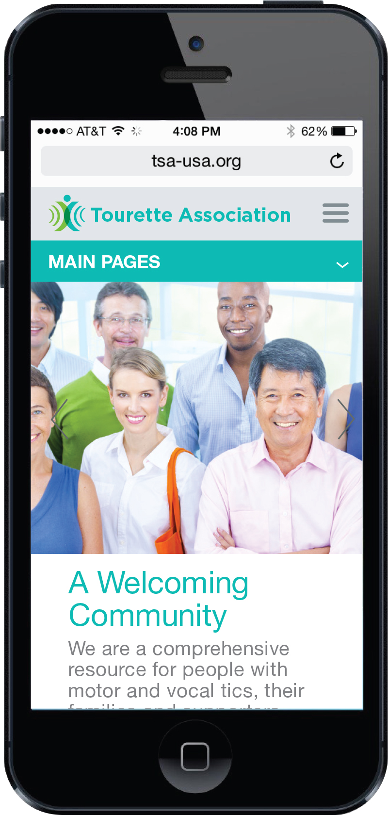
TSA Mobile

The website is fully responsive for viewing on tablets and other mobile devices.

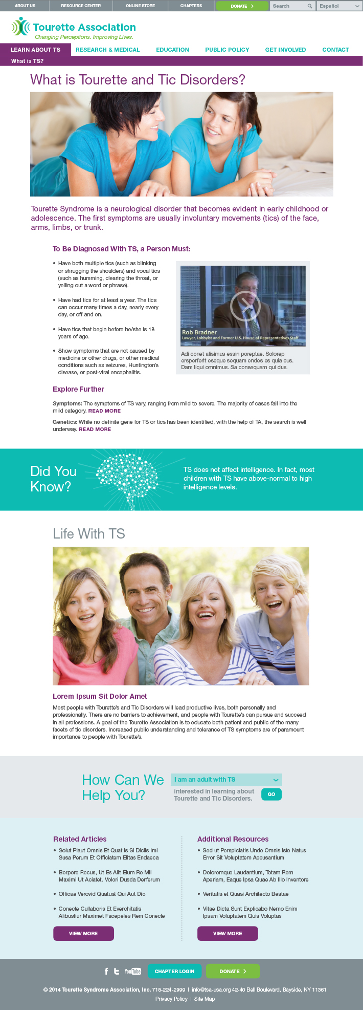
What is TS?

This subpage is used to provide information for those new to Tourette Syndrome.

TA Website What is TS

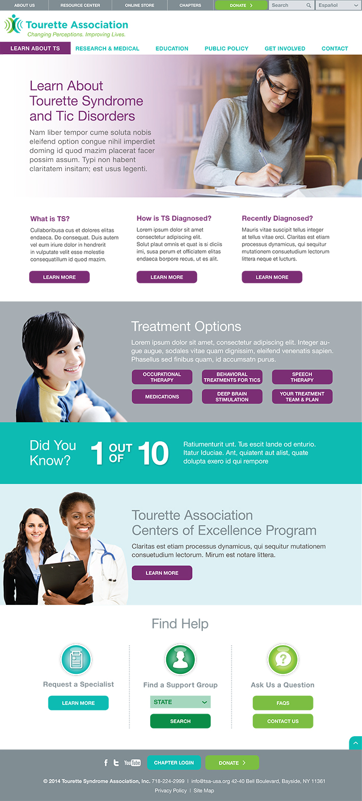
Learn About

Main section pages were designed to engage users and allow easy navigation to audience-specific resources.

TA Website Learn About

Color-coded header modules for each section welcome users and help them acclimate to the section.

Three-column format provides choices for users without overwhelming them.

This module allows an image and multiple buttons.

Certain modules allow set content to appear on different pages throughout the site.
Action modules are present throughout the site to encourage interaction and provide help to site visitors.

Blocks of volunteer opportunities showcase the many ways users can donate
their time.
This page offers quick links to other ways users can support the organization.
Event modules allow users to sign up and get involved with events in their area.

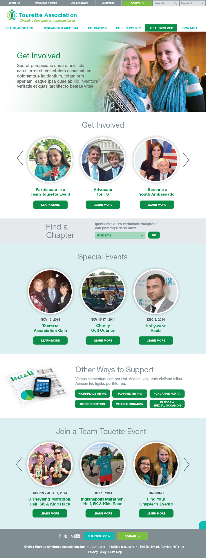
Get Involved

Tourette Association offers a variety of ways in which users can get involved with the organization.

TA Website Get Involved

Teens with TS

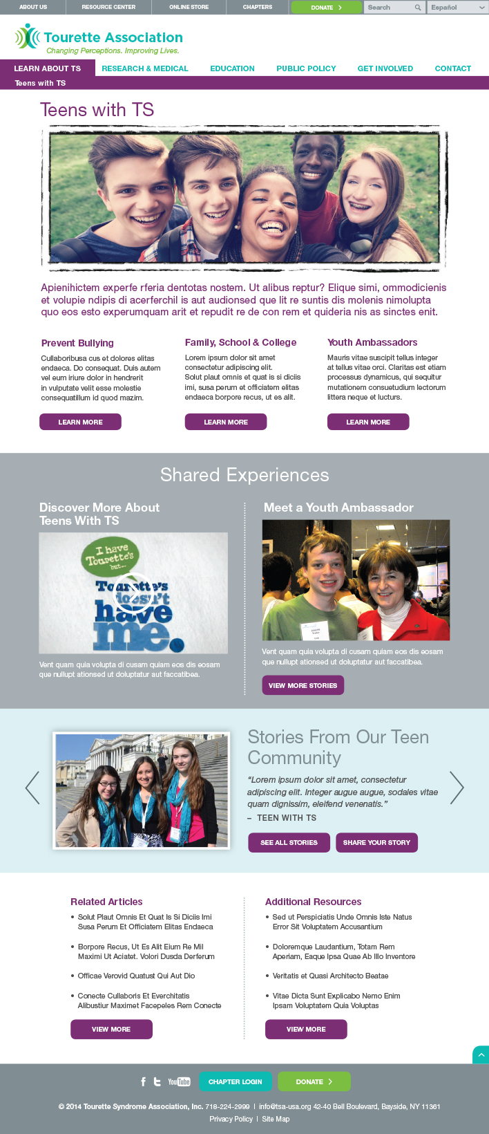
Teenagers with TS face particular challenges so we created a page with information written specifically for them.

TA Website Teens

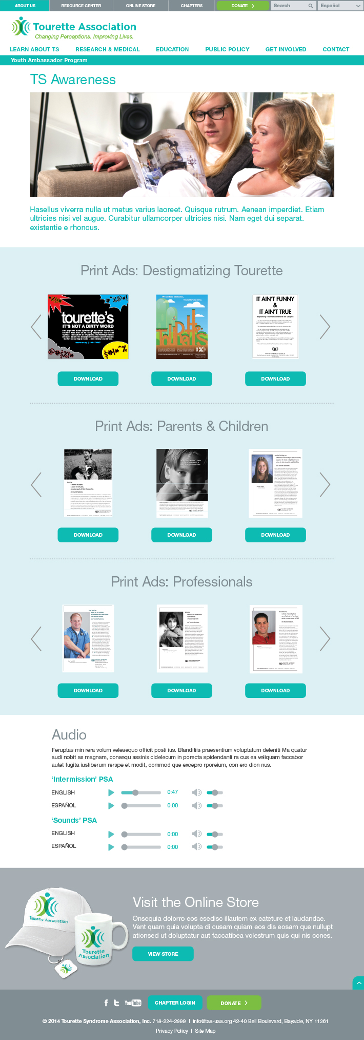
TS Awareness Main Page

Easy access is provided to publications, ads, audio lectures, and other resources.

TA Website Awareness

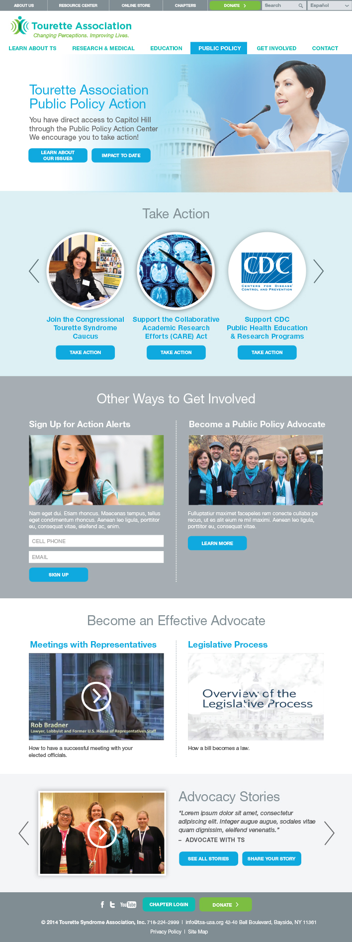
Advocacy Main Page

The site presents quick and easy ways to support and advocate for the Tourette Association’s issues.

TA Website Advocacy

Integration with advocacy software allows users to engage with and take action on current issues.

Action items to engage users are embedded throughout the site.
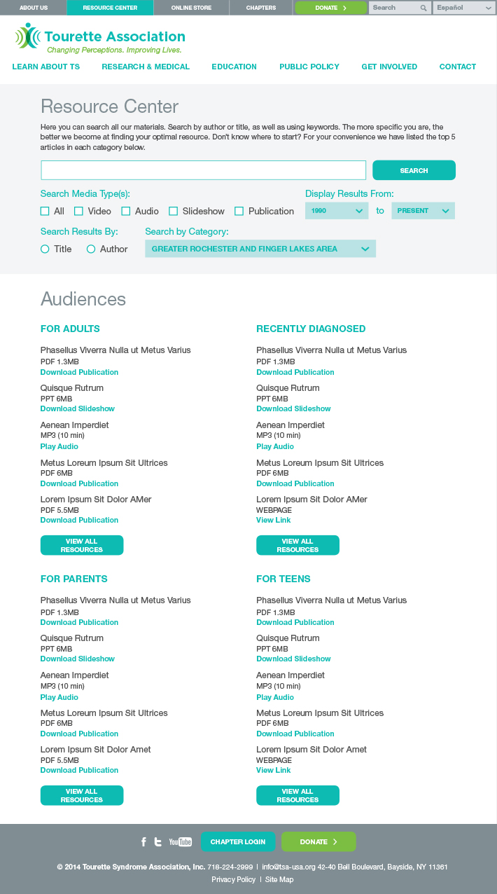
A specialized search functions allows users to filter and sort thousands of resources.

Quick link sections provide easy access to content.

Resource Center

By aggregating years of past publications, articles, videos and slide shows, the Resource Center allows users to quickly and easily search for reference materials that meet their needs and answer their questions.

TA Website Resource Center

Connect with TA Main Page

With contact information, newsletters, and feedback forms built right into the site, the Tourette Association welcomes all who come to it for information, assistance, or even some friendly advice.
TA Website Connect

New Brand Helps Three Camps Merge into One

UJA Federation of New York

Camp Header_Image_R2

Merging Three Camps Into One Leads to Increased Enrollment

Three well-respected day camps were merging into one while introducing a new camping model. They needed to maintain current campers and gain new ones. We helped them do that.

Services

  • Discovery
  • Brand Positioning
  • Messaging
  • Naming
  • Visual Identity
  • Consumer Testing
  • Marketing Collateral
  • Website

Challenge

The three camps that make up the new camp are each long-time providers of Jewish camping experiences. One challenge was maintaining the loyalty and respect of existing supporters while igniting enthusiasm for the new organization. The additional challenge was introducing a new camp model in which campers choose one track of activities for a week at a time. The camp also had to appeal to Jewish campers without putting off non-Jewish ones. Equally important is a name that embodies the values of the new camp in a process that generates buy-in from existing stakeholders. Red Rooster Group worked with the three entities to craft a unified brand to successfully launch the new camp.

Organizations Merging Their Camps

Discoveryy

Our process began with a Discovery Phase which lays the foundation for the name, logo, branding, and marketing strategy. This provided a deep understanding of all the organizations involved in this merger and a clear picture of the potential market for the new camp. Discovery included interviews, competitive reviews, and a review of existing research that had been done for the camp merger.

Discovery Findings

Camp Similarities

The three existing camps share many attributes including position, values, and goals. Their common denominators were:

  • Commitment to quality programming and staff.
  • Dedication to Jewish values.
  • Reputation as best option in local area for the price.
  • Community, personal feel, familiarity.

Current equities: quality reputation of delivering on promise, trust, reliability, child-centric, focused, customer service and communications, ”best game in town.”

Local Differences

The research also uncovered unique differences for each of the three existing camps that had to be reconciled in the brand. For example, parents at one of the institutions based in the city felt a strong need for their children to be outside and in green space. At the entity in NJ, the population was homogeneous, contrasting with the diversity in the city. The third camp had a more educated and more Jewish/religious population.

Audiences
  • Current camper base is more than half non-Jewish or unaffiliated Jewish families.
  • Parents are looking for their child to be safe, grow, learn to be better human beings, feel good about themselves, make friends, and have fun.
  • They are looking for a camp that will provide a long day of coverage, safety, convenience, attractive pricing – many campers are on scholarships.
  • Child is engaged, busy, happy, making friends, learning, and growing emotionally.
  • Middle class working families prefer quality experience over bells and whistles.
Competitive Situation
  • Trend in short-term attendance at specialty camp instead of camp all summer.
  • Highly competitive focus on a single area in specialty camp can cause burn out.
  • Private camps are significantly more expensive, have ”brand name” instructors, many ”bells and whistles.”
  • Town camps are significantly less expensive with corresponding limited facilities and programming.
  • Competition is increasing from summer programs at schools and synagogues as well as community offerings.
New Camp Competitive Position
  • The new camp will hold a center position at the crossroads between expensive to inexpensive, and specialty to traditional.
  • Offers what the expensive camps have at an affordable price.
  • Serves campers who wants a specialty experience without giving up other activities.
  • The pre-eminent place in the area to send your child.

Group

Positioning

Goals

The camp’s marketing goal is to increase the collective camp attendance by 300 to 800 in 2015. Reaching this goal requires raising awareness of the new brand and the value of the camping experience it offers while communicating a consistent narrative about the new entity formed from three different organizations.

Brand Positioning

We wrote a brand positioning statement to set the new camp apart from other camps serving families — both Jewish and non-Jewish — in the Upper Manhattan-Bronx-Tarrytown area. In developing the new camp’s messaging, we explored the concepts from the Discovery Phase to clearly differentiate the new camp from its competitors and appeal to parents.

Brand Positioning Statement

New Camp provides your children with a well-rounded summer day camp experience where they get to choose specialty programming that interests them while also enjoying all of the other activities that you would expect from a camp. Because this new model offers campers freedom of choice, it also aids families in making the best camp choices for their children.

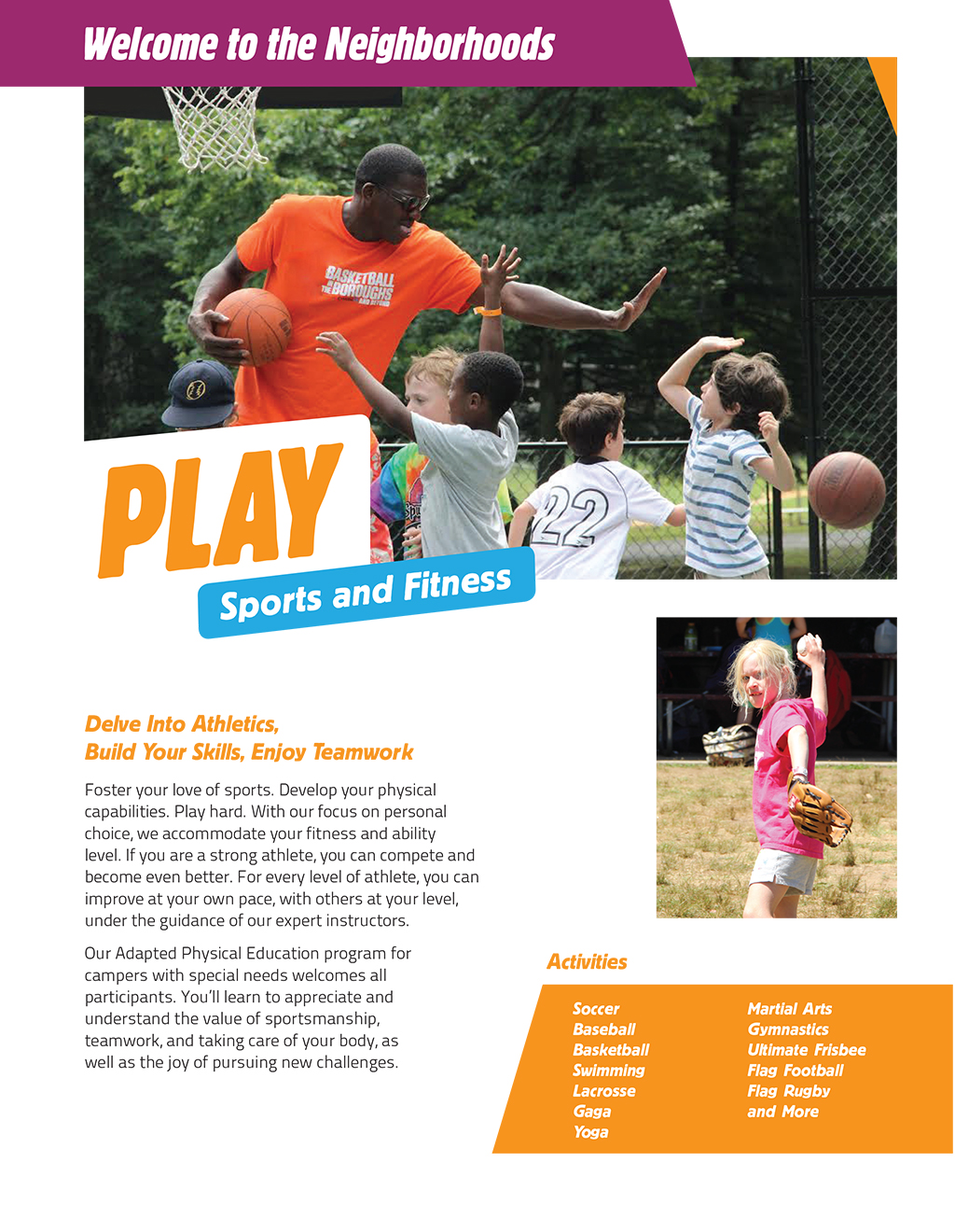
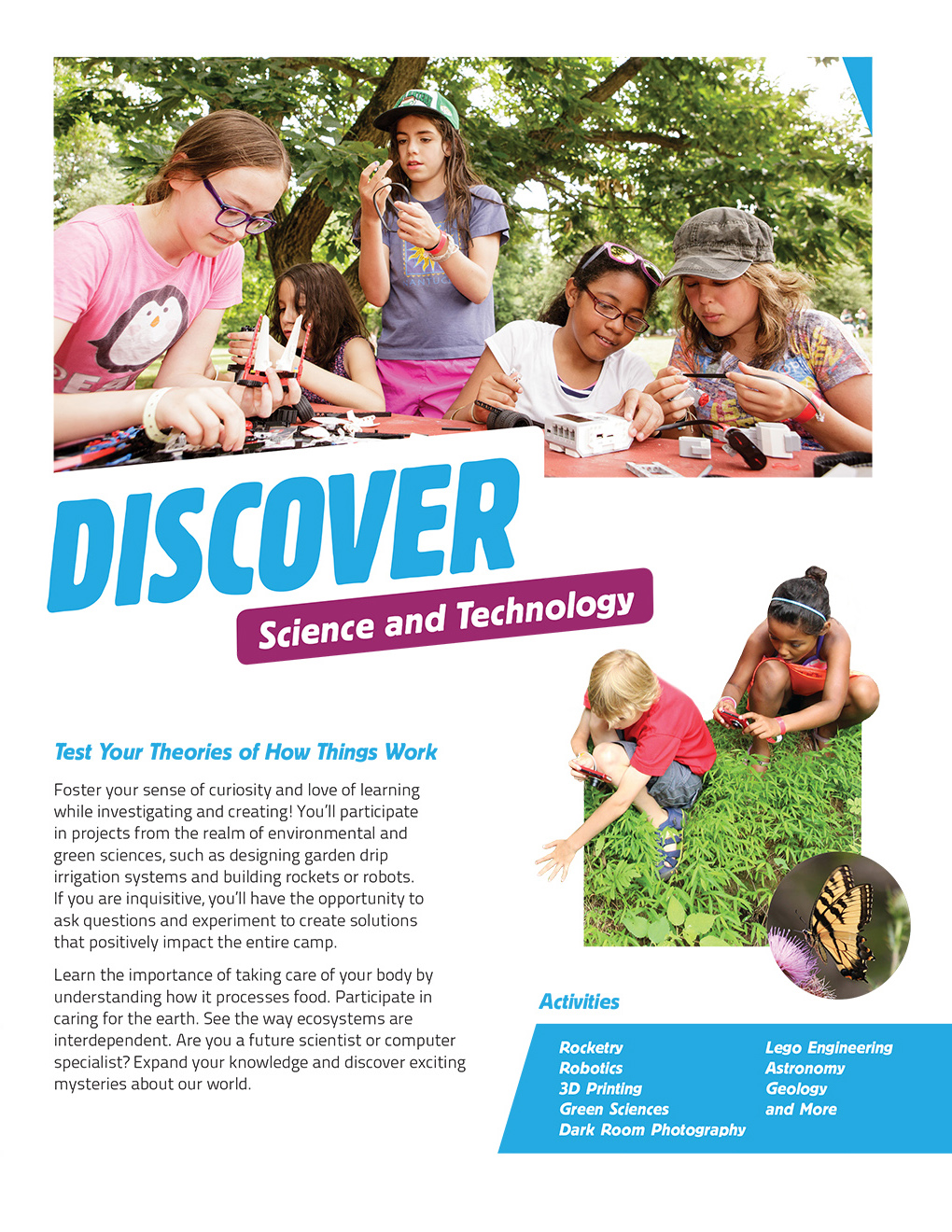
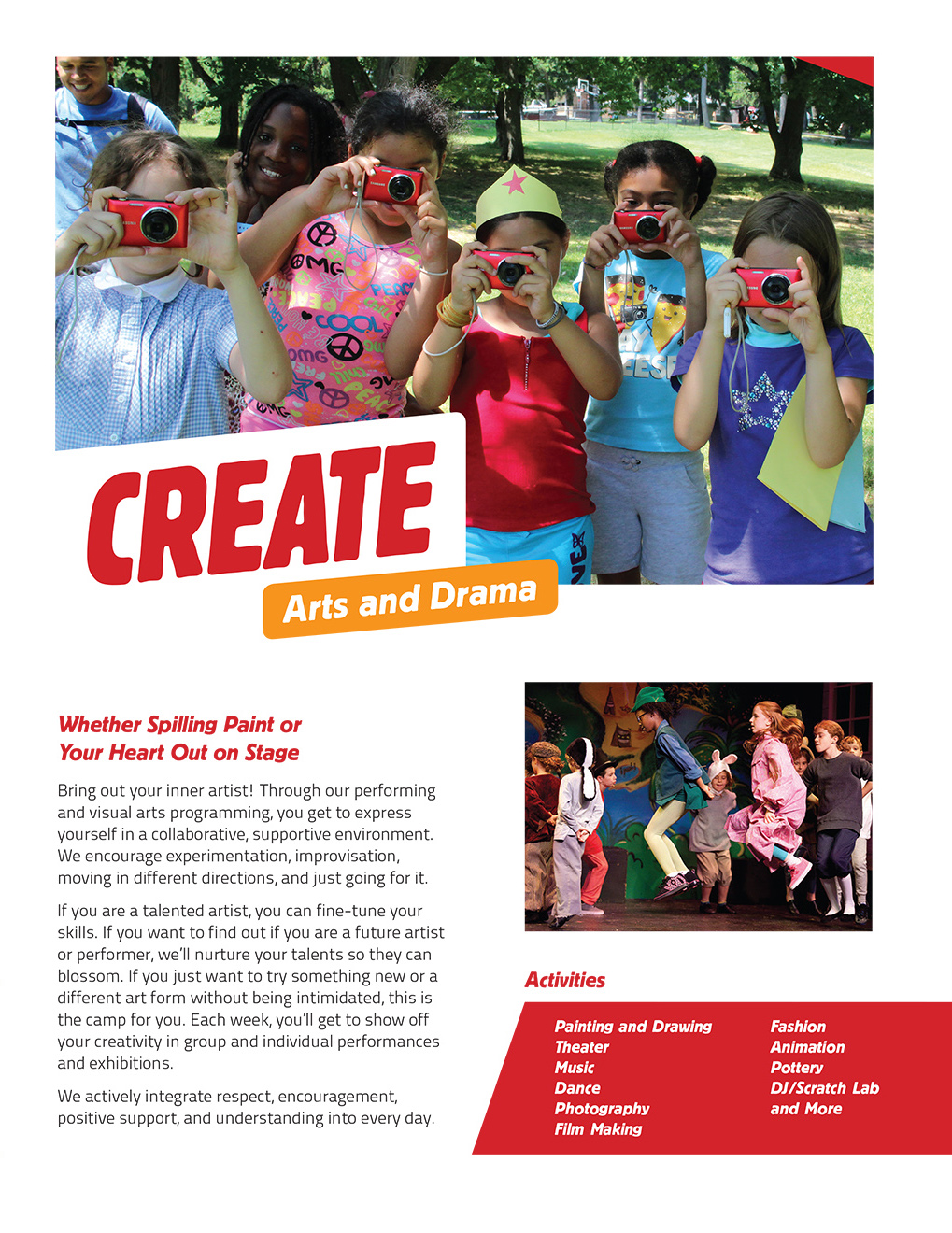
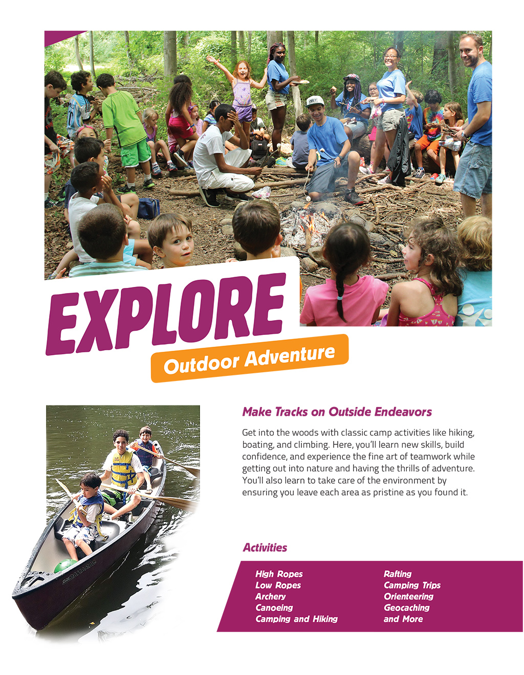
Like choosing a major at college, children select from different “Neighborhoods” or “pockets  of interest” for a week at a time, allowing them to explore new activities, learn new skills, and strengthen those they already have. This Neighborhood concept allows campers to focus on their favorite specialty area and then to explore other areas if they want to. Deep friendships evolve as the children explore these activities with others kids who share their interests. The Neighborhoods include: Fitness and Athletics, Arts and Drama, Science and Nature, Outdoor Adventure, and Farm to Table

Campers spend their time in a warm, nurturing environment where the framework of Jewish values actively teaches them to care for their bodies, the environment, and for other people.

Naming

Naming

The camp’s name is the first point of contact with parents and campers. It must convey something that makes people — staff as well as parents — want to engage with the organization. The new camp needs a name and tagline that accurately represents the new organization and can serve as a foundation for growth.

Naming Process

Our process is to generate a wide-ranging selection of names and home in on those that meet the naming criteria.

  1. We wrote a Creative Brief that described the naming criteria that had been determined through the Discovery process.
  2. We collected the names of 1,000 camps, analyzed them and found that they could be sorted into 8 different categories, providing a framework for exploring potential camp names.
  3. We then generated hundreds of name ideas for the camp, exploring a range of different types of names, from Descriptive to Evocative. The names explored how to communicate some level of Judaism without being too overt.
  4. After rounds of refinement and vetting to eliminate names that had conflicts with other entities, we presented a refined list of names for consideration.
  5. After review by the three decision-makers and others from the three entities, three names were selected for field testing.

Refined List of Names

Camp Mavenhood

Camp Mavenwood

Camp Twelve Trails

Camp 12 Stones

Camp Starpoint

Camp Blue Jay

Camp Cluster

Camp Oola, Oola Day Camp

Camp Kiskadee

Camp Plentifun

Fantastikids Day Camp

Camp Visioneer

Camp WonderQuest

Camp WonderScope

Camp Wonderville

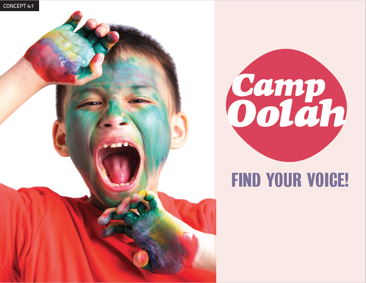
Three Names Selected for Testing

Camp Twelve Trails

Camp Starpoint

Camp Oola

Discover

Developing the Concepts 

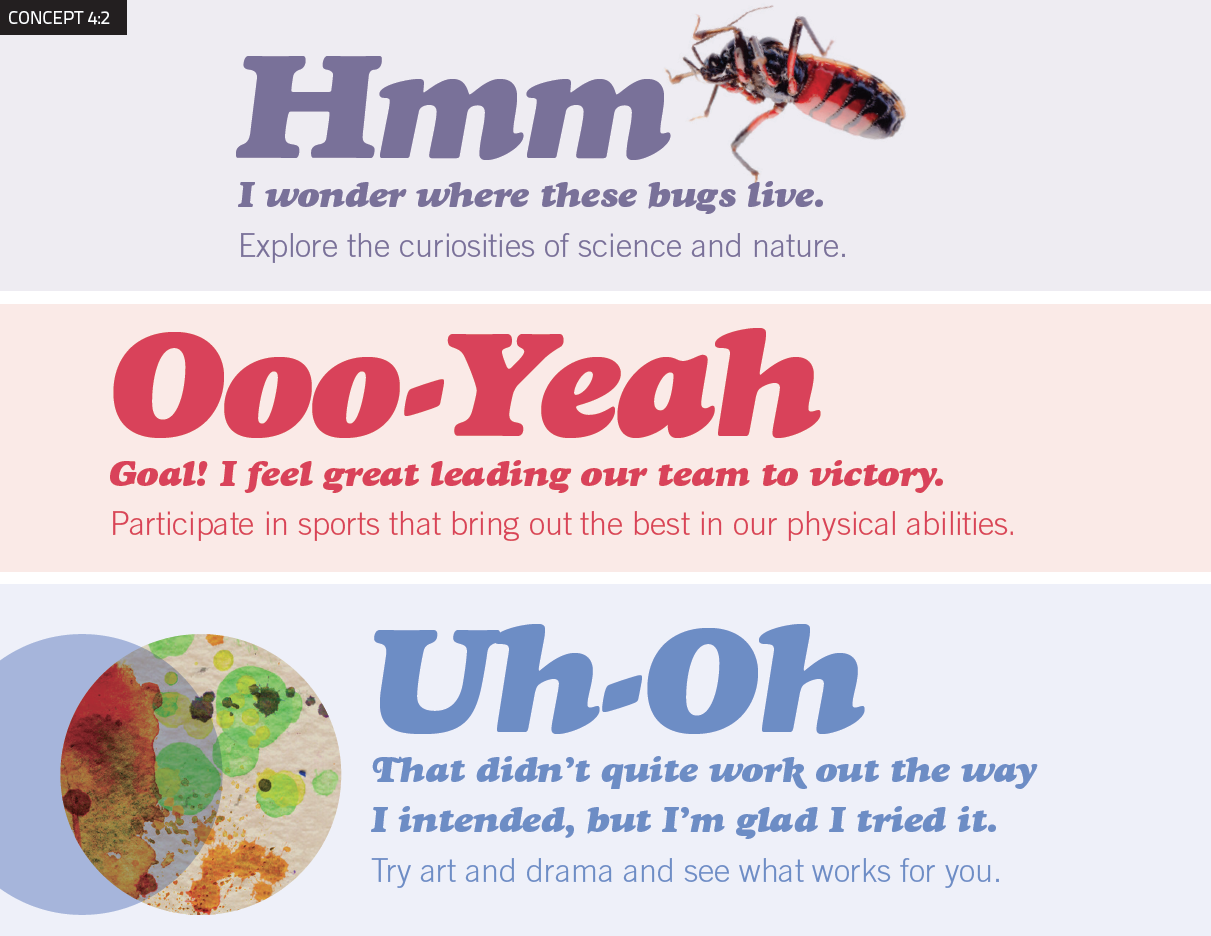
To bring the names to life, we developed conceptual approaches for each of the names to show the logos and overall visual direction for the marketing materials.

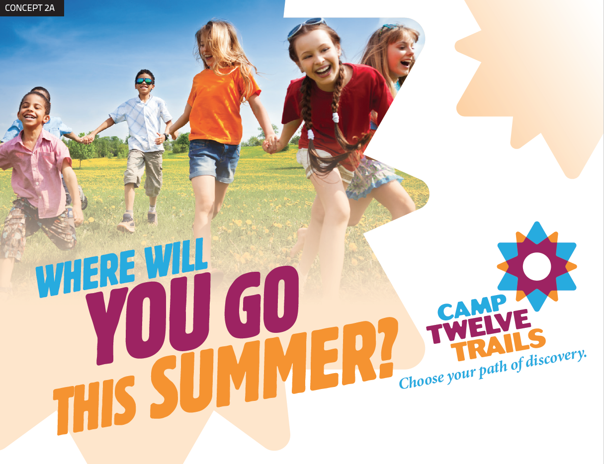
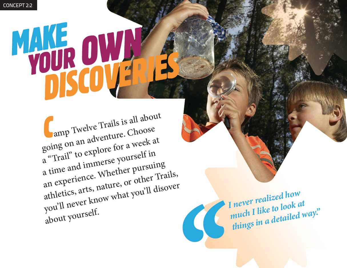
Camp Moodboard 2-1
Camp Moodboard 2-2
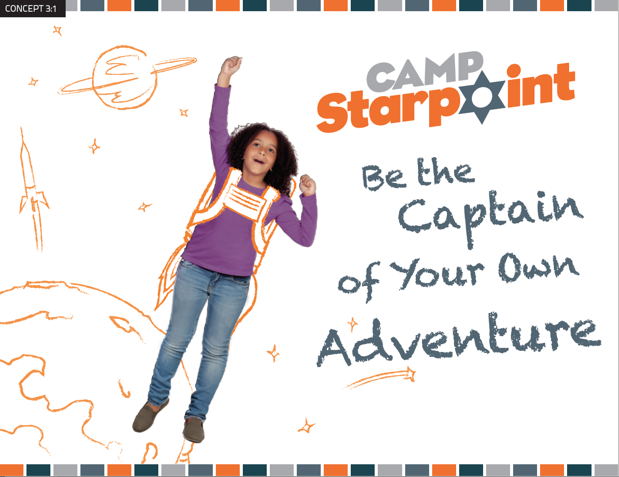
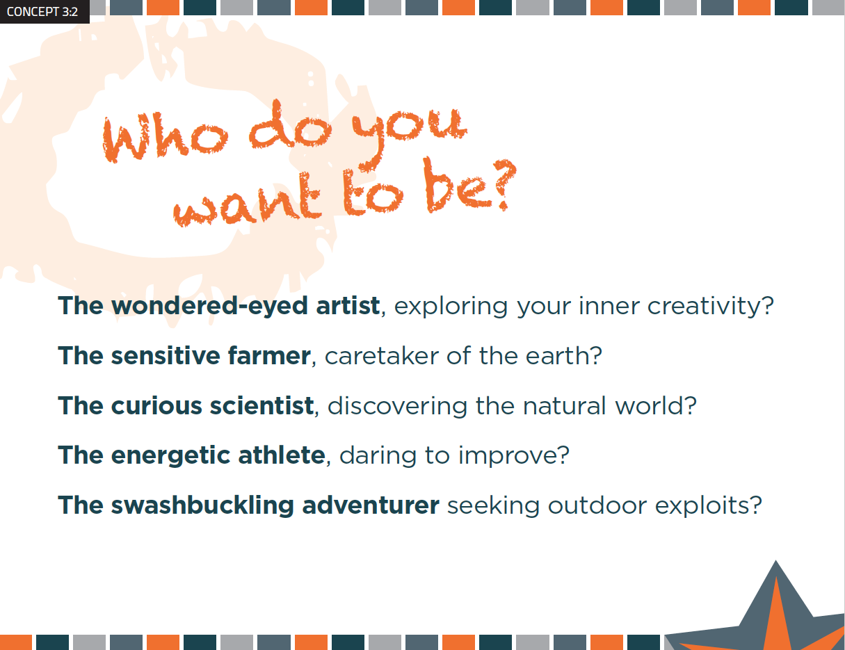
Camp Moodboard 3-1
Camp Moodboard 3-2
Camp Moodboard 4-1
Camp Moodboard 4-2

Getting Parent Feedback

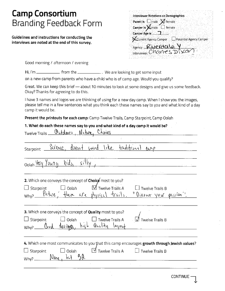
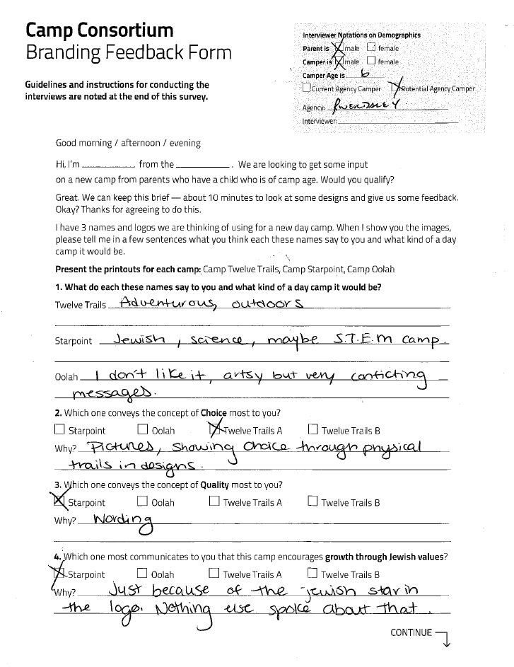
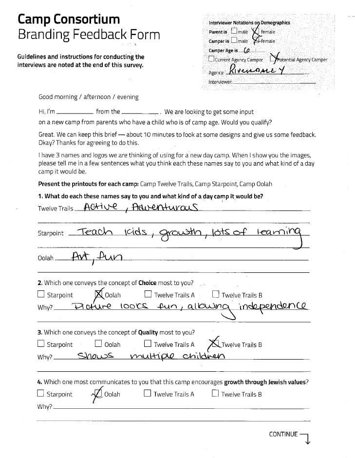
We gathered feedback on the concepts from parents at the venues. The questionnaire was carefully crafted to ask people to rate the concepts based on how well they met specific criteria, allowing us to evaluate which concept best met the camp’s needs rather than just gathering subjective opinions.

Camp Feedback 6
Camp Feedback 5
Camp Feedback 4

Selected Name & Visual Approach

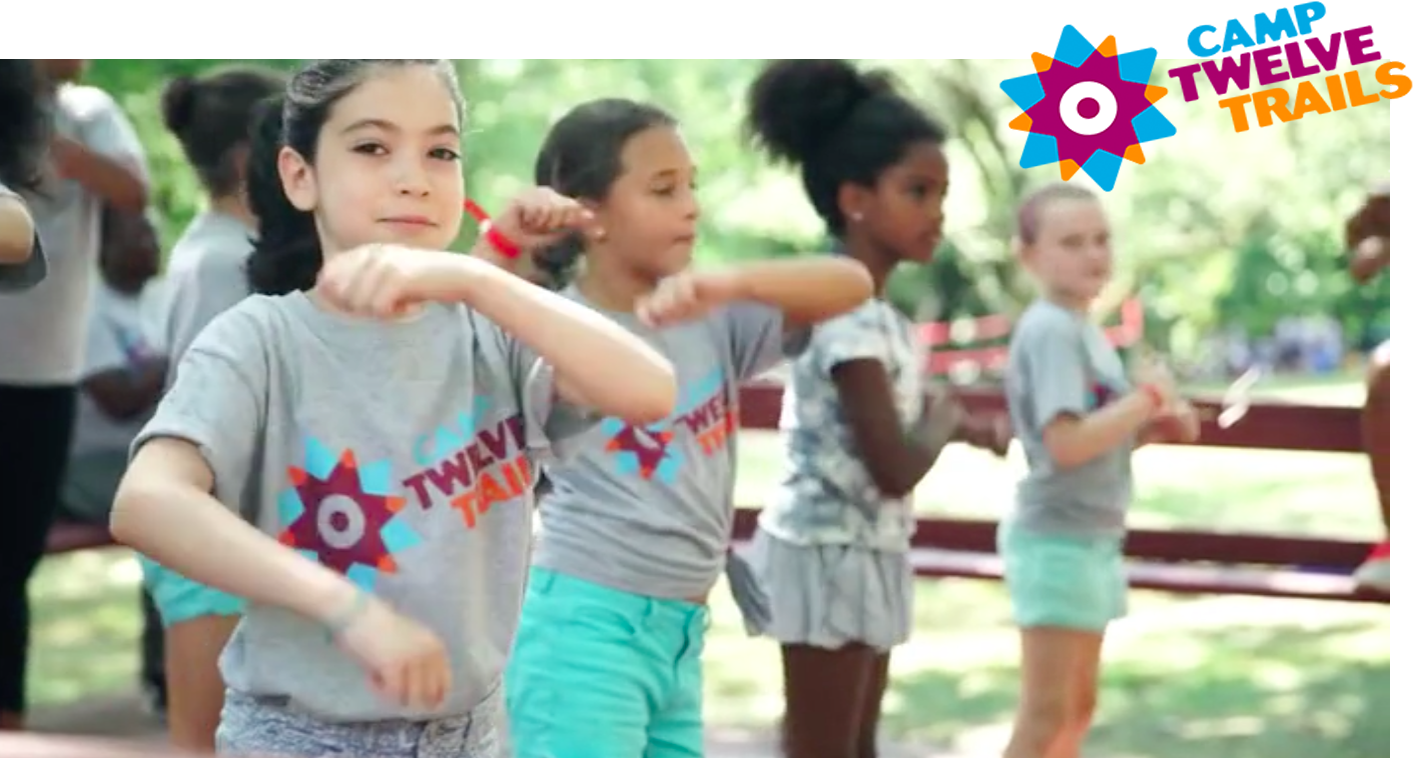
Camp Twelve Trails was the name chosen to best convey the array of choices and adventure that campers face, with a subtle reference to the twelve tribes of Israel. A sense of Judaism is also subtly conveyed in the logo — two overlapping Jewish stars create a compass with 12 points.

Camp Selected Concept

Brand Manual

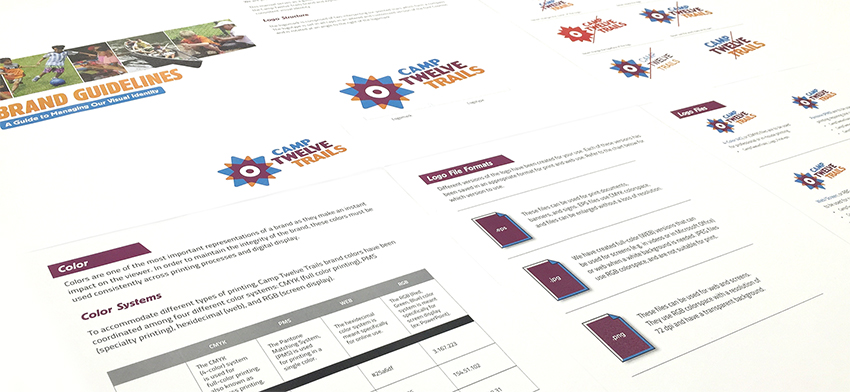
To help the camp manage their brand, we developed a Brand Manual that describes the brand elements and shows correct and incorrect ways to use the logo. The package also contains a full set of logos created for use in print and online.

Camp Brand Manual

Brochure

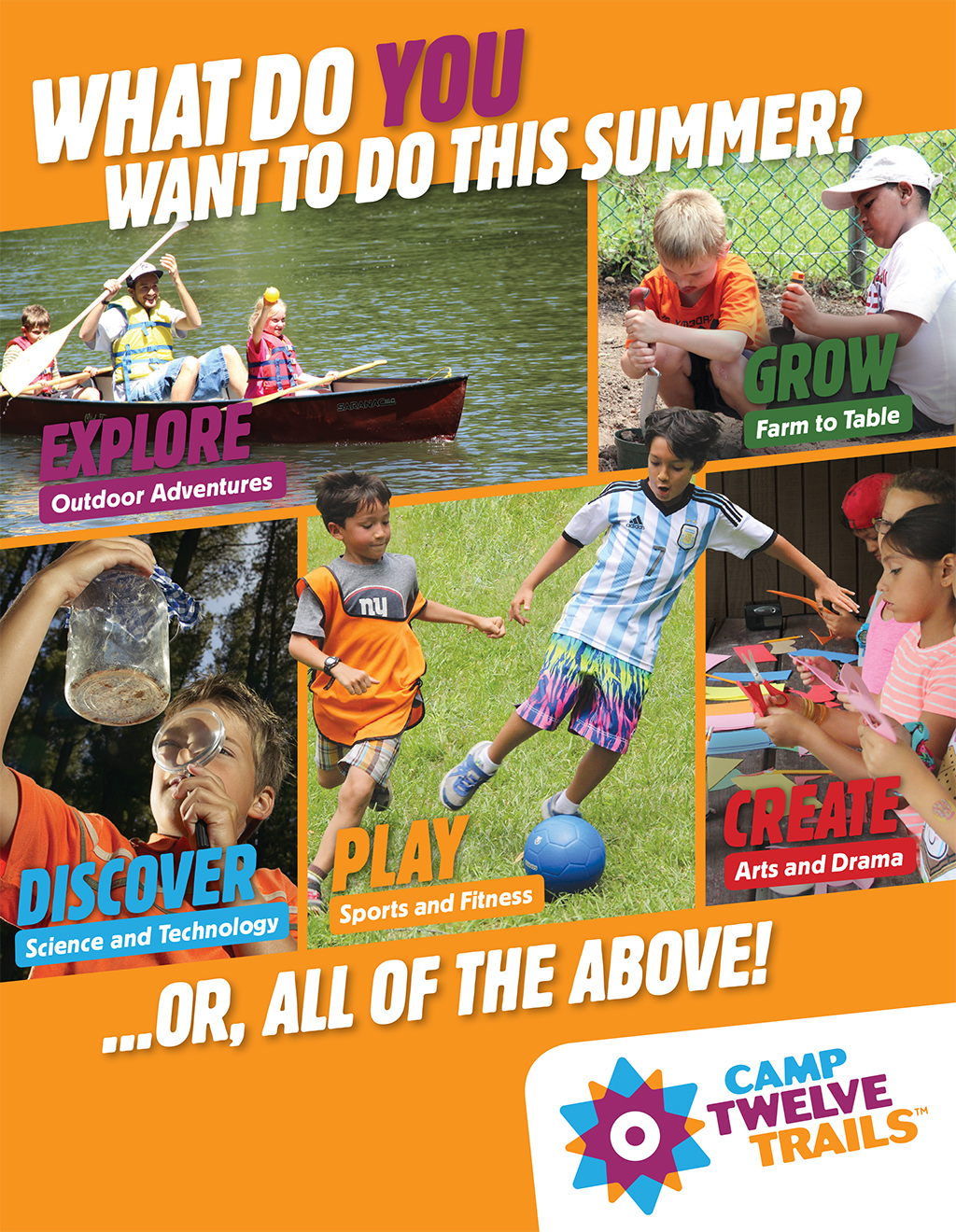
We wrote and designed a brochure to showcase the camp’s unique Neighborhood model, which allows campers to select one specialization for a week at a time. The brochure addressed the issue of connecting to the three merging organizations, and addressed the camp’s Jewish values in a section called Our Philosophy. The visual look of the brochure established the look for the website.

YMHA Brochure Cover
C12T Brochure Back
YMHA Brochure Play
YMHA Brochure Discover
YMHA Brochure Create
YMHA Brochure Explore

Website

As the first point of contact with many potential campers, the website showcases the new identity and makes a compelling case that positions the Consortium as a singular camping experience for Jewish and non-Jewish children. We created an engaging design to capture people’s attention while maintaining a professional, unified look for the organization that is consistent across the website and reinforces the brand messages.

The website features visual storytelling to showcase the vibrancy of the programs and tell the stories of campers. A clean navigation and user experience let site visitors easily find the specific information they need. Templates allow flexibility in the management of the site moving forward and responsive design adapts to tablets and mobile devices.

New Brand Helps Three Camps Merge into One

Results

The new camp has been successful in attracting campers.

In the first year, the new camp exceeded the combined registrations for the 3 camps from the prior year. The camp has received the most early bird registrations they have ever received with 205, compared with 180 the previous year.

Early Bird Registrations

205 in first year of new camp

180 previous year

Education Nonprofit Rebrands for Greater Awareness

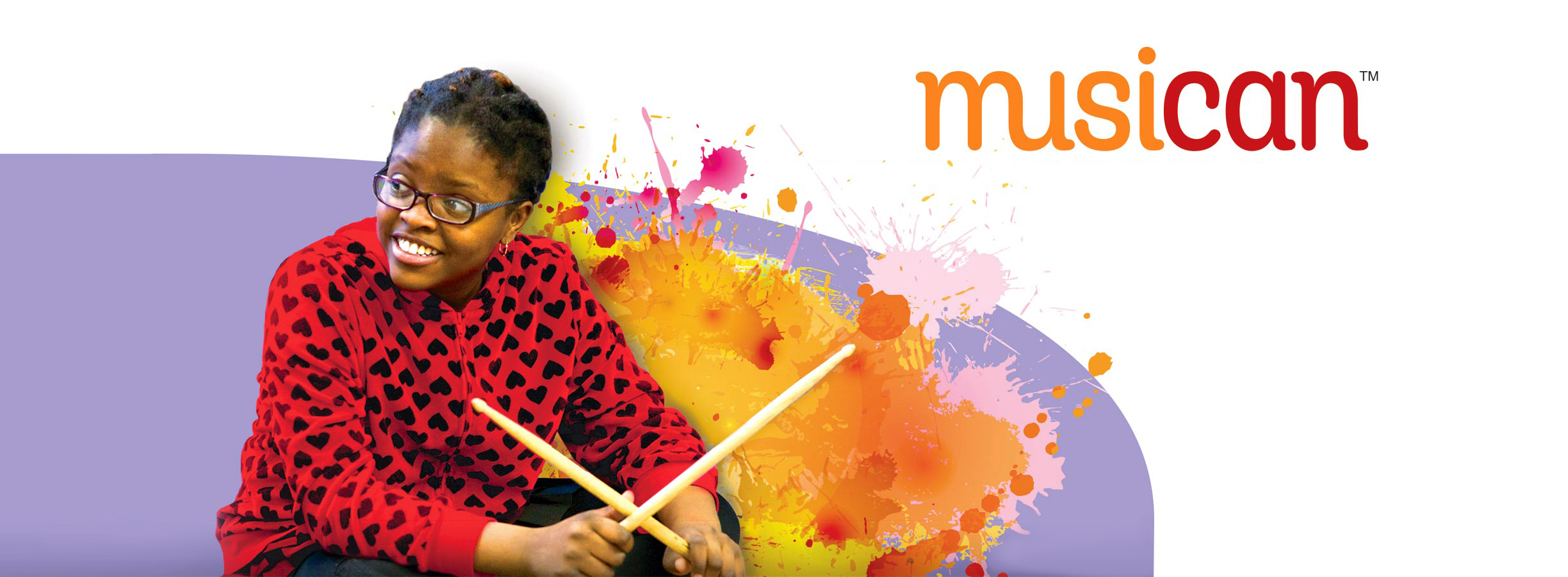
Musican

Musican Header

A New Brand Boosts an Educational Organization

A powerful new name, mission, and website created a professional face for this young organization that improves awareness and fundraising results.

Services

  • Leadership Discussions
  • SWOT Analysis
  • Brand Positioning & Messaging
  • Organizational Naming
  • Visual Identity
  • Brand Style Guide
  • Website Writing, Design & Development
  • Fundraising Campaign

The CWB Foundation for Children and Music provides music instruction for students in New York City public schools that lack funding for arts programs. Red Rooster Group developed a new name, visual identity, message, and website to rejuvenate their brand so that it could attract more donors.

Old Name & Logo

New Name & Logo

Market Research

To understand what makes The CWB distinct among other music programs in New York City public schools, we conducted a comprehensive competitive review and SWOT analysis.

We discovered CWB is the only program in New York City offering music that is culturally relevant to the students, which can make a big difference in how kids perceive and participate in the program.

Goals

We helped the organization to define its vision and develop its goals:

1. Expand the program from three schools to six schools in New York City in the next two years.

2. Expand the organization’s fundraising base and double revenue in three years.

To achieve these goals, we energized the Mission Statement by including the outcomes: equipping students with the discipline, confidence, and team-building skills necessary to reach their full potential.

Naming & Visual Identity

The next major area to tackle was the name.

The CWB Foundation for Music & Children was long and cumbersome, and mischaracterized the entity as giving money away rather than providing programs. A new name needed to convey a positive and inspiring message about the benefits of music.

After writing a Creative Brief to ensure what everyone was on the same page about what we were aiming for, we generated a list of 200 names. We culled the list down to 12 that best represented the mission:

Benefit Oriented Combined Multiple Word Coined
Brighter Beats LifeChords FutureBeat Music MusiCan
Keys for the Future SongRise Momentum Music Posibeats
Lifenotes Kids PlayChime Sound Unbound Posikidity

The chosen name, MusiCan, suggests that music can be empowering to children.

The name was brought to life with a vibrant, contemporary, and friendly logo that evokes the youthful energy of the program

Website

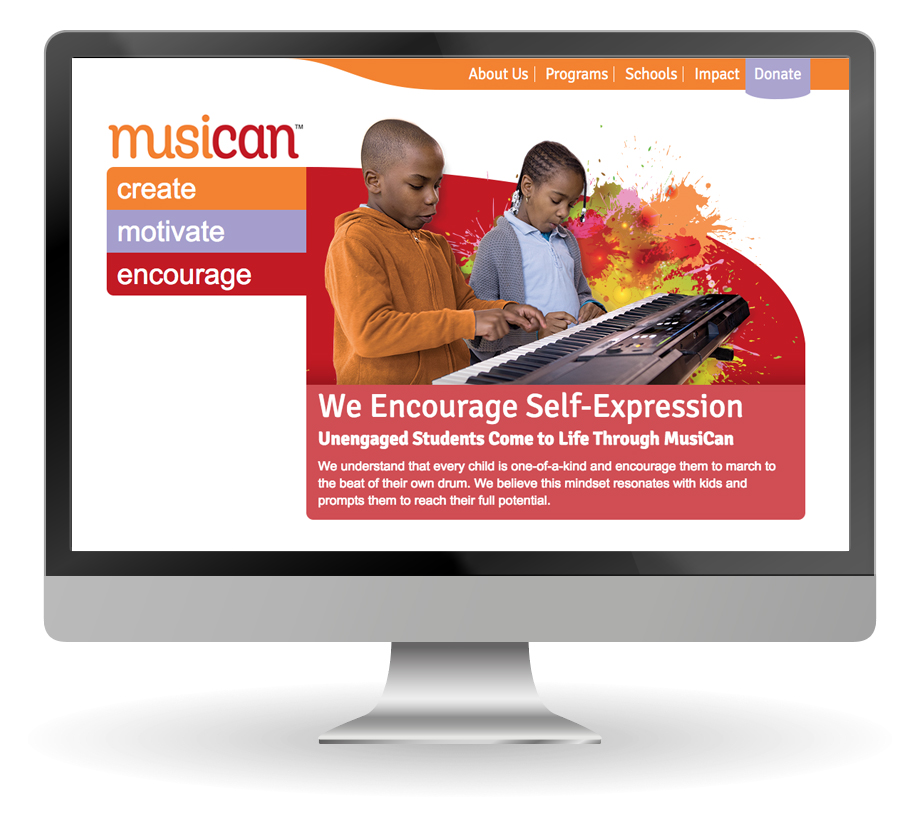
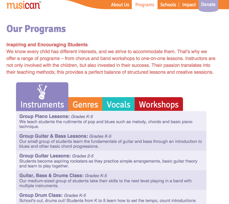
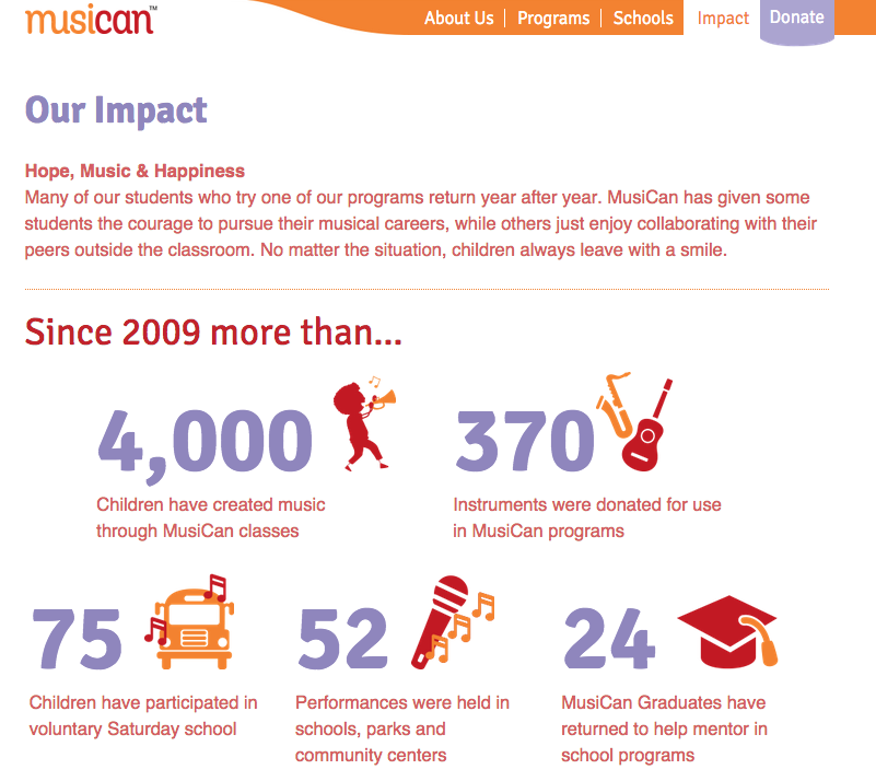
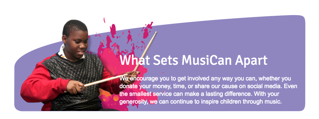
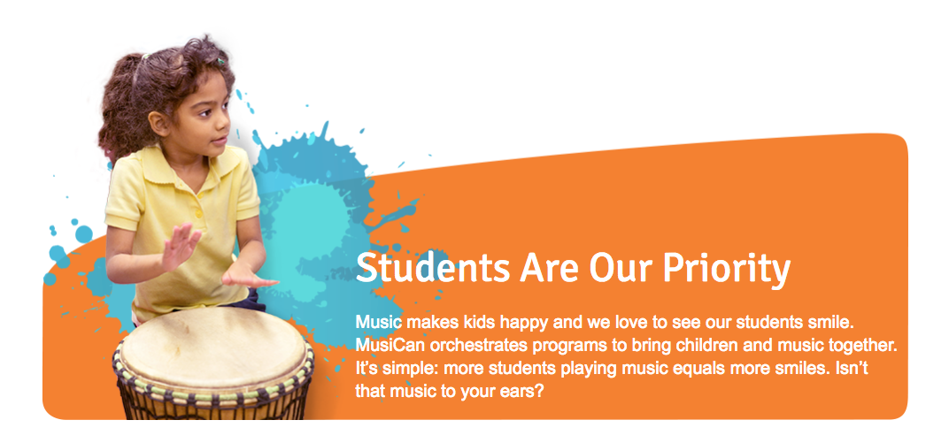
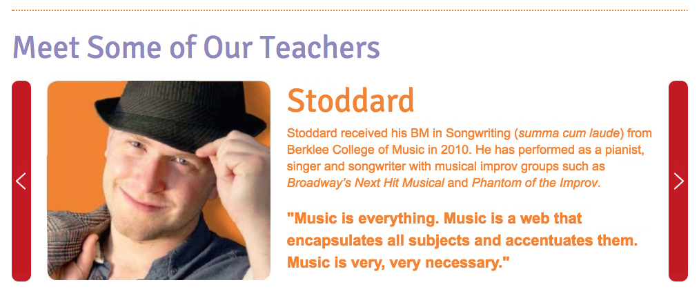
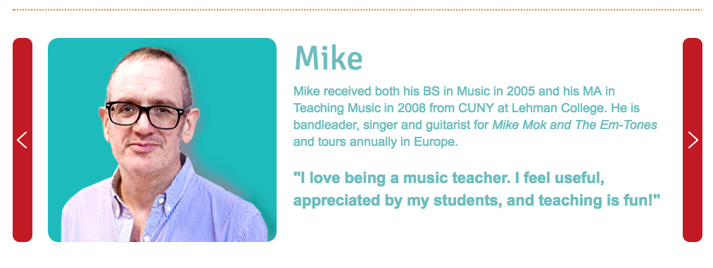
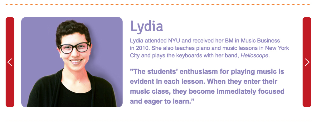
The website we created tells how music can empower children to achieve more, showcases the program, features testimonials, and describes the organization’s impact.

“Red Rooster Group impressed us at every turn. They provoked us to think deeply about our work and how we wanted to present ourselves to the world. Their systematic approach, as well as intrinsic understanding of our values and aspirations, enabled the team to hit the ball out of the park on the first try with every single creative aspect, from naming our organization, to branding our image, to fashioning our website. Our experience has been flawless. We are thrilled with the results.”

LISA WIXON, Director of Operations
, MusiCan