
Board members do more than govern. They are also guardians and ambassadors for the brand.
Continue readingBoard members do more than govern. They are also guardians and ambassadors for the brand.
Continue reading
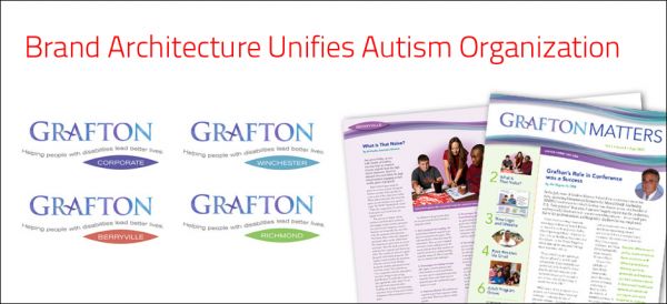
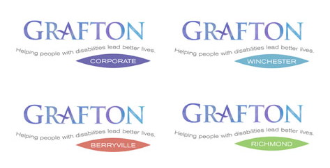
Our research uncovered that one of Grafton’s strengths, the specialized expertise and dedication of its staff, was not being conveyed. We shortened the official name of Grafton School to Grafton and established a brand hierarchy to unify the organization’s four locations under one brand name.

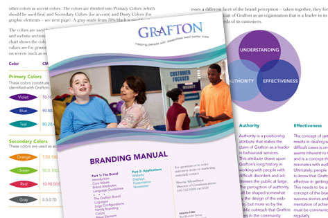
We created a brand manual to explain the brand – what the organization stands for — and specifies colors, typefaces, graphics and guidelines for the brand. This has allowed the client manage their own brand effectively.
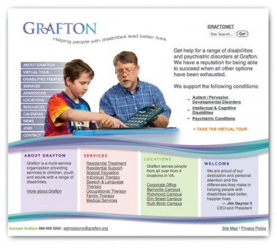
After a strategic assessment of competitors and the users, we redesigned the website around the needs of the users. The redesign has been receiving rave reviews. grafton.org
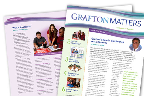
Grafton’s internal newsletter to its 700 employees at their three locations keeps employees informed and generates enthusiasm for the organization.
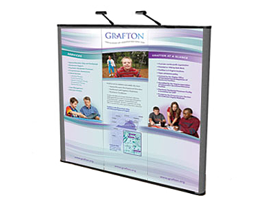
A flexible system of interchangeable panels helps make their display adaptable for fairs, attracting potential students and employees.

Logo for a manufacturer of raw materials for vitamins.

Naming, branding and storefront design for CarePath, a senior care management service launched by the Park Slope Geriatric Day Center.

Logo for business coach.

We updated the branding for Solid Innovation, a technology company that markets handheld inventory control devices. We designed a series of coordinated icons to indicate the various components of their software.
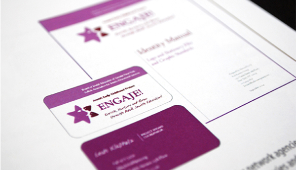
With non-Jewish pre-school teachers providing the first school experience for pre-schoolers in Jewish schools, there was an opportunity to create a stronger Jewish foundation for these students. So the Board of Jewish Education and Suffolk Adult Jewish Education Services came to together to develop a training program to help educate teachers about values so that they could impart them to their students.
With a limited budget for promotion, we knew the logo needed to convey a lot of information, and do so quickly. We developed the logo around the concept of interaction between the teacher and students. The logo was well received for its human aspect and positive emotional quality. We then adapted it to business cards, and event promotion — which was very successful.
This project was done as a pro bono project under the UJA-Federation’s Management Assistance Program (MAP), and was featured in MAP’s 25 anniversary celebration.

The branding for this financial advisory firm uses a ship as a metaphor for guidance through rough waters. Three colors distinguish Tax Strategy, Financial Planning and Insurance services.

Main graphic for Globix Digital Exchange, their digital asset management service. The overall branding was applied to sales presentations, displays and brochures.

This graphic was designed to show all the facets of Globix’s Digital Exchange digital asset management service.