Career Guide Engages Urban Teens

CLIENT: Seedco


With black males in this country facing a 1 in 4 chance of going to prison during their lifetimes, how do you get urban teens to think about career choices? National nonprofit organization, Seedco created a workbook, funded by the New York City Department of Youth and Community Development, to address this issue and tasked Red Rooster Group with making it appealing to the target market.


Workbook

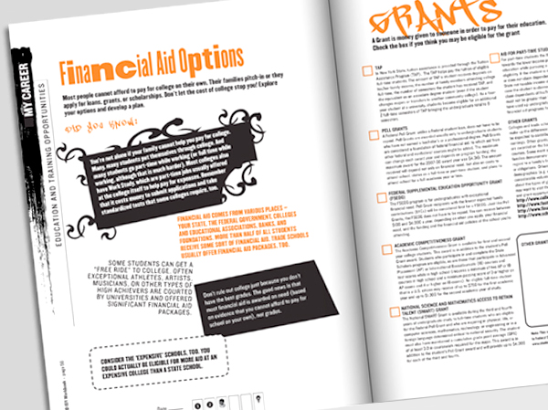
We employed three aspects of design to make this project a success: The first was in organizing the information in a way that would be useful, allowing readers to enter the workbook on any page. All activities are designed to be stand-alone and each page features a strip down the side indicating the activity name and chapter.
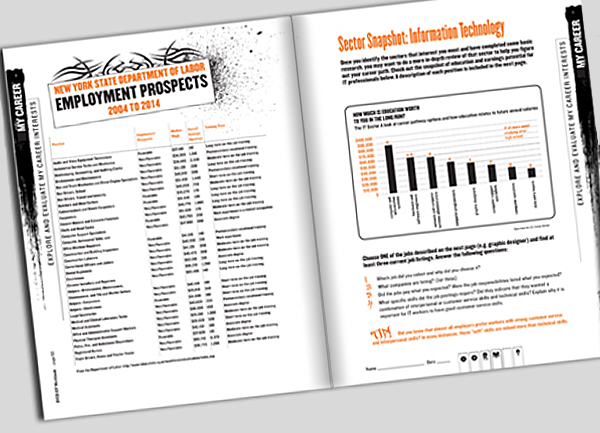
Step Up Guide 1

Secondly, the overall design uses the vernacular typefaces and images that inner city teens can identify with. Each page in the 160 page workbook is different to keep kids engaged.
Step Up Guide 2

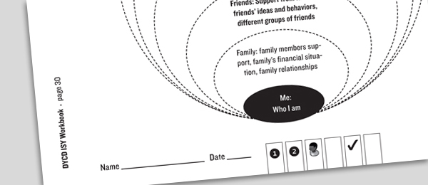
And finally, to help as an educational tool, on the bottom of every page, each activity has a series icons indicating the types of skills that the activity builds. This is useful for both the teens, and teachers who are looking for activities to strengthen students’ weaknesses.
Step Up Guide 3


“We cannot say enough about the incredible work produced by Howard Levy and the Red Rooster Group! From the professional services, to the thoughtful approach to design work, and creative concepts, the Red Rooster Group has helped us translate our big thinking into eye catching designs relevant for the populations we serve. At this risk of gushing– we just could not do our work without them. We consider the Red Rooster Group to be a valuable partner in our efforts to help low-income individuals become financially self-sufficient.”

— Linda Rodriguez

Senior Manager for Program Development & Technical Assistance


Other Seedco Projects

We have worked with Seedco on numerous projects over the years, including branding and program promotion, event marketing, and publications.


Links


Internal Newsletter for Nonprofit Helps Improves Employee Communications

CLIENT: Grafton

With 700 employees, Grafton, a nonprofit organization that serves people with autism and other developmental disorders, realized that is had a great opportunity to develop a deeper relationship with its employees and help get its story out.

When Grafton engaged Red Rooster Group to upgrade its overall brand image and improve its communications, giving their internal newsletter an upgrade was a part of the process.

The newsletter, addressed to Grafton’s 300 employees, describes the news at the organization’s three locations. Each of the locations were allocated a spread in the publication, establishing a format for each venue to collect news to share with all the employees. The newsletter helps all employees to feel connected to the organization, fosters a better understanding of Grafton’s services, and boost morale.


Brand Architecture

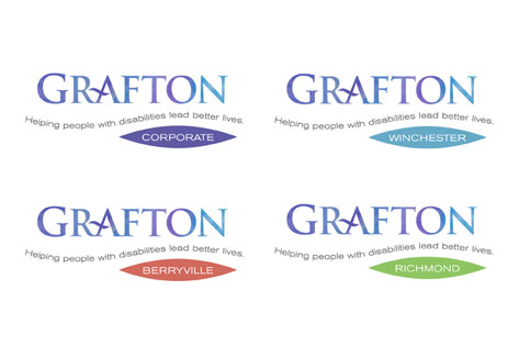
Our research uncovered that one of Grafton’s strengths, the specialized expertise and dedication of its staff, was not being conveyed. We shortened the official name of Grafton School to Grafton and established a brand hierarchy to unify the organization’s four locations under one brand name.

Grafton Brand Architecture


Brand Manual

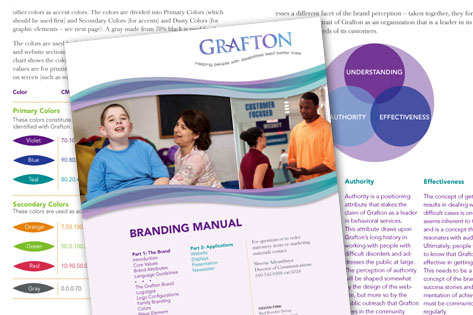
We created a brand manual to explain the brand – what the organization stands for — and specifies colors, typefaces, graphics  and guidelines for the brand. This has allowed the client manage their own brand effectively.

Grafton Brand Manual


Website

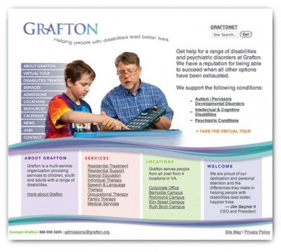
After a strategic assessment of competitors and the users, we redesigned the website around the needs of the users. The redesign has been receiving rave reviews. grafton.org

Grafton Website


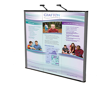
Display

A flexible system of interchangeable panels helps make their display adaptable for fairs, attracting potential students and employees.


Links


Westbridge Academy Newsletter

CLIENT: Westbridge Academy

We launched this newsletter to help this special needs school communicate its unique approach to helping students with learning and behavioral issues. We developed the ideas, wrote the articles, designed the pages, created the artwork and handled the printing. The newsletter was a part of a brand update for the school.


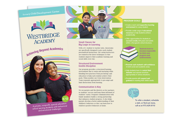
After a name change, complete branding process, and smooth transition, the Child Development Center is now Westbridge Academy. The branding process included creation of new logo, brochure, website, and newsletter. It is now able to highlight its strengths, attract new students, and convey the professional nature of the school.


Logo

The new logo is professional as well as a little playful while emphasizing learning. The open book in the form of a bridge reinforces the name.

Westbridge Academy Logo


Brochure

The school’s brochure explains their unique approach to helping kids. The audience for the brochure are the special needs departments at schools aimed towards getting referrals.

Westbridge Academy Brochure


Website

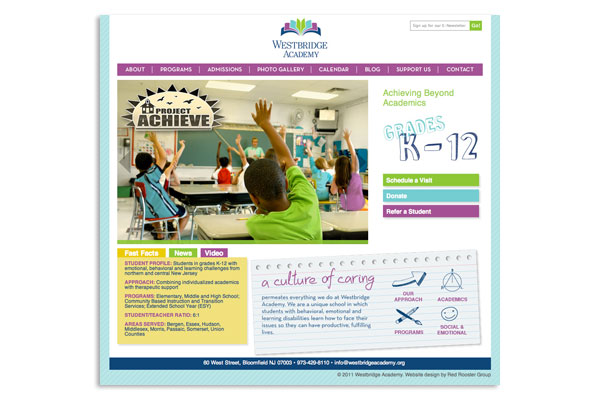
The website portrays a fresh new look and helps keep parents and educators at the school districts informed about school activities and news related to special needs education. An easy to use website promoting the right qualities of the school features a calendar of events, photo gallery, and a blog.

Westbridge Academy Website


Links


Magazine Helps Conservation Organization Increase Membership

CLIENT: New Jersey Conservation Foundation

How do  you create statewide visibility to showcase your good work and help drive donations? We launched this full color magazine by combining the resources of several of the organization’s newsletters. The magazine features stories on the land that the group is preserving, as well as its volunteers, and a column by the director. In an example of effective nonprofit publication design, we created the center spread as a pull out that people could use to visit the specific sites that the organization was protecting. The magazine helped to increase donations an won an award of the best nonprofit publication.


Links


Invitation Design Helps People Connect with Organization’s Mission

CLIENT: Jewish Federation of Greater Middlesex County, NJ

CHALLENGE

How do you expand the audience for an event which has traditionally attracted women only, to include more men? This Federation’s Main Event is the signature event for their Women’s Philanthropy division, and a key source of connection and revenue. However, faced with a shrinking donor base, the goal was to appeal to a wider audience.

SOLUTION

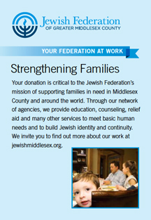
Strengthening FamiliesWith the change in the nature of the event to a less formal structure, we decided to emphasize the topic of the event — Inside the First Marriage. As an example of effective nonprofit design, we created a gatefold design that invites the recipients to open the invitation, and step inside the White House. We put more emphasis on the speaker’s topic, rather than as just a social mingling opportunity, and feature the recognizable Main Event logo on the front, but in a more subordinate role.

Seeing the mailing as an opportunity to inform people about the Federation’s work, we also connected the event to an aspect of the Federation’s mission, by creating a panel that describes their programs that strengthen families. We also created an email version of the invitation.

RESULT

The event was a huge success — attracting 160 people — more than double the 60 attendees from the previous year.

Further Findings

A post-event online survey was conducted to learn want people thought of the event. The attendees indicated that the printed email was the primary way that they found out about the event. This was interesting since 4 times the amount of people received an email invite as did the printed invite (in fact, the emails went out twice). So the invite did its job in getting people’s attention.

We also discovered that most people attended because they were interested to hear the keynote speaker, but after the event reported that they were most moved by the personal stories of local women who supported the Federation’s work.

The survey also asked what should be improved for next year’s event, so we gained some valuable feedback about that as well. The survey was short – just 5 questions so that people would be motivated to respond. We used Survey Monkey since it’s free and easy to use. It’s a great tool to use to gain feedback on your event, and it helped us learn what marketing worked, what people wanted to hear, and how to create an even more successful event next year.


OTHER DESIGN EXAMPLES

ARTICLES

CONTACT US


Red Rooster Group is a New York based graphic design firm that creates effective brands, websites and marketing campaigns for nonprofits to increase their visibility, fundraising and communications effectiveness. Contact us at info@redroostergroup.com.


Event Invitation for High Level Donors Conveys Organization’s Themes

CLIENT: Jewish Federation of Greater Middlesex County, NJ

Challenge

You might think that your high level donors know about your organization, after all they are giving substantial amounts of money. However, donors come to organizations in many ways, including others that bring them in, and donors might not know as much about your organization as you think.

We found that this was so for the Jewish Federation serving Greater Middlesex County, NJ. A survey among donors found that many were unfamiliar with all of the ways in which the organization builds value in the community.

So when we were tasked with creating the invitation for this group of influential donors, we saw it as an opportunity to help them understand more about the organization.

Solution

We used the theme of Transformation to ties together the speaker (A German who converted to Judaism), and the venue (an historic barn that had been relocated and restored) as well as convey the Federation’s work in transforming lives through the humanitarian aid that it provides. We included a paragraph about what the Federation is doing so that even those who may not attend the event can learn more about the organization’s work (notice the bottom photo and paragraph on the right hand panel of the invitation).

We have been using this tactic of “advertising” to the donors at every opportunity, to deepen ties with the organization.


Links