To promote this inspirational fundriasing event, we created a save the date postcard, invitation package, website graphics, as well as the ad journal
Continue readingTo promote this inspirational fundriasing event, we created a save the date postcard, invitation package, website graphics, as well as the ad journal
Continue reading
I received the mailing showing the new paper ballot and I am shocked how poorly designed it is. The fill in dot is in the bottom of the box for each candidate and is actually located closest to the name right under it. Given the huge white space separating the candidate’s name from fill in dot and the proximity of the dot to the next candidate, it is entirely logical that many people will assume that the dot is for the candidate closest to it (the one below). I wonder how many people will make that mistake. Unfortunately, we will never know.
Also, why is all the type set flush right? That is counter to the most natural and most common formatting. For a piece of communication addressed to the widest possible audience and lowest possible literacy level, it would make sense to use the most common conventions that most people understand.
After the fiasco around the design of the butterfly ballot in the 2004 election, one would assume the utmost of care in the design of the ballot. It is reprehensible that our democracy is jeopardized by such short-sightedness. It just shows you the importance of good design. What do you think?

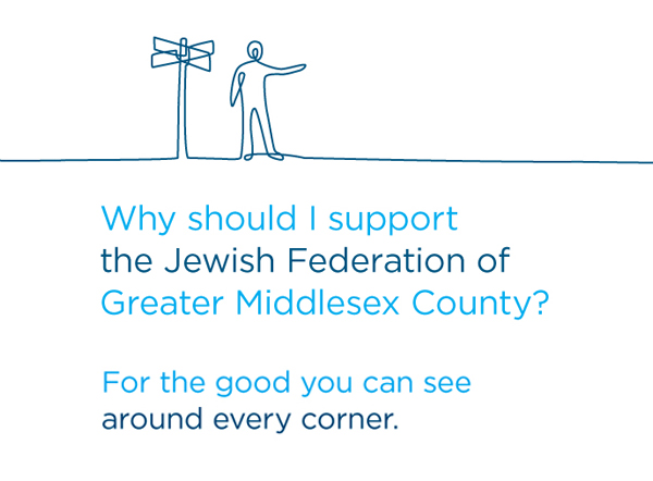
How do you help tell a cohesive story for an organization that works in so many areas? We created a compelling fundraising theme, brochure and materials to promote this Jewish Federation. With the headline, “Why should I support the Jewish Federation?,” the inside panel of the brochure answered with, “For the good you can see around every corner.” This was used as the overall fundraising theme to show the impact that the Federation has in many areas around the county. The inside of the brochure presents a virtual walk through the community, visually showing all the ways in which the Federation was supporting the institutions that people rely on.
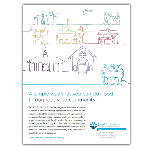
The ad presented the concept in one panel – a visual reminder of all the institutions that the Federation supports and a powerful appeal for support.
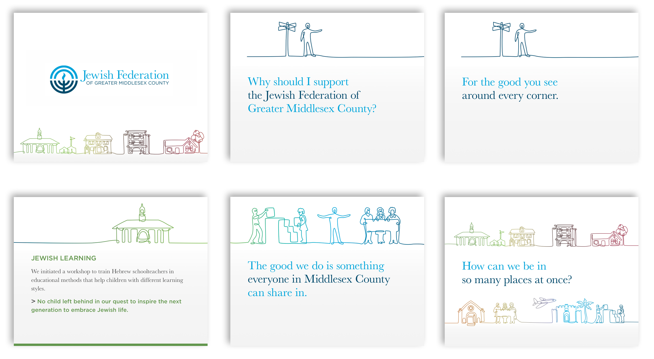
We then created a presentation that allows the organization to delve into the story at a more personal level, exploring the impact based on the values and institutions that donors could identify with.
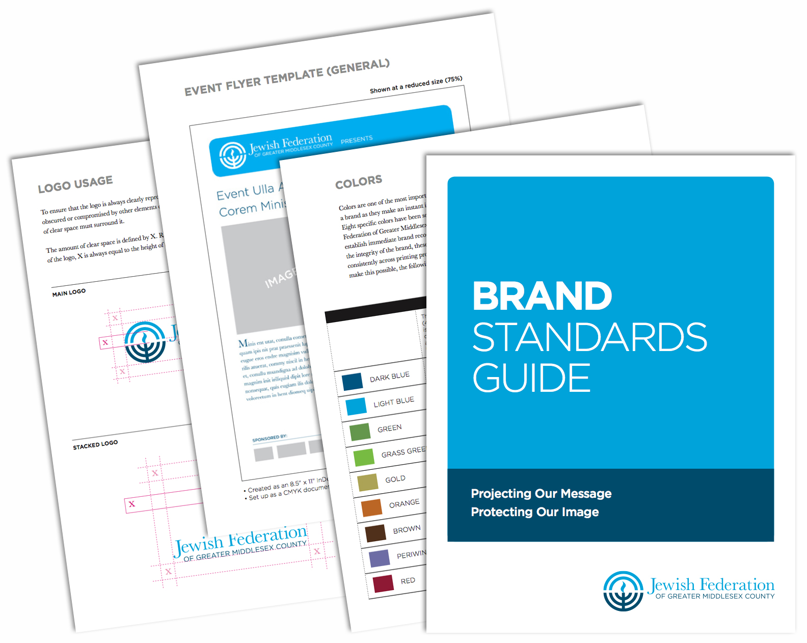
While the national organization, the Jewish Federations of North America, had developed a new logo, we adapted it for local use. To help the staff implement the brand successfully, we adapted the national Federation’s brand manual. The manual contains all the messaging elements, shows all the versions of the logos – with and without the tagline, in color and grayscale, and in print and web formats — along with guidelines for logo usage, typefaces, colors, stationery items and other marketing materials.
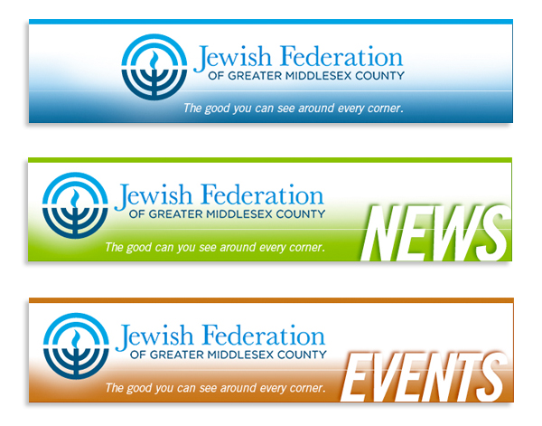
To help the Federation’s recipients quickly identify emails, we created a consistent system for the email templates, with headers for a general, news, and events emails.
Read the full case study and get the inside scoop.
Read “Lessons from Branding a Jewish Agency”
 Red Rooster Group is a New York based graphic design firm that creates effective brands, websites, and marketing campaigns to increase your visibility, fundraising, and communications effectiveness. Contact us at info@redroostergroup.com.

Nonprofits can focus their message, appear more professional and attract donors when they have a strong brand. These were the key points I made in a workshop at the Support Center for Nonprofit Management yesterday. The 3-hour session helped nonprofits to understand the essential steps in the branding process.
Continue reading
How do you expand the audience for an event which has traditionally attracted women only, to include more men? This Federation’s Main Event is the signature event for their Women’s Philanthropy division, and a key source of connection and revenue. However, faced with a shrinking donor base, the goal was to appeal to a wider audience.
 With the change in the nature of the event to a less formal structure, we decided to emphasize the topic of the event — Inside the First Marriage. As an example of effective nonprofit design, we created a gatefold design that invites the recipients to open the invitation, and step inside the White House. We put more emphasis on the speaker’s topic, rather than as just a social mingling opportunity, and feature the recognizable Main Event logo on the front, but in a more subordinate role.
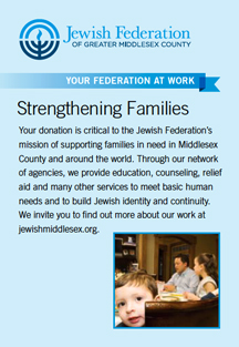
Seeing the mailing as an opportunity to inform people about the Federation’s work, we also connected the event to an aspect of the Federation’s mission, by creating a panel that describes their programs that strengthen families. We also created an email version of the invitation.
The event was a huge success — attracting 160 people — more than double the 60 attendees from the previous year.
Further Findings
A post-event online survey was conducted to learn want people thought of the event. The attendees indicated that the printed email was the primary way that they found out about the event. This was interesting since 4 times the amount of people received an email invite as did the printed invite (in fact, the emails went out twice). So the invite did its job in getting people’s attention.
We also discovered that most people attended because they were interested to hear the keynote speaker, but after the event reported that they were most moved by the personal stories of local women who supported the Federation’s work.
The survey also asked what should be improved for next year’s event, so we gained some valuable feedback about that as well. The survey was short – just 5 questions so that people would be motivated to respond. We used Survey Monkey since it’s free and easy to use. It’s a great tool to use to gain feedback on your event, and it helped us learn what marketing worked, what people wanted to hear, and how to create an even more successful event next year.
Red Rooster Group is a New York based graphic design firm that creates effective brands, websites and marketing campaigns for nonprofits to increase their visibility, fundraising and communications effectiveness. Contact us at info@redroostergroup.com.

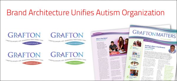
Our research uncovered that one of Grafton’s strengths, the specialized expertise and dedication of its staff, was not being conveyed. We shortened the official name of Grafton School to Grafton and established a brand hierarchy to unify the organization’s four locations under one brand name.
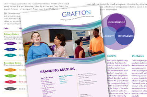
We created a brand manual to explain the brand – what the organization stands for — and specifies colors, typefaces, graphics and guidelines for the brand. This has allowed the client manage their own brand effectively.
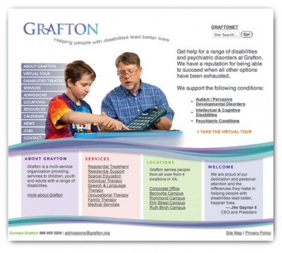
After a strategic assessment of competitors and the users, we redesigned the website around the needs of the users. The redesign has been receiving rave reviews. grafton.org
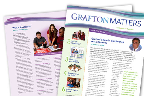
Grafton’s internal newsletter to its 700 employees at their three locations keeps employees informed and generates enthusiasm for the organization.
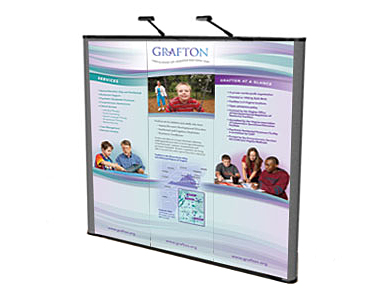
A flexible system of interchangeable panels helps make their display adaptable for fairs, attracting potential students and employees.
A fundraising and training guide helps participants raise the required $1,200 minimum per rider during a recession year.
Continue readingUsing the Safari theme, we created materials that attracted attention and increased attendance for this organization’s annual fundraising auction. The campaign consisted of a postcard, invitation, poster and auction program guide.
Each item in the campaign featured a different animal with a different pattern. The type was designed to look like it was stenciled on crates, and the items were printed on a recycled craft stock. The award-winning campaign resulted in the JCC’s most successful fundraising event to date.
 American Graphic Design Award
GreenDepot’s use of icons to explain the environmental benefits of their various products can serve as a model for nonprofits in telling a complex story. Each of their products features a strip of icons above the description to indicate the eco attributes they possess. You can then click to find out more about each attribute – a nice way to present a lot of information in a useful way. Nonprofits can similarly use this system to showcase specific services for various audiences or convey the benefits of particular programs.
SOURCE: greendepot.com
Ads promoting a voter outreach effort in the Jewish community in New York City.
Logo for a cycling team to support a fundraising ride. The logo was part of a marketing effort to build support for Hazon’s New York Jewish Environmental Bike Ride.
In order to have an effective, campaign, we knew that we would have to coordinate all marketing activities around people who were not accustomed to fundraising. The overall strategy included:
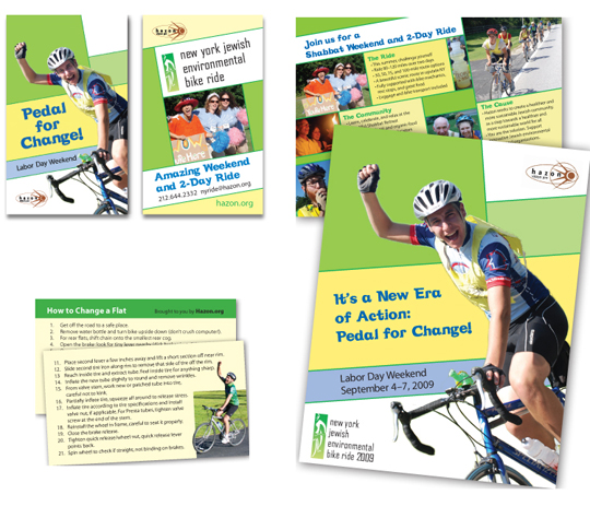
The outreach materials were designed to convey the excitement of the three day event and appeal to a broad spectrum of people. The event attracts people from all walks of Judaism including the unaffiliated. The posters, postcards and pocket cards showcased the diversity of people on the ride and the excitement of the ride experience. To make it easy for riders to promote the ride, we created business card-sized promotional cards and that are easy to keep in the pockets of a riding jersey or small bike pouch. To show riders that they are appreciated, we created cards explaining how to change a flat tire, which were distributed at the ride.
Since a good portion of the participants were riding and fundraising for the first time, we created a 28-page fundraising and training guide. The booklet contained an overview of the event and what to expect, a guide to fundraising, including sample letters, and a training guide with charts to help riders get in shape for the event. We also produced a fundraising clinic to explain how to overcome the fear of asking for money, who to ask, and to answer their questions.
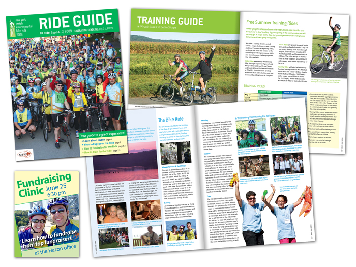
> Download PDF of the RIDE GUIDE
To galvanize participants, help them fundraise and train, and develop a sense of community, we created a new team — Team Brooklyn. The team kicked off with a house event that attracted 20 people and was soon followed by a series of other in-person events as various team members volunteered to host dinners in their apartments.
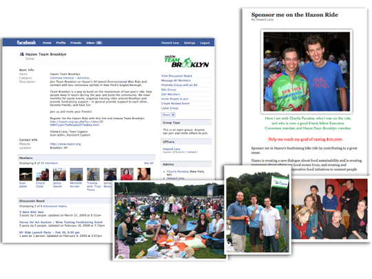
Social media was used to keep the team together and fundraise. A Facebook page as established for the team to foster interaction and communicate team events. Blog posts and email were used to solicit sponsors for the event.
All team activity was monitored including maintaining an active list of all participants and what events they have attended. To boost the recruitment efforts, we collated information from riders who had participated in the past several years so they could be included in outreach efforts.